Download presentation
Presentation is loading. Please wait.

1
Data Presentation & Graphing Introduction to Mechanical Engineering The University of Texas-Pan American College of Science and Engineering

2
Objectives Understand the Usefulness of Data Display in Tables. Practice Visual Presentation of Data Including Line Graphs, Circle Charts, and Column Charts. Assignment: Handout or download from website (http://www.engr.panam.edu/~tarawneh)http://www.engr.panam.edu/~tarawneh

3
Introduction Once a project (problem) has been completed (solved), it is necessary to present the results (solution) to others. Engineers collect a wide variety of data that must be summarized in reports as tables and graphs. Engineers must develop the skills to handle all types of data presentation.

4
Displaying data in tables Seeing the number is very important. A good table should be identified by a number and have a title that satisfactorily explains the data. Data should be presented under headings that include a description or name of each variable and the units of the variable.

5
Displaying data in tables

6
Presenting data in line graphs A two-variable graph consists of data points plotted along two axes, usually arranged at 90 degrees to one another. Two-variable data points can appear in any of the four quadrants of the rectilinear coordinate field. Graphs can be classified as rectilinear graphs or log graphs.

7
Presenting data in line graphs

8
Creating graphs using related variables The horizontal distance from the y-axis is called the abscissa; the corresponding vertical distance from the x-axis is called the ordinate. The horizontal axis is used to plot the independent variable and the vertical axis shows the dependent variable.

9
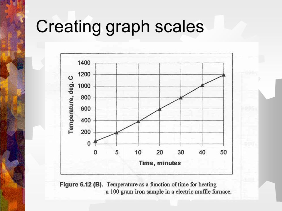
Creating graphs using related variables In the graph of Velocity vs. Time, the time data runs the length of the x-axis because Time is the independent variable, and Velocity is displayed on the y-axis because it represents the dependent variable.

10
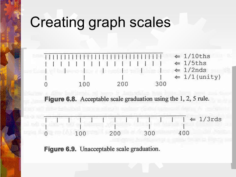
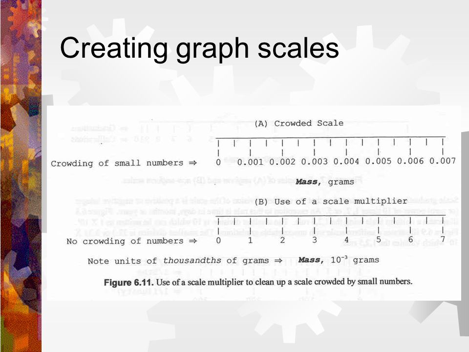
Creating graph scales A scale is a series of marks, called graduations, laid down at predetermined distances along the axis. Numerical values assigned to major graduations are called calibrations. A scale can be uniform with equal spacing along the axis or it can be non-uniform such as the logarithmic scale. It is important to note that once you establish the scale you are going to use, you must keep that same scale along the entire axis.

11
Creating graph scales

16
Convention for different types of data Experimental data points are simply plotted and connected by straight lines. Interpretations of what is happening between the data points can be drawn from the complete data set. A set of theoretical data derived from an equation are plotted as a solid line with no points.

17
Creating circle charts Circle charts or pie graphs allow for comparisons to be made easily. These graphs visually compare (through percentages or ratios) the different information that is placed within them.
 the different information that is placed within them..")
18
Creating circle charts

19
Creating column charts Identify each item in the category along the x-axis. Create a scale on the y-axis to accommodate all of the data. Plot the amount of each item as a column above the item. The columns can be left open, can be shaded, or can be solid.

20
Creating column charts

21
Open Forum

22
Tutorial: Using excel to create a line graph The ability to create graphs is a required tool that will be implemented throughout your educational and professional journey. Because of the demand for graphical skills, we will walk you through the creation of the graph seen in slide nine of this presentation.

23
Tutorial: Using excel to create a line graph 1.Begin by starting Excel. 2.Once the spreadsheet is active, you will need to place the data that you would like to graph within the worksheet. In this case, the velocities and times are inputted as shown in the picture to the right. 3.With the velocity and time data inputted, you will now need to open the chart wizard which is located in the toolbar at the top of the excel spreadsheet. 4.Once the chart wizard is active you should see the pop up window shown to the right. Velocity (miles/hour) Time (seconds) 20050 200920 202340 204060 205780 2038100
 Time (seconds)")
24
Tutorial: Using excel to create a line graph 5.For this graph, we are going to create an x-y line graph with the plotted points connected with straight lines, so we will go ahead and choose the XY Scatter plot from the chart type option, and then from the chart sub- type option, we choose the straight line connection (see the image to the right). 6.Once selected hit the next button.

25
Tutorial: Using excel to create a line graph 7.After hitting next, the following window will allow for input of the data so that the chart can be made. Because we have both X and Y data, and would like to plot them against each other, we have to use the SERIES option, so go ahead and hit the series tab. 8.After hitting the series tab, begin to input the data that is needed. First, in the name box, decide on what you would like to call the data (test 1, test 2, etc…). 9.Now click in the X value box and delete its contents; we are going to add our own numbers. 10.Click in the empty X value box and then go to the time column in the spreadsheet and highlight the data to be used (in our case, it is all the values from 0 - 100). If done correctly, you should see something very similar to what is in the X value box shown in the next slide. 11.With the X values inputted, we need to input our Y values. The process used to input the X values is also used to input the Y values. At this point, you should already be able to see the way the graph will look.
. 9.Now click in the X value box and delete its contents; we are going to add our own numbers. 10.Click in the empty X value box and then go to the time column in the spreadsheet and highlight the data to be used (in our case, it is all the values from ). If done correctly, you should see something very similar to what is in the X value box shown in the next slide. 11.With the X values inputted, we need to input our Y values. The process used to input the X values is also used to input the Y values. At this point, you should already be able to see the way the graph will look..")
26
Tutorial: Using excel to create a line graph This is what you should see on the monitor. Note that the X & Y values have already been inputted, thus, showing the way the graph will look.

27
Tutorial: Using excel to create a line graph 12.After having inputted the data, go ahead and click on the next button. Clicking next will bring you to the title and labels window were you can input the title of the graph, and the X & Y labels that will appear on the X and Y axes. 13.Make sure that you include all units. Without units, your graph is meaningless.

28
Tutorial: Using excel to create a line graph 14.After having titled the graph and labeled the X and Y axes, click the next button. 15.In the final window you will be prompted to either place the chart within the current work sheet or place it in a new one; go ahead and decide which you would like to do (in this example, I went ahead and placed it within the current worksheet - see image to right). 16.After deciding where you want to place the chart, you should be able to see the final graph you created.
. 16.After deciding where you want to place the chart, you should be able to see the final graph you created..")
29
Tutorial: Using excel to create a line graph With everything completed, the graph you created should look like the one below (the finished product).
.")
Similar presentations


 Represents the passage of time and the numerical value of behavior. The Independent.>")


