Download presentation
Presentation is loading. Please wait.

1
New Seats – Block 1

2
New Seats – Block 2

3
Warm-up with Scatterplot Notes 1) 2) 3) 4) 5)
 2) 3) 4) 5)")
4
Student of the day! Block 1

5
Student of the day! Block 2

6
Terms for Ch. 3 1)bivariate14) line of means 2)Linearity15) regression effect 3)Trend16) regression toward 4)Strength the mean 5)predicted - response variable17) residual plot 6)predictor - explanatory variable18) exponential 7)lurking variable relationships 8)Extrapolation19) Power Relationships 9)Interpolation20) power transformations 10)prediction errors 11)Residuals 12)method of least squares 13) least squares line or regression line
bivariate14) line of means 2)Linearity15) regression effect 3)Trend16) regression toward 4)Strength the mean 5)predicted - response variable17) residual plot 6)predictor - explanatory variable18) exponential 7)lurking variable relationships 8)Extrapolation19) Power Relationships 9)Interpolation20) power transformations 10)prediction errors 11)Residuals 12)method of least squares 13) least squares line or regression line.")
7
3.1 Scatterplots Before we were studying single variable data, now we are learning about bivariate data. Scatterplots have two variables: The predictor or explanatory variable is on the x-axis. The predicted or response variable is on the y-axis. If you created a scatter plot comparing tests scores to hours spent studying, on which axes would you put each of the variables?

8
Some examples to look at

9
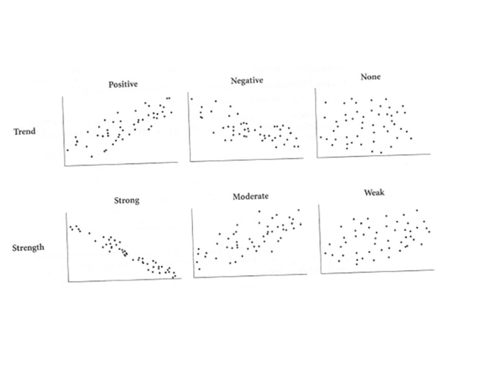
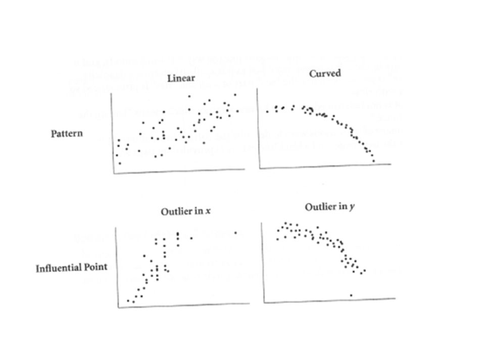
Describing Scatterplots Scatterplots can be described by their: Shape: linearity clusters (fans has variability vs. less variability) outliers (in the x or in the y) Trend: positive or negative Strength: strong, weak or no correlation
 outliers (in the x or in the y) Trend: positive or negative Strength: strong, weak or no correlation.")
12
Positive or Negative correlation? Identify which variable is the independent variable and which is the dependent. 1)A graph comparing the number of hours spent studying and the grade on a test. 2) A graph showing the years after a car accident and the corresponding car insurance rates. 3) A graph comparing shoe size and height.
A graph comparing the number of hours spent studying and the grade on a test. 2) A graph showing the years after a car accident and the corresponding car insurance rates. 3) A graph comparing shoe size and height..")
13
Pinching Pages Activity Materials: Graph paper, pencil, ruler, and textbook You will use the front cover EVERY time you pinch pages. To be more accurate use millimeters. Align the bottom page with 0 on the ruler and the top of the cover is the measurement you are writing down. Activity is on pg 117. *You are creating a table of your measurements for 50, 150, 200, 250 pages. Count the pages!!! The textbook does not start with page 1. *When you are done measuring and putting your data in an organized table, create a scatter plot (label everything), and answer 4 – 7 in Complete sentences on your sheet.
, and answer 4 – 7 in Complete sentences on your sheet..")
14
Results of Pinching Pages Activity You should have a table displaying 50, 150, 200 and 250 pages and the thickness in mm for each. Your scatter plot should have a title labels and 4 dots representing your data. 4) Does the plot look linear? Should it? Discuss why or why not, and make your measurements again if necessary. On the plot, place a straight line that best fits the cloud of points. 5) Find the slope and y-intercept of your line. What does the y-intercept tell you? What does the slope tell you? What is your estimate of the thickness of a sheet?
 Does the plot look linear. Should it. Discuss why or why not, and make your measurements again if necessary. On the plot, place a straight line that best fits the cloud of points. 5) Find the slope and y-intercept of your line. What does the y-intercept tell you. What does the slope tell you. What is your estimate of the thickness of a sheet .")
15
#6 and #7 from Pinching Pages 6) Use the information in your graph to discuss how much your estimate in step 5 is likely to vary from the true thickness. 7) How would your line have changed if you hadn’t included the front cover?
 How would your line have changed if you hadn’t included the front cover .")
16
H.W. Assignment A.P. Statistics - 3.1 E#1 - 4 Read 3.2

Similar presentations
. * Explanatory variable goes on x-axis * Response variable goes on y-axis * Don’t forget labels and scale * Statplot 1 st.>")


