Download presentation
Presentation is loading. Please wait.

1
Graphic Presentation The Pie Chart The Bar Graph The Statistical Map
The Histogram The Frequency Polygon Times Series Charts Distortions in Graphs It is important to choose the appropriate graphs to make statistical information coherent.

2
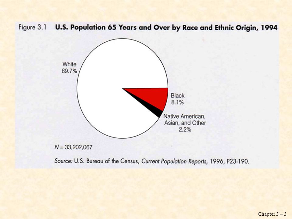
The Pie Chart: The Race and Ethnicity of the Elderly
Pie chart: a graph showing the differences in frequencies or percentages among categories of a nominal or an ordinal variable. The categories are displayed as segments of a circle whose pieces add up to 100 percent of the total frequencies.

4
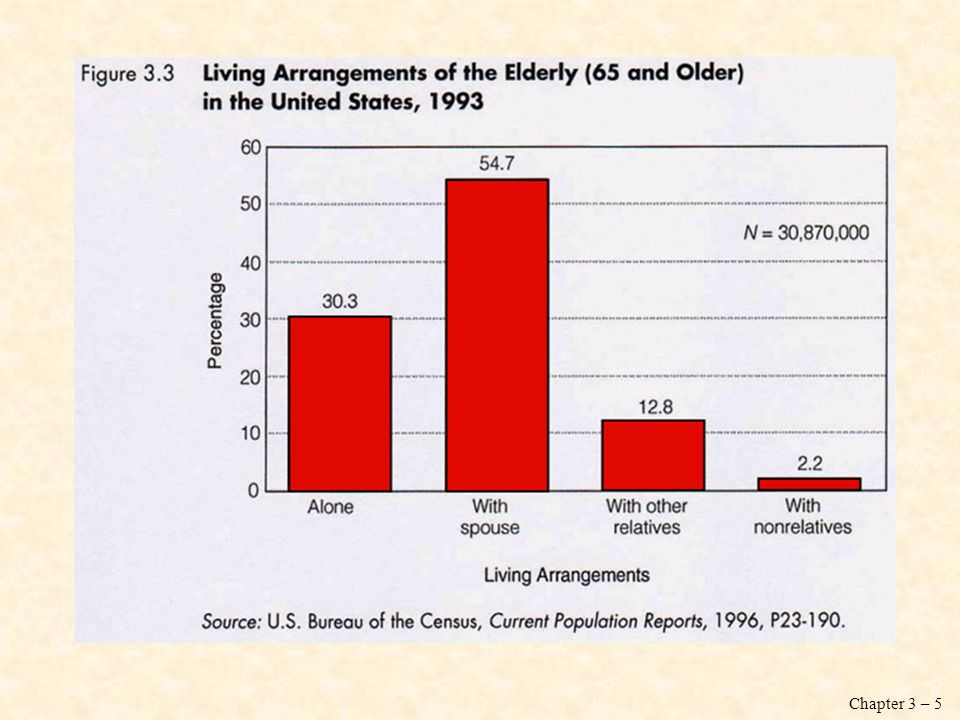
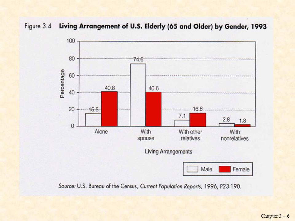
The Bar Graph: The Living Arrangements and Labor Force Participation of the Elderly
Bar graph: a graph showing the differences in frequencies or percentages among categories of a nominal or an ordinal variable. The categories are displayed as rectangles of equal width with their height proportional to the frequency or percentage of the category.

8
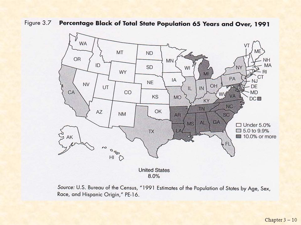
The Statistical Map: The Geographic Distribution of the Elderly
We can display dramatic geographical changes in American society by using a statistical map. Maps are especially useful for describing geographical variations in variables, such as population distribution, voting patterns, crimes rates, or labor force participation.

11
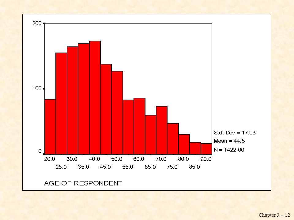
The Histogram Histogram: a graph showing the differences in frequencies or percentages among categories of an interval-ratio variable. The categories are displayed as contiguous bars, with width proportional to the width of the category and height proportional to the frequency or percentage of that category.

13
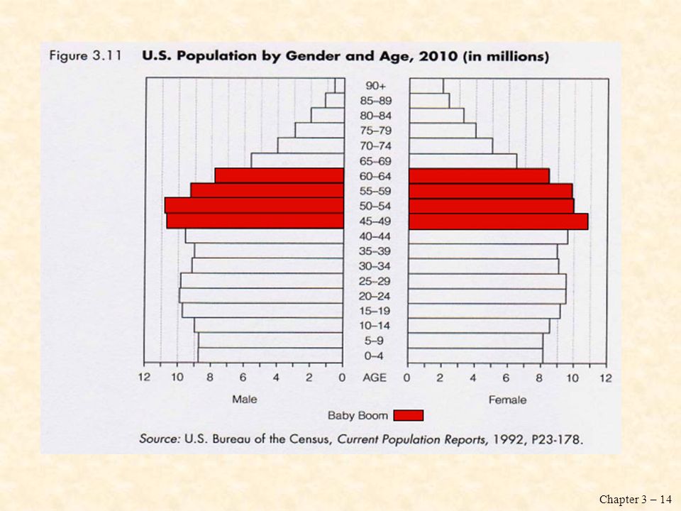
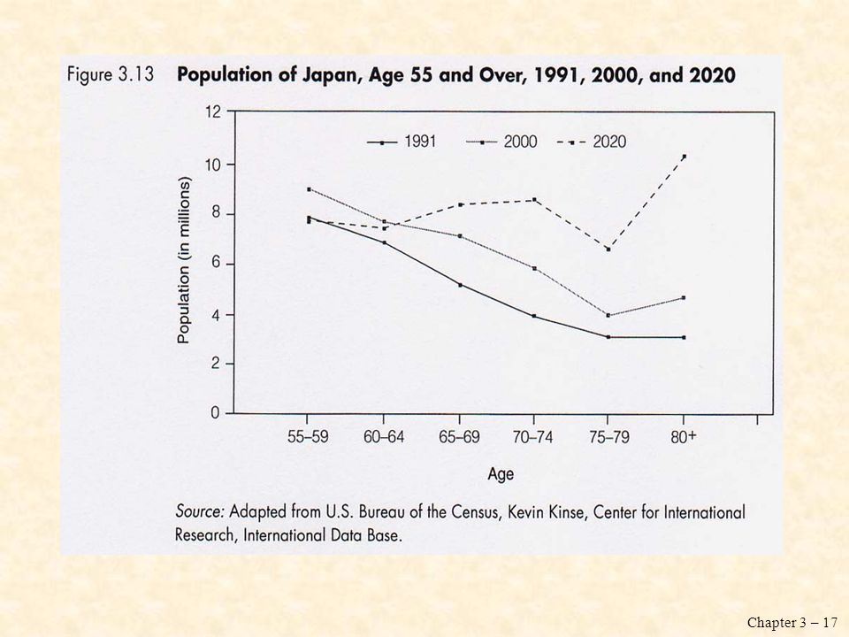
The following two slides are applications of the histogram
The following two slides are applications of the histogram. They examine, by gender, age distribution patterns in the U.S. population for 1955 and 2010 (projected). Notice that in both figures, age groups are arranged along the vertical axis, whereas the frequencies (in millions of people) are along the horizontal axis. Each age group is classified by males on the left and females on the right. Because this type of histogram reflects age distribution by gender, it is also called an age-sex pyramid.
. Notice that in both figures, age groups are arranged along the vertical axis, whereas the frequencies (in millions of people) are along the horizontal axis. Each age group is classified by males on the left and females on the right. Because this type of histogram reflects age distribution by gender, it is also called an age-sex pyramid.")
15
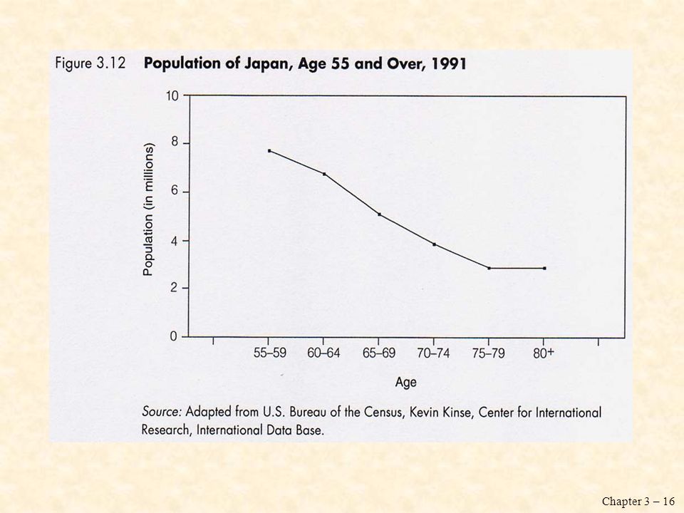
The Frequency Polygon Frequency polygon: a graph showing the differences in frequencies or percentages among categories of an interval-ratio variable. Points representing the frequencies of each category are placed above the midpoint of the category and are jointed by a straight line.

18
Time Series Charts Time series chart: a graph displaying changes in a variables at different points in time. It shows time (measured in units such as years or months) on the horizontal axis and the frequencies (percentages or rates) of another variable on the vertical axis.
 on the horizontal axis and the frequencies (percentages or rates) of another variable on the vertical axis.")
21
Distortions in Graphs Graphs not only quickly inform us; they can quickly deceive us. Because we are often more interested in general impressions than in detailed analyses of the numbers, we are more vulnerable to being swayed by distorted graphs. What are graphical distortions? How can we recognize them?

22
Shrinking an Stretching the Axes: Visual Confusion
Probably the most common distortions in graphical representations occur when the distance along the vertical or horizontal axis is altered in relation to the other axis. Axes can be stretched or shrunk to create any desired result.

23
Shrinking an Stretching the Axes: Visual Confusion

24
Distortions with Picture Graphs
Another way to distort data with graphs is to use pictures to represent quantitative information. The problem with picture graphs is that the visual impression received is created by the picture’s total area rather than by is height (the graphs we have discussed so far rely heavily on height).
.")
25
Statistics in Practice
The following graphs are particularly suitable for making comparisons among groups: - Bar chart - Frequency polygon - Time series chart

26
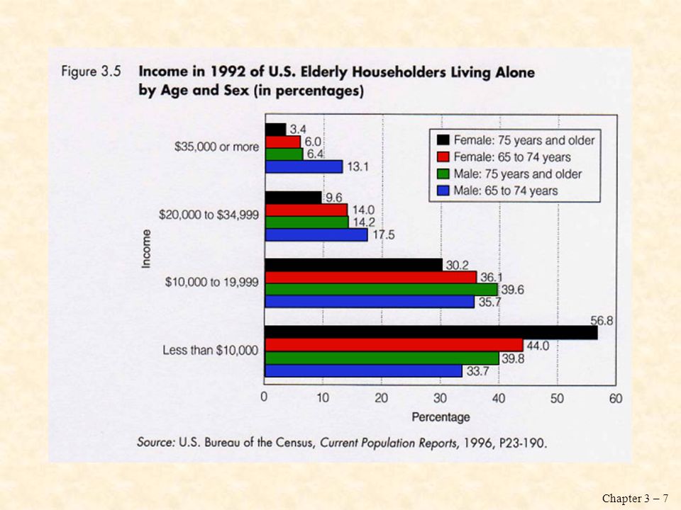
This bar chart compares elderly males and females who live alone by age, gender, and race or Hispanic origin. It shows that that the percentage of elderly who live alone varies not only by age but also by both race and gender.

27
This frequency polygon compares years of school completed by black Americans age 25 to 64 and 65 years and older with that of all Americans in the same age groups.

28
Why use charts and graphs?
What do you lose? What do you gain? ability to examine numeric detail offered by a table potentially the ability to see additional relationships within the data potentially time: often we get caught up in selecting colors and formatting charts when a simply formatted table is sufficient ability to direct readers’ attention to one aspect of the evidence ability to reach readers who might otherwise be intimidated by the same data in a tabular format ability to focus on bigger picture rather than perhaps minor technical details We do this as an in-class exercise – where they pair up and construct a chart based on a table from the text or handed out in class and then answer the two questions above.

Similar presentations


. Statistics graph Data recorded in surveys are displayed by a statistical graph. There are some specific.>")


