Download presentation
Presentation is loading. Please wait.

1
February 2013

3
Study & Abstract StudyAbstract Graphic presentation of data. Graphic presentation of data. Statistical Analyses Statistical Analyses

5
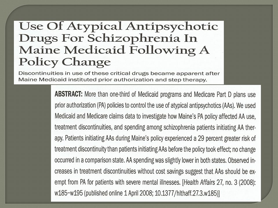
Assume: You have two articles that provide conflicting evidence regarding the imposition of formulary controls for mental health drugs. One says prior authorization causes “gaps” in therapy. The other says when you impose restrictions drug costs go down as well as other services such as hospital, ER and doctor visits.

6
Conceptualize a Scatter Diagram Pearson Correlation Coefficient Linear regression analysis Hypothesis testing of relationship between x and y

7
Correlation and regression are the two most common methods to describe the relationship between two quantitative variables (x and y) Correlation coefficient measures the strength of the relationship between the two variables, provided that the relationship is linear Regression analysis is an equation that allows the estimation of the value of y for any given x.
 Correlation coefficient measures the strength of the relationship between the two variables, provided that the relationship is linear Regression analysis is an equation that allows the estimation of the value of y for any given x.")
8
A good way to understand the relationship between two variables is by graphing them

9
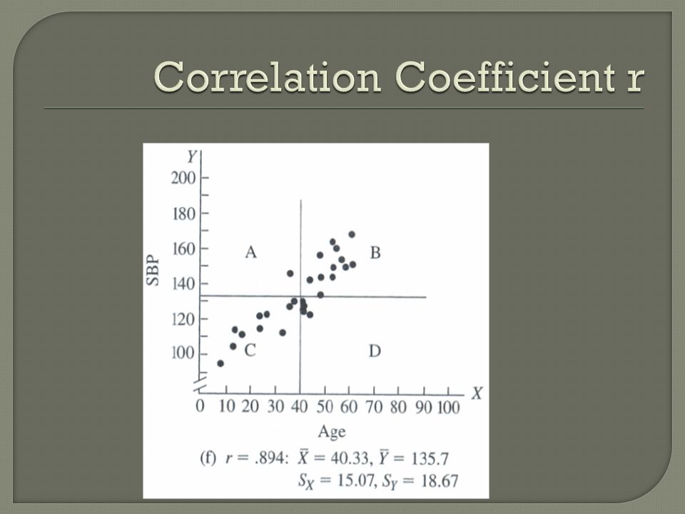
The correlation coefficient r measures how strong the linear relationship is The relationship between two variables are not necessarily linear When the relationship is not linear, r may not be an appropriate description of the relationship

10
The value of r can range from 0 (no linear association between x and y), and 1 (perfectly linear association) The value of r can also be positive or negative The closer the value of r to +1 and -1, the stronger the relationship is and the more nearly it approximates a straight line.
, and 1 (perfectly linear association) The value of r can also be positive or negative The closer the value of r to +1 and -1, the stronger the relationship is and the more nearly it approximates a straight line.")
13
Also referred to as the “r-squared” It is always between 0 and 1. At the extreme value of 0, the regression line is horizontal r2 measures the percent of the variance explained by your mathematical model (i.e. regression model) The closer r2 is to 1, the better the fit of the regression line. r2’s are evaluated using 2 sample t-tests with n-2 d.f.
 The closer r2 is to 1, the better the fit of the regression line. r2’s are evaluated using 2 sample t-tests with n-2 d.f..")
14
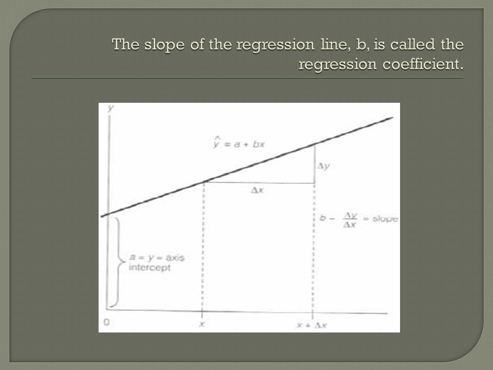
Although correlation tells us the strength of the relationship between x and y, it doesn’t allow us to predict the value of y for a given value of x Instead of using r, we can use a linear equation to represent the relationship between x and y yˆ = a + bx

17
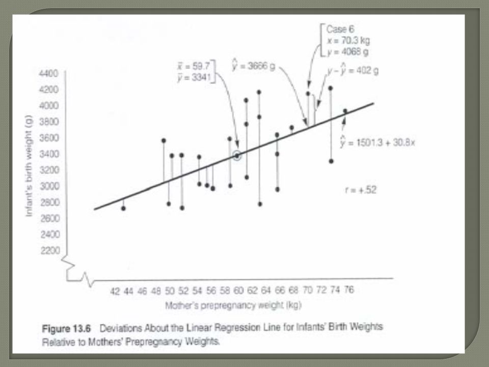
Always pass through the means of x and y The sum of deviations about the line is equal to zero Sum of residuals above the line equals the sum of those below the line The sum of the squared deviations about the line is a minimum so it is the best fit This is where “least squares” comes from

19
H0: β 1 = 0 (i.e., there is no relationship between x and y) H1: β 1 ≠ 0 Determine α Calculate t statistic with n-2 df Compare to critical value Reject H0 if t is greater than c.v.
 H1: β 1 ≠ 0 Determine α Calculate t statistic with n-2 df Compare to critical value Reject H0 if t is greater than c.v.")
20
If null hypothesis: β 1=0 cannot be rejected, it means that a straight line model in x is not the best model to use and doesn’t provide much help for predicting y If null hypothesis: β 1=0 is rejected we would conclude that x provides significant information for predicting y BUT there still might be a better model out there

21
Graphs a and b are examples when H0: β1=0 cannot be rejected Graphs c and d are examples when H0: β1=0 is rejected

22
Common to see this used in biomedical research. It is a special case of multiple regression where the dependent variable (the one being studied) is a discrete, nominal variable, for example 0 or 1, representing the presence or absence of some characteristic. For example, you could do a study of long term statin use where the dependent variable (left side of the equation) is all cause mortality and the independent variable (right side) is length of statin use. So the dependent variable could be 0 v. 1 for dead or alive. The reference category would be patients who were alive at the end of the study and the regression result will be expressed as an “odds ratio.” In other words, is there a greater or less chance of being alive at some point in the future as a result of using the statin?
 is a discrete, nominal variable, for example 0 or 1, representing the presence or absence of some characteristic. For example, you could do a study of long term statin use where the dependent variable (left side of the equation) is all cause mortality and the independent variable (right side) is length of statin use. So the dependent variable could be 0 v. 1 for dead or alive. The reference category would be patients who were alive at the end of the study and the regression result will be expressed as an odds ratio. In other words, is there a greater or less chance of being alive at some point in the future as a result of using the statin .")
23
So, if the odds ratio were.78 you could interpret this as a 22% less chance of remaining alive as a result of statin use. Conversely, if the odds ratio were 1.22 you could conclude there was a 22% greater chance of dying as a result of statin use. Odds ratio’s are assessed for significance using chi- square analysis, and p values are reported. Note: Which way the percents go depends on which variable, life or death you set up as the reference variable.

24
Correlations and regression are methods to measure the relationship between two variables Regression analysis can also study the relationship of more than two variables, such as in the example we will walk through in class

Similar presentations


>")
 measures the strength of the linear relationship.>")


