Download presentation
Presentation is loading. Please wait.

1
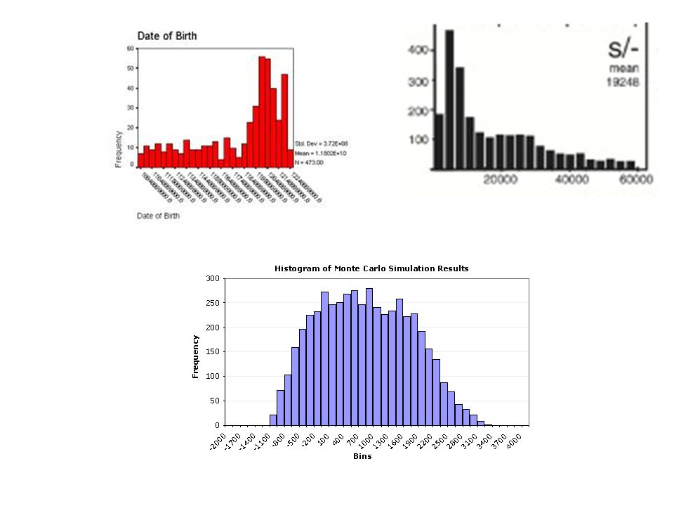
Histogram A frequency plot that shows the number of times a response or range of responses occurred in a data set.

2
What is a histogram? A histogram is like a bar chart, but there are some important differences. It can only be used to show continuous data The bars on a histogram touch. The bars found on a bar graph do not touch The bars on a histogram touch. The bars found on a bar graph do not touch. It can only be used to show numerical data The data is always grouped The data is always grouped.

3
Histogram: Pros and Cons Advantages: Visually strong Visually strong Good for determining the shape of the data Good for determining the shape of the data Disadvantages: Cannot read exact values because data is grouped into categories Cannot read exact values because data is grouped into categories More difficult to compare two data sets More difficult to compare two data sets

4
How do you make a histogram? Create a frequency table Count how many occurrences in the data – Be sure to create equal intervals Label the x and y axis – Choose a scale to label – X and Y axis do not need to have the same scale Draw a bar for each interval. – The height of the bar is the frequency for that interval. – Bars must touch but not overlap.

5
Let’s try! A study collected the number of hours children watch TV. The collected the following number of hours: 8, 7, 5, 4, 9, 6, 3, 1, 7, 5, 4, 2, 3, 5, 2, 4, 3, 5, 7, 3, 6, 5, 3, 7, 2, 9, 6, 7, 8, 5, 4, 7, 3, 9, 4, 7, 3, 1, 2, 8, 5, 3, 7, 9, 5 16 27 38 49 5

6
Create the frequency table Frequency Number of hours of TV 61 72 83 94 5

7
Label x and y axis (Choose your scale!) Draw the bars
 Draw the bars")
8
Analyzing Histograms When you compare two or more data sets, focus on the following four features: »Center »Spread »Shape »Unusual Features How To Compare Distributions

9
To Find the Center: 5 6 7 8 9 10 11 12 13 14 15 List out the numbers in order, smallest to largest, then find the median.

10
Your Turn!

11
Spread (RANGE) EXAMPLES Less Spread More Spread Highest – Lowest = Range
 EXAMPLES Less Spread More Spread Highest – Lowest = Range")
12
You Try!

14
3 Overall Shapes: Normal/Symmetrical: –The shape is symmetrical around the middle. Skewed left: –Most of the data is to the right, with a long tail to the left. Skewed right: –Most of the data is to the left, with a long tail to the right.

15
You Try!

17
Analyzing Histograms Unusual Features Unusual features refer to gaps: areas of the distribution where there are no observations and Outliers: a data point that stands out from the rest. (1.5 times the IQR) EXAMPLES Gap Outlier
 EXAMPLES Gap Outlier.")
18
You Try!

20
Classwork/Homework Graphical Displays for Data Homework

Similar presentations


 C2-4: Categorical and Quantitative Data.>")


