Download presentation
Presentation is loading. Please wait.

1
Process Improvement Dr. Ron Tibben-Lembke

2
Statistics

3
Measures of Variability Range: difference between largest and smallest values in a sample Very simple measure of dispersion R = max - min Variance: Average squared distance from the mean Population (the entire universe of values) variance: divide by N Sample (a sample of the universe) var.: divide by N-1 Standard deviation: square root of variance
 variance: divide by N Sample (a sample of the universe) var.: divide by N-1 Standard deviation: square root of variance")
4
Skewness Lack of symmetry Pearson’s coefficient of skewness: Skewness = 0 Negative Skew < 0 Positive Skew > 0

5
Kurtosis Amount of peakedness or flatness Kurtosis < 0 Kurtosis > 0 Kurtosis = 0

6
Subgroup Size All data plotted on a control chart represents the information about a small number of data points, called a subgroup. Variability occurs within each group Only plot average, range, etc. of subgroup Usually do not plot individual data points Larger group: more variability Smaller group: less variability Control limits adjusted to compensate Larger groups mean more data collection costs

7
Number of data points Ideally have at least 2 defective points per sample for p, c charts Need to have enough from each shift, etc., to get a clear picture of that environment At least 25 separate subgroups for p or np charts

8
Control Chart Usage Only data from one process on each chart Putting multiple processes on one chart only causes confusion 10 identical machines: all on same chart or not?

9
Attribute Control Charts Tell us whether points in tolerance or not p chart: percentage with given characteristic (usually whether defective or not) np chart: number of units with characteristic c chart: count # of occurrences in a fixed area of opportunity (defects per car) u chart: # of events in a changeable area of opportunity (sq. yards of paper drawn from a machine)
.")
10
p Chart Control Limits # Defective Items in Sample i Sample i Size UCLpz p n p X n p i i k i i k (1 - p) 1 1
 1 1")
11
p Chart Control Limits # Defective Items in Sample i Sample i Size UCLpz pp) n p X n p i i k i i k (1 1 1 z = 2 for 95.5% limits; z = 3 for 99.7% limits # Samples n n k i i k 1
 n p X n p i i k i i k (1 1 1 z = 2 for 95.5% limits; z = 3 for 99.7% limits # Samples n n k i i k 1")
12
p Chart Control Limits # Defective Items in Sample i # Samples Sample i Size z = 2 for 95.5% limits; z = 3 for 99.7% limits UCLpz LCLpz n n k p X n p p i i k i i k i i k 11 1 and n pp) (1 pp) n (1
 (1 pp) n (1")
13
p Chart Example You’re manager of a 500- room hotel. You want to achieve the highest level of service. For 7 days, you collect data on the readiness of 200 rooms. Is the process in control (use z = 3)? © 1995 Corel Corp.
. © 1995 Corel Corp..")
14
p Chart Hotel Data No.No. Not DayRoomsReady Proportion 12001616/200 =.080 2200 7.035 320021.105 420017.085 520025.125 620019.095 720016.080

15
p Chart Control Limits n n k i i k 1 1400 7 200

16
p Chart Control Limits 16 + 7 +...+ 16 p X n i i k i i k 1 1 121 1400 0864.n n k i i k 1 1400 7 200

17
p Chart Control Limits Solution p p 308643. n pp) (1 200.0864 * (1-.0864) p X n i i k i i k 1 1 121 1400 0864.n n k i i k 1 1400 7 200 16 + 7 +...+ 16
 ( * ( ) p X n i i k i i k n n k i i k ")
18
p Chart Control Limits Solution 086405961460... or &.0268 p p 308643. n pp) (1 200.0864 * (1-.0864) p X n i i k i i k 1 1 121 1400 0864.n n k i i k 1 1400 7 200 16 + 7 +...+ 16
 ( * ( ) p X n i i k i i k n n k i i k ")
19
p Chart Control Chart Solution UCL LCL

20
Table 7.1 p.193 Enter the data, compute the average, calculate standard deviation, plot lines

21
Dealing with out of control Two points were out of control. Were there any “assignable causes?” Can we blame these two on anything special? Different guy drove the truck just those 2 days. Remove 1 and 14 from calculations. p-bar down to 5.5% from 6.1%, st dev, UCL, LCL, new graph

22
Figure 7.4, p. 196

23
Different Sample sizes Standard error varies inversely with sample size Only difference is re-compute for each data point, using its sample size, n. Why do this? The bigger the sample is, the more variability we expect to see in the sample. So, larger samples should have wider control limits. If we use the same limits for all points, there could be small-sample-size points that are really out of control, but don’t look that way, or huge sample-size point that are not out of control, but look like they are. Judging high school players by Olympic/NBA/NFL standards.

24
Fig. 7.6

25
How not to do it If we calculate n-bar, average sample size, and use that to calculate a standard deviation value which we use for every period, we get: One point that really is out of control, does not appear to be OOC 4 points appear to be OOC, and really are not.

26
5 false readings

27
C-Chart Control Limits # defects per item needs a new chart How many possible paint defects could you have on a car? C = average number defects / unit Each unit has to have same number of “chances” or “opportunities” for failure UCL c z C c LCLz C c c

28
Figure 7.9

29
Small Average Counts For small averages, data likely not symmetrical. Use Table 7.8 to avoid calculating UCL, LCL for averages < 20 defects per sample Aside: Everyone has to have same definitions of “defect” and “defective” Operational Definitions: we all have to agree on what terms mean, exactly.

30
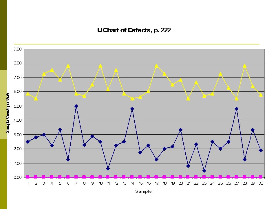
U charts: areas of opportunity vary Like C chart, counts number of defects per sample No. opportunities per sample may differ Calculate defects / opportunity, plot this. Number of opportunities is different for every data point Table 7.13

32
Variable Control Charts Focus on unit-to-unit variability x chart: subgroup average R chart: subgroup range I chart: average, subgroup size of one MR moving range chart: one data point per subgroup s chart: standard deviation with more than 10 samples per subgroup

33
R Chart Type of variables control chart Interval or ratio scaled numerical data Shows sample ranges over time Difference between smallest & largest values in inspection sample Monitors variability in process Calculate the range of each data sample: Maximum – Minimum Calculate average range:

34
R Chart – Control Limits How much variability should there be in the R values? Depends on process variability, We don’t know that, only the R values. We could get it from here: But this seems a lot easier: Look up values in Table B-1, p. 786

35
Control Chart Limits

36
You’re manager of a 500-room hotel. You want to analyze the time it takes to deliver luggage to the room. For 7 days, you collect data on 5 deliveries per day. Is the process in control? Hotel Example

37
Hotel Data DayDelivery Time 17.304.206.103.455.55 24.608.707.604.437.62 35.982.926.204.205.10 47.205.105.196.804.21 54.004.505.501.894.46 610.108.106.505.066.94 76.775.085.906.909.30

38
R & X Chart Hotel Data Sample DayDelivery TimeMeanRange 17.304.206.103.455.555.32 7.30 + 4.20 + 6.10 + 3.45 + 5.55 5 Sample Mean =

39
R & X Chart Hotel Data Sample DayDelivery TimeMeanRange 17.304.206.103.455.555.323.85 7.30 - 3.45Sample Range = LargestSmallest

40
R & X Chart Hotel Data Sample DayDelivery TimeMeanRange 17.304.206.103.455.555.323.85 24.608.707.604.437.626.594.27 35.982.926.204.205.104.883.28 47.205.105.196.804.215.702.99 54.004.505.501.894.464.073.61 610.108.106.505.066.947.345.04 76.775.085.906.909.306.794.22

41
R R Chart Control Limits R k i i k 1 385427422 7 3894....

42
R Chart Control Limits Solution From B-1 (n = 5) R R k UCLDR LCLDR i i k R R 1 4 3 385427422 7 3894 (2.114)(3.894)8232 (0)(3.894)0.....

43
R Chart Control Chart Solution UCL

44
X Chart Control Limits Sample Range at Time i # Samples Sample Mean at Time i

45
X Chart Control Limits From Table B-1

46
R & X Chart Hotel Data Sample DayDelivery TimeMeanRange 17.304.206.103.455.555.323.85 24.608.707.604.437.626.594.27 35.982.926.204.205.104.883.28 47.205.105.196.804.215.702.99 54.004.505.501.894.464.073.61 610.108.106.505.066.947.345.04 76.775.085.906.909.306.794.22

47
X Chart Control Limits X X k R R k i i k i i k 1 1 532659679 7 5813 385427422 7 3894........

48
X Chart Control Limits From B-1 (n = 5) X X k R R k UCLXAR i i k i i k X 1 1 2 532659679 7 5813 385427422 7 3894 5813058 *38948060............

49
X Chart Control Limits Solution From Table B-1 (n = 5) X X k R R k UCLXAR LCLXAR i i k i i k X X 1 1 2 2 532659679 7 5813 385427422 7 3894 5813(058) 5813(058) (3.894) = 3.566............ (3.894) = 8.060
 =")
50
X Chart Control Chart Solution* 0 2 4 6 8 1234567 X, Minutes Day UCL LCL

51
General Considerations, X-bar, R Operational definitions of measuring techniques & equipment important, as is calibration of equipment X-bar and R used with subgroups of 4-9 most frequently 2-3 is sampling is very expensive 6-14 ideal Sample sizes >= 10 use s chart instead of R chart.

Similar presentations


 Theory of Process Management (Deming’s Fourteen points) The Theory of Control Charts Common Cause Variation.>")
. Quality of Manufacturing Process depends on Entry Criteria.>")


