Download presentation
Presentation is loading. Please wait.

1
Principal Component Analysis
Step by Step Walk Through Paul Biliniski

2
Purpose Find patterns in data with many dimensions
Reduces the number of dimensions, analysis becomes easier ONLY WORKS ON SQUARE MATRICES

3
Mathematical Concepts
Measures of Spread in 1 Dimension Standard Deviation – spread of data from mean Variance Measure of Spread in 2 Dimensions Covariance – Variance between 2 data sets, to see if they change at similar rates; sign is important Covariance Matrix Matrix of all of the covariances between each pair of data sets Eigenvector Transformation vector that creates a reflection of a data set onto itself Eigenvalue Amount by which the original vector is scaled

4
Step 1: Data, Subtract Means
Find the Mean of each component of the data set Subtract that mean from each of the components Mean of Height: Mean of OFC: Height (CM) OFC (CM) 161.1 56.1 179.8 57.5 186.3 60.1 163.9 56.6 190 59.8 179.9 58 177.9 59.3 195 59.9
 OFC (CM)")
5
Step 1: Data Graphed Clearly, there is a linear relationship

6
Step 1: Subtract Means Height (CM) OFC (CM) -12.83666667 -1.665789474

7
Step 2: Covariance Matrix
Calculate the covariance matrix The diagonal should be the variance in each data set, the anti-diagonal should be the covariance All positive values tells us that we expect to see that as data set 1 increases, data set 2 also increases. Verified by graph

8
Step 3: Calculate Eigens
Eigenvector x times matrix A equals Eigenvalue (Λ) times x Ax = Λx The eigenvalue is found with: det (A – ΛI) = 0 It is the determinant (performs a linear transformation of vector space) of the original matrix – Λ in the diagonals So with the original matrix: The Eigenvalue can be found with the equation: Use the Quadratic to solve
 times x. Ax = Λx. The eigenvalue is found with: det (A – ΛI) = 0. It is the determinant (performs a linear transformation of vector space) of the original matrix – Λ in the diagonals. So with the original matrix: The Eigenvalue can be found with the equation: Use the Quadratic to solve.")
9
Step 3: Calculate Eigens
So for our situation, we use the 2x2 matrix of the covariances: So the determinant for this is: ( – Λ) * ( – Λ) ^2 =0 So, the eigenvalues are 0.54 and ! Λ Λ det
 * ( – Λ) ^2 =0. So, the eigenvalues are 0.54 and ! Λ Λ. det.")
10
Step 3: Calculate Eigens
With the Eigens solved, we can now solve for the vectors in the null space, getting our vector to Row Echelon form; first just use one of the eigenvalues as the Λ For row echelon form, get the item in the second row(15.36), first column to equal – , or super close to it. So, multiply the second row by 6.86! – 0.54 X Y 104.35 2.26 X Y
, first column to equal – , or super close to it. So, multiply the second row by 6.86! – X. Y X. Y.")
11
Step 3: Calculate Eigens
Row 1 stays the same, Row 2 = Row 1 – 6.86*(Row2) So, do the multiplication: 105.44X Y = 0 We can define X = S, the variable S. This means that 15.36Y = 0.14S The Vector for the value 0.54 is Apply this same technique to the eigenvalue of 107, and get 105.44 ~0 X Y 1 0.14 -.014 1
 So, do the multiplication: X Y = 0. We can define X = S, the variable S. This means that 15.36Y = 0.14S. The Vector for the value 0.54 is. Apply this same technique to the eigenvalue of 107, and get ~0. X. Y")
12
Step 3: Calculate Eigens
Now lets see how our Eigens look on our graph of subtracted means data… looks like a line of best fit, reasonable.

13
Step 3: Calculate Eigens
The eigenvalue with the highest value is considered the principle component of the data set. Set up a matrix with your two eigenvalues, so you can transform the data. Note that column 1 is the eigenvector associated with our 107 eigenvalue, the bigger one Now, we get back to the data… 1 0.146 -0.146

14
Step 4: Transform Data Using the 2x2 matrix of eigenvectors, multiply each matrix of the data (each should be a 1 column 2 row matrix, X value on top of Y value) Continue this for EVERY set of points… 1 0.146 -0.146
 Continue this for EVERY set of points…")
15
Step 4: Transform Data This is what the data should look like after this eigenvector multiplication step.

16
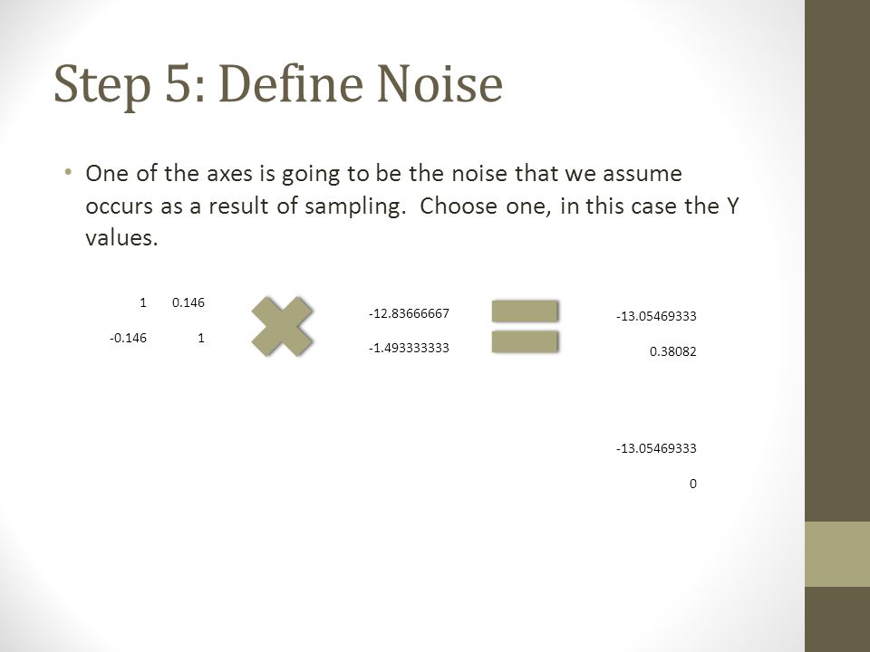
Step 5: Define Noise One of the axes is going to be the noise that we assume occurs as a result of sampling. Choose one, in this case the Y values. 1 0.146 -0.146
17
Step 6: Getting back the Data
Use the new noise-less data to plot your new points. Multiply the data without noise by the eigen matrix Repeat for all of your points. Now, add the means of each back to the data: 1 0.146 -0.146

18
Step 7: Victory Plot your new data points. They are now one line without noise. This is now the new axis against which you can plot another component. Keep adding variables into each component until there is no longer a linear relationship. That will show you what components cause the variation in your data.

Similar presentations


 is a technique that is useful for the compression and classification.>")


