Download presentation
Presentation is loading. Please wait.

1
Statistical Process Control Using Control Charts to Monitor “Quality”

2
Walter Shewhart www.york.ac.uk/.../ histstat/people/welcome.htm Developer of Control Charts in the late 1920’s

3
Statistical Process Control SPC does not refer to a particular technique, algorithm or procedure SPC is an optimisation philosophy concerned with continuous process improvements, using a collection of (statistical) tools for –data and process analysis –making inferences about process behaviour –decision making http://lorien.ncl.ac.uk/ming/spc/spc1.htm
 tools for –data and process analysis –making inferences about process behaviour –decision making")
4
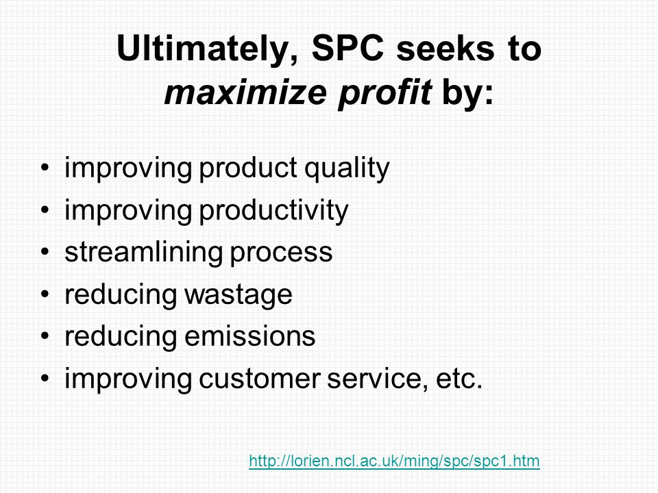
Ultimately, SPC seeks to maximize profit by: improving product quality improving productivity streamlining process reducing wastage reducing emissions improving customer service, etc. http://lorien.ncl.ac.uk/ming/spc/spc1.htm
5
Control Charts Control charts are particularly useful for monitoring quality and giving early warnings that a process may be going “Out of Control” and on its way to producing defective parts.

6
http://www.pqsystems.com/products/SPC/CHARTrunner/CHARTrunnerChartingExample1.php

7
Objectives Be able to explain how control charts relate to assigned dimension and tolerance State what value you get from control charts Be able to name several ways that control charts indicate that a process is “out of control”

8
Normal Distribution Defined by two parameters: mean and standard deviation http://www.campbell.berry.edu/faculty/jgrout/spclecture.ppt Reminder:

9
2.50 0.05 Example: Suppose we specify a dimension and tolerance as shown. Questions: - What does the control chart look like? - How does control chart relate to the tolerances?

10
Control charts are normal distributions with an added time dimension http://lorien.ncl.ac.uk/ming/spc/spc8.htm#interpretation

11
Control charts provide a graphical means for testing hypotheses about the data being monitored. Consider the commonly used Shewhart Chart as an example. http://lorien.ncl.ac.uk/ming/spc/spc8.htm#interpretation

12
What does the control chart look like? - First we measure a number of parts as they come off the line. - For example we might measure 4 parts per hour for 20 hours. - Those 80 parts would give us an overall mean and standard deviation that would define the control chart. - The average of the size of the four parts would give us the y values for each hour (plotted on the x-axis) +3 -3 Time
 +3 -3 Time.")
13
+3 -3 2.55 2.45 Assigned Tolerances Measured Variation How does the control chart relate to the tolerances?

14
Value of Control Charts Defect Prevention through “Early Warning” Prevent “Over-Tweaking” of Process Assures that Process is Working Provides Information on “Process Capability”

15
Defect Prevention When you see signs that the process is “out of control” you can look for and fix the causes before you make bad parts. The control chart can help you distinguish between “common cause” and “special cause” problems.

16
Q - How do you know a process is “out of control”? A – When the data aren’t “normal” “Out of Control” cues include - Points outside of control limits ( 3σ) - 8 consecutive points on one side of center line - 2 of 3 consecutive points outside the 2 limits - 4 of 5 points outside the 1 limits - 7 consecutive points trending up or down
 - 8 consecutive points on one side of center line - 2 of 3 consecutive points outside the 2 limits - 4 of 5 points outside the 1 limits - 7 consecutive points trending up or down.")
17
Screen Dump from MiniTab

18
Prevent “Over-Tweaking” Without understanding of the statistics you can chase your tail trying to get rid of variation

19
Process Capability Comparing the control chart information with the tolerance specification tells you about the process capability.

20
The capability index is defined as: Cp = (allowable range)/6s = (USL - LSL)/6s USL (Upper Specification Limit) LSL LCL UCL (Upper Control Limit) http://lorien.ncl.ac.uk/ming/spc/spc9.htm
/6s = (USL - LSL)/6s USL (Upper Specification Limit) LSL LCL UCL (Upper Control Limit)")
21
The process performance index takes account of the mean (m) and is defined as: Cpk = min[ (USL - m)/3s, (m - LSL)/3ss ] USL (Upper Specification Limit) LSL LCL UCL (Upper Control Limit) http://lorien.ncl.ac.uk/ming/spc/spc9.htm
![The process performance index takes account of the mean (m) and is defined as: Cpk = min[ (USL - m)/3s, (m - LSL)/3ss ] USL (Upper Specification Limit) LSL LCL UCL (Upper Control Limit)](http://images.slideplayer.com/13/3877833/slides/slide_21.jpg "The process performance index takes account of the mean (m) and is defined as: Cpk = min[ (USL - m)/3s, (m - LSL)/3ss ] USL (Upper Specification Limit) LSL LCL UCL (Upper Control Limit)")
22
+3 -3 2.55 2.45 Assigned Tolerances Measured Variation -3 +3 Process Capability Good Poor C PK >1 C PK <1

23
Tolerance Stackups

24
www.afmusa.com/doc_ generator.asp?doc_id=1238 Tolerance Stack-up for an O-Ring

25
How to calculate Stack-up WC – Worst Case (add all the tolerances at full value) RSS – Root Sum Squared (add the tolerances statistically) Monte Carlo (use part distribution data to predict the distribution of the added tolerances)
 RSS – Root Sum Squared (add the tolerances statistically) Monte Carlo (use part distribution data to predict the distribution of the added tolerances)")
Similar presentations


. Quality of Manufacturing Process depends on Entry Criteria.>")


 >S (process variation) > R (process variation) > p (proportion) > c (proportion)>")


