Download presentation
Presentation is loading. Please wait.

1
Always design your logos in a vector application such as Adobe Illustrator, and not a raster application such as Photoshop, why?

2
Where might an organization use a logo?

3
Ensure that the logo can be reproduced in a single color, such as black and still be recognizable. What media are shades of black?

4
Logo may need to be reproduced as small as a postage stamp, so ensure that any fine lines or text will still be legible when scaled down Where might logo be very small? Test in Illustrator, Use scale tool on ai file Save as gif…is logo legible?

5
Upper left corner One use: A link to the home page Size: rule of thumb about 74 x 74 pixels

6
Draw many sketches Paper and pencil Show client only a few (2-3)…or will get bogged down
…or will get bogged down")
7
Examples: Pencil and paper, two alternatives

12
Jeff Bezos created it. He had big dreams for this business and expected to do huge volume selling, so he renamed his company "Amazon" after the world's most voluminous river. The logo has a very simple design: The word Amazon A small yellow arrow between the first A and the Z letters. The yellow arrow implies that they have everything from A to Z and also represents the smile on the customer's face

13
Colors of the Amazon Logo The use of black color in the Amazon logo depicts the company’s supremacy and grace, while the orange color represents pride and happiness of the customers. Font of the Amazon Logo The Amazon logo uses a custom-made typeface.

14
http://www.hongkiat.com/blog/logo-evolution/

16
Pittsburgh bridges Bridges theory with practical Were three majors

17
Make sure the font is legible when scaled down, especially with script fonts. One font is ideal, and avoid more than two.

18
The whole point of creating a logo is to build brand recognition. So, how do you go about doing this? It varies from case to case, but the goal with the logo is for the average person to instantly call the brand to mind.

19
What makes a good logo by David Airey What a logo does not have to be or do by Brian Hoff Vital Tips For Effective Logo Design by Jacob Cass What makes a good logo What a logo does not have to be or do Vital Tips For Effective Logo Design

Similar presentations


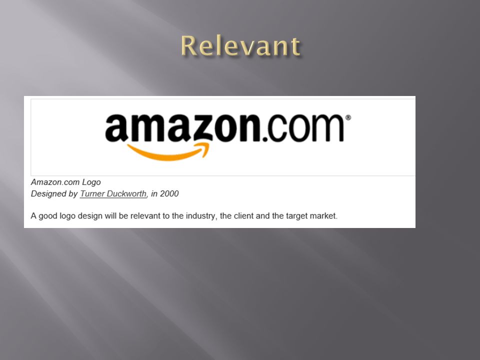


 image: Matrix describing the individual dots that are the smallest elements (pixels) of resolution on a computer.>")


