Download presentation
Presentation is loading. Please wait.

1
Design Reviews

2
Genres of assessment Automated: Usability measures computed by software Empirical: Usability assesses by testing with real users Formal: Models and formulas to calculate measures Inspection: Based on heuristics, skills, and experience of evaluators

3
When to do a design review? Begin review with a clear goal Before user testing. Don't waste users on the small stuff. An expert usability inspection will identify minor issues that can be resolved before testing, allowing users to focus on the big issues. Before redesigning. An expert usability inspection will expose the elements of your existing design that work and should be retained (not just the bad stuff). When you know there are problems, but you need evidence. Perhaps you've received complaints from customers or found yourself stumbling around your own site. An expert usability inspection can help you articulate problems and provide you with the ammunition to build a business case for redesign. Before release. Smooth off the rough edges before go-live. Source: http://www.etre.com/usability/inspection
. When you know there are problems, but you need evidence. Perhaps you ve received complaints from customers or found yourself stumbling around your own site. An expert usability inspection can help you articulate problems and provide you with the ammunition to build a business case for redesign. Before release. Smooth off the rough edges before go-live. Source:")
4
Heuristic Evaluation Developed by Jakob Nielsen Helps find usability problems in a UI design Small set (3-5) of evaluators examine UI independently check for compliance with usability principles (“heuristics”) different evaluators will find different problems evaluators only communicate afterwards findings are then aggregated Can perform on working UI or on sketches
 of evaluators examine UI independently check for compliance with usability principles ( heuristics ) different evaluators will find different problems evaluators only communicate afterwards findings are then aggregated Can perform on working UI or on sketches")
5
1. Visibility of System Status Keep users informed about what is going on Example: pay attention to response time 0.1 sec: no special indicators needed, why? 1.0 sec: user tends to lose track of data 10 sec: max. duration if user to stay focused on action for longer delays, use percent-done progress bars

6
Visibility of System Status

7
2. Match between system & world Speak the users’ language Follow real world conventions Bad example: Mac desktop Dragging disk to trash Should delete it, not eject it

8
3. User Control & Freedom Wizards must respond to Q before going to next for infrequent tasks e.g., configuration not for common tasks good for beginners have 2 versions “exits” for mistaken choices, undo, redo don’t force down fixed paths

9
4. Consistency & Standards

10
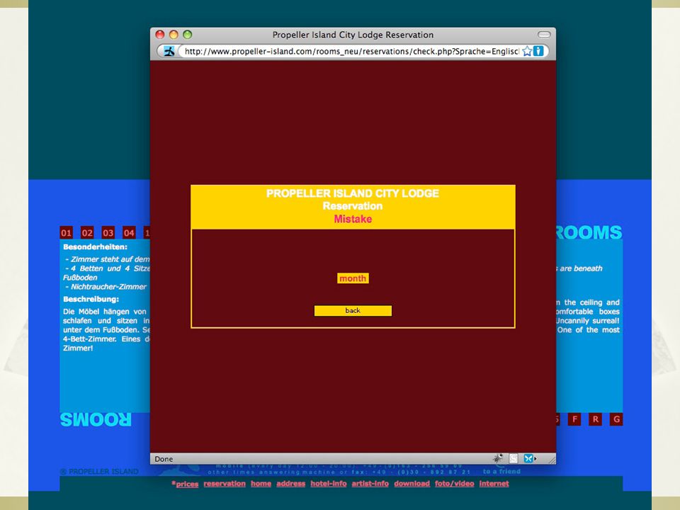
5. Error Prevention Before dialing asks for id & password When connecting asks again for id & pw

14
6. Recognition Rather than Recall Make objects, actions, options, & directions visible or easily retrievable

16
7. Flexibility & Efficiency of Use accelerators for experts (e.g., gestures, kb shortcuts) allow users to tailor frequent actions (e.g., macros)
 allow users to tailor frequent actions (e.g., macros).")
17
8. Aesthetic & Minimalist Design Avoid Clutter & Irrelevant information. High signal-to-noise ratio.

18
Aesthetic & Minimalist Design

19
9. Help Users Recognize, Diagnose, & Recover from Errors error messages in plain language precisely indicate the problem constructively suggest a solution

23
10. Help and Documentation easy to search focused on the user’s task list concrete steps to carry out not too large

25
Heuristic Evaluation Process Evaluators go through UI several times inspect various dialogue elements compare with list of usability principles consider other principles/results that come to mind Usability principles Nielsen’s “heuristics” supplementary list of category-specific heuristics competitive analysis & user testing of existing products Use violations to redesign/fix problems

26
Why Multiple Evaluators? Every evaluator doesn’t find every problem Good evaluators find both easy & hard ones

27
HE vs. User Testing HE is much faster 1-2 hours each evaluator vs. days-weeks HE doesn’t require interpreting user’s actions User testing is far more accurate (by def.) takes into account actual users and tasks HE may miss problems & find “false positives” Good to alternate between HE & user testing find different problems don’t waste participants
 takes into account actual users and tasks HE may miss problems & find false positives Good to alternate between HE & user testing find different problems don’t waste participants.")
28
Results of Using HE Discount: benefit-cost ratio of 48 [Nielsen94] cost was $10,500 for benefit of $500,000 value of each problem ~15K (Nielsen & Landauer) how might we calculate this value? in-house -> productivity; open market -> sales Correlation between severity & finding w/ HE Single evaluator achieves poor results only finds 35% of usability problems 5 evaluators find ~ 75% of usability problems why not more evaluators???? 10? 20? adding evaluators costs more & won’t find more probs
![Results of Using HE Discount: benefit-cost ratio of 48 [Nielsen94] cost was $10,500 for benefit of $500,000 value of each problem ~15K (Nielsen & Landauer) how might we calculate this value.](http://images.slideplayer.com/13/3836148/slides/slide_28.jpg " in-house -> productivity; open market -> sales Correlation between severity & finding w/ HE Single evaluator achieves poor results only finds 35% of usability problems 5 evaluators find ~ 75% of usability problems why not more evaluators adding evaluators costs more & won’t find more probs.")
29
Decreasing Returns problems foundbenefits / cost Caveat: graphs for a specific example

30
Phases of Heuristic Evaluation 1. Pre-evaluation training give evaluators needed domain knowledge and information on the scenario 2. Evaluation individuals evaluate and then aggregate results 3. Severity rating determine how severe each problem is (priority) can do this first individually and then as a group 4. Debriefing discuss the outcome with design team
 can do this first individually and then as a group 4. Debriefing discuss the outcome with design team.")
31
How-to: Heuristic Evaluation At least two passes for each evaluator first to get feel for flow and scope of system second to focus on specific elements If system is walk-up-and-use or evaluators are domain experts, no assistance needed otherwise might supply evaluators with scenarios Each evaluator produces list of problems explain why with reference to heuristic or other information be specific and list each problem separately

32
How-to: Heuristic Evaluation Why separate listings for each violation? risk of repeating problematic aspect may not be possible to fix all problems Where problems may be found single location in UI two or more locations that need to be compared problem with overall structure of UI something that is missing hard w/ paper prototypes so work extra hard on those note: sometimes features are implied by design docs and just haven’t been “implemented” – relax on those

33
Severity Rating Used to allocate resources to fix problems Estimates of need for more usability efforts Combination of frequency impact persistence (one time or repeating) Should be calculated after all evals. are in Should be done independently by all judges

34
Severity Ratings 0 - don’t agree that this is a usability problem 1 - cosmetic problem 2 - minor usability problem 3 - major usability problem; important to fix 4 - usability catastrophe; imperative to fix

35
Debriefing Conduct with evaluators, observers, and development team members Discuss general characteristics of UI Suggest potential improvements to address major usability problems Dev. team rates how hard things are to fix Make it a brainstorming session little criticism until end of session

36
References http://www.useit.com/papers/heuristic/heu ristic_list.html http://www.useit.com/papers/heuristic/heu ristic_list.html

Similar presentations


 Prof. Garzotto.>")


 of evaluators examine.>")
 SIMS 213, UI Design & Development March 2, 1999.>")
