Download presentation
Presentation is loading. Please wait.

2
At a Glance Monitors a Continuous Process Gauge Oriented

3
Discovery Production Parameter Driven Advanced Visualization Highly Formatted Tables, Crosstabs, Charts, Graphs Managed Analysis Dashboards Ease of Development & Usage ParamountCustomization & Distribution Alternatives Depth & Quickness of Analytics Guided Analytics Programmer Developed Line Developed Staff Developed Interactive Navigation

4
Information Dashboard Design By Stephen Few

5
Some are Better Than Others

7
Specific – Clear on what is being measured Measurable – Accurate and consistent Actionable– Influence to alter the outcome Relevant– Significance and leverage Timely – Appropriate intervals

9
Displays Patterns Abstract Data Minimal Grids Graphical“Graphical” No Scrolling Nothing Hidden Linked Content Single Page“Single Page” Domain Aware Leverages Knowledge Guided Analytics“Guided Analytics” Better Dashboard Design All Relevant Info One Place to Look Not Data Driven Disparate Data“Disparate Data”

11
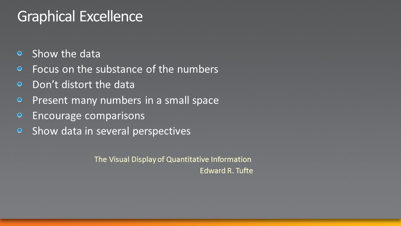
The Visual Display of Quantitative Information Edward R. Tufte

13
Visual Cues Color Size Shape Boldness Position Icons

14
Dashboards are not an end unto themselves GuidedAnalytics HierarchicalDrill-Down Contextual Content Updates AssociatedLayers Root Cause Analysis Detail Reports Ad Hoc Analysis Links to New Pages Update Dashboard Webparts

15
Grids ChartsDiagramsMaps Scorecards Tree Map Gauges Decomp Tree And So Much More……

16
A dashboard is not a painting Usefulness is Paramount

18
Icons are best used to: Replace data to save space Show variance or score

19
Scorecards are less about data and more about process

20
Data Scorecards Measures KPIs Score Metrics Tolerances DerivationDerivation NavigationNavigation BudgetPlanForecast Benchmarks Objectives Perspectives Processes Initiatives Organize Catalog Audited Accurate Approved

21
http://www.symcorp.com

22
Too Dense? 1 Page – 6#s Pretty Yes! Useful? If the dashboard is not visually appealing, people will not go to it If the dashboard is not effective and practical, people will not use it What is fun the first time Might be boring the 100 th time

24
Great Data-Ink Ratio Effective Mixing Of Charts & Values Introduction of Sparklines & Bullet Graphs Small Multiples Trellis Charts

25
A bullet graph is a variation of a bar graph developed by Stephen Few. Seemingly inspired by the traditional thermometer charts and progress bars found in many dashboards, the bullet graph serves as a replacement for dashboard gauges and metersStephen Few Black Bar = Value Green/Red Bar = Target Blue Pointer = Last Year Symmetry’sVariation Sales Costs

26
Be careful of charts within a map Maps are great for demographics Useful in showing regional components Impact grids can be effective

27
Best for continuous process Poor Data-Ink Ratio Hard to set gauge scale for the general case When using a set of gauges expected value should be straight up

28
Balanced Scorecard Strategy Map Root Cause/Fishbone Diagram Impact Diagram Process Diagram Diagrams are underutilized Graphical Representations

32
A tiered set of dashboards based on role or function A set of grids, graphs, or visualizations that examine a single metric A set of detailed reports or ad-hoc analytics http://www.symcorp.com

38
Questions?

39
www.microsoft.com/teched www.microsoft.com/learning http://microsoft.com/technet http://microsoft.com/msdn

41
Sign up for Tech·Ed 2011 and save $500 starting June 8 – June 31 st http://northamerica.msteched.com/registration You can also register at the North America 2011 kiosk located at registration Join us in Atlanta next year

Similar presentations


>")


