Download presentation
Presentation is loading. Please wait.

1
Theming for V12 Revolution
Customer Success Confidential

2
What is Theming? Theming allows Admins to apply custom or pre-selected visual design styles to the SuccessFactors User Interface (UI). Admins can create a theme by changing selected page attributes, such as background and text color. A theme can be as simple as a color shift in the background of the interface or it can be very complex. For example, Admins can include tiled images (patterns that create the look of textures) and features such as lighting effects (an overlay of a tonal gradient). More importantly, theming makes it possible for customers to transform the appearance of SuccessFactors products so that they meet the visual design standards that are part of their company's brand requirements.
. Admins can create a theme by changing selected page attributes, such as background and text color. A theme can be as simple as a color shift in the background of the interface or it can be very complex. For example, Admins can include tiled images (patterns that create the look of textures) and features such as lighting effects (an overlay of a tonal gradient). More importantly, theming makes it possible for customers to transform the appearance of SuccessFactors products so that they meet the visual design standards that are part of their company s brand requirements.")
9
Types of Themes Base Themes
A set of pre-made themes that are included with the V12 release. They are listed on the Manage Themes page in Admin Tools. They are ready to be used as soon as a company logo is added. They cannot be deleted or directly edited. Base Themes can, however, be duplicated and the copied version renamed, edited and saved. These are then considered Custom Themes.

10
Types of Themes Custom Themes
Admins can also create one or more Custom Themes by clicking the Create a New Theme button on the Manage Themes page. Either method requires the Admin to then make changes to a set of page attributes that will specify a look and feel in the control panel of the Create a Theme page. Admins can create as many Custom Themes as needed from a Base Theme; companies that have sub-brands, for example, can benefit from this feature.

11
Types of Themes Visible Themes
The Visible Theme is the theme the Admin selects as the one to be used live (or viewed). It can be a Custom or Base Theme. The Visible Theme is selected on the Manage Themes page. Admins can Try out a Theme for the session they are in before selecting it to be the Viewable Theme.
. It can be a Custom or Base Theme. The Visible Theme is selected on the Manage Themes page. Admins can Try out a Theme for the session they are in before selecting it to be the Viewable Theme.")
12
Applying a theme

15
What can be themed? Page attributes that can be changed
Main page background color, texture and lighting effects for the UI Placemat (holds the page content) background color, texture and opacity Accent color scheme generated that assigns colors to certain UI elements: portlet headers, primary button, menu highlights, navigation labels, table background colors (rows and header) Whether the logo has a container around it and if so, the color Text color Icon sets based on light or dark color theme
 background color, texture and opacity. Accent color scheme generated that assigns colors to certain UI elements: portlet headers, primary button, menu highlights, navigation labels, table background colors (rows and header) Whether the logo has a container around it and if so, the color. Text color. Icon sets based on light or dark color theme.")
18
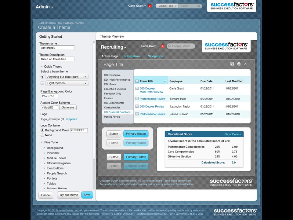
How to theme Do it in Admin Tools Option1: Out of the box Select a ready to use base theme provided by SuccessFactors. Upload a logo and adjust the background of the logo’s container.* Preview as you go (all options have this feature). Save to the Manage Themes page in Admin Tools Select as the Viewable Theme. *must be done by SuccessFactors PS/CS
. Save to the Manage Themes page in Admin Tools. Select as the Viewable Theme. *must be done by SuccessFactors PS/CS.")
19
How to theme Option2: Create a Quick Theme: Select a base theme to build from; currently SuccessFactors offers the choice of a light or dark theme, but will add more themes in the near future. Admins can then change the background color. They can pick an accent color that the system will use to generate a color scheme consisting of ten different values of the Hex color. Each of these is automatically applied to specific page attributes. Save the named Custom Theme to the Manage Themes page. Select the theme as the Viewable Theme or store it to be used later or as part of a number of themes to be reviewed.

20
How to theme Option3: Fine Tune (Customize as needed)
Use Fine Tuning on the Quick Theme you created or a copy of a Base Theme to customize any of the page attributes that are theme-able, including those assigned by the Accent Color Scheme Generator. Fine-Tune items include: Background color for the whole page, the placemat and placemat border, portlet headers and sidebar, primary buttons, table headers and rows, and logo container. Text color of navigation labels, page titles, headers, drop down menus, footer content, table content and more. Page background texture: select one of ours or upload your own. Page background lighting effects: select one of ours, or upload your own. Page background using a single large image: upload your own. Placemat opacity and placemat border opacity. Placemat background texture: select one of ours or upload your own. Light or Dark set of icons.

21
How to theme: Accent Color Scheme Generator
A part of the Quick Theme feature is the generation of an accent color scheme. The Admin enters a Hex# color (base color) that can be from the list of recommended colors or any of their choosing and this becomes the basis for a system generated color scheme (see below). The base color is located at top left (# in this example) Ten shades of the base color, located top-left, are created at varying degrees of opacity. The top row emulates opacity over a white background, the bottom over black. The opacity values are 100% opaque, 75%, 50%, 25% and 10% on the top row. The bottom row begins at 85% rather than 100% and continues on as the first. These colors will be applied to the following items in the UI (see next page):
 that can be from the list of recommended colors or any of their choosing and this becomes the basis for a system generated color scheme (see below). The base color is located at top left (# in this example) Ten shades of the base color, located top-left, are created at varying degrees of opacity. The top row emulates opacity over a white background, the bottom over black. The opacity values are 100% opaque, 75%, 50%, 25% and 10% on the top row. The bottom row begins at 85% rather than 100% and continues on as the first. These colors will be applied to the following items in the UI (see next page):")
22
How to theme: Accent Color Scheme

23
How to theme: Recommended Accent Color Schemes

24
How to Theme: Example one

25
How to Theme: Example two

26
Different themes for sub-orgs (Expected 7/2012)
What it is B1207: Allow users who are part of different subsidiaries or sub-brands to have their own identity How to do it Create permission groups for different groups of users (e.g. in different subsidiaries) Assign a different theme to each group
 Assign a different theme to each group.")
Similar presentations


Start in your “My Documents” folder 2)Create a new folder called “website” 3)Create a sub folder called “images” 4)Start.>")


