Download presentation
Presentation is loading. Please wait.

1
Grade 10 Mathematics Data handling

2
Contents Revise measures of central tendency of ungrouped data
Measures of central tendency in grouped data Revision of Range as a measure of Dispersion and extension to include percentiles, quartiles, interquartile and semi-interquartile range. Five number summaries and box and whisker plots Using statistical summaries to make meaningful comments on the context associated with the given data.

3
Revision: Measures of Central Tendency of Ungrouped Data
Mean: This is the average of a set of data. The mean is obtained by adding up all scores and then dividing the sum by the total number of scores. Mode: The mode is the most commonly occurring observation.\ Median: The median is the middlemost score (for an odd number of scores) and the average of the middle two scores (for an even number of scores). The scores must be arranged in increasing order before the median can be determined.
 and the average of the middle two scores (for an even number of scores). The scores must be arranged in increasing order before the median can be determined.")
4
Revision: Measures of Central Tendency of Ungrouped Data
Eg: The following test scores were achieved by Sarah in her maths tests: 45% ; 60% ; 72% ; 65 % ; 60 % ; 88% ; 60% ; 73%. Mean: Mode: % (occurs 3 times) Median: (data must be ordered) 45 ; 60 ; 60 ; 60 ; 65 ; 72 ; 73 ; 88
 Median: (data must be ordered) 45 ; 60 ; 60 ; 60 ; 65 ; 72 ; 73 ; 88.")
5
Measures of Dispersion
Range: Highest score – lowest score Quartiles: points that divide the data set into quarters Lower Quartile (Q1) – score at the first quarter section Upper Quartile (Q3) – score at the third quartile section Interquartile range: (Q3 – Q1) Semi-interquartile Range: ½ (Q3 – Q1)
 – score at the first quarter section. Upper Quartile (Q3) – score at the third quartile section. Interquartile range: (Q3 – Q1) Semi-interquartile Range: ½ (Q3 – Q1)")
6
Measures of Dispersion
Eg: Given the following set of data: ; ; ; ; ; ; ; ; 17 Q3 = (16+16) ÷2 Q1 = (7+8)÷2 Median = Q2 =13 SIQR = 16 – 7.5 = 8.5 Range = 17 – 7 = 10
 ÷2. Q1 = (7+8)÷2. Median = Q2 =13. SIQR = 16 – 7.5. = 8.5. Range = 17 – 7. = 10.")
7
Approximate mean of grouped data: = 565÷26 = 21.73
Interval Frequency (f) Midpoint (m) f x m 0 ≤ x <10 4 5 4x5 10≤ x <20 7 15 7x15 20≤ x <30 9 25 9x25 30≤ x <40 6 35 6x35 Total 26 565
 Midpoint (m) f x m. 0 ≤ x < x5. 10≤ x < x15. 20≤ x < x25. 30≤ x < x35. Total")
8
Grouped Data cont. Interval Frequency (f) Midpoint (m) f x m 0 ≤ x <10 4 5 4x5 10≤ x <20 7 15 7x15 20≤ x <30 9 25 9x25 30≤ x <40 6 35 6x35 Total 26 565 Modal Class in Grouped Data = the class (group) with the highest frequency: 20≤ x <3 To find the median, you need to draw an ogive.
 with the highest frequency: 20≤ x <3. To find the median, you need to draw an ogive.")
9
5 Number Summary Minimum value Lower Quartile (Q1) Median (Q2)
Upper Quartile (Q3) Maximum Value A five number summary van be represented on a box and whisker plot. Min Max Q1 Q2 Q3
 Maximum Value. A five number summary van be represented on a box and whisker plot. Min. Max. Q1. Q2. Q3.")
10
Representing Data

11
Table of Contents: Use histograms to represent data.
Use frequency polygons to represent data. Use pie diagrams to represent data. Use line and broken line diagrams to represent data

12
Data Handling involves:
collecting data for a particular purpose sorting out the data representing the data in tables, charts or graphs analysing the results coming to conclusions

13
Test Your Knowledge What does data handling involve? A Collecting information, analyzing information and then representing it in a graph B Analyzing a frequency table and basing future decisions on this information C Making a decision and then calculating the averages to suit your decision

14
Use histograms to represent data.
A histogram displays the frequency of either continuous (is used for continuous data like measurements ) or grouped discrete data in the form of bars. A histogram represents each class of information by means of a rectangle whose width represents the class width and whose height is proportional to the frequency. It is a “special” bar chart, but has no spaces between the bars / columns.
 or grouped discrete data in the form of bars. A histogram represents each class of information by means of a rectangle whose width represents the class width and whose height is proportional to the frequency. It is a special bar chart, but has no spaces between the bars / columns.")
15
The reason the bars touch each other is because class intervals are drawn on a continuous line. Each bar represents the class frequency in a particular class and is mostly of equal width. Because we work with grouped data, we use the value of the midpoint of each class to represent the class Remember: in a histogram the columns are always touching each other and therefore we have to determine class boundaries and midpoints of intervals.

16
Test Your Knowledge When would a learner use a histogram? A: For listed data B: For raw data C: For grouped data

17
Test Your Knowledge The table below shows the marks out of 100 in a maths test for a class of 32 students. Draw a histogram representing this data.

18
Solution

19
Use frequency polygons to represent data.
A frequency table may be graphed in three ways: The histogram The frequency polygon. The cumulative frequency curve A frequency polygon joins the midpoints of classes and although the histogram is shown it is not part of the frequency polygon. We need to know the midpoint of each class. The broken line segments joining these midpoints will give us a frequency polygon.

20
Test Your Knowledge What does a frequency polygon join? A: Frequencies B: Midpoints of grouped data C: Joining dots of plotted points

21
Test Your Knowledge First draw the histogram and then complete the frequency polygon.

22
Solution

23
Use pie diagrams to represent data.
The graph is called a pie-graph, because of its shape. It is circular in shape and frequencies are represented by sectors. Each sector will give us a percentage of the total amount. Sectors can be given as percentages or degrees. A full circle represents either 100% or.

24
Use pie diagrams to represent data.
Characteristics: a) The graph has a label, or heading, to indicate what it represents. b) All the frequencies are added and then written as a fraction of the sum of frequencies. c) Each fraction can then be changed into a number representing percentages or degrees by multiplying by 100% or 360 d) By drawing a radius as a starting point and using a protractor, you can construct angles at the centre corresponding to each sector.
 The graph has a label, or heading, to indicate what it. represents. b) All the frequencies are added and then written as a. fraction of the sum of frequencies. c) Each fraction can then be changed into a number. representing percentages or degrees by multiplying by. 100% or 360. d) By drawing a radius as a starting point and using a. protractor, you can construct angles at the centre. corresponding to each sector.")
25
This type of graph is extremely helpful to make comparisons
This type of graph is extremely helpful to make comparisons. You can see at a glance which slice of the pie represents the biggest/smallest group. The values in a pie-chart are represented by pieces of a pie. The bigger the value, the greater the angle in the piece of pie.

26
Test Your Knowledge Select the correct option to indicate the characteristics of a pie diagram…. A: Bars, classes, width of rectangles and class boundaries. B: Circle, sectors, percentages, degrees C: Bars not touching, vertical/horizontal columns, heights and frequencies.

27
The sales are divided into four quarters
The sales are divided into four quarters. Illustrate the quarterly sales in a pie-chart. First quarter sales: = 10 Second quarter sales: = 14 Third quarter sales: = 20 Fourth quarter sales: = 28 Total sales: = 72

29
Test Your Knowledge

30
Solution

31
Use line and broken line diagrams to represent data
A line graph connects points, representing data items in the plane, by means of line segments. Each point corresponds to an item on the horizontal and on the vertical axis. Items on both axes are evenly spaced, according to a appropriate scale. We join the points to highlight the trend in the variable we are measuring. There are two variables, but they are independent of one another. The vertical height of each point is proportional to the quantity being represented.

32
Do not confuse a broken line graph with a frequency polygon. Example:
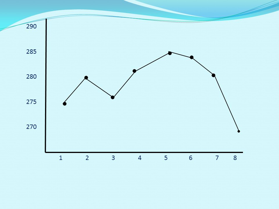
Other points on the lines joining two points have no meaning in terms of the graph. Do not confuse a broken line graph with a frequency polygon. Example: Consider the gold price over an eight week period at the beginning of 2008: Week 1 2 3 4 5 6 7 8 Price / ounce in $ 274 279 276 281 285 283 270 The graphical representation is given on the following slide

33
290 285 280 275 270
34
Test Your Knowledge What is the difference between a line or broken line diagram and a frequency polygon? Line graphs join midpoints of grouped classes Polygons join points of specific data Polygons join midpoints of grouped classes and line graphs join points representing specific data

Similar presentations


 MSIS 111 Prof. Nick Dedeke.>")


 Lower Extreme Lower Quartile Median Upper Quartile Upper Extreme Back.>")

 Unit 1 Data and Technology.>")


 and.>")


