Download presentation
Presentation is loading. Please wait.

3
1. Start with the proper GRAPH PAPER. Do not use Engineering Paper or Quad-ruled paper. 2. Orient the paper correctly. The larger margin (with holes) should be to the left side or to the top. 3. Determine which quantity is the DEPENDENT VARIABLE (outcome) and which is the INDEPENDENT VARIABLE (variable you control in the experiment). 4. Always plot the DEPENDENT VARIABLE on the Y- axis and the INDEPENDENT VARIABLE on the X- axis. Hypothesis = If we __IV__, then __DV__ happens because___
 should be to the left side or to the top. 3. Determine which quantity is the DEPENDENT VARIABLE (outcome) and which is the INDEPENDENT VARIABLE (variable you control in the experiment). 4. Always plot the DEPENDENT VARIABLE on the Y- axis and the INDEPENDENT VARIABLE on the X- axis. Hypothesis = If we __IV__, then __DV__ happens because___.")
4
5. Determine the RANGE for both variables by extending the scale beyond the last data value to a major number. Example #1: Largest data VALUE = 188; then set the maximum in your RANGE to be 200. Example #2: Largest data VALUE = 0.37; then set your RANGE to be 0.40 or 0.50. 6. Select a SCALE for each axis. They don’t have to be the same - a tip is to use multiples of 1, 2, 5, 10, 20, 25, 50, 100, etc. 7. Label your graph with a TITLE. Do not write in the margins except to mark your labels. 8. Next label the VARIABLE NAME, UNITS, and SCALE MARKINGS for each axis. You should cover most of the page… don’t cramp your graph in to the bottom half of the sheet. 9. Stay within the lines of the graph paper. If you mislabel, erase and start over. 10. Plot each DATA POINT with a sharp pencil. Remember to label the point (0,0) if appropriate. Connect your DATA POINTS using a ruler or straight edge.
 if appropriate. Connect your DATA POINTS using a ruler or straight edge..")
5
Growth of a baby badger from birth to age 10 months Age/monthsMass/kg 00.1 21.4 43.6 66.8 89.8 1010.4 Measurements are often presented as a table. For example, the results below show the growth of a baby badger…

6
You can show these results more clearly if you draw a graph of them using graph paper.

7
You can use the graph to estimate, for example, the age when you would expect the baby badger to have a mass of 8 kg. You can also do the opposite. What will be the mass of the badger at 5 months? What about 12 months

8
Line Graphs show changes and trends over TIME. When multiple independent variables are used, you can use more than one line. IS IT A DIRECT RELATIONSHIP (↑↑) OR INDIRECT/INVERSE (↑↓)?
 OR INDIRECT/INVERSE (↑↓) .")
10
A Bar Graph is good for COMPARING data on similar things.

12
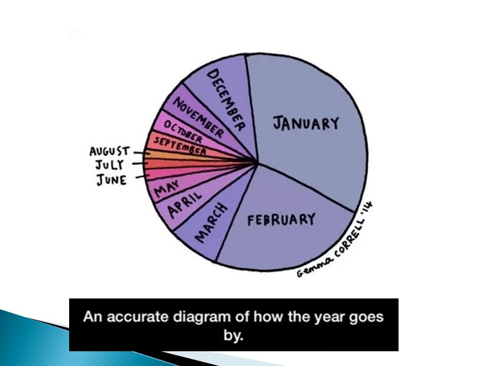
A Circle Graph or Pie Chart shows parts of a whole (100%).
.")
14
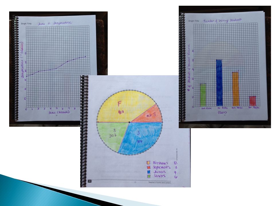
TimeTemp. 0 sec85 ° C 1 sec90 ° C 2 sec97 ° C 3 sec100 ° C 4 sec102 ° C 5 sec105 ° C 6 sec115 ° C 7 sec125 ° C 8 sec130 ° C 9 sec135 ° C 10 sec.138 ° C Number of Students with their Drivers License Mrs. Knox’s Class Mr. Proto’s Class Mrs. Pierce’s Class Mr. Buck’s Class 1225185 9th10th11th12th Number of Students in my class. 12396 (Note: 30 = 100%)
.")
Similar presentations


? Do Now: Copy the following: Line Graph - A graph that is used to display data that shows how one variable.>")
 1) Vertical. Your data table should have columns at the top and the data should be underneath the columns. The data table should not be horizontal.>")


