Download presentation
Presentation is loading. Please wait.

1
Chapter 1.1 – Analyzing Categorical Data A categorical variable places individuals into one of several groups of categories. A quantitative variable takes numerical values for which it makes sense to find an average. -a counter-example would be zip codes…they are numbers but it doesn’t make sense to take the average of zip codes. Therefore they are actually categorical values. The distribution of a variable describes what values the variable takes and how often it takes them,

2
-Pie charts show the distribution of a categorical variable as a “pie” whose slices are sized by the counts or percent's for the categories. -Use a pie chart only when you want to emphasize each category’s relation to the whole. -A pie chart must include all the categories that make up a whole. Sometimes it may be necessary to include a category labelled “other” to complete the whole pie. PIE CHARTS!!!!

3
Bar Graphs Bar graphs represent each category as a bar. The bar heights show the category counts or percent’s. Bar graphs are easier to make than pie charts and are also easier to read. Bar graphs are also more flexible than pie charts. Both graphs can display the distribution of a categorical variable, but a bar graph can also compare any set of quantities that are measured in the same units. While a pie chart does not take into account units. Its always out of the whole whether that be 100% or a set of people, etc.

4
Exploring Bar Graphs Example: When Apple, Inc., introduced the iMac, the company wanted to know whether this new computer was expanding Apple’s market share. Was the iMac mainly being bought by previous Macintosh owners, or was it being purchased by first-time computer buyers and by previous PC users who were switching over? To find out, Apple hired a firm to conduct a survey of 500 iMac customers. Each customer was categorized as a new computer purchaser, a previous PC owner, or a previous Macintosh owner. The table summarizes the survey results. 5 Here’s a clever graph of the data that uses pictures instead of the more traditional bars. How is this graph misleading?

5
Two possible bar graphs of the data are shown below. Which one could be considered deceptive? Why?

6
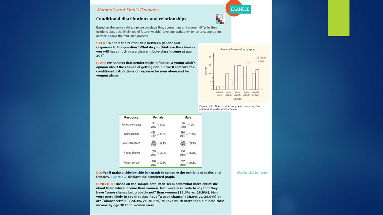
Marginal Distributions The marginal distribution of one of the categorical variables in a two-way table of counts is the distribution of values of that variable among all individuals described by the table. Percent’s are more informative than counts, especially when we are comparing groups of different sizes. We can display the marginal distribution of opinions in percent’s by dividing each row total by the table total. For instance, the percent of these young adults who think they are almost certain to be rich by age 30 is: This is a two-way table because it describes two categorical variables, gender and opinion about becoming rich. Opinion is the row variable and gender is the column variable. The entries in the table are the counts of individuals in each opinion-by- gender class.

7
Conditional Distributions Marginal distributions do not tell us anything about the relationship between two variables. A Conditional Distribution of a variable describes the values of that variable among individuals who have a specific value of another variable. There is a separate conditional distribution for each value of the other variable. For example: To find the percent of young women who think they are almost certain to be rich by age 30, divide the count of such women by the total number of women. Doing this for all 5 entries in the female column gives the conditional distribution of opinion among women.

8
Segmented Bar Graph An alternative to a bar graph is a segmented bar graph like the one shown below. For each category, there is a single bar with “segments” that correspond to the different genders. The height of the bar in each color is determined by the percent of young adults who having that opinion who were of each gender.

9
Organizing a Statistical Problem Four steps you must remember: State: What’s the question you’re trying to answer. Plan : How will you go about answering the question? What statistical tool does the problem call for? Do : Make graphs and carry out needed calculations. Conclude : Give your practical conclusion in the setting of the real-world problem.

Similar presentations