Download presentation
Presentation is loading. Please wait.

1
CIVIL ENGINEERING DRAWING
LETTERING CIVIL ENGINEERING DRAWING

2
GENERAL INSTRUCTIONS LINES:
The thickness of line is depending on the type and size of the drawing. The thicknesses should be chosen from the following range: 0.13, 0.18, 0.25, 0.35, 0.5, 0.7, 1.0, 1.4, 2.0 mm. ORDER OF PRIORITY OF COINCIDING LINES: In case of two or more lines of different types which may overlap or coincide, the drawing priority may be given in the following order: Visible outline and edges Hidden outline and edges Cutting Planes Centre lines and line of symmetry Centroidal Lines Projection lines

3
1 Viewing-plane line Dimension Line 3 Center Line 4 2 Extension line 5 Hidden Line 6 Break Line Cutting-plane Line 7 8 Visible Line 9 Center Line (of motion) 10 Leader 14 Phantom Line 13 Section Line SECTION A-A 12 VIEW B-B 11 Source:
 10. Leader. 14. Phantom Line. 13. Section Line. SECTION A-A. 12. VIEW B-B. 11. Source:")
4
GENERAL INSTRUCTIONS CLEANING THE INSTRUMENTS
ATTACHING THE DRAWING SHEET TO DRAWING TABLE AFTER CORRECT ALIGNMENT THROUGH THE DRAFTING EDGE BORDER LINES: Perfectly rectangular working space is determined by drawing the border lines. These may be drawn at equal distances of about 1-inch from top, bottom and right hand edges of the paper and about 1.5-inch from the left hand edge. TO DRAW BORDER LINES Marking the points and draw top and bottom horizontal lines with the help of drafting edge or T-square Marking points on horizontal borders for the vertical lines. Erasing the extra lengths of lines beyond the points of intersection. One more horizontal line at about 1-inch from the bottom border line may also be drawn and the space divided into three blocks. The title block must be drawn in the right hand bottom corner above block-3, in which Name of the Institution title of the drawing, and name class etc. of the student may be written

5
GENERAL INSTRUCTIONS SPACING OF DRAWING:
If one drawing is to be drawn on a sheet it should be in the centre of the working space. For more than one figure, the space should be divided into suitable blocks and each figure should be drawn in the centre of its respective block.

6
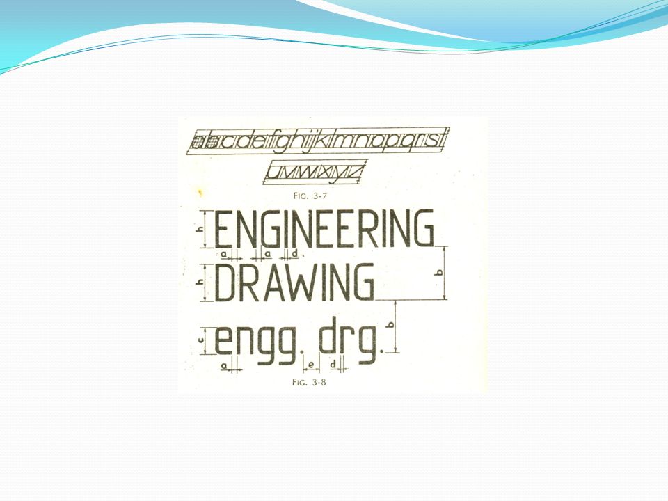
LETTERING INSTRUCTIONS
Writing of titles, dimensions, notes and other important particulars on a drawing is called lettering. Lettering should be done properly in clear, legible and uniform style. It should be done in plain and simple style so that it could be done freehand and speedily. Use of drawing instruments in lettering takes considerable time and hence it should be avoided.

7
LETTERING INSTRUCTIONS
SINGLE STROKE LETTERS: BIS recommends single-stroke lettering for use in engineering drawing. The word single-stroke should not be taken to mean that the letter should be made in one stroke without lifting the pencil. It actually means that the thickness of the line of the letter should be such as is obtained in one stroke of pencil. Horizontal lines should be drawn from LEFT TO RIGHT Vertical or inclined lines, from TOP TO BOTTOM.

8
LETTERING INSTRUCTIONS
Single stroke letters are of two types: Vertical Inclined Inclined letters lean to the right, the slope being 75 degree with the horizontal. The size of the letter is described by its height. According to the height of letters, they are classified as: Lettering “A” (refer to table) Lettering “B” (refer to table)
 Lettering B (refer to table)")
9
LETTERING INSTRUCTIONS
“A” type: The height of the capital letter is divided into 14 parts “B” type: The height of the capital letter is divided into 10 parts

10
DIMENSIONING OF LETTERING TYPE “A”

11
DIMENSIONING OF LETTERING TYPE “B”

13
LETTERING INSTRUCTIONS

14
LETTERING INSTRUCTIONS
Alphabet and numerals should neither touch each other nor the lines. Letters should be so written that they appear upright from the bottom edge, except when they are used for dimensioning. For dimensioning, they may appear upright from the bottom edge for the right hand side or the corner in between. Letters should be so spaced that the area between letters appear equal. Its not necessary to keep the clearances between adjacent letters equal, e.g. LA, TV or Tr. Obtain constant line density. All letters should be uniform in shape, size, shade and spacing.

15
LETTERING GOTHIC LETTERS: Stems of single-stroke letters, if given more thickness, form what are know as gothic letters. These are mostly used for main titles of ink drawings. The outline of the letters are first drawn with aid of instruments then filled in with ink. The thickness of the stem may vary from 1/5 to 1/10 of the height of the letters.

16
GOTHIC LETTERING

Similar presentations