Download presentation
Presentation is loading. Please wait.

1
© 2004 by David T. Olson Sample - Not for Public Use1 A Sample Presentation of The State of the Church in Michigan and the Detroit & Grand Rapids Metro Areas Dave Olson www.TheAmericanChurch.org

2
© 2004 by David T. Olson Sample - Not for Public Use2 The first 19 slides are from the “State of the Church in Michigan” Powerpoint. The Complete Powerpoint is 43 slides in length, and is available at http://www.theamericanchurch.org/state/UMI20.htm. It includes maps of church attendance in every county, as well as denominational charts, average size charts, church planting charts, ethnicity charts and population growth information. http://www.theamericanchurch.org/state/UMI20.htm

3
© 2004 by David T. Olson Sample - Not for Public Use3 In 1996, polls taken immediately after the Presidential election revealed that 58% of people claimed they had voted, when in reality only 49% actually did. This is called the Halo Effect. People tend to over-inflate their participation in activities that create acceptability within their social group. For many decades, pollsters such as Gallup and Barna have reported that around 45% of Americans attend church every Sunday. But there is a religious Halo Effect. Actual attendance counts have shown that the percentage of people attending church on any given weekend is much lower than was previously thought.

4
© 2004 by David T. Olson Sample - Not for Public Use4 The Intent of this presentation is to answer and then expand on two key questions: “How Many People Really Attend Church in Michigan Every Week?” “Is the Christian Church Going Forwards or Backwards in Influence in Michigan?” As the data is analyzed county by county assessing a number of factors, a comprehensive picture of the State of the Church in Michigan will begin to take shape.

5
© 2004 by David T. Olson Sample - Not for Public Use5 This study uses weekend church attendance as a more reliable and more immediate snapshot of Christian influence than membership. The following map shows the percentage of the population attending a Christian church on any given weekend in all 50 states in 2000. Michigan has an average church attendance percentage (20.6%) higher than the national average (18.7%).
 higher than the national average (18.7%)..")
6
© 2004 by David T. Olson Sample - Not for Public Use6

7
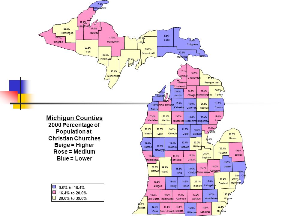
7 The Next Map shows the percentage of the population attending a Christian church on any given weekend in 2000 for each county in Michigan.

9
© 2004 by David T. Olson Sample - Not for Public Use9 The Next 2 Maps show the population numbers for each county in Michigan. The first map shows the population of each county. The second map shows the growth or decline in population for each county from 1990 - 2000.

10
© 2004 by David T. Olson Sample - Not for Public Use10

11
© 2004 by David T. Olson Sample - Not for Public Use11

12
© 2004 by David T. Olson Sample - Not for Public Use12 The Next 2 Slides show the ethnicity of Michigan in 1990 and 2000. The third slide shows the growth or decline in the percentage of the population for each ethnic group.

13
© 2004 by David T. Olson Sample - Not for Public Use13

14
© 2004 by David T. Olson Sample - Not for Public Use14

15
© 2004 by David T. Olson Sample - Not for Public Use15

16
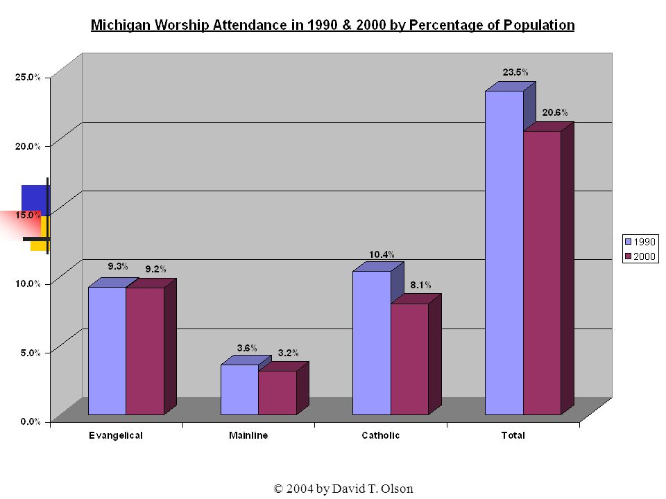
© 2004 by David T. Olson Sample - Not for Public Use16 The Next Graph shows the attendance numbers for the churches in Michigan in 1990 and 2000. Evangelicals have grown in attendance, while the Mainline, Catholics and total numbers have significantly declined. Unfortunately, as overall worship attendance has declined, the population has grown. A more reliable standard for evaluating increasing or declining influence is the percentage of the population attending church on any given weekend, shown in the second graph.

17
© 2004 by David T. Olson

19
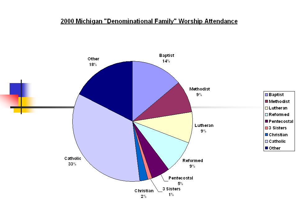
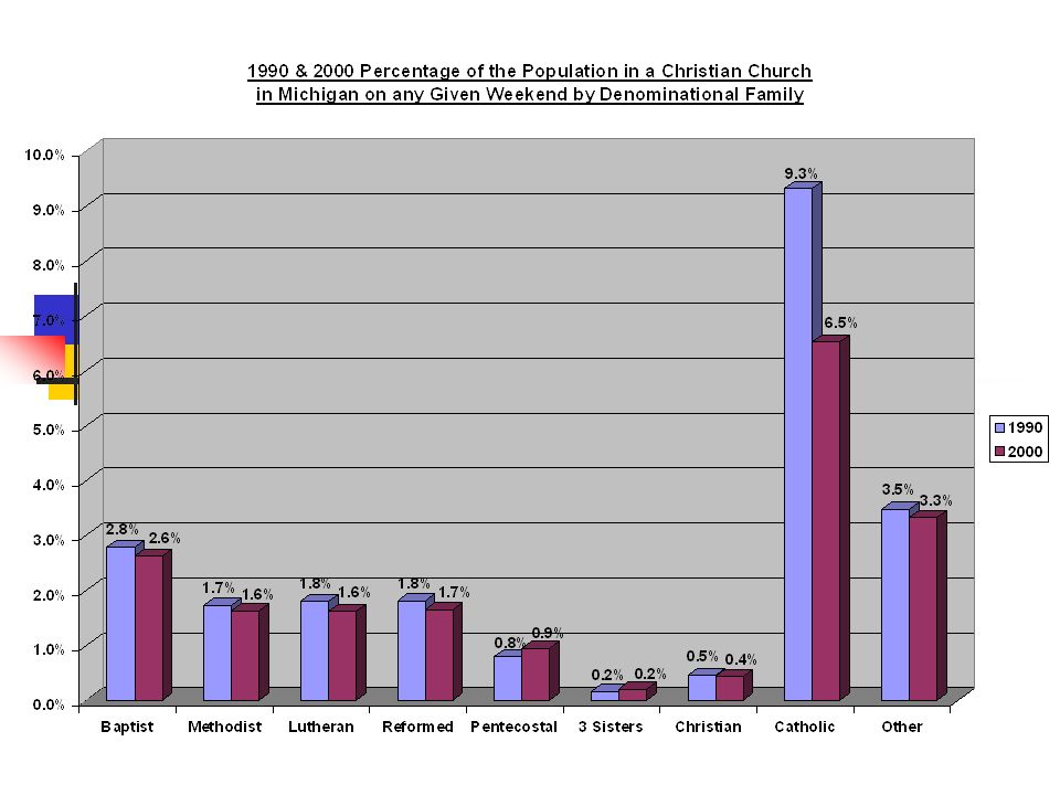
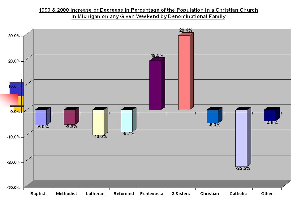
© 2004 by David T. Olson Sample - Not for Public Use19 The 3 Next Charts show the relative strength of the 9 major denominational groups in Michigan. The second and third charts show the significant decline of all denominations in Michigan, with the exception of Pentecostal and Three Sisters churches. (The 3 Sisters are 3 similar evangelical denominations originally from Sweden, the Baptist General Conference, the Evangelical Free Church and the Evangelical Covenant Church.)
.")
23
© 2004 by David T. Olson Sample - Not for Public Use23 The Next Map shows the percentage of the population attending a Christian church on any given weekend in 2000 for each county in Michigan.

25
© 2004 by David T. Olson Sample - Not for Public Use25 The Complete Michigan Powerpoint is 43 slides in length, and is available at http://www.theamericanchurch.org/state/UMI20.htm. It includes maps of church attendance in every county in the metro area, as well as denominational charts, average size charts, church planting charts, ethnicity charts and population growth information. http://www.theamericanchurch.org/state/UMI20.htm

26
© 2004 by David T. Olson Sample - Not for Public Use26 The next 9 slides are from the “State of the Church in Detroit” Powerpoint. The Complete Powerpoint is 38 slides in length, and is available at http://www.theamericanchurch.org/metro/Detroit.htm. It includes maps of church attendance in every county in the metro area, as well as denominational charts, average size charts, church planting charts, ethnicity charts and population growth information. http://www.theamericanchurch.org/metro/Detroit.htm

27
© 2004 by David T. Olson Sample - Not for Public Use27 The Next Graph shows the attendance numbers for the churches in the Detroit metro in 1990 and 2000. While evangelicals have seen attendance grow, decline has occurred in Mainline and Catholic churches. Unfortunately, as overall worship attendance has increased, the population has grown even faster. A more reliable standard for evaluating increasing or declining influence is the percentage of the population attending church on any given weekend, shown in the second graph.

28
© 2004 by David T. Olson

30
© 2004 by David T. Olson Sample - Not for Public Use30 The Next 3 Maps show the attendance percentages for the Evangelical, Catholic and Mainline churches in each county in Detroit in 2000.

31
Detroit Metro Counties 2000 Percentage of Population at Worship in All Evangelical Churches on a Given Weekend Blue = Lowest Rose = Middle Beige = Highest

32
Detroit Metro Counties 2000 Percentage of Population at Worship in All Mainline Churches on a Given Weekend Blue = Lowest Rose = Middle Beige = Highest

33
Detroit Metro Counties 2000 Percentage of Population at Worship in All Catholic Churches on a Given Weekend Blue = Lowest Rose = Middle Beige = Highest

34
© 2004 by David T. Olson Sample - Not for Public Use34 The Next Chart shows the net gain in the number of churches in the Detroit Metro area in the past decade. There was a net loss of 80 churches. However, to keep up with the population growth in the Detroit metro, there would have needed to have been a net gain of 80 churches from 1990 - 2000.

35
© 2004 by David T. Olson

36
© 2004 by David T. Olson Sample - Not for Public Use36 The Complete Detroit Powerpoint is 38 slides in length, and is available at http://www.theamericanchurch.org/metro/Detroit.htm. It includes maps of church attendance in every county in the metro area, as well as denominational charts, average size charts, church planting charts, ethnicity charts and population growth information. http://www.theamericanchurch.org/metro/Detroit.htm

37
© 2004 by David T. Olson Sample - Not for Public Use37 The next 11 slides are from the “State of the Church in Grand Rapids” Powerpoint. The Complete Powerpoint is 46 slides in length, and is available at http://www.theamericanchurch.org/metro/GrandRapids.htm. It includes maps of church attendance in every county in the metro area, as well as denominational charts, average size charts, church planting charts, ethnicity charts and population growth information. http://www.theamericanchurch.org/metro/GrandRapids.htm

38
© 2004 by David T. Olson Sample - Not for Public Use38 The Next Graph shows the attendance numbers for the churches in the Grand Rapids metro in 1990 and 2000. Evangelical churches have grown, Mainline churches have stayed the same and Catholic churches have declined slightly. Unfortunately, as overall worship attendance has increased, the population has grown even faster. A more reliable standard for evaluating increasing or declining influence is the percentage of the population attending church on any given weekend, shown in the second graph.

39
© 2004 by David T. Olson

41
© 2004 by David T. Olson Sample - Not for Public Use41 The 2 Next Charts show the relative strength of the 8 major denominational groups in Grand Rapids metro area. Reformed churches predominate the Grach Rapids area.

42
© 2004 by David T. Olson Sample - Not for Public Use42

43
© 2004 by David T. Olson Sample - Not for Public Use43

44
© 2004 by David T. Olson Sample - Not for Public Use44

45
© 2004 by David T. Olson Sample - Not for Public Use45 The Next Map shows the percentage of the population attending a Christian church on any given weekend in 2000 for each county in the Grand Rapids metro.

46
Grand Rapids MSA 2000 Percentage of Population in Worship At a Christian Church on any Given Weekend 18.5% Muskegon 18.9% Allegan 30.7% Ottawa 26.2% Kent

47
© 2004 by David T. Olson Sample - Not for Public Use47 The Next Map shows the growth or decline in the percentage of the population attending a Christian church on any given weekend from 1990 to 2000 for each county. No county grew in attendance percentage, while 4 counties declined.

48
Grand Rapids Metro Counties 1990 - 2000 Growth or Decline in Percentage of the Population at Worship in All Christian Churches on a Given Weekend Blue = Decline Rose = Growth -9.6% Muskegon -3.5% Allegan -12.8% Ottawa -13.5% Kent

49
© 2004 by David T. Olson Sample - Not for Public Use49 The Complete Grand Rapids Powerpoint is 46 slides in length, and is available at http://www.theamericanchurch.org/metro/GrandRapids.htm. It includes maps of church attendance in every county in the metro area, as well as denominational charts, average size charts, church planting charts, ethnicity charts and population growth information. http://www.theamericanchurch.org/metro/GrandRapids.htm

50
© 2004 by David T. Olson Sample - Not for Public Use50 The next 7 slides are from the “State of the Church in Ann Arbor” Powerpoint. The Complete Powerpoint is 46 slides in length, and is available at http://www.theamericanchurch.org/metro/AnnArbor.htm. It includes maps of church attendance in every county in the metro area, as well as denominational charts, average size charts, church planting charts, ethnicity charts and population growth information. http://www.theamericanchurch.org/metro/AnnArbor.htm

51
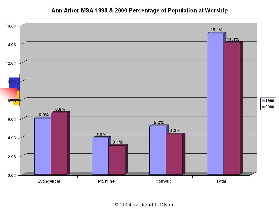
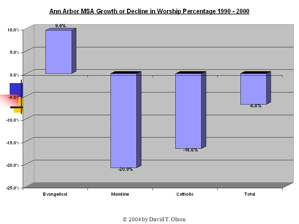
© 2004 by David T. Olson Sample - Not for Public Use51 The Next Graph shows the attendance numbers for the churches in the Ann Arbor metro in 1990 and 2000. The Evangelical churches have grown considerably, but Mainline and Catholic have declined slightly. Unfortunately, as overall worship attendance has increased, the population has grown even faster. A more reliable standard for evaluating increasing or declining influence is the percentage of the population attending church on any given weekend, shown in the second graph.

52
© 2004 by David T. Olson

55
© 2004 by David T. Olson Sample - Not for Public Use55

56
© 2004 by David T. Olson Sample - Not for Public Use56 The Next Chart shows the net gain in the number of churches in the Ann Arbor Metro area in the past decade. There was a net gain of 10 churches. However, to keep up with the population growth in the Ann Arbor metro, there would have needed to have been a net gain of 69 churches from 1990 - 2000.

57
© 2004 by David T. Olson

58
© 2004 by David T. Olson Sample - Not for Public Use58 The Complete Ann Arbor Powerpoint is 46 slides in length, and is available at http://www.theamericanchurch.org/metro/AnnArbor.htm. It includes maps of church attendance in every county in the metro area, as well as denominational charts, average size charts, church planting charts, ethnicity charts and population growth information. http://www.theamericanchurch.org/metro/AnnArbor.htm

59
© 2004 by David T. Olson Sample - Not for Public Use59 This Presentation is based on a nationwide study of American church attendance, as reported by churches and denominations. The database currently has average worship attendances for each of the last 10 years for over 200,000 individual churches. It also uses supplementary information (actual membership numbers correlated with accurate membership to attendance ratios) to project the attendances of all other denominational and independent churches. All told, accurate information is provided for over 300,000 orthodox Christian churches. 1 1 This presentation looks only at people attending orthodox Christian churches. Approximately 3 million people attend non-orthodox Christian churches, and perhaps 3 million attend a religious service of another religion. Those ‘houses of worship’ would add another 35,000 churches in the United States and increase the 2000 percentage to 20.5%.
 to project the attendances of all other denominational and independent churches. All told, accurate information is provided for over 300,000 orthodox Christian churches. 1 1 This presentation looks only at people attending orthodox Christian churches. Approximately 3 million people attend non-orthodox Christian churches, and perhaps 3 million attend a religious service of another religion. Those ‘houses of worship’ would add another 35,000 churches in the United States and increase the 2000 percentage to 20.5%..")
60
© 2004 by David T. Olson Sample - Not for Public Use60 For More Information... Please go to www.theamericanchurch.org for additional information on the American Church.www.theamericanchurch.org 12 Surprising Facts about the American Church is available at http://www.theamericanchurch.org/ 12supm. htm http://www.theamericanchurch.org/ 12supm. htm The complete Michigan Powerpoint presentation is available at http://www.theamericanchurch.org/state/UNE20.htm http://www.theamericanchurch.org/state/UNE20.htm The Complete Detroit Powerpoint presentation is available at http://www.theamericanchurch.org/metro/Detroit.htm http://www.theamericanchurch.org/metro/Detroit.htm The Complete Grand Rapids Powerpoint presentation is available at http://www.theamericanchurch.org/metro/GrandRapids.htm http://www.theamericanchurch.org/metro/GrandRapids.htm The Complete Ann Arbor Powerpoint presentation is available at http://www.theamericanchurch.org/metro/AnnArbor.htm http://www.theamericanchurch.org/metro/AnnArbor.htm A Combo Pack (12 Surprising Facts, Michigan, Detroit and Grand Rapids Powerpoints) is available at http://www.theamericanchurch.org/combo/MI0.htm http://www.theamericanchurch.org/combo/MI0.htm
 is available at")
Similar presentations