Download presentation
Presentation is loading. Please wait.

1
CPSC 481 – Week #7 Sowmya Somanath ssomanat@ucalgary.ca

2
Reminder Monday Nov 2 in class – 1.Write-up – redesign rational (i.e. changes from first prototype) 2.Screen snapshots 3.Grading sheet from handout 4.Horizontal prototype presentation freeze Either email your slides to me (ssomanat@ucalgary.ca) OR submit them on a USB along with your write-up.
 2.Screen snapshots 3.Grading sheet from handout 4.Horizontal prototype presentation freeze Either your slides to me OR submit them on a USB along with your write-up..")
3
Reminder Wednesday Nov 4 in tutorial (15 min each group) – T04: Horizontal prototype presentation Friday Nov 6 in tutorial (15 min each group) – T02: Horizontal prototype presentation
 – T04: Horizontal prototype presentation Friday Nov 6 in tutorial (15 min each group) – T02: Horizontal prototype presentation")
4
Plan for Today More WPF – useful for implementing vertical prototype. Please download Week 7 slides from: http://pages.cpsc.ucalgary.ca/~ssomanat/CPSC481.htm http://pages.cpsc.ucalgary.ca/~ssomanat/CPSC481.htm

5
User Controls

6
User controls pack a set of UI elements. Useful when repeating same UI patterns Instead of copy pasting code, you can re-use user controls.

7
User Controls 1.Add a user control to your class. Name it UserControlDemo

8
User Controls 2. Add Elements to your user control

9
User Controls 3. Add below code to MainWindow.xaml

10
User Controls 4. Add below code to MainWindow.cs private void button1_Click(object sender, RoutedEventArgs e) { UserControlDemo ucdemo = new UserControlDemo(); Grid.SetRow(ucdemo, 1); grid1.Children.Add(ucdemo); }
 { UserControlDemo ucdemo = new UserControlDemo(); Grid.SetRow(ucdemo, 1); grid1.Children.Add(ucdemo); }.")
11
User Control and Transitions: Navigation Method

12
1.Create 3 user controls. Name them: MainMenu, Page 1 and Page 2 2.Add a Switcher.cs to the project – This class will handle switching between different user controls using System.Windows.Controls; public static MainWindow pageSwitcher; public static void Switch(UserControl newPage) { pageSwitcher.Navigate(newPage); } You will need this to use Navigate() method
 { pageSwitcher.Navigate(newPage); } You will need this to use Navigate() method.")
13
3. Add the following code to MainWindow.cs public MainWindow() { InitializeComponent(); Switcher.pageSwitcher = this; Switcher.Switch(new MainMenu()); } public void Navigate(UserControl nextPage) { this.Content = nextPage; }
 { InitializeComponent(); Switcher.pageSwitcher = this; Switcher.Switch(new MainMenu()); } public void Navigate(UserControl nextPage) { this.Content = nextPage; }.")
14
4. Design MainMenu, Page 1 and Page 2 to look like this:

15
5. For MainMenu, Page 1 and Page 2 add the following events private void Button_Click(object sender, RoutedEventArgs e) { Switcher.Switch(new MainMenu()); } private void Button_Click_1(object sender, RoutedEventArgs e) { Switcher.Switch(new Page1()); } private void Button_Click_2(object sender, RoutedEventArgs e) { Switcher.Switch(new Page2()); }
 { Switcher.Switch(new MainMenu()); } private void Button_Click_1(object sender, RoutedEventArgs e) { Switcher.Switch(new Page1()); } private void Button_Click_2(object sender, RoutedEventArgs e) { Switcher.Switch(new Page2()); }.")
16
User Control and Transitions: Excercise1

17
Don’t duplicate this

18
Solution

19
Solution private void button1_Click(object sender, RoutedEventArgs e) { Next _next = new Next(); stack1.Children.Clear(); stack1.Children.Add(_next); } private void button2_Click(object sender, RoutedEventArgs e) { Back _back = new Back(); stack1.Children.Clear(); stack1.Children.Add(_back); }
 { Next _next = new Next(); stack1.Children.Clear(); stack1.Children.Add(_next); } private void button2_Click(object sender, RoutedEventArgs e) { Back _back = new Back(); stack1.Children.Clear(); stack1.Children.Add(_back); }")
20
User Control and Scroll Viewers: Excercise2

21
Create a user control for an email that looks like this:

22
Solution

23
Create a scroll viewer in MainWindow.xaml:

24
Solution

25
Make the Sender a property that can be different in each instance of an email. When the delete Button is clicked, the email should be removed from the view. Use the scroll viewer in your main window to show 20 emails (using the Email User Control you created) ---- Create a for loop that initializes 20 Email User Controls. ---- To make it easy, initialze the Sender of each email to “Sender” + I e.g. Sender 0, Sender 1….
 ---- Create a for loop that initializes 20 User Controls To make it easy, initialze the Sender of each to Sender + I e.g. Sender 0, Sender 1…..")
26
Solution public partial class Email : UserControl { private string name; public string Name { get { return name; } set { name = value; this.SenderTextblock.Content = this.name; } public Email() { InitializeComponent(); this.DeleteGroup.MouseLeftButtonDown += DeleteGroup_MouseLeftButtonDown; } void DeleteGroup_MouseLeftButtonDown(object sender, MouseButtonEventArgs e) { (this.Parent as Panel).Children.Remove(this); }
 { InitializeComponent(); this.DeleteGroup.MouseLeftButtonDown += DeleteGroup_MouseLeftButtonDown; } void DeleteGroup_MouseLeftButtonDown(object sender, MouseButtonEventArgs e) { (this.Parent as Panel).Children.Remove(this); }")
27
Solution public MainWindow() { InitializeComponent(); for(int i = 0; i < 20; i++) { Email email = new Email(); email.Name = "Sender " + i.ToString(); this.Emails.Children.Add(email); }
 { InitializeComponent(); for(int i = 0; i < 20; i++) { = new (); .Name = Sender + i.ToString(); this. s.Children.Add( ); }")
28
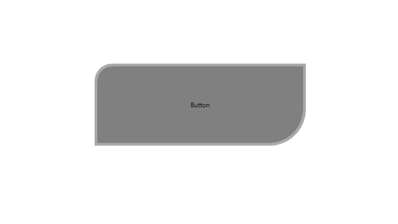
Styles and Templates: Button

30
Give the style a key you can refer it by Create this as a resource – window/ user control

32
Control Template defines how a control is drawn Can also include a setter property that can be changed:

33
Style and Template: Excercise3

34
Define a template for a button that has default border color of black. Create a button instance that uses the template but changes border color to blue.

35
Solution

36
List Boxes

37
Drag a ListBox into the XAML List Boxes

38
Click to modify items

39
List Boxes Click to add Select ‘ListBoxItem’

40
List Boxes Change content

41
Can get the currently-selected index: listbox1.SelectedIndex

42
ListBox: Excercise4

43
Create a listbox like below and change TextBox content based on listbox selection. Add ‘SelectionChanged’ event handler.

44
Solution private void ListBox_SelectionChanged(object sender, SelectionChangedEventArgs e) { textbox1.Text = (String)((ListBoxItem)listbox1.SelectedItem).Content; }
 { textbox1.Text = (String)((ListBoxItem)listbox1.SelectedItem).Content; }")
45
Simple Animation

46
Add an ellipse to your xaml Simple animations

47
Simple animation Add this code to the top of your C# file: using System.Windows.Media.Animation; Add this inside your user control class before the constructor: private Storyboard myStoryboard;

48
Simple animation // animate fade in and fade out DoubleAnimation animation = new DoubleAnimation(); animation.From = 1.0; animation.To = 0.0; animation.Duration = new Duration(TimeSpan.FromSeconds(5)); animation.AutoReverse = true; animation.RepeatBehavior = RepeatBehavior.Forever; myStoryboard = new Storyboard(); myStoryboard.Children.Add(animation); Storyboard.SetTargetName(animation, ellipse1.Name); Storyboard.SetTargetProperty(animation, new PropertyPath(Ellipse.OpacityProperty)); // Use the Loaded event to start the Storyboard. ellipse1.Loaded += new RoutedEventHandler(myEllipseLoaded);
;.")
49
Simple animation private void myEllipseLoaded(object sender, RoutedEventArgs e) { myStoryboard.Begin(this); }
 { myStoryboard.Begin(this); }")
50
Simple animations: Excercise5

51
Change the animation so that the width of the ellipse is animated.

52
Solution // animate change width DoubleAnimation animation = new DoubleAnimation(); animation.From = 120.0; animation.To = 240.0; animation.Duration = new Duration(TimeSpan.FromSeconds(5)); animation.AutoReverse = true; animation.RepeatBehavior = RepeatBehavior.Forever; myStoryboard = new Storyboard(); myStoryboard.Children.Add(animation); Storyboard.SetTargetName(animation, ellipse1.Name); Storyboard.SetTargetProperty(animation, new PropertyPath(Ellipse.WidthProperty));
; animation.From = 120.0; animation.To = 240.0; animation.Duration = new Duration(TimeSpan.FromSeconds(5)); animation.AutoReverse = true; animation.RepeatBehavior = RepeatBehavior.Forever; myStoryboard = new Storyboard(); myStoryboard.Children.Add(animation); Storyboard.SetTargetName(animation, ellipse1.Name); Storyboard.SetTargetProperty(animation, new PropertyPath(Ellipse.WidthProperty));")
53
Mouse based Interactions

54
Add an ellipse to your xaml Click and Drag

55
Click and Drag Add MouseDown, MouseMove and MouseUp events to the ellipse

56
Drag and Move bool captured = false; private void ellipse1_MouseDown(object sender, MouseButtonEventArgs e) { captured = true; } private void ellipse1_MouseMove(object sender, MouseEventArgs e) { if (captured) { Thickness margin = ellipse1.Margin; margin.Left = e.GetPosition(grid1).X - (ellipse1.Width / 2); margin.Top = e.GetPosition(grid1).Y - (ellipse1.Height / 2); ellipse1.Margin = margin; } private void ellipse1_MouseUp(object sender, MouseButtonEventArgs e) { captured = false; }
 { captured = true; } private void ellipse1_MouseMove(object sender, MouseEventArgs e) { if (captured) { Thickness margin = ellipse1.Margin; margin.Left = e.GetPosition(grid1).X - (ellipse1.Width / 2); margin.Top = e.GetPosition(grid1).Y - (ellipse1.Height / 2); ellipse1.Margin = margin; } private void ellipse1_MouseUp(object sender, MouseButtonEventArgs e) { captured = false; }")
57
Triggers

58
Allow you to change the value of a given property once a certain condition changes Allow you to do this entirely in XAML Three types: 1.Property trigger 2.Data trigger 3.Event trigger

59
Property Trigger Defined by element. Watches a specific property on the owner control, and whenever that property has a specific value, it changes other properties.

60
Property trigger example

61
Property trigger example Result: Underlines and colours the text red on mouse-over.

62
Data Triggers Defined by element. Watches a specific property that can be anywhere (not specifically on the owner control), and whenever that property has a specific value, it changes other properties.
, and whenever that property has a specific value, it changes other properties..")
63
Data Trigger example

64
Triggers Data trigger example Result: Changes the text to “Yes!” and the text colour to green when the checkbox is checked.

65
Event Triggers Defined by element. Triggers in response to an event being called. Triggers exactly once that event is called.

66
Event Trigger example...

67
Event Trigger example...

68
Event Trigger Result: Animation enlarges the text on mouse-over, and shrinks it back to its original size on mouse-leave.

69
Image as a Button Exercise: Create a button that displays as an image.

70
Image as a Button Solution:

Similar presentations


 A GUI allows user to interact with a program visually. GUIs are built from GUI components. A GUI component is an object.>")


