Download presentation
Presentation is loading. Please wait.

1
Histograms, Frequency Polygons, and Ogives

2
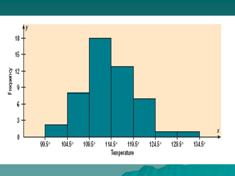
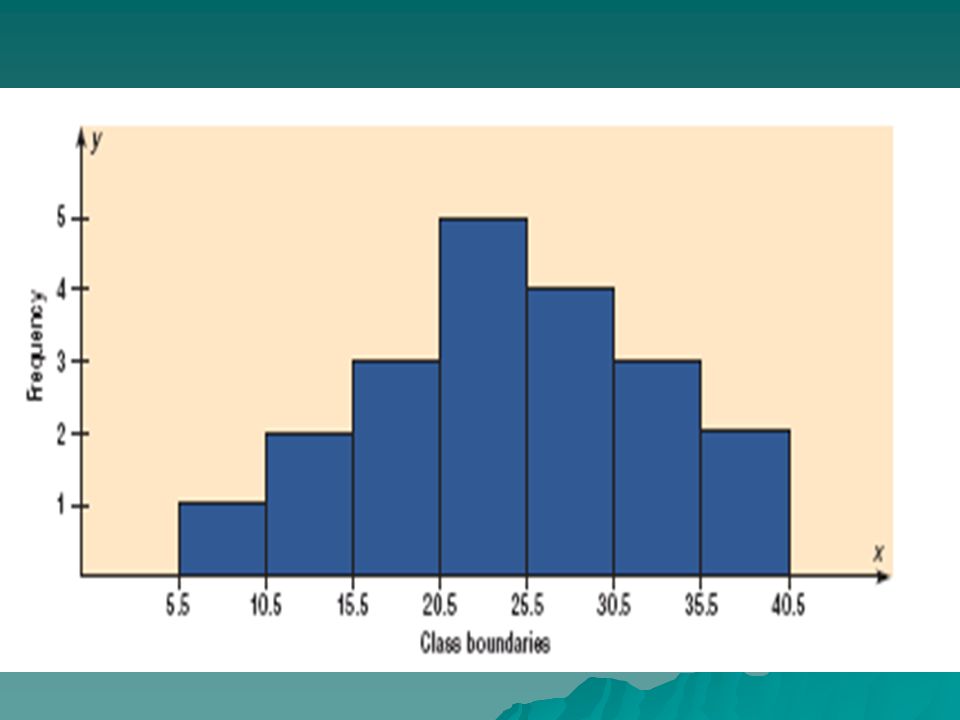
What is a histogram? A graphic representation of the frequency distribution of a continuous variable. Rectangles are drawn in such a way that their bases lie on a linear scale representing different intervals, and their heights are proportional to the frequencies of the values within each of the intervals.

3
Uses for a Histogram A Histogram can be used:
to display large amounts of data values in a relatively simple chart form. to tell relative frequency of occurrence. to easily see the distribution of the data. to see if there is variation in the data. to make future predictions based on the data. Here, I name some of the uses for a Histogram. I tell what makes this tool useful in making quality improvements. Since the histogram is such a useful tool, it can have many uses. Histograms can be used to display large amounts of data in a simple chart view. They can be used to find any patterns that the data might reveal. They can be used to tell relative frequency of occurrence for certain data values. They can also be used to see the distribution, or any variations in the data values. One other use would be to make predictions regarding the future based on the way the data values pan out.

4
Definition: Bin The class size (width of the rectangles) in a histogram
 in a histogram")
5
X-axis: range of data sub-divided into bins
Y-axis: frequency

7
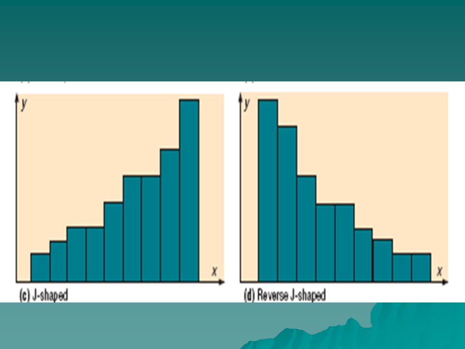
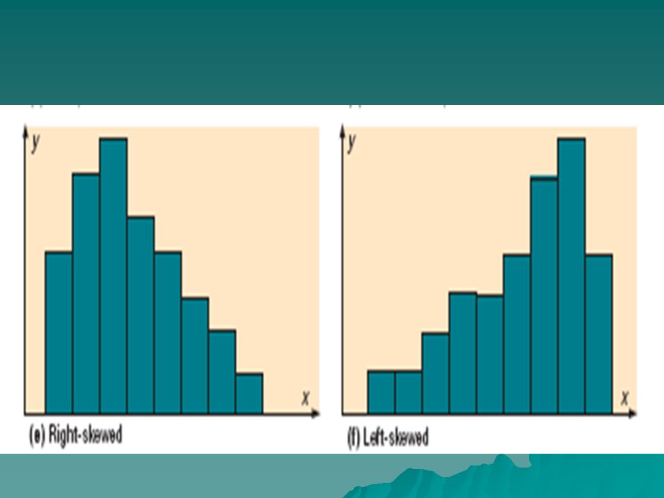
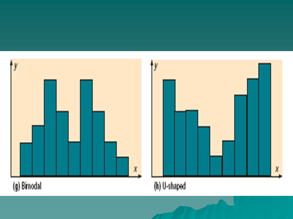
Quick Review of histogram shapes

11
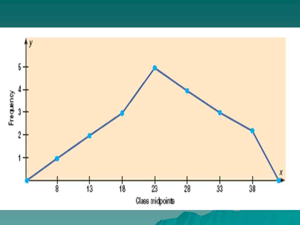
The frequency polygon is a graph that displays the data by using lines that connect points plotted for the frequencies at the midpoints of the classes. The frequencies are represented by the heights of the points.

14
Find the midpoints of each class

15
Find the midpoints of each class

16
Create a frequency polygon using the data

17
Create a frequency polygon using the data

18
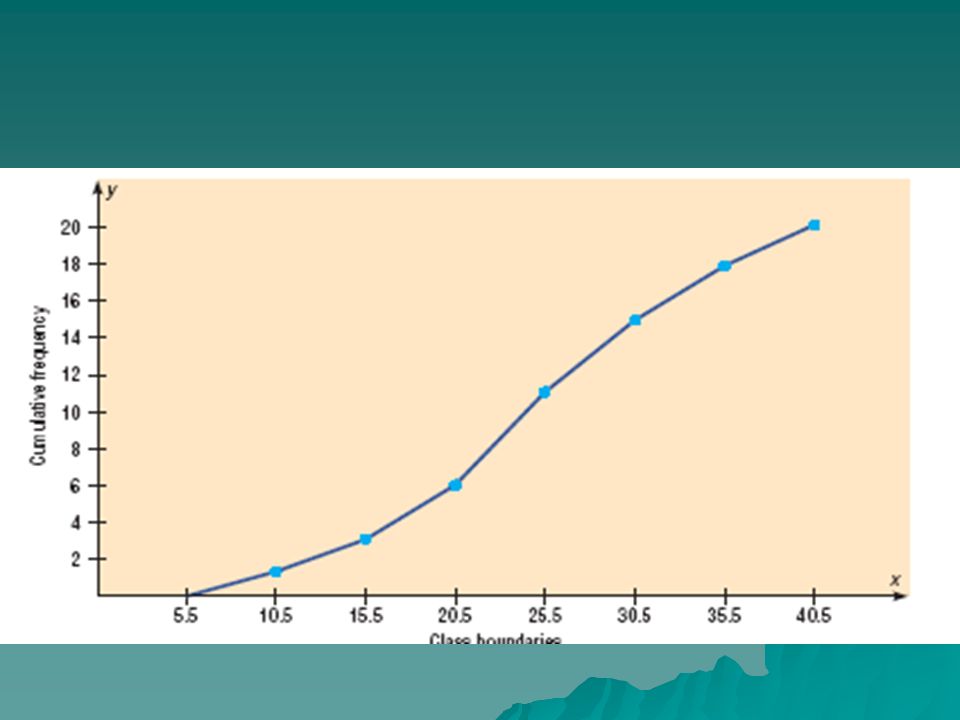
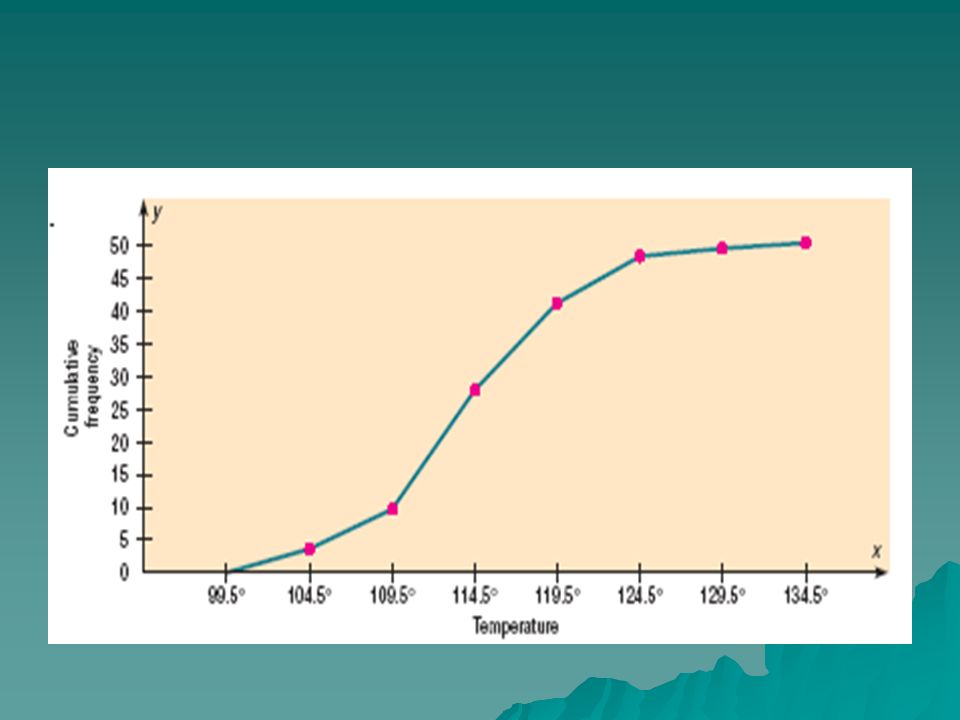
Cumulative Frequency Graph (Ogive)
The ogive is a graph that represents the cumulative frequencies for the classes in a frequency distribution.

22
Create an ogive

23
Draw the x and y axis Plot the points

Similar presentations


. Statistics graph Data recorded in surveys are displayed by a statistical graph. There are some specific.>")


