Download presentation
Presentation is loading. Please wait.

1
MIS2502: Data Analytics Principles of Data Visualization

2
What makes a good chart? Wikipedia: Patriotic War of 1812 http://en.wikipedia.org/wiki/File:Patriotic_War_of_1812_ENG_map1.svg

3
What makes a good chart? Minard’s map of Napoleon’s campaign into Russia, 1869 Reprinted in Tufte (2009), p. 41
, p. 41.")
4
Video Games do this well…

5
What can you learn from this map? http://www.popvssoda.com/countystats/total-county.html

6
What makes a good chart? Zhang et al. (2010), “A case study of micro-blogging in the enterprise: use, value, and related issues,” Proceedings of the 28th International Conference on Human Factors in Computing Systems. This is from an academic conference paper. What are the problems with this chart? This is from an academic conference paper. What are the problems with this chart?
, A case study of micro-blogging in the enterprise: use, value, and related issues, Proceedings of the 28th International Conference on Human Factors in Computing Systems. This is from an academic conference paper. What are the problems with this chart. This is from an academic conference paper. What are the problems with this chart .")
7
Some basic principles (adapted from Tufte 2009) The chart should tell a story 1 The chart should have graphical integrity 2 The chart should minimize graphical complexity 3 Tufte’s fundamental principle: Above all else show the data
 The chart should tell a story 1 The chart should have graphical integrity 2 The chart should minimize graphical complexity 3 Tufte’s fundamental principle: Above all else show the data")
8
Principle 1: The chart should tell a story Graphics should be clear on their ownThe depictions should enable meaningful comparisonThe chart should yield insight beyond the text “If the statistics are boring, then you’ve got the wrong numbers.” (Tufte 2009)
")
9
Do these tell a story? http://www.evl.uic.edu/aej/491/week03.html http://flowingdata.com/2009/11/26/fox-news- makes-the-best-pie-chart-ever/

10
Daylight Savings Time Explained http://visual.ly/daylight-saving-time-explained

11
Telling a Story http://economix.blogs.nytimes.com/2009/05/05/obesity- and-the-fastness-of-food/ http://flowingdata.com/2011/01/19/states-with-the-most-and-least-firearms-murders/

12
Telling a story The electoral result of the 2012 election Under pre-1920 rules: men only Under 1850 rules: white men only http://www.buzzfeed.com/buzzfeedpolitics/what-the-2012-election-would-have-looked-like-with

13
Principle 2: The chart should have graphical integrity Should be ~ 1 < 1 = understated effect > 1 = exaggerated effect

14
Examples of the “lie factor” Reprinted from Tufte (2009), p. 57 & p. 62
, p. 57 & p. 62")
15
How is this deceptive? http://www.guardian.co.uk/environment/interactive/2009/mar/09/ food-carbon-emissions

16
How is this deceptive? http://www.guardian.co.uk/environment/interactive/2009/mar/09/ food-carbon-emissions

17
How about this? http://20bits.com/articles/politics-and-tuftes-lie-factor/ The original graphic from Real Clear Politics, 2008. (Look at the y-axis) The original graphic from Real Clear Politics, 2008. (Look at the y-axis)
 The original graphic from Real Clear Politics, (Look at the y-axis).")
18
How about this? http://20bits.com/articles/politics-and-tuftes-lie-factor/ The original graphic from Real Clear Politics, 2008. (Look at the y-axis) The original graphic from Real Clear Politics, 2008. (Look at the y-axis) The adjusted graphic.
 The original graphic from Real Clear Politics, (Look at the y-axis) The adjusted graphic..")
19
Or this? http://mediamatters.org/research/2012/10/01/a-history-of-dishonest-fox-charts/190225 The original graphic from Fox Business, 2012. The adjusted graphic.

20
Other tips to avoid “lying” Adjust for inflation Make sure the context is presented vs.

21
Principle 3: The chart should minimize graphical complexity Key concepts Sometimes a table is better Data-inkChartjunk Generally, the simpler the better…

22
The Ultimate Table: The Box Score Large amount of information in a very small space So why does this work? – Depends on the reader’s knowledge of the data

23
When a table is better than a chart For a few data points, a table can do just as well… SalespersonTotal Sales Peacock$225,763.68 Leverling$201,196.27 Davolio$182,500.09 Fuller$162,503.78 Callahan$123,032.67 King$116,962.99 Dodsworth$75,048.04 Suyama$72,527.63 Buchanan$68,792.25 The table carries more information in less space and is more precise.

24
Data Ink Should be ~ 1 < 1 = more non-data related ink in graphic = 1 implies all ink devoted to data Tufte’s principle: Erase ink whenever possible

25
Being conscious of data ink Lower data-ink ratio (worse) Higher data-ink ratio (better)
 Higher data-ink ratio (better)")
26
Office 2000 vs. Office 2010

27
What makes a good chart? Sometimes it’s really a matter of preference. These both minimize data ink. Why isn’t a table better here? Sometimes it’s really a matter of preference. These both minimize data ink. Why isn’t a table better here?

28
3-D Charts Evaluate this from a data-ink perspective. How does it affect the clarity of the chart? Evaluate this from a data-ink perspective. How does it affect the clarity of the chart?

29
Chartjunk: Data Ink “gone wild” Unnecessary visual clutter that doesn’t provide additional insight Distraction from the story the chart is supposed to convey When the data-ink ratio is low, chartjunk is likely to be high

30
Example: Moiré effects (Tufte 2009) Creates illusion of movement Stands out, in a bad way
 Creates illusion of movement Stands out, in a bad way")
31
Example: The Grid Why are these examples of chartjunk? What could you do to remedy it?

32
Data Ink Working Against Us http://www.economist.com/node/21537922http://www.economist.com/node/21537909

33
Data Ink Working For Us Evaluate this chart in terms of Data Ink. Imagine this as a bar chart. As a table!! Evaluate this chart in terms of Data Ink. Imagine this as a bar chart. As a table!!

34
Review: What do you think of these? http://www.economist.com/node/21537909 http://images.macworld.com/images/howto/graphics/134708 -create-charts-good_376.jpg

35
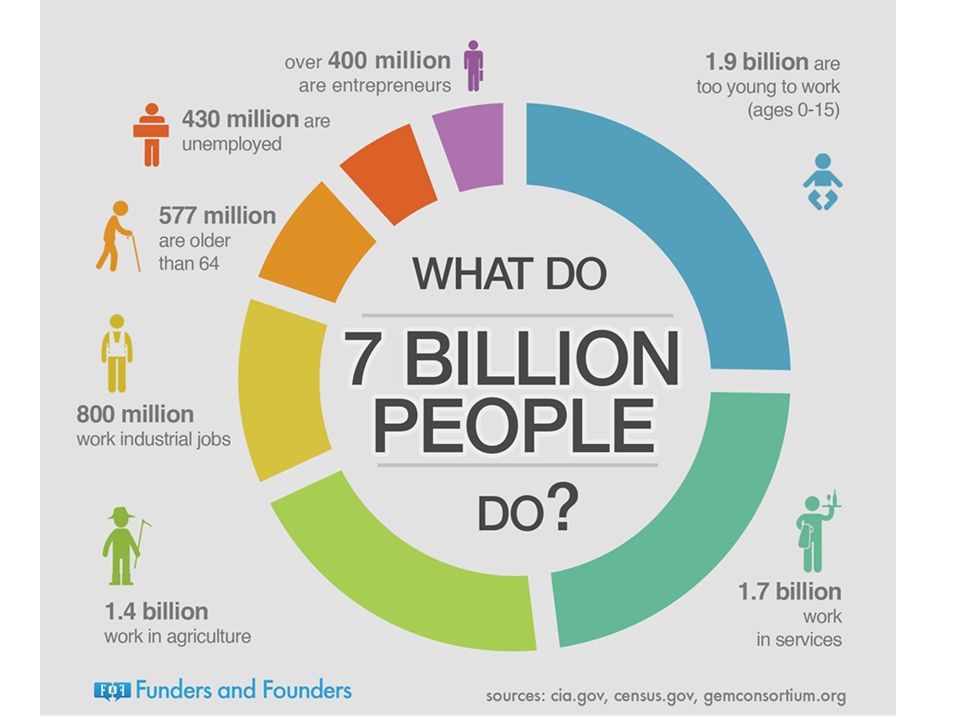
The Infographic http://visual.ly/what-infographic-2 Check out more at www.coolinfographics.com

37
Another example http://www.biztechmagazine.com/article/2012/08/how-make-sure-your- byod-plan-all-good-infographic

38
Where we are… Transactional Database Analytical Data Store Stores real-time transactional data Stores historical transactional and summary data Data entry Data extraction Data analysis

39
Analytics Procedures Descriptive Clustering Association Rule Discovery Sequential Pattern Discovery Visualization Predictive Classification Regression Neural Networks Deviation Detection

Similar presentations


 上課投影片 3.1 Chapter Three Art and Science of Graphical Presentations.>")


