Download presentation
Presentation is loading. Please wait.

1
What is an association between variables? Explanatory and response variables Key characteristics of a data set 1

2
Association: Some values of one variable tend to occur more often with certain values of the other variable Both variables measured on same set of individuals Examples: ◦ Height and weight of same individual ◦ Smoking habits and life expectancy ◦ Age and bone-density of individuals

3
Caution: Often there are spurious, other variables lurking in the background ◦ Shorter women have lower risk of heart attack ◦ Countries with more TV sets have better life expectancy rates ◦ More deaths occur when ice cream sales peak Just explore association or investigate a causal relationship?

4
4 Key Characteristics of a Data Set Certain characteristics of a data set are key to exploring the relationship between two variables. These should include the following: Cases: Identify the cases and how many there are in the data set. Label: Identify what is used as a label variable if one is present. Categorical or quantitative: Classify each variable as categorical or quantitative. Values: Identify the possible values for each variable. Explanatory or response: If appropriate, classify each variable as explanatory or response.

5
Scatterplots Interpreting scatterplots Categorical variables in scatterplots 5

6
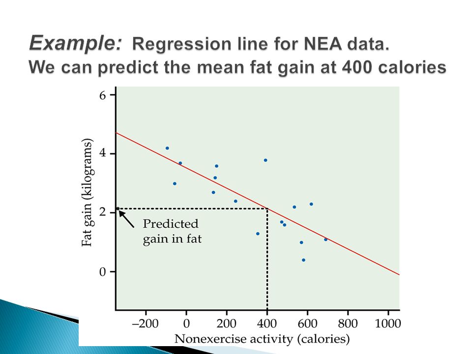
Does fidgeting keep you slim? Some people don’t gain weight even when they overeat. Perhaps fidgeting and other “nonexercise activity” explains why, here is the data: We want to plot Y vs. X ◦ Which is Y? ◦ Which is X?

8
Form (linear, curve, exponential, parabola) Direction: ◦ Positive Association: Y increases as X increases ◦ Negative Association: Y decreases as X increases Strength: Do the points follow the form quite closely or scattered? Outliers: deviations from overall relationship Let’s look again…

10
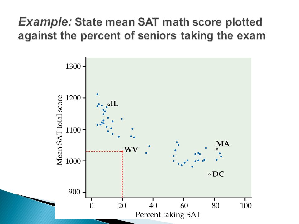
May enhance understanding of the data Categorical variable is (region): ◦ “ e ” is for northeastern states ◦ “ m ” is for midwestern states ◦ All others states excluded
: ◦ e is for northeastern states ◦ m is for midwestern states ◦ All others states excluded")
12
Plotting different categories via different symbols may throw light on data Read examples 2.7-2.9 for more examples of scatterplots Existence of a relationship does not imply causation ◦ SAT math and SAT verbal scores have strong relationship ◦ But a person ’ s intelligence is causing both The relationship does not have to hold true for every subject, it is random

13
The correlation coefficient r Properties of r Influential points 13

14
Linear relationships are quite common Correlation coefficient r measures strength and direction of a linear relationship between two quantitative variables X and Y Data structure: (X,Y) pairs measured on n individuals ◦ Weight and blood pressure ◦ Age and bone-density
 pairs measured on n individuals ◦ Weight and blood pressure ◦ Age and bone-density")
15
15 We say a linear relationship is strong if the points lie close to a straight line and weak if they are widely scattered about a line. The following facts about r help us further interpret the strength of the linear relationship. Properties of Correlation r is always a number between –1 and 1. r > 0 indicates a positive association. r < 0 indicates a negative association. Values of r near 0 indicate a very weak linear relationship. The strength of the linear relationship increases as r moves away from 0 toward –1 or 1. The extreme values r = –1 and r = 1 occur only in the case of a perfect linear relationship. Properties of Correlation r is always a number between –1 and 1. r > 0 indicates a positive association. r < 0 indicates a negative association. Values of r near 0 indicate a very weak linear relationship. The strength of the linear relationship increases as r moves away from 0 toward –1 or 1. The extreme values r = –1 and r = 1 occur only in the case of a perfect linear relationship. Measuring Linear Association

17
Calculate means and standard deviations of data Standardize X and Y: take off respective mean divide by corresponding standard deviation Take products of X(standardized)*Y (standardized) for each subject Add up and divide by n-1 Or just ask your calculator nicely!
*Y (standardized) for each subject Add up and divide by n-1 Or just ask your calculator nicely!")
18
r is affected by outliers Captures only the strength of the “ linear ” relationship ◦ it could be true that Y and X have a very strong non- linear relationship but r is close to zero r = +1 or -1 only when points lie perfectly on a straight line. (Y=2X+3) SAS program: correlation.doc ◦ proc corr is the procedure
 SAS program: correlation.doc ◦ proc corr is the procedure.")
19
19 For each graph, estimate the correlation r and interpret it in context. Correlation Examples

20
20 For each graph, estimate the correlation r and interpret it in context. Correlation Examples

21
21 For each graph, estimate the correlation r and interpret it in context. Correlation Examples

22
22 For each graph, estimate the correlation r and interpret it in context. Correlation Examples

23
Regression lines Least-squares regression line Predictions Facts about least-squares regression Correlation and regression 23

24
Straight line which describes best how the response variable y changes when the explanatory variable x changes ◦ We do distinguish between Y and X cannot switch their roles Equation of straight line: ŷ = b 0 + b 1 x ◦ ŷ is the predicted value (the line at a given x value) ◦ b 0 is the intercept (where it crosses the y-axis) ◦ b 1 is the slope (rate) Procedure ◦ calculate best b 0 and b 1 for your data ◦ Find the line that best fits your data ◦ Use this line to predict y for different values of x
 ◦ b 0 is the intercept (where it crosses the y-axis) ◦ b 1 is the slope (rate) Procedure ◦ calculate best b 0 and b 1 for your data ◦ Find the line that best fits your data ◦ Use this line to predict y for different values of x")
26
Fitted line for NEA data: Pred. fat gain = 3.505 – 0.00344(NEA) Prediction at 400 calories: Pred. fat gain = 3.505 – 0.00344*400 = 2.13 kg So when a person’s NEA increases by 400 calories when they overeat, they will have a predicted fat gain of 2.13 kilograms.
 Prediction at 400 calories: Pred. fat gain = – *400 = 2.13 kg So when a person’s NEA increases by 400 calories when they overeat, they will have a predicted fat gain of 2.13 kilograms..")
27
Warning: Extrapolation--predicting beyond the range of the data--is dangerous! Prediction at 1500 calories Pred. fat gain = 3.505 – 0.00344*1500 = -1.66 kg So predicting for a 1500 NEA increase when overeating, the prediction is that they will lose 1.66 kilograms of weight Not trustworthy Far outside the range of the data

28
The line which makes the sum of squares of the vertical distances of the data points from the line as small as possible y is the observed (actual) response ŷ is the predicted response by using the line Residuals ◦ Error in prediction ◦ y – ŷ
 response ŷ is the predicted response by using the line Residuals ◦ Error in prediction ◦ y – ŷ")
29
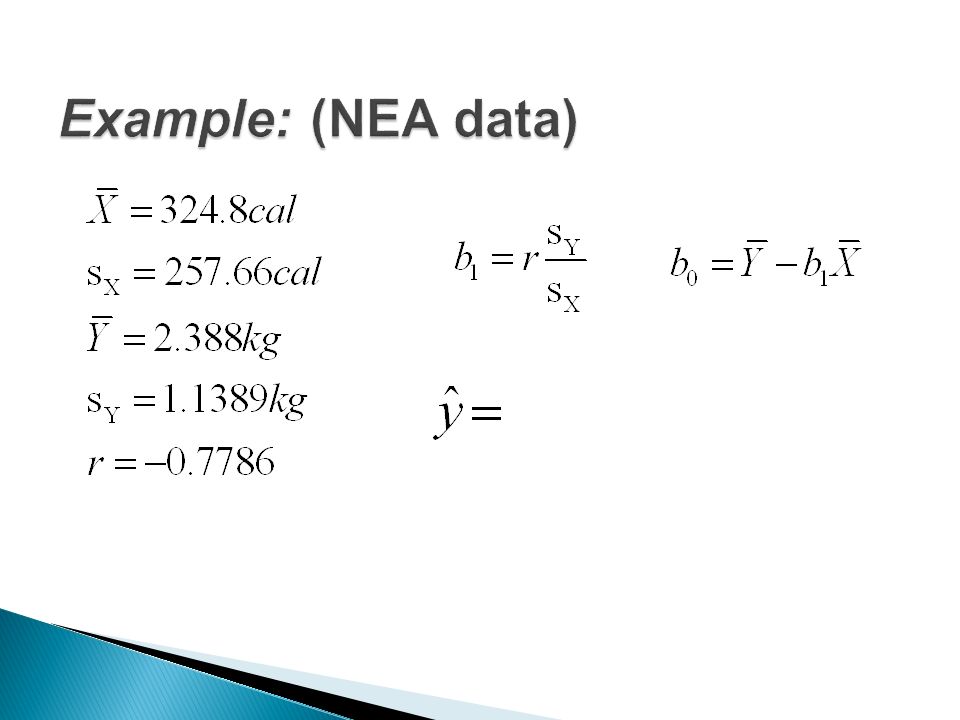
Calculate:

31
Slope: b 1 = -.7786 * 1.1389/257.66 = -0.00344 Intercept: b 0 = (mean of y) – slope * (mean of x) = 2.388 – (-0.00344)*324.8 = 3.505 Regression line: Predicted fat gain = 3.505 – 0.00344*cal ŷ = 3.505 – 0.00344x
 – slope * (mean of x) = – ( )*324.8 = Regression line: Predicted fat gain = – *cal ŷ = – x")
32
Predicted fat gain for observation 2 (-57 cal.) ŷ 2 = 3.505 – 0.00344*(-57) = 3.70108 kg Observed fat gain: y 2 = 3.0 kg Residual or error in prediction = y 2 - ŷ 2 = 3.0 – 3.70108 = -0.70108 kg
 ŷ 2 = – *(-57) = kg Observed fat gain: y 2 = 3.0 kg Residual or error in prediction = y 2 - ŷ 2 = 3.0 – = kg")
33
Residual is y i – ŷ i For NEA data observation 14 has NEA = x 14 = 580 ◦ Find the predicted value, ŷ 14 ◦ Find the residual, y 14 - ŷ 14

34
Cannot switch Y and X Passes through the mean of x and mean of y Physical interpretation of the slope b 1 : ◦ with one unit increase in X, how much does Y change on average? ◦ Example: NEA data: with 1 calorie increase in NEA, fain gain changes by -0.00344 kg ◦ How about 100 increase in NEA?

35
SAS will evaluate the least squares regression line but you have to know where to find them in the output! ◦ Residuals and predicted values are also printed SAS program : regression.doc ◦ the regression procedure is proc reg We will do a deeper analysis of regression in chapter 10

36
In correlation, X and Y are interchangeable, NOT so in regression. Slope (b 1 ), depends on correlation (r) R 2 —Coefficient of Determination ◦ Square of correlation ◦ Fraction of variation in y explained by LSR line ◦ Higher R 2 suggests better fit ◦ Example: R 2 = 0.6062 for NEA data means that 60.62% of the unexplained variation in fat gain is explained by your fitted regression line with x = NEA.
, depends on correlation (r) R 2 —Coefficient of Determination ◦ Square of correlation ◦ Fraction of variation in y explained by LSR line ◦ Higher R 2 suggests better fit ◦ Example: R 2 = for NEA data means that 60.62% of the unexplained variation in fat gain is explained by your fitted regression line with x = NEA..")
37
less spread tight fit R 2 = 0.989 Explains the part of the variation of y which comes from the linear relationship between y and x. In this case between Height and Age. more scatter more error in prediction R 2 = 0.849

38
Residuals and residual plots Outliers and influential observations Lurking variables Correlation and causation 38

39
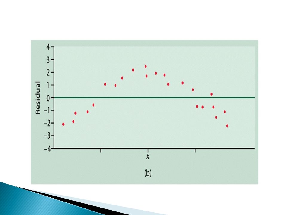
39 A residual is the difference between an observed value of the response variable and the value predicted by the regression line: residual = observed y – predicted y A residual is the difference between an observed value of the response variable and the value predicted by the regression line: residual = observed y – predicted y Residuals A regression line describes the overall pattern of a linear relationship between an explanatory variable and a response variable. Deviations from the overall pattern are also important. The vertical distances between the points and the least-squares regression line are called residuals. Residuals add up to zero and have a mean of zero Thus, a fit is considered good if the plot shows a random spread of points about the zero line but without any definitive pattern

40
Scatterplot of residuals against explanatory variable Helps assess the fit of regression line Residual plot

44
Outliers: Lies outside the pattern of other observations ◦ Y-outliers: large residual ◦ X-outliers: often influential in regression Influential points: Deleting this point changes your statistical analysis drastically ◦ pull the regression line towards themselves Least squares regression is NOT robust to presence of outliers

45
r = 0.4819 Subject 15: ◦ Y-outlier ◦ Far from line ◦ High residual Subject 18: ◦ X-outlier ◦ Close to line ◦ Small residual

46
r = 0.4819 Drop 15: ◦ r = 0.5684 Drop 18: ◦ r = 0.3837 Both have some influence, but neither seems excessive

47
Association, however strong, does NOT imply causation. Some possible explanations for an observed association The dashed lines show an association. The solid arrows show a cause- and-effect link. x is explanatory, y is response, and z is a lurking variable. Explaining Association: Causation 47

48
It appears that lung cancer is associated with smoking. How do we know that both of these variables are not being affected by an unobserved third (lurking) variable? For instance, what if there is a genetic predisposition that causes people to both get lung cancer and become addicted to smoking, but the smoking itself doesn’t CAUSE lung cancer? 1. The association is strong. 2. The association is consistent. 3. Higher doses are associated with stronger responses. 4. Alleged cause precedes the effect. 5. The alleged cause is plausible. We can evaluate the association using the following criteria: 48 Establishing Causation
 variable. For instance, what if there is a genetic predisposition that causes people to both get lung cancer and become addicted to smoking, but the smoking itself doesn’t CAUSE lung cancer. 1. The association is strong. 2. The association is consistent. 3. Higher doses are associated with stronger responses. 4. Alleged cause precedes the effect. 5. The alleged cause is plausible. We can evaluate the association using the following criteria: 48 Establishing Causation.")
Similar presentations


 and.>")


 and response variable (y). u We.>")


 and.>")


 of the.>")
