Download presentation
Presentation is loading. Please wait.

1
Correlation The apparent relation between two variables.

2
Trend A pattern of average behaviour that occurs over time

3
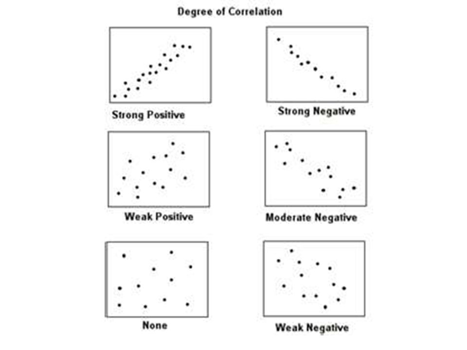
Which of the scatter plots indicate the strongest trends?

4
Which of the scatter plots do not indicate a trend?

5
If a line of best fit were drawn on each of the scatter plots that show a trend, describe the slope of each line.

6
Which do you think show strong positive correlation and which shows strong negative correlation?

7
Make your own scatter plot and examine the trends http://staff.argyll.epsb.ca/jreed/math9/strand 4/scatterPlot.htm http://staff.argyll.epsb.ca/jreed/math9/strand 4/scatterPlot.htm

8
Correlation Coefficient, r A number from +1 to -1 that gives the strength and direction of the relationship between two variables.

9
Positive Correlation If there is a positive correlation, the coefficient is a number between 0 and 1. If there is no relationship between the predicted values and the actual values the correlation coefficient is 0 or very low (the predicted values are no better than random numbers). As the strength of the relationship between the predicted values and actual values increases so does the correlation coefficient. A perfect fit gives a coefficient of 1.0. Thus the higher the correlation coefficient the better.
. As the strength of the relationship between the predicted values and actual values increases so does the correlation coefficient. A perfect fit gives a coefficient of 1.0. Thus the higher the correlation coefficient the better..")
10
Negative Correlation If there is a negative correlation, the coefficient is a number between 0 and -1. If there is no relationship between the predicted values and the actual values the correlation coefficient is 0 or very low (the predicted values are no better than random numbers). As the strength of the relationship between the predicted values and actual values increases so does the correlation coefficient. A perfect fit gives a coefficient of -1.0. Thus the higher the correlation coefficient the better.
. As the strength of the relationship between the predicted values and actual values increases so does the correlation coefficient. A perfect fit gives a coefficient of Thus the higher the correlation coefficient the better..")
12
Coefficient of Determination, r 2 A number from 0 to +1 that gives the relative strength of the relationship between two variables. If r 2 = 0.44, this means 44% of the variation of the dependent variable is due to variation in the independent variable.

13
Example r=.9 This means there is a strong positive correlation. Calculate r 2 and explain what it means.

14
Residual Plot Residual Value – the vertical distance between a data point and the line of best fit

15
To do: Make a scatter plot using Open Calc for the data below xy -48 -35 012 515 27 1930 2132 2838 3650 1.Enter data for x vertically in Column 1 2.Enter data for y vertically in Column 2 3.Highlight data and click INSERT and then CHART 4.Select XY(Scatter) to get a scatter plot 5.Click, NEXT, NEXT, FINISH
 to get a scatter plot 5.Click, NEXT, NEXT, FINISH")
16
To do: Make a line of best fit using Open Calc for the data below xy -48 -35 012 515 27 1930 2132 2838 3650 1.Highlight the graph 2.Click INSERT, TREND LINE 3.Choose LINEAR 4.Click SHOW EQUATION and SHOW COEFFICENT before pressing OK 5.What is the equation? 6.What is R 2 7.What does R 2 tell you about the correlation

17
To do: Make a scatter plot using Open Calc for the data below xy -48 -210 012 214 417 618 820 1021 1224 1.Enter data for x vertically in Column 1 2.Enter data for y vertically in Column 2 3.Highlight data and click INSERT and then CHART 4.Select XY(Scatter) to get a scatter plot 5.Click, NEXT, NEXT, FINISH
 to get a scatter plot 5.Click, NEXT, NEXT, FINISH")
18
To do: Make a scatter plot using Open Calc for the data below xy -48 -210 012 214 417 618 820 1021 1224 1.Highlight the graph 2.Click INSERT, TREND LINE 3.Choose LINEAR 4.Click SHOW EQUATION and SHOW COEFFICENT before pressing OK 5.What is the equation? 6.What is R 2 7.What does R 2 tell you about the correlation

19
Compare Graph 1 and 2 Which one of your two graphs show stronger correlation? How can you tell???

Similar presentations


, (0, –3) 2. (8, 5), (–8, 7) Use.>")
