Download presentation
Presentation is loading. Please wait.

1
0707 IAT 102 Graphic Design

2
0707 Design Basics

3
Design Tools

4
Fundamental Questions:

5
How do you lead users through information by visual means?

6
What is the most important information? What should you see first? Second? hierarchy

7
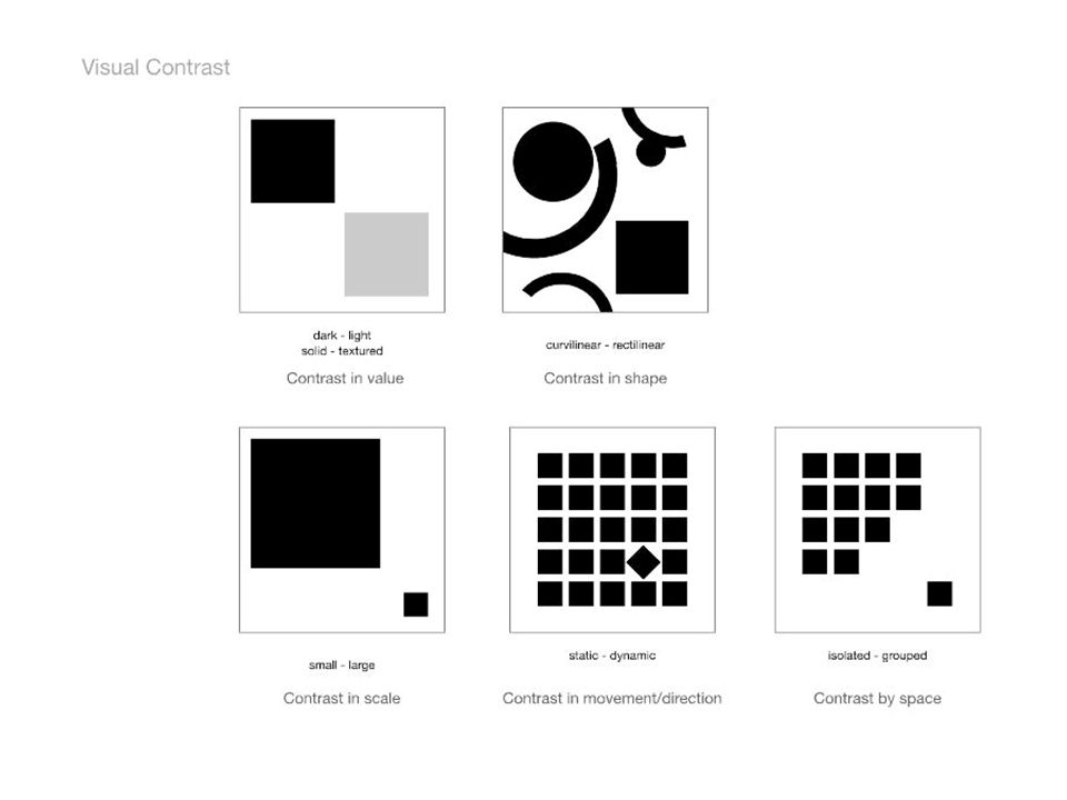
Hierarchy Contrast – dark / light, colour, text, scale, white space Movement Balance – asymmetrical & symmetrical Consistency / Repetition Proximity Alignment Style-Hints (or elements for good design):
:")
8
Scale: relative size Contrast: colour, value, texture….. Example: A designer might design a full-page magazine ad using a single small image in the middle of the page with lots of white space. The contrast between the scale of the page and the scale of the content (image) draws attention to the image (it has greater Mass or visual weight). This can create a specific mood (depending on other elements) such as conservative, elegant, lonely, or open. http://desktoppub.about.com/od/gestalt/Gestalt.htm Hierarchy: look first, second, third….
 draws attention to the image (it has greater Mass or visual weight). This can create a specific mood (depending on other elements) such as conservative, elegant, lonely, or open. Hierarchy: look first, second, third…..")
10
Where do you look first, second third? Why? What leads you through information? What creates balance?

12
Value: light to dark area Color: colour harmonies Example: A designer might design a full-page magazine ad using a single dominant colour and then highlight an area through use of a different colour based on a specific colour pallet. Colour can also be used to lead the eye through the work. Contrast

14
White space should not be considered merely 'blank' space — it is an important element of design which enables the objects in it to exist at all, the balance between positive (or non-white) and the use of negative spaces is key to aesthetic composition. - wikipedia Balance

15
Balance: Informal / asymmetry / visual weight

22
Balance: Informal / symmetry – not to be used in this project

26
White space should not be considered merely 'blank' space — it is an important element of design which enables the objects in it to exist at all, the balance between positive (or non-white) and the use of negative spaces is key to aesthetic composition. - wikipedia White space

30
Repetition The concept of repetition says that you repeat design elements throughout the entire piece. The element can be a font style, graphic, line, icons, colors, the list is endless.

33
Proximity The concept of proximity says that related items should be grouped together. Likewise, items that are not related should not be close to each other. The process of grouping related information creates visual cues, which accomplishes Jakob's principle of facilitating scanning. An example of proximity is the relationship between subheading for my paragraphs (such as Proximity above), and the Paragraphs below them. Williams also suggests never having the same amount of white space between elements that aren't a part of a list
, and the Paragraphs below them. Williams also suggests never having the same amount of white space between elements that aren t a part of a list.")
34
proximity

36
Alignment The concept of alignment says that everything on a page should be visually connected to something else on the page. Nothing should be placed arbitrarily. When elements are aligned they are connected to each other, even if they are separated on the page. You may have noticed that the alignment of the subheading "Alignment" was centered. As it is said, "Good design is transparent." The lack of alignment between the subhead and the related paragraph made your eye have to travel across the page, and it was probably enough for you to notice

Similar presentations


>")


