Download presentation
Presentation is loading. Please wait.

1
Data and Variation

2
Ways to Represent Data…
There are quite a few! Let’s look at a few that we have seen, along with some that we saw in previous years.

3
Pie Charts

4
Raw Data Here are all the first quiz scores for the 200 students enrolled in Algebra I. How’d they do?

5
Put them in order. How’d they do?

6
Stem-and-Leaf Plot How’d they do?

7
Frequency Histogram How’d they do?

8
Same data, different histogram
How’d they do?

9
Measures of Central Tendency
What is the “average” versus the average? Average can mean different things! MEAN: the average of an entire set of data MEDIAN: the data point in the middle when a data set is ordered from lowest to highest MODE: the most common occurring data value(s)
")
10
Each one can be used in any situation but it can be misleading or not give you an accurate picture of the entire data set. If you want to find the average price to fill your tank with gas? If you want to find the average salary of graduates of your school? If you want to find the average number of pets in a family? If you want to find the average test score?

11
Variation 2000 Batting Averages 1920 Batting Averages
Highest was 0.372 1920 Batting Averages Highest was over and 2 players were in the 0.380s

12
What do you see? 2000 Batting Averages Not much variation in data
More variation in data

13
Measuring Variation Five-Number Summary Minimum Value Maximum Value
Median Value of all data Median of Bottom Half of Data (1st quartile) Median of Top Half of Data (3rd quartile)
 Median of Top Half of Data (3rd quartile)")
14
Box and Whisker Plots Here is a plot of the exam data from before.
Dots are outliers (more than 1.5 times the distance from Q1 to Q3). How’d they do?
. How’d they do")
15
Accuracy in Measurement
100 people are given a new fancy laser that will measure a persons’ height. Here are the results when 100 people measured the same girl.

16
Measuring Variation Calculate the Mean.
Find out how far each value is from the mean. How far on average is each value from the mean? This is called the deviation from the mean.

17
Standard Deviation

18
Look back at our data… The standard deviation of the height of the girl was 0.2”. The standard deviation of 1920 batting averages is and of 2000 batting averages is Smaller standard deviation implies the data is more tightly grouped. The standard deviation of exam scores is (Large due to outliers that affect the mean as well.)
")
19
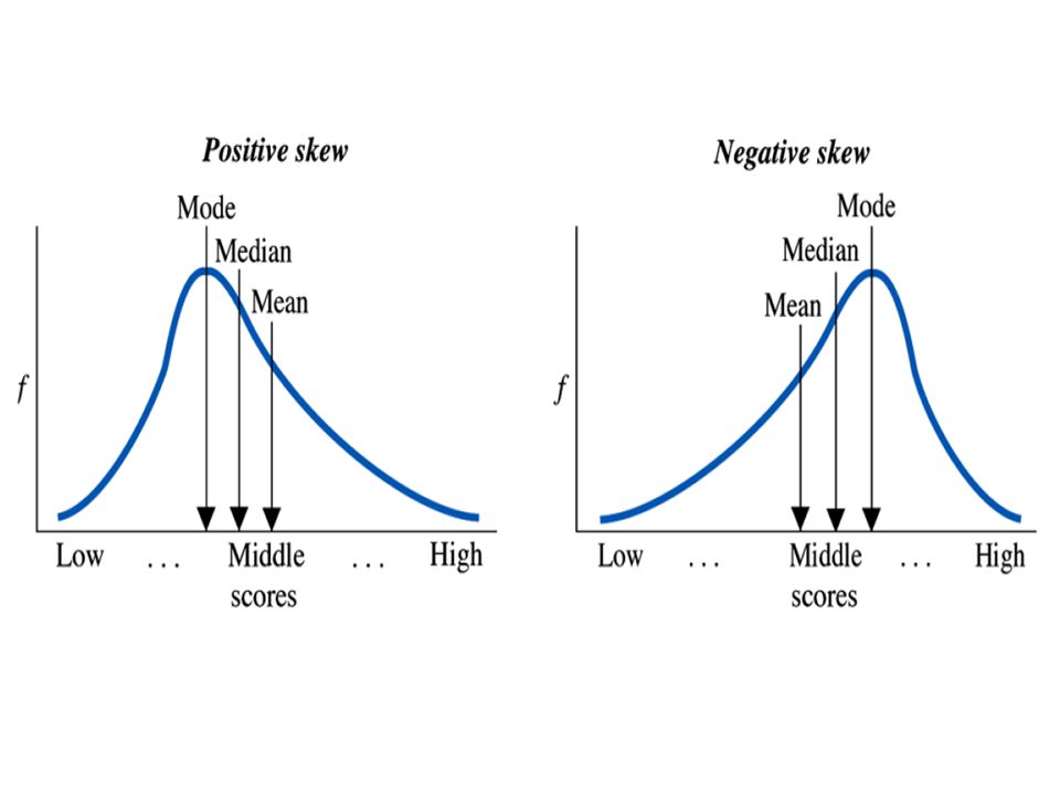
Shapes of Graphs Graphs can be skewed one direction or the other.
Graphs of batting averages and height were symmetrical around the central value. Exam scores were not symmetrical since most students scored higher. This is skewed to the left (where the tail is). A graph skewed to the right means the tail is on the right side of the graph.
. A graph skewed to the right means the tail is on the right side of the graph.")
20
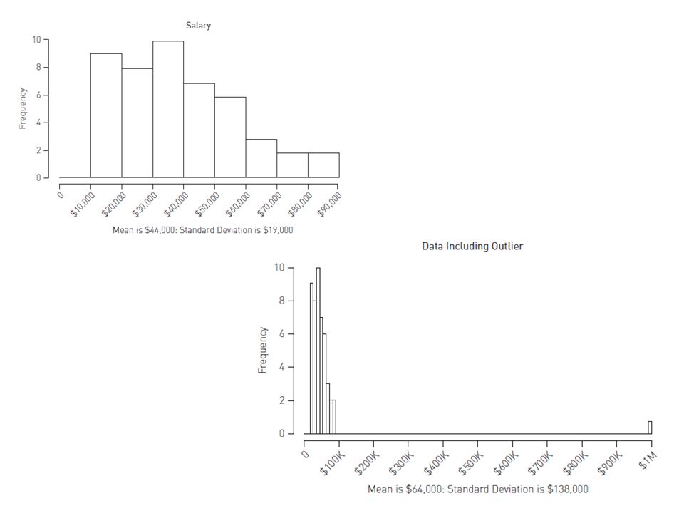
Salaries at Corporations
They are skewed to the right. Fewer people at the top of the ladder who make the most money. Because it is skewed to the right, this means that the mean is HIGHER than the median. Median is best for describing the average employee salary, while Mean is best when doing payroll calculations and budgets.

22
Housing Prices Skewed to the right.
Mean pulled in direction of skew relative to median. Mean is HIGHER than median.

23
Exam scores Data is skewed to the left. Mean is LOWER than median.

25
Example #3 The following histogram shows the exam scores for 30 students in a freshman accounting class. Estimate the mean of these scores. Is the standard deviation of these scores likely to be closer to 12 or to 25?

26
Answer to Example #3 The mean score is approximately 70 The standard deviation is more likely to be closer to 12 because about half of the scores are within 10 of 70 and the other half are further than 10 but less than 30 away therefore it seems more likely that the standard deviation would average out to close to 12 rather than 25.

27
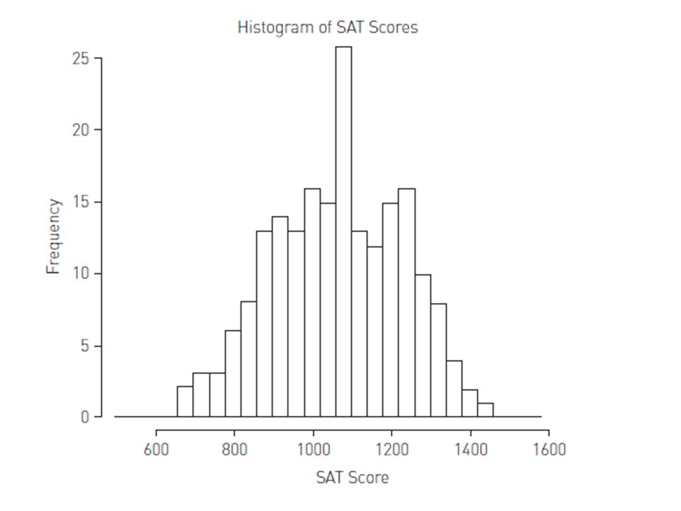
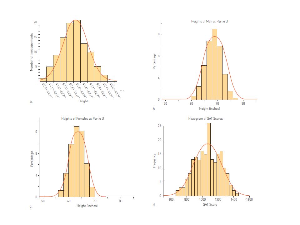
SAT Scores What do you see?
Bimodal distribution – often experienced on test scores. Students who know what they are doing come exam time and students who do NOT know.

28
Uniform Distributions
All are around 166 times. Theoretically, it should be 166 2/3 times, but that is impossible for real data.

29
The Bell Curve Most famous of the shapes is the bell-shaped curve, aka normal curve, aka normal distribution, aka Gaussian distribution. Appears often in nature and in mathematics. Lots of formulas to describe it and analyze it. Let’s look at some examples!

32
Why should we expect bells?
Around the mean, there should be an expected amount of variation above and below. The more the variation, the less likely it is. Thus we have a cluster in the middle and approximately the same in high and low ends.

34
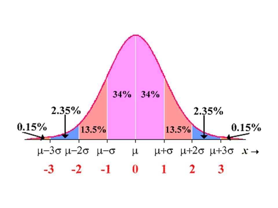
Normal Curves and Standard Deviation
68% of the data differ from the mean by less than one standard deviation. 95% of the data differ from the mean by less than two standard deviations. 99.7% of the data differ from the mean by less than three standard deviations.

36
Example #1 All freshmen entering NHS have their heads measured for the beanies they are required to wear. One year the head circumference data had a normal distribution with mean 55 cm and standard deviation 1.7 cm. What percentage of the students that year had a head circumference between 53.3 cm and 56.7 cm? What percentage had circumference above 58.4 cm?

37
Answer to Example #1 For data with a normal distribution, about 68% of the values differ from the mean by less than one standard deviation. The normally distributed head measurements have mean 55 cm and standard deviation 1.7 cm, so heads within one standard deviation of the mean will measure between = 53.3 cm and = 56.7 cm. Thus approximately 68% of the freshmen have head circumferences between 53.3 and 56.7 cm. A head measuring more than 58.4 cm is more than 3.4 cm, or two standard deviations, above the mean. For the second question, recall that approximately 95% of the values in a normal distribution are within two standard deviations, so only 5% lie above or below those limits. Thus, in this case, roughly 5%/2 = 2.5% of the freshmen will have head circumferences measuring more than 58.4 cm.

38
Example #2 The average high temperature in Anchorage, Alaska, in January is 21ºF with a standard deviation of 10º. The average high temperature in Honolulu in January is 80ºF with a standard deviation of 8º. In which location would it be more unusual to have a day in January with a high of 57ºF?

39
Answer to #2 A January temperature of 57° would be more unusual in Anchorage. This temperature is within three standard deviations (3 * 8° = 24°) of the mean (80°) in Honolulu but is outside the range of three standard deviations (3 * 10° = 30°) of the mean (21°) in Anchorage.
 of the mean (80°) in Honolulu but is outside the range of three standard deviations (3 * 10° = 30°) of the mean (21°) in Anchorage.")
Similar presentations


 Mean ( x ):Arithmetic.>")


 Nutan S. Mishra. Exercises 3.11-3.15 Size of the data set = 12 for all the five problems In 3.11 variable x 1 = monthly rent of.>")
