Download presentation
Presentation is loading. Please wait.

1
Understanding Logo Design
Web Design 35S

2
Contents: What is a logo? A short history of logo design
Why are logos important? Types of logos What makes a good logo? The logo design process Design principles

3
What is a logo? A logo is the visual representation of a company or organization. forms its corporate identity. designed for easy recognition by the company’s audience.

4
Richard the Lionheart crest
A brief history of logo design. Ancient Greece and Mesopotamia Use on stationery & signs Logos of rulers or towns Middle Ages: church & commercial use Masons, goldsmiths, paper makers, and nobility Widespread by 1700’s Richard the Lionheart crest

5
A brief history of logo design.
Industrial Revolution Mass production, mass distribution Better logos America, More competition leads to brands

6
Logos have become the faces of business and our economy.
Today: Huge diversity Logos have become the faces of business and our economy. The general public has become very responsive to logos the need for innovative and well thought-out logos is central to a company’s success.

7
Why are logos important?
Logos trigger people’s memories of previous experiences with the company Simple and direct way of promoting A logo describes a company or organization without a lengthy explanation.

8
Types of Logos Letter type Symbol type Letter & symbol type

9
What makes a good logo? Simple Versatile
should be instantly recognizable number of colours used should be minimized Easy to read big or small, in different places Envelopes or billboards Packaging or television Distinctive Distinguishes the company from others Doesn’t violate copyright

10
The Logo Design Process
First steps Conceptual development Begin with the formulation of objectives and a verbal description of the logo Who is the target audience? What is the purpose of the logo? What should it look like to meet that purpose? Preliminary sketches to develop the idea Present to the client Refine the sketches into near-finished product

11
All about communication
Design principles

12
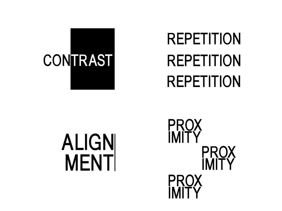
“C.R.A.P.” Contrast Repetition Alignment Proximity

14
Contrast Makes things stand out from each other. size value hue
orientation texture shape position

15
Contrast Hockey Canada: where is the contrast?
White, red and black stand out against each other and sets off the player High noticeability Meaning of colours?

16
Repetition Repetition adds emphasis and pattern
Olympic rings: what do the repeated, interlocked circles represent? Strength, unity, continuity…

17
Alignment Connect elements visually Not aligned = eye catching
Mercedes-Benz logo is centered Radial symmetry Very balanced Looks organized; communicates quality

18
Alignment Facebook logo Aligned asymetrically Adds visual interest
Lets the eye go back and forth, left to right Weighted towards the bottom Why such a simple design?

19
Proximity Close Far Things that are too close get hard to read!
But too far just isn’t as interesting sometimes, or changes the reading! What do you think the arrow means?

20
Proximity Suggests relationships between parts
Influences balance & alignment Can create feelings and moods, e.g. serious or fun:

21
Proximity Close Far HP Invent campaign logo HP is an old, classic logo
The far proximity of “invent” is meant to freshen up the image The letters are spaced apart: unique, innovative Formula 1 Racing logo Unmistakably close “F” and “1” emphasizes the name and the brand Proximity of the lines indicates speed & action

22
Get Inspired Let’s analyze a logo…
What do you see here – what does the logo try and represent? See the smile? What does it mean? Where is the arrow pointing to and from? They have “everything from A to Z”. Which design principles do you see? Contrast: orange/black; alignment to the left; close proximity of arrow

23
Other Basic Principles
Design is about making communication easy and clear for the viewer. Remove all nonessential elements. Remove visual clutter. Create clean designs. Empty space is not nothing; it is a powerful something. Font influences feeling as well: light, heavy, old, modern, fun, serious… Colour creates feelings, attracts attention, and much, much more

Similar presentations