Download presentation
Presentation is loading. Please wait.

1
Unit 5C Statistical Tables and Graphs

2
TYPES OF DATA There are two types of data: Qualitative data – describes qualities or nonnumerical categories EXAMPLES: (1) Colors of m&m candy (2) Freshman, Sophomore, Junior, Senior Quantitative data – represents counts or measures EXAMPLES: (1) Temperatures (2)Mileage (3) Test scores
 Colors of m&m candy (2) Freshman, Sophomore, Junior, Senior Quantitative data – represents counts or measures EXAMPLES: (1) Temperatures (2)Mileage (3) Test scores")
3
FREQUENCY TABLE A basic frequency table has two columns: The first column lists all the categories of data. The second column lists the frequency of each category, which is the number of times each category appears in the data set. Additional columns may include: relative frequency – frequency expressed as a fraction or percentage of the total cumulative frequency – total of frequencies for the given category and all previous categories

4
EXAMPLE OF A FREQUENCY TABLE Consider the following set of 20 scores from a 100-point exam: 76 80 78 76 94 75 98 77 84 88 81 72 91 72 74 86 79 88 72 75 ScoreFrequency Relative Frequency Cumulative Frequency 70-7440.20 = 20%4 75-7970.35 = 35%11 80-8430.15 = 15%14 85-8930.15 = 15%17 90-9420.10 = 10%19 95-9910.05 = 5%20 Total201.00 = 100%

5
IMPORTANT LABELS FOR GRAPHS Title/Caption Vertical Scale and Title Horizontal Scale and Title Legend

6
BAR GRAPHS A bar graph shows each category with a bar whose length corresponds to its frequency. NOTE: A bar graph is usually used for qualitative data.

7
PIE CHART A pie chart divides a whole pie into wedges (representing the categories) whose sizes are proportional to their relative frequencies. NOTE: A pie chart is usually used for qualitative data. A Pie Chart for Essay Scores

8
HISTOGRAM A histogram shows the quantitative data categories in their natural order with bars (rectangles) whose lengths correspond to their frequencies. The bars of a histogram touch each other, and the bar widths have specific meaning.

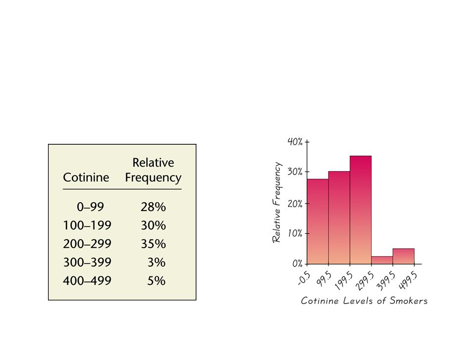
9
EXAMPLE OF A HISTOGRAM The table and histogram below summarize the cotinine levels of forty smokers.

11
LINE CHART A line chart shows the data value for each category as a dot (whose horizontal position is the center of the bin/class, and the vertical position is its frequency), and connects the dots with line segments.
, and connects the dots with line segments.")
12
EXAMPLE OF A LINE CHART

13
TIME-SERIES DIAGRAM A time-series diagram is a histogram or line chart in which the horizontal axis represents time. For an example, see Figure 5.10 on page 337 of the text.

Similar presentations