Download presentation
Presentation is loading. Please wait.

1
Numerical and Graphical Analysis Finding and understanding patterns in data

2
The course so far Academic use of the web. Publishing on the web Analysing text Manipulating textual lists Tables Numerical Analysis – why it matters Graphical Analysis – a better way for humanists

3
Lists Ann Simms of Riverhead (Female) left £1560 died at age 89 years Anne Potts of Ide Hill (Female) left £34 died at 17 years Charles Forth of Chevening (Male) left £129 died at age 48 years :::: GeorgeSalter of Riverhead (male) left £190, died at age 26 years
 left £1560 died at age 89 years Anne Potts of Ide Hill (Female) left £34 died at 17 years Charles Forth of Chevening (Male) left £129 died at age 48 years :::: GeorgeSalter of Riverhead (male) left £190, died at age 26 years")
4
Data as a table Forename Surname Village Gender Wealth Age at death Ann SimmsRiverhead Female £1560 89 Anne PottsIde Hill Female £34 17 Charles ForthChevening Male £129 48

5
Tables in a Spreadsheet

6
Spreadsheet Software Evolved from financial accounting practice. Tabular data Simple lists Simple databases Establish relationships within and between data sets – simple statistics Apply various functions Plot Graphs and Charts

7
Applications in the humanities Maintaining and manipulating lists. Studying quantifiable information. Managing budgets and projects. Plotting graphs and charts. Compensating for weaknesses in other software applications. Building utility programs.

8
What would your tutors comments be? During the early 19 th century the population of London grew rapidly due to mass migration in from the countryside. The overcrowding caused by the rising population placed a strain on the sanitation systems causing a series of cholera epidemics, each worse than the one before.

9
Quantify your statements: evidence? During the early 19 th century the population of London grew rapidly due to mass migration in from the countryside. The overcrowding caused by the rising population placed a strain on the sanitation systems causing a series of cholera epidemics, each worse than the one before.

10
Poetry or Maths? Reproduced from: Burrows J. (2002) Delta: a Measure of Stylistic Difference and a Guide to Likely Authorship, Literary and Linguistic Computing, Vol. 17:3 p. 270.
 Delta: a Measure of Stylistic Difference and a Guide to Likely Authorship, Literary and Linguistic Computing, Vol. 17:3 p")
11
Reproduced from: Burrows J. (2002) Delta: a Measure of Stylistic Difference and a Guide to Likely Authorship, Literary and Linguistic Computing, Vol. 17:3 p. 280.
 Delta: a Measure of Stylistic Difference and a Guide to Likely Authorship, Literary and Linguistic Computing, Vol. 17:3 p")
12
Examples Social History - New Poor Law - Effects of the Industrial Revolution - Voting patterns in elections Textual analysis - word frequencies etc George Orwell, Author attribution Shakespeare or Marlowe

13
Why use numerical analysis? Wide variety of techniques –suitable for different types of data and questions. In the humanities it usually means statistics Three Roles - Summarise and compare data sets - Test hypotheses - Determine the significance of findings

14
Research Process What is your question? What results would prove/disprove it? Write a code book defining - variable names - variable data type - categories, ranges (controlled vocabulary for numeric data) Code data Analysis Interpretation
 Code data Analysis Interpretation.")
15
Authorship attribution Analysis of writing style Consistency of style Find frequently used words and look at their frequency in different portions of the book. End up with tables of frequencies and various indices – need to interpret them

16
Simple Statistics To summarise a set of data - mean average value - mode most common value - median middle value - range minimum, maximum and the difference between them

17
Graphical Analysis Allows us to: Summarise data Explore and identify areas for further study. To communicate the meaning of large volumes of data

18
Variance and correlation Are two things related? - ability in one language to another - poverty and disease - smoking and cancer Mostly easily done by drawing a graph.

19
Lung Cancer and Smoking

20
With regression line fitted

21
Variation in data How much variation is there in the data values? Standard deviation measures the deviation of the data from its mean Small value means very little spread

22
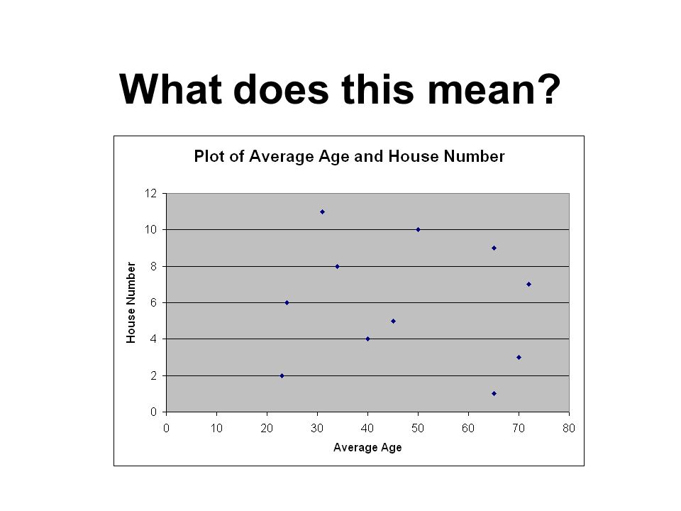
What does this mean?

26
Warnings Think about what you are doing. A correlation does not mean there is a link. Even if there is a mathematical relationship it may not be a causal one. Beware of interpolated and extrapolated values.

27
Correlation? Tufte (2001) p. 15
 p. 15")
28
René Magritte: La Trahison des Images (1928-9) (The Treachery of Images) Los Angeles County Museum of Art
 (The Treachery of Images) Los Angeles County Museum of Art")
Similar presentations


 showing the fate of Napoleons Grand Army in the.>")


 to show you how 208 and 214 are telling you many of the the same things; and how to use.>")


 Collecting evidence (often in the form of numerical data)>")
151 231 2284 CMPDLLM002 Research Methods Lecture 8: Quantitative.>")