Download presentation
Presentation is loading. Please wait.

1
COLOR

2
Color is one of the most expressive elements in art because its quality affects our emotions directly. When we view a work of art we have an immediate, emotional reaction to it.

3
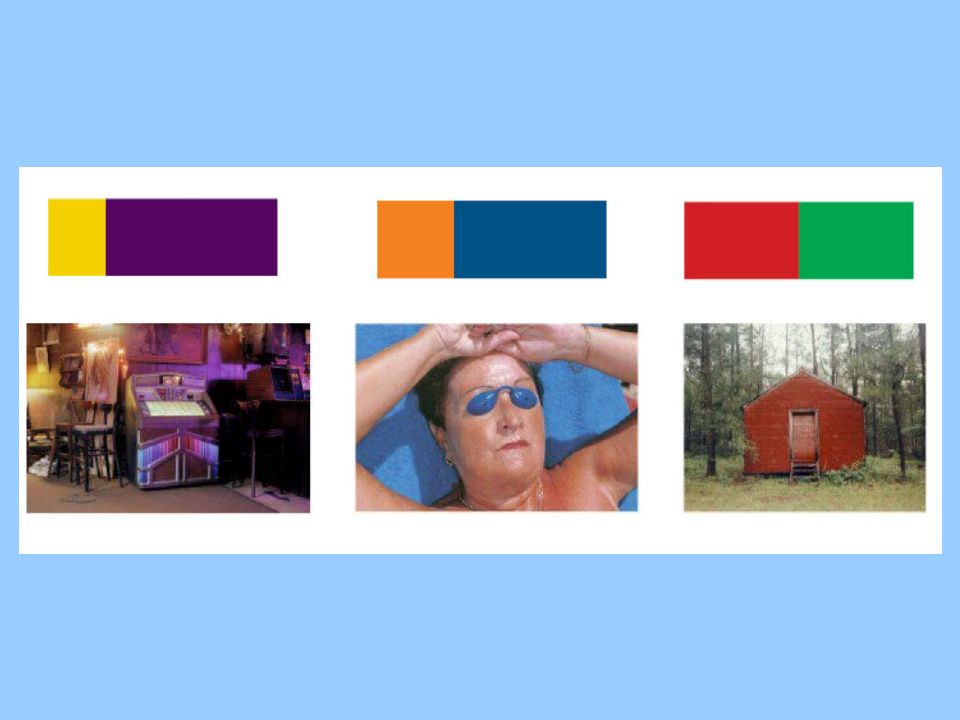
Anything Wrong Here? Color is an important part of identifying brands, products, services, ideas, and messages. Color is one of the first things we see when we encounter marketing material for a product, service or idea. Imagine how these wrong color combinations would confuse the loyal customer.

4
Color begins with and is derived from light.
Where there is light there is some color. Where there is no light there is no color.

5
color is likely to be more intense.
When light is weak it is difficult to distinguish different colors (i.e. dusk and dawn). When light is strong, color is likely to be more intense. Claes Oldenburg's Spoonbridge & Cherry at dusk Sculpture during the day – notice the difference of color quality?
. When light is strong, color is likely to be more intense. Claes Oldenburg s Spoonbridge & Cherry at dusk. Sculpture during the day – notice the difference of color quality")
6
Rays of light coming from the sun are made up of waves that vibrate at different speeds.
When we see color our sense of vision is actually responding to the wavelengths of light passing through (glass) or reflecting off an object. An object is "colored," as stated above, because of the light it reflects—all other colors are absorbed into that specific object. So then, an apple appears red because it reflects red light.
 or reflecting off an object. An object is colored, as stated above, because of the light it reflects—all other colors are absorbed into that specific object. So then, an apple appears red because it reflects red light.")
7
White consists of all of the colors in the color spectrum
White consists of all of the colors in the color spectrum. Black is the absence of color. When a beam of white light is passed through a prism, a spectrum of the entire range of pure colors visible to the naked eye is formed.

8
Color – the visual response to the wavelengths of sunlight called hues (red, orange, yellow, green, blue, indigo or blue-violet, and violet)
")
9
Color Spectrum – the band of individual colors that result when a beam of white light is broken into its component wavelengths, identifiable as hues.

10
Hue A Hue is the common name of a color and indicates its position on the spectrum or on the color wheel.

11
Intensity – the saturation, strength, or purity of a hue
Intensity – the saturation, strength, or purity of a hue. A vivid color is high intensity and a dull color is low intensity.

12
Local Color – the color as seen in the objective world (green grass, blue sky, red barn)
Not Local Color

13
Primary Colors Red, blue, and yellow are the three primary colors.
The preliminary hues that cannot be broken down or reduced. These are the hues from which all other colors on the spectrum can be made.

14
Secondary Colors Orange, violet, and green are the secondary colors. –
a color produced by mixing two primary colors.

15
Primary & Secondary Colors

16
Intermediate Colors – colors resulting from mixing a primary and a secondary color.
(Red-orange, red-violet, yellow-orange, yellow-green, blue-green, blue-violet) Notice the primary color is always listed first… red-orange, yellow-green, blue-violet
 Notice the primary color is always listed first… red-orange, yellow-green, blue-violet.")
17
Color Schemes Complementary Split Complementary Analogous
Monochromatic

18
Complementary Complementary color: two colors directly opposite each other on the color wheel. A primary color is complementary to a secondary color. (Red and Green, Blue and Orange, Violet and Yellow)
")
21
Monochromatic Monochromatic: Using only one hue (color) to show a complete range of values from light to dark.
 to show a complete range of values from light to dark.")
22
Analogous colors: Colors that are closely related in hue
Analogous colors: Colors that are closely related in hue. They are adjacent or next to each other on the color wheel. They usually include only one primary color & 2 Intermediate colors.

23
Split Complementary A color and two colors on either side of its complement.

24
Split Complementary color scheme is used in advertising

25
Warm Colors Warm, or advancing colors, are those that resemble fire and heat. Red, orange and yellow are examples of warm colors. Warm colors appear closer and are more eye catching than cool colors.

26
The warm colored flower pops out from the cool colored background

27
Cool Colors Cool, or receding colors, are associated with peace and calm. Blue, green, and violet represent cool colors. Cool colors in a composition tend to visually recede and look smaller. They are not easily seen from a distance.

28
Value Tint – adding a hue mixed into white.
Value is the lightness or darkness of a hue achieved by adding white, gray, or black. Tint – adding a hue mixed into white. Shade – adding black mixed into a hue. Tint

29
Which emotions are associated with each of these colors?

Similar presentations


 to the object (the apple),>")


. INTENSITY -brightness.>")

