Download presentation
Presentation is loading. Please wait.

1
screen design and layout
Dix , Alan Finlay, Janet Abowd, Gregory Beale, Russell screen design and layout basic principles grouping, structure, order alignment use of white space ABCDEFGHIJKLM NOPQRSTUVWXYZ

2
basic principles ask think design what is the user doing?
what information, comparisons, order design form follows function

3
available tools grouping of items order of items
decoration - fonts, boxes etc. alignment of items white space between items

4
grouping and structure
logically together physically together Billing details: Name Address: … Credit card no Delivery details: Delivery time Order details: item quantity cost/item cost size 10 screws (boxes) …… … … …
 …… … … …")
5
order of groups and items
think! - what is natural order should match screen order! use boxes, space etc. set up tabbing right! instructions beware the cake recipie syndrome! … mix milk and flour, add the fruit after beating them

6
decoration use boxes to group logical items
use fonts for emphasis, headings but not too many!! ABCDEFGHIJKLM NOPQRSTUVWXYZ

7
alignment - text you read from left to right (English and European)
align left hand side boring but readable! Willy Wonka and the Chocolate Factory Winston Churchill - A Biography Wizard of Oz Xena - Warrior Princess Willy Wonka and the Chocolate Factory Winston Churchill - A Biography Wizard of Oz Xena - Warrior Princess fine for special effects but hard to scan

8
alignment - names Usually scanning for surnames make it easy!
Alan Dix Janet Finlay Gregory Abowd Russell Beale Dix , Alan Finlay, Janet Abowd, Gregory Beale, Russell Alan Dix Janet Finlay Gregory Abowd Russell Beale

9
alignment - numbers think purpose! which is biggest?
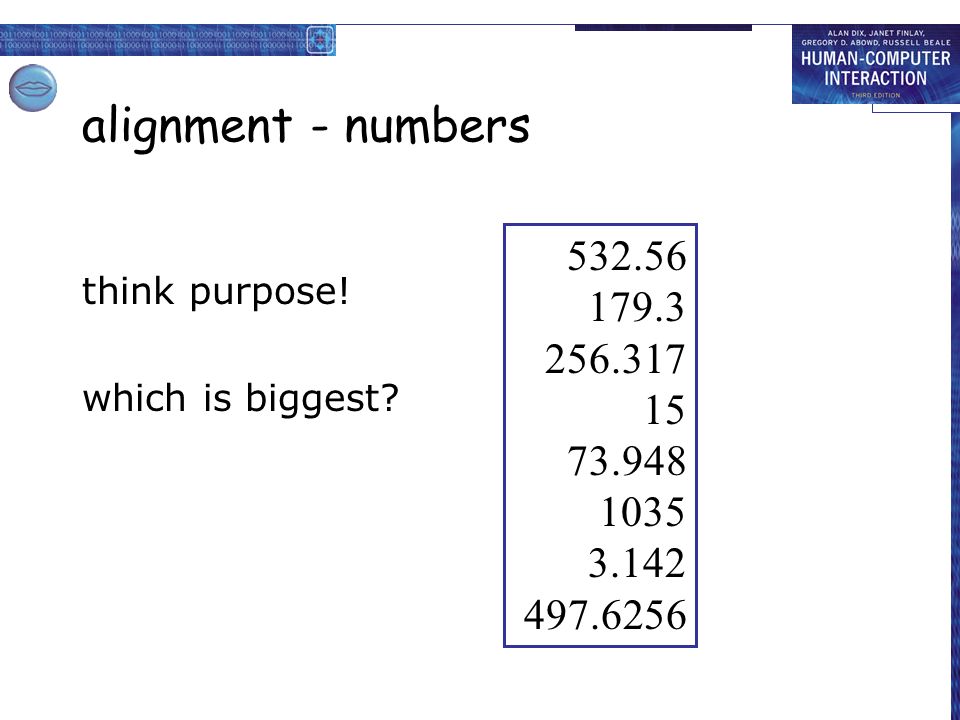
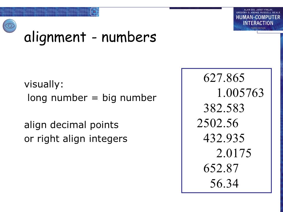
10
alignment - numbers visually: long number = big number align decimal points or right align integers
11
multiple columns scanning across gaps hard: (often hard to avoid with large data base fields) sherbert 75 toffee 120 chocolate 35 fruit gums 27 coconut dreams 85

12
multiple columns - 2 use leaders
sherbert 75 toffee 120 chocolate 35 fruit gums 27 coconut dreams 85

13
multiple columns - 3 or greying (vertical too)
sherbert 75 toffee 120 chocolate 35 fruit gums 27 coconut dreams 85

14
multiple columns - 4 or even (with care!) ‘bad’ alignment
sherbert 75 toffee 120 chocolate 35 fruit gums 27 coconut dreams 85

15
white space - the counter
WHAT YOU SEE

16
white space - the counter
WHAT YOU SEE THE GAPS BETWEEN

17
space to separate

18
space to structure

19
space to highlight

20
physical controls grouping of items defrost settings type of food
time to cook defrost settings type of food time to cook

21
physical controls grouping of items order of items type of heating
temperature time to cook start 1 1) type of heating 2 2) temperature 3 3) time to cook 4 4) start
 type of heating. 2. 2) temperature. 3. 3) time to cook. 4. 4) start.")
22
physical controls grouping of items order of items decoration
different colours for different functions lines around related buttons different colours for different functions lines around related buttons (temp up/down)
")
23
physical controls grouping of items order of items decoration
alignment centered text in buttons ? easy to scan ? centred text in buttons ? easy to scan ?

24
physical controls grouping of items order of items decoration
alignment white space gaps to aid grouping gaps to aid grouping

26
user action and control
entering information knowing what to do affordances

27
? entering information forms, dialogue boxes logical layout
Name: Address: Alan Dix Lancaster forms, dialogue boxes presentation + data input similar layout issues alignment - N.B. different label lengths logical layout use task analysis (ch15) groupings natural order for entering information top-bottom, left-right (depending on culture) set tab order for keyboard entry Name: Address: Alan Dix Lancaster ? Name: Address: Alan Dix Lancaster N.B. see extra slides for widget choice
 groupings. natural order for entering information. top-bottom, left-right (depending on culture) set tab order for keyboard entry. Name: Address: Alan Dix. Lancaster. Name: Address: Alan Dix. Lancaster. N.B. see extra slides for widget choice.")
28
knowing what to do what is active what is passive
where do you click where do you type consistent style helps e.g. web underlined links labels and icons standards for common actions language – bold = current state or action

29
appropriate appearance
presenting information aesthetics and utility colour and 3D localisation & internationalisation

30
presenting information
purpose matters sort order (which column, numeric alphabetic) text vs. diagram scatter graph vs. histogram use paper presentation principles! but add interactivity softens design choices e.g. re-ordering columns ‘dancing histograms’ (chap 21) chap10 chap5 chap1 chap14 chap20 chap8 … 12 16 17 22 27 32 name size chap1 chap10 chap11 chap12 chap13 chap14 … 17 12 51 262 83 22 size name size
 text vs. diagram. scatter graph vs. histogram. use paper presentation principles! but add interactivity. softens design choices. e.g. re-ordering columns. ‘dancing histograms’ (chap 21) chap10. chap5. chap1. chap14. chap20. chap8. … name. size. chap1. chap10. chap11. chap12. chap13. chap14. … size. name. size.")
31
aesthetics and utility
aesthetically pleasing designs increase user satisfaction and improve productivity beauty and utility may conflict mixed up visual styles easy to distinguish clean design – little differentiation confusing backgrounds behind text … good to look at, but hard to read

32
colour and 3D both often used very badly! colour 3D effects
older monitors limited palette colour over used because ‘it is there’ beware colour blind! use sparingly to reinforce other information 3D effects good for physical information and some graphs but if over used … e.g. text in perspective!! 3D pie charts

33
bad use of colour over use - without very good reason (e.g. kids’ site) colour blindness poor use of contrast do adjust your set! adjust your monitor to greys only can you still read your screen?

34
across countries and cultures
localisation & internationalisation changing interfaces for particular cultures/languages globalisation try to choose symbols etc. that work everywhere simply change language? use ‘resource’ database instead of literal text … but changes sizes, left-right order etc. deeper issues cultural assumptions and values meanings of symbols e.g tick and cross … +ve and -ve in some cultures … but … mean the same thing (mark this) in others
 in others. ")
36
prototyping

37
iteration and prototyping
getting better … … and starting well

38
prototyping you never get it right first time
if at first you don’t succeed … prototype evaluate design re-design done! OK?

39
pitfalls of prototyping
moving little by little … but to where Malverns or the Matterhorn? 1. need a good start point 2. need to understand what is wrong

Similar presentations


 Quite a bit of this is Language and culture dependent, Internationalization brings a whole new set of.>")


 4124404 Human and Computer Interaction By Juthawut Chantharamalee.>")
