Download presentation
Presentation is loading. Please wait.

1
Displays Chapter 8 Rebecca W. Boren, Ph.D.
Introduction to Human Factors Engineering IEE 437/547 Arizona State University October 17, 2011

2
What are displays? Human-made artifacts designed to support the perception of relevant system variables and further processing of that information.

3
Ways of Classifying Displays
Physical properties The tasks they are designed to support Properties of the human user that dictate the best mapping between display and task (what we learned from the chapters on vision, hearing, and cognition)
")
4
Ways of Classifying Displays
Physical properties: Color or monochrome Visual or auditory modality 3-D display or stereo

5
Ways of Classifying Displays
The tasks they are designed to support: Navigating Controlling Decision Making Learning So forth…

6
Ways of Classifying Displays
Properties of the human user that dictate the best mapping between display and task: Thirteen principles of display design Perceptual principles Mental model principles Principles based on attention Memory Principles

7
Perceptual Principles
Display Principles Perceptual Principles

8
Make displays legible (or audible)
Good contrast Font size and type How far away will the display be viewed? Use the principles for vision (ch 4) and audition (ch 5) Example: ClearviewHwy Fonts
 and audition (ch 5) Example: ClearviewHwy Fonts.")
9
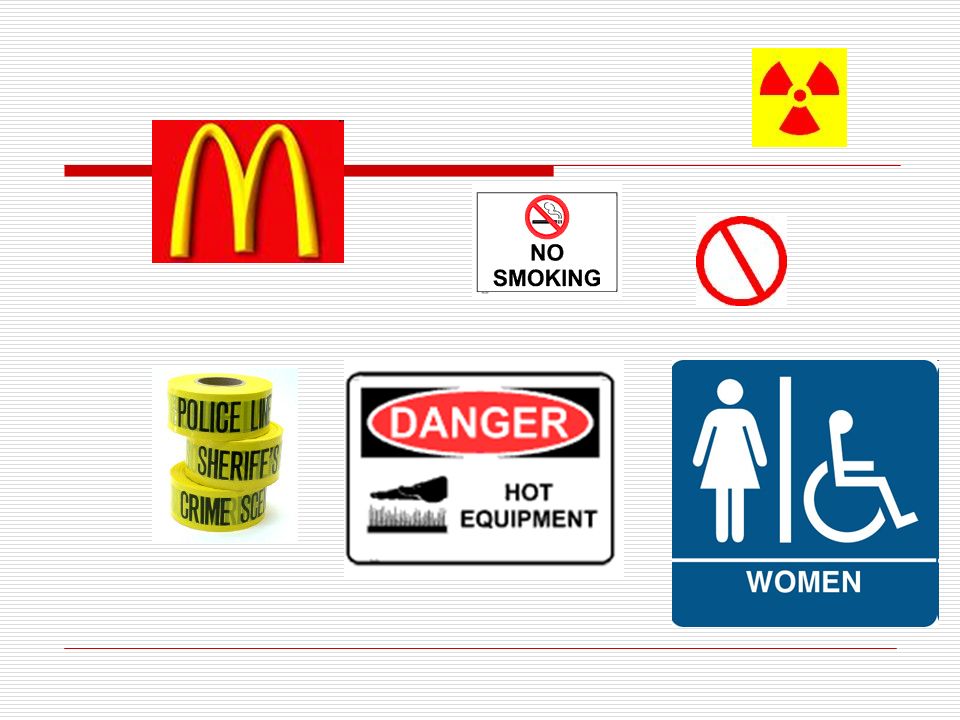
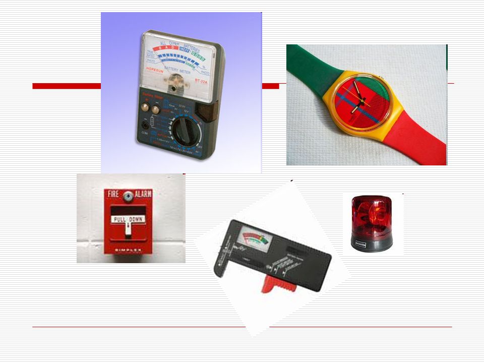
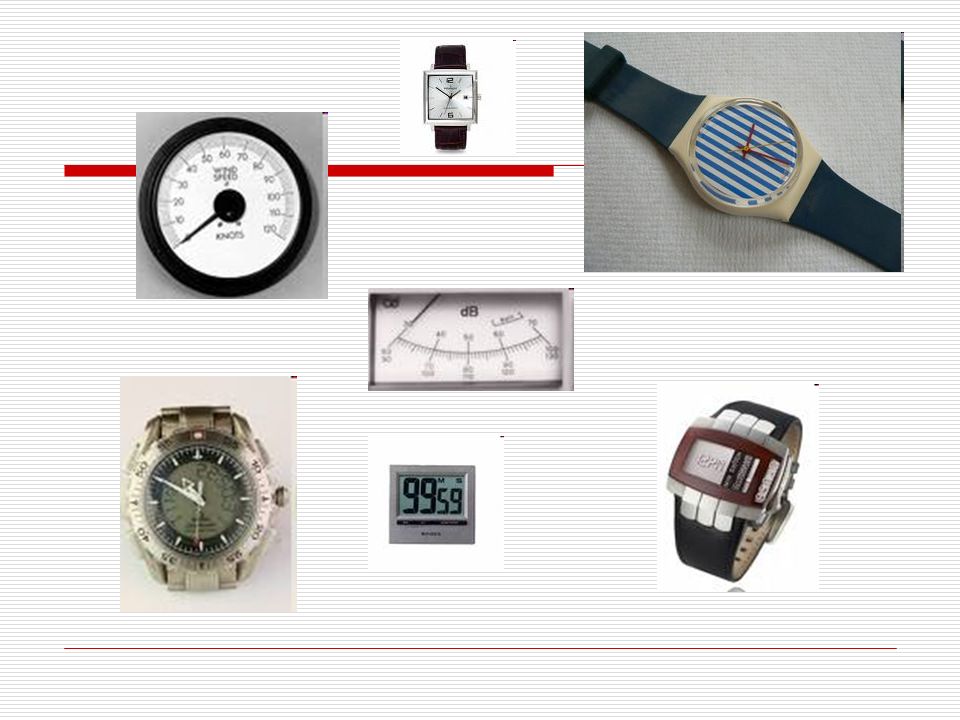
Avoid absolute judgment
Do not require users to judge the level of a variable on the basis of a single sensor variable like color or size, which contains more than five to seven possible levels.

10
The variables used to differentiate the batteries are their size and form.

11
What variable is used to differentiate
these screwdrivers?

12
What variable is used to differentiate these screwdrivers?
Answer: Length Does it conform to the Principle of Avoiding Absolute Judgment?

14
Choose a leather

15
How many colors are used in this example?

16
Does this conform to the Principle of Avoiding Absolute Judgment?
Answer: 3 Does this conform to the Principle of Avoiding Absolute Judgment?

19
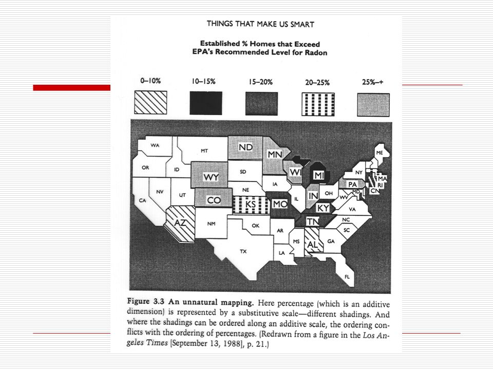
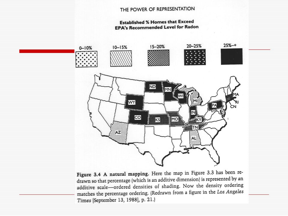
Unnatural mapping Natural mapping

20
Top-down processing People will perceive and interpret signals in accordance with what they expect to perceive on the basis of past experience. WARNING

21
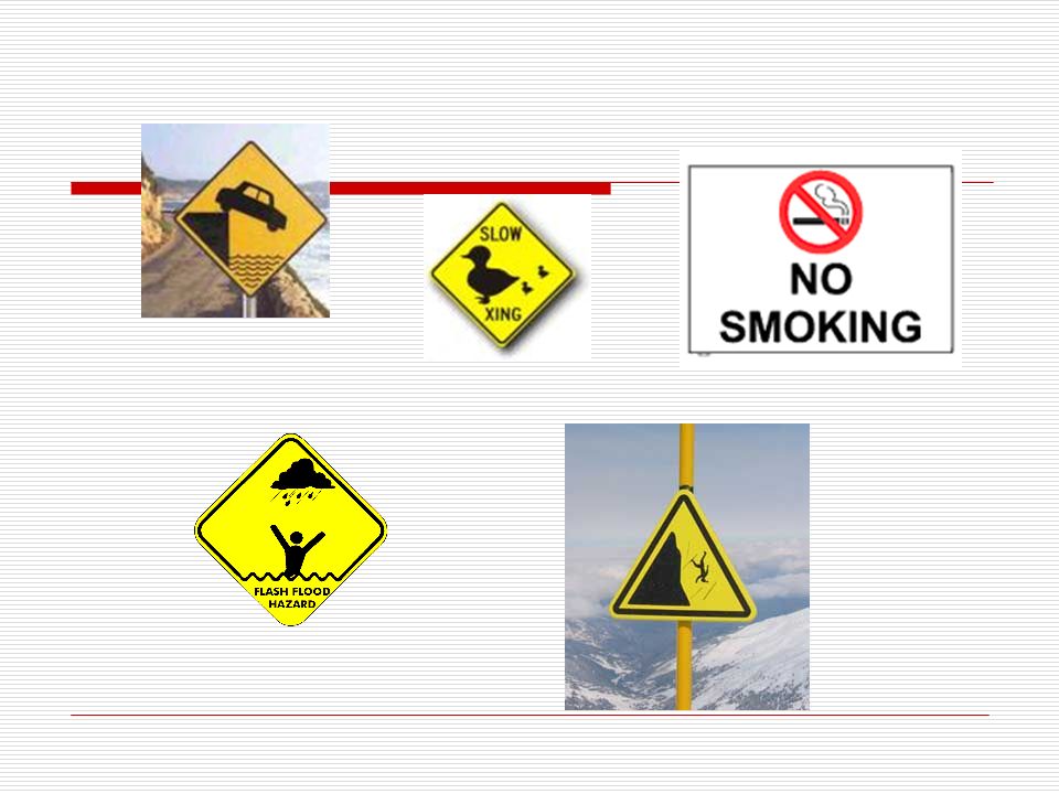
Can you identify these signs by their shape?

22
Were you correct?

23
Redundancy gain When the same message is expressed more than once, particularly if the presentation is in alternative physical forms. (In this case, color and words.)
")
24
Discriminability Similarity causes confusion

25
Discriminability Similarity causes confusion

26
Problem With the design on the left, the two displays are very similar, but represent two very different quantities. Both displays have the same numeric scale with the same incremental increases. This can cause driver confusion. Bad Good Solution To eliminate confusion, the tachometer and speedometer should be on different numeric scales, like the display on the right.

27
Mental Model Principles
Display Principles Mental Model Principles

28
Principle of pictorial realism
A display should look like the variable that it represents. X X X X

30
Quicken Check-writing Features – looks like an actual checkbook.

31
Principle of the moving part
Display variables move similarly to the way the actual parts move.

32
Principle of the moving part
Safety Blanket Uses 4 AA batteries and car plug 4 lighting modes: arrows flashing in sequence, all arrows flashing simultaneously, all arrows on at the same time, reflectors only (lights off)
")
33
Principles Based on Attention
Display Principles Principles Based on Attention

34
Minimizing information access cost
Cost is measured in time and effort of the user. Keep frequently accessed sources in such a location that the cost of traveling between them is small.

35
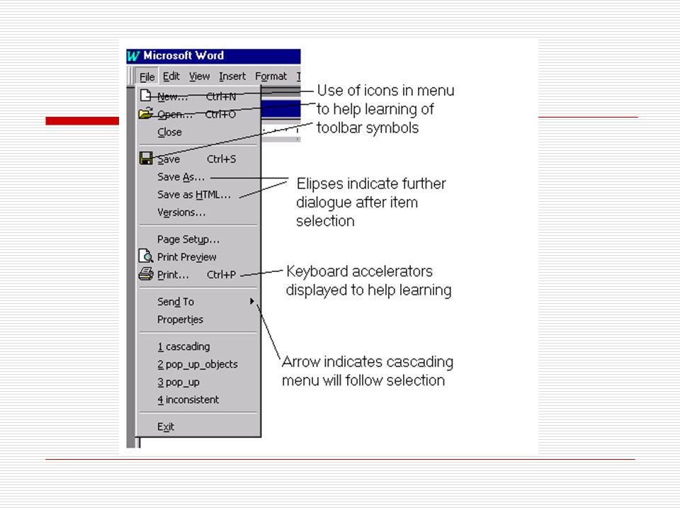
Drop-down Menus

37
Proximity compatibility principle
Sometimes two or more sources of information must be mentally integrated to complete the task. Parts of the information should be close together, but not too close.

38
Proximity compatibility principle
and (c) are better than (b) or (d)
 are better than. (b) or (d)")
39
Proximity compatibility principle

40
Principle of multiple resources
Dividing information display between modalities (audition and vision). Multiple cues to identification. Icons accompanied by words.
. Multiple cues to identification. Icons accompanied by words.")
41
Display Principles Memory Principles

42
Replace memory with visual information: Knowledge in the World
Visible reminders or statements of what is to be done. Computer on the right with labels For each device: E:, A:, D:, F:, G:.

43
Principle of predictive aiding
Help with making prediction in the future.

44
Principle of consistency
When all else fails, standardize.

46
Confusing Signs

47
Confusing Signs

48
Confusing Signs

49
Let’s look at this example of a home office.
Any Questions so far? Let’s look at this example of a home office.

50
What display principles can we apply here?

51
Why is this better?

52
What is the best way to present an alert?
Alerting Displays What is the best way to present an alert?

53
Alerting Displays Should it be visual or auditory? Could it be both?

54
Alerting Displays Three levels of alerts
Warning: most critical category; signaled by the most salient auditory alerts. Cautions: less critical, softer auditory alert. Advisories: need not be auditory. Can be visual.

55
Alerting Displays Smoke alarm Radar detector Warning light

56
Alerting Displays Aviation community has agreed on a common color code: Red for warning Amber or yellow for caution Other colors (that cannot be confused with red or amber) for advisory information.
 for advisory information.")
57
Display that is static and unchanging.
Labels Display that is static and unchanging.

58
Labels Purpose is to signal the identity or function of an entity.
Represents “knowledge in the world” Usually print, but can be an icon.

59
Design criteria for labels:
Visibility/legibility (contrast sensitivity) Discriminability (try to avoid Don’t) Meaningfulness (avoid icons only or abbreviations) Location (should be located physically close to the entity)
 Discriminability (try to avoid Don’t) Meaningfulness (avoid icons only or abbreviations) Location (should be located physically close to the entity)")
60
Monitoring Displays Potentially changing values, such as noise level, speed, temperature, etc.

61
Design criteria for monitoring displays
Legibility Analog versus digital If analog is chosen, the orientation of the display scale should be in a form and direction that is congruent with the user’s mental model. Up or right shows increase.

62
Prediction Prediction is not something humans do very well, particularly under stress. A good predictor display can aid human performance. Do not try to predict further into the future than is reasonable and necessary. Sluggishness can be a problem.

63
Multiple Displays Establish a primary visual area (PVA)
")
64
Multiple Monitors

65
The Large Display Paradox
Is a large display more productive or not?

66
Design criteria for multiple display layouts
Frequency of use. Most frequently used displays should be adjacent to the PVA. Display relatedness or sequence of use.

67
Navigation Displays serve to
Provide guidance about how to get to a destination. Facilitate planning Help recovery if the traveler becomes lost. Maintain situation awareness regarding the location of a broad range of objects.

68
Forms of navigation displays
Paper Electronic

69
Navigation may be through
Physical space, or Information space

70
Navigation Displays & Maps
Route lists & command displays work best if accompanied by a map.

71
Electronic Maps With electronic maps, detail can be achieved without sacrificing legibility if zooming capabilities are incorporated.

72
The Problem with Clutter
Clutter slows down the time to access information Slows down the time to read items, as a consequence of masking by nearby items.

73
Cluttered Map

74
Solutions to the Problem of Clutter
Effective color-coding Minimalist maps With electronic maps it is possible to highlight needed information A “you are here” or YAH indication is useful

75
Solutions to the Problem of Clutter
Minimalist Maps You Are Here Maps

76
Tables & Graphs Decide how best to display data
Legibility and clutter are issues. “Greatest amount of data with the least amount of ink”

77
Other Display Modes The most common forms of display are visual and auditory. Occasionally, touch and smell are used to alert us.

78
Olfactory Displays Olfactory relates to the sense of smell.
Natural gas does not have any odor. A stinky smell is added to warn of a gas leak.

79
IF THE RED LIGHT IS BLINKING OR YOU SMELL WINTERGREEN
– EVACUATE THE BUILDING In buildings where carbon dioxide is released when a fire is detected, an odor of wintergreen was added to the gas as a warning. E. J. McCormick & M. S. Sanders, Human Factors in Engineering and Design, 5th Ed., 1982, p. 150.

80
Tactile Displays Bott’s Dots are used on the highway to mark the lanes. They are also used on the race track to help the drivers stay on course.

81
Any Questions?

82
More displays

Similar presentations


 Map 18 November 2005.>")


, AMIE(SL), AMCS(SL)>")
 Presenter: Danny Ho Advanced Interface Design Lab University of Waterloo.>")


. This lecture will deal with the design.>")


 Mental model Senses Attention Perception.>")