Download presentation
Presentation is loading. Please wait.

2
You may place prompt over or to the left of the data-entry field; select one and be consistent. Name Tom PromptResponse Box Name Tom Prompt Response Box

3
Some database and/or prototyping tools automatically append a colon to right of all prompts; remove the colon from the prompts.

4
Each and every prompt should always be extremely clear and concise. Capitalize the beginning of each word in the prompt. Try to make your prompts so clear that an idiot can understand them and you will seldom be disappointed. Supplier ID# Minimum Quantity To Stock

5
This form still looks like a mess. It looks like someone just threw onto the screen. We will clean the format up shortly, but before we do, it would be nice if we just see the entire prompt.

6
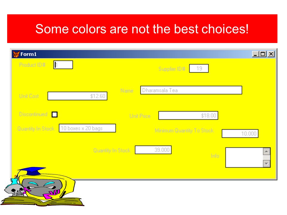
Select a form background that would be pleasant and easy to read for the person doing data-entry 8 hours at a time. White is pretty bland!

7
Some colors are not the best choices!

9
Select a font color that is compatible with your background. It should be an easy combination to read from a distance.

10
A better choice for background colors.

11
Likewise, select a font face, font size, and font color combination that would be easy to read for the person doing data-entry 8 hours at a time. Never make the prompt more bold or larger than the data. The data is more important than the prompt!

12
Opt for font clarity over cuteness.

13
It is most often a good idea to lay out your form in such a way that it has one or two major columns. Place the most important info at the top! There are certainly many exceptions.

14
Align all prompts and data horizontally.

15
Frame the form so that you have about the same amount of blank space around all four of the form borders. Avoid void spaces in form. Don’t Always Need A Prompt For Textbox Message

16
The space between rows should be consistent and not too large.

17
Left justify the data-entry fields

18
Right justify the horizontal prompts for forms. Left justify horizontal prompts for reports.

19
The distance between the prompt and the data should be small, readable, and consistent.

20
Each form should contain a clear statement of title in the title bar; the title should describe the form and the developer of the form.

21
The use of lines and boxes will enable you to place more information on a form. Organize the information in some logical pattern.

22
Multiple font faces and font sizes and font colors can decrease the usability of the form. Have a reason for those changes.

24
Consider using tab frames when your form has a lot of data. Organize it logically. Label the tabs. Use tab colorization to help user recognize each tab.

25
Programmable Interests – Note that the contact name is available on each tab so that there will never be a need to return to the personal tab for identification.

26
Information Memo – Note that the contact name is available on each tab so that there will never be a need to return to the personal tab for identification.

27
Business Info – Note contact name. Keep colors consistent throughout the many forms and many tabs of an application.

28
Use pull down combo buttons to help verify data and isolate options. Wouldn’t a combo box, or a spinner, which contained only the acceptable values be better for verifying the birthday? Wouldn’t a combo box, containing only the acceptable abbreviations for the states be better than the user selection?

29
Button names should be extremely clear.

30
Button should be well organized in some form of symmetry. Remember to frame the form.

31
We have found that next works best on the bottom right and previous works best on the bottom left. You might make more frequently used buttons larger.

32
We have found that menus on the right are not nearly as effective as menus on the bottom.

33
Rather than create one form/prototype for an edit mode and one for a normal mode, it is often possible to design a system to use one format for all. Concurrent/Multi-User The form below might reflect the normal mode. The user would enter the edit mode by selecting add or edit.

34
Rather than create one form/prototype for an edit mode and one for a normal mode, it is often possible to design a system to use one format for all. The form below might reflect the edit/add mode. The user may either save all changes or cancel them.

35
Power Users often don’t want to take the time to move the cursor from the far left previous button to the far right next button. It is perfectly all right to have different button layouts for users with different skills. Many users want lots of functionality, but do not want to consume large portions of the form with buttons. Consider using Graphical buttons!

36
All graphical buttons and text buttons can be vague. Consider using mouse over text to further clarify all button functionality.

37
Combo controls often provide a great mechanism for utilizing indexes to order data. They belong in most applications. How is your user likely to order the data?

38
Combo controls for ordering/indexing?

39
Combo controls often provide a great mechanism for utilizing filters to select sub-sets of the data. They belong in most applications. How is your user likely to want to partition the data.

40
More combo controls for filtering.

41
Software systems often involve multiple forms. Keep the look, feel, color, and controls consistent/similar. Avoid too many background colors, too many font colors, and too many font faces! Navigate! There must be some obvious way to get to all portions of the system to all other portions of the system. Main Menu is one option!

42
Obvious is not “Right Mouse Click On The Form & Select……

Similar presentations


 10 IST – Topic 6.>")


