Download presentation
Presentation is loading. Please wait.

1
Statistical Analysis IB Diploma Biology Stephen Taylor Image: 'Hummingbird Checks Out Flower' http://www.flickr.com/photos/25659032@N07/7200193254 http://www.flickr.com/photos/25659032@N07/7200193254 Found on flickrcc.net

2
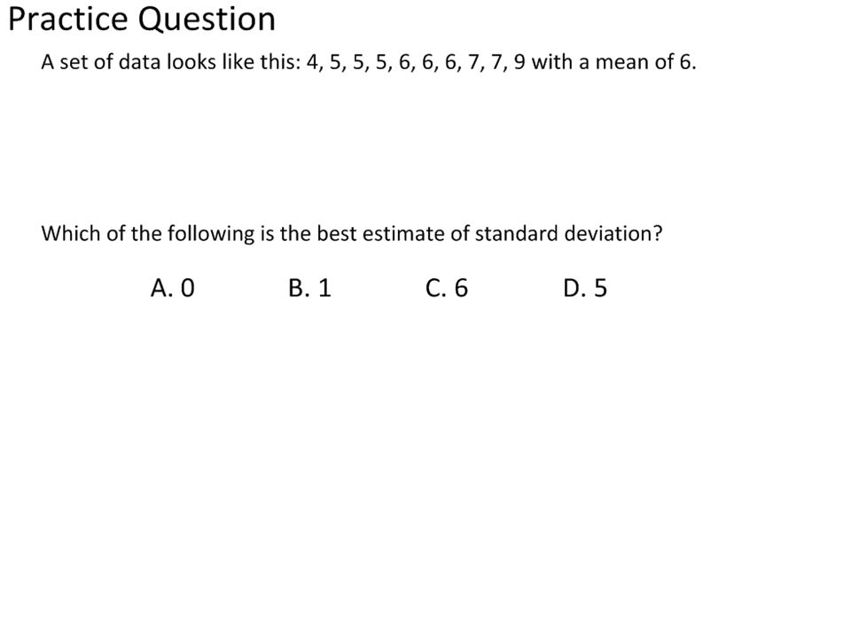
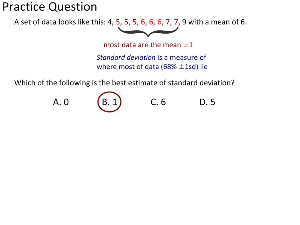
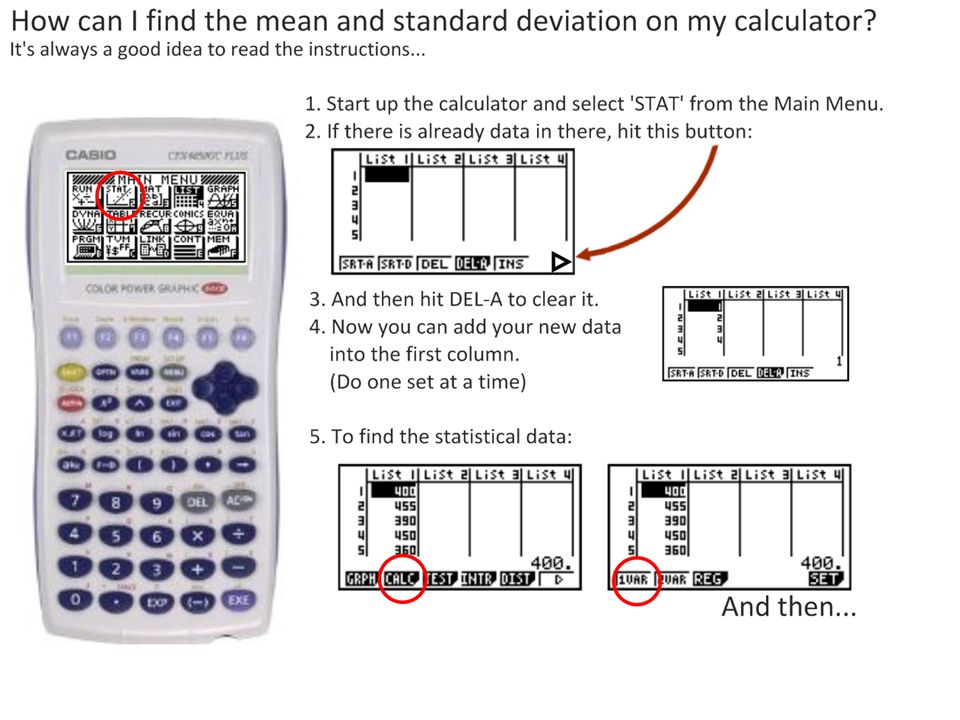
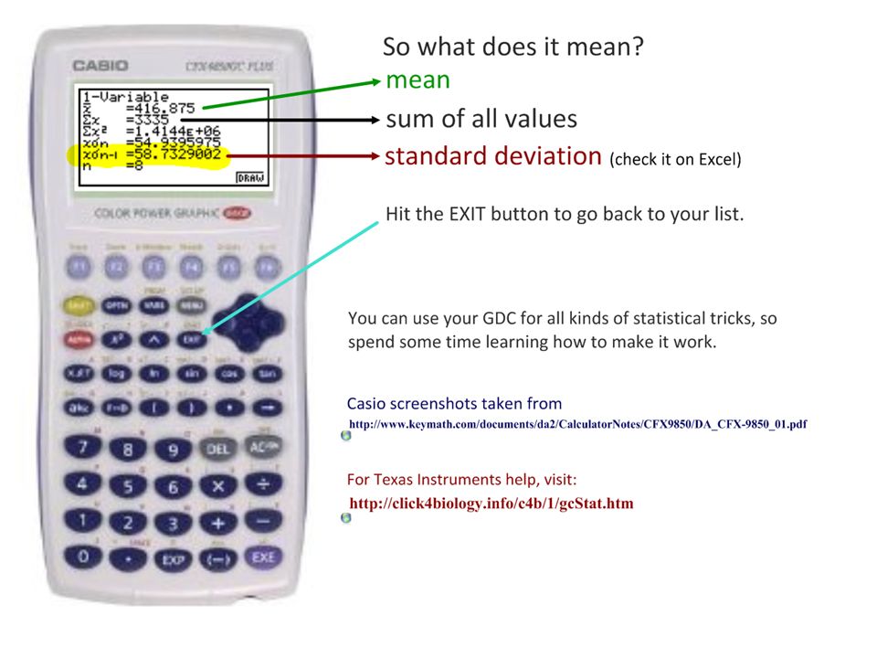
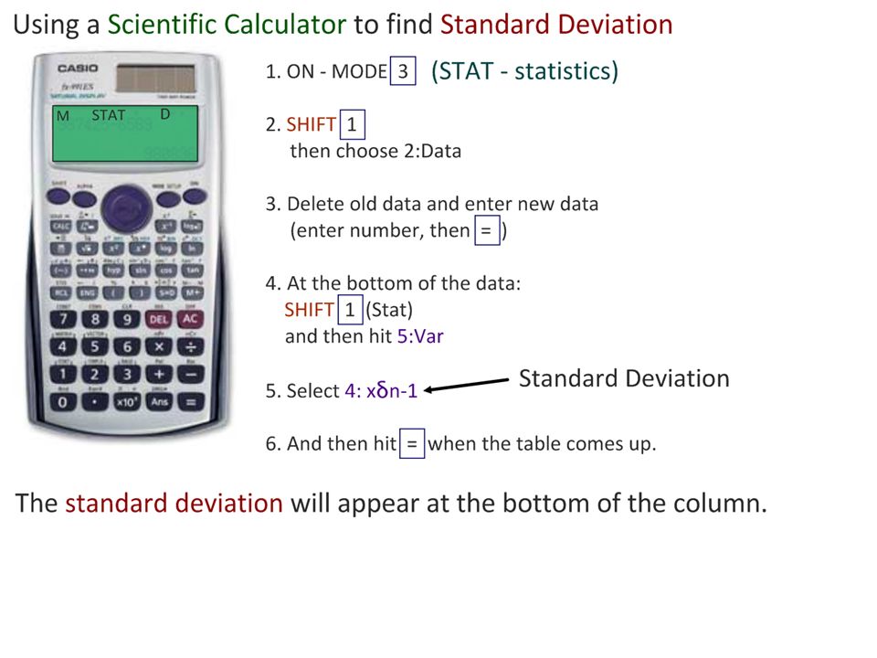
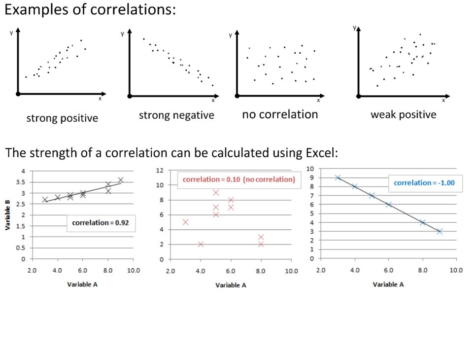
Assessment StatementsObj. 1.1.1 State that error bars are a graphical representation of the variability of data. Range and standard deviation show the variability/ spread in the data 95% Confidence Interval error bars suggest significance of difference where there is no overlap. 1 1.1.2 Calculate the mean and standard deviation of a set of values Using Excel (Formula =STDEV(rawdata)) Using your calculator 2 1.1.3 State that the term standard deviation (s) is used to summarize the spread of values around the mean, and that 68% of all data fall within (±) 1 standard deviation of the mean. 1 1.1.4 Explain how the standard deviation is useful for comparing the means and the spread of data between two or more samples. A greater standard deviation shows a greater variability of data around the mean. This can be used to infer reliability in methods or results. 3 1.1.5 Deduce the significance of the difference between two sets of data using calculated values for t and the appropriate tables. Using t-values, t-tables and critical values Directly calculating P values using Excel in lab reports. 3 1.1.6 Explain that the existence of a correlation does not establish that there is a causal relationship between two variables. 3 Assessment statements from: Online IB Biology Subject GuideOnline IB Biology Subject GuideCommand terms: http://i-biology.net/ibdpbio/command-terms/http://i-biology.net/ibdpbio/command-terms/
) Using your calculator State that the term standard deviation (s) is used to summarize the spread of values around the mean, and that 68% of all data fall within (±) 1 standard deviation of the mean Explain how the standard deviation is useful for comparing the means and the spread of data between two or more samples. A greater standard deviation shows a greater variability of data around the mean. This can be used to infer reliability in methods or results Deduce the significance of the difference between two sets of data using calculated values for t and the appropriate tables. Using t-values, t-tables and critical values Directly calculating P values using Excel in lab reports Explain that the existence of a correlation does not establish that there is a causal relationship between two variables. 3 Assessment statements from: Online IB Biology Subject GuideOnline IB Biology Subject GuideCommand terms:")
3
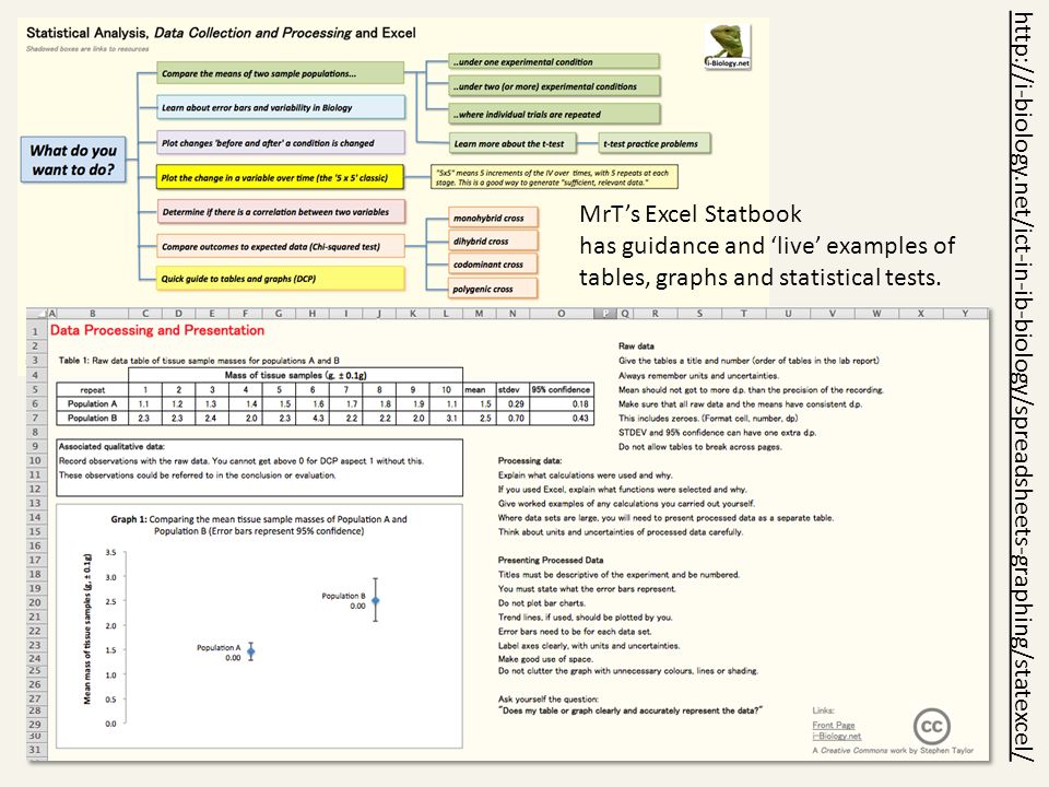
MrT’s Excel Statbook has guidance and ‘live’ examples of tables, graphs and statistical tests. http://i-biology.net/ict-in-ib-biology/spreadsheets-graphing/statexcel/
4
“Why is this Biology?” Variation in populations. Variability in results. affects Confidence in conclusions. The key methodology in Biology is hypothesis testing through experimentation. Carefully-designed and controlled experiments and surveys give us quantitative (numeric) data that can be compared. We can use the data collected to test our hypothesis and form explanations of the processes involved… but only if we can be confident in our results. We therefore need to be able to evaluate the reliability of a set of data and the significance of any differences we have found in the data. Image: 'Transverse section of part of a stem of a Dead-nettle (Lamium sp.) showing+a+vascular+bundle+and+part+of+the+cortex' http://www.flickr.com/photos/71183136@N08/6959590092http://www.flickr.com/photos/71183136@N08/6959590092 Found on flickrcc.net
 data that can be compared. We can use the data collected to test our hypothesis and form explanations of the processes involved… but only if we can be confident in our results. We therefore need to be able to evaluate the reliability of a set of data and the significance of any differences we have found in the data. Image: Transverse section of part of a stem of a Dead-nettle (Lamium sp.) showing+a+vascular+bundle+and+part+of+the+cortex Found on flickrcc.net.")
5
“Which medicine should I prescribe?” Image from: http://www.msf.org/international-activity-report-2010-sierra-leonehttp://www.msf.org/international-activity-report-2010-sierra-leone Donate to Medecins Sans Friontiers through Biology4Good: http://i-biology.net/about/biology4good/http://i-biology.net/about/biology4good/

6
“Which medicine should I prescribe?” Image from: http://www.msf.org/international-activity-report-2010-sierra-leonehttp://www.msf.org/international-activity-report-2010-sierra-leone Donate to Medecins Sans Friontiers through Biology4Good: http://i-biology.net/about/biology4good/http://i-biology.net/about/biology4good/ Generic drugs are out-of-patent, and are much cheaper than the proprietary (brand-name) equivalents. Doctors need to balance needs with available resources. Which would you choose?

7
“Which medicine should I prescribe?” Image from: http://www.msf.org/international-activity-report-2010-sierra-leonehttp://www.msf.org/international-activity-report-2010-sierra-leone Donate to Medecins Sans Friontiers through Biology4Good: http://i-biology.net/about/biology4good/http://i-biology.net/about/biology4good/ Means (averages) in Biology are almost never good enough. Biological systems (and our results) show variability. Which would you choose now?
 show variability. Which would you choose now .")
8
Hummingbirds are nectarivores (herbivores that feed on the nectar of some species of flower). In return for food, they pollinate the flower. This is an example of mutualism – benefit for all. As a result of natural selection, hummingbird bills have evolved. Birds with a bill best suited to their preferred food source have the greater chance of survival. Photo: Archilochus colubris, from wikimedia commons, by Dick Daniels.wikimedia commonsDick Daniels

9
Researchers studying comparative anatomy collect data on bill-length in two species of hummingbirds: Archilochus colubris (red-throated hummingbird) and Cynanthus latirostris (broadbilled hummingbird). To do this, they need to collect sufficient relevant, reliable data so they can test the Null hypothesis (H 0 ) that: “there is no significant difference in bill length between the two species.” Photo: Archilochus colubris (male), wikimedia commons, by Joe Schneidwikimedia commons
 that: there is no significant difference in bill length between the two species. Photo: Archilochus colubris (male), wikimedia commons, by Joe Schneidwikimedia commons.")
10
The sample size must be large enough to provide sufficient reliable data and for us to carry out relevant statistical tests for significance. We must also be mindful of uncertainty in our measuring tools and error in our results. Photo: Broadbilled hummingbird (wikimedia commons).wikimedia commons
.wikimedia commons.")
12
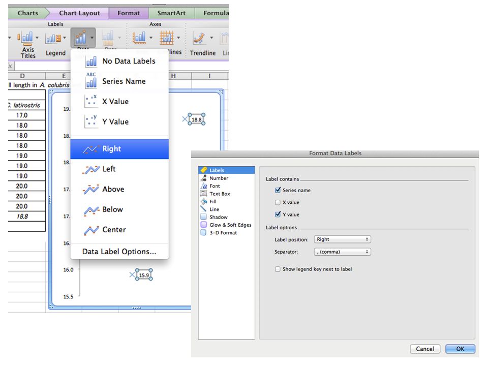
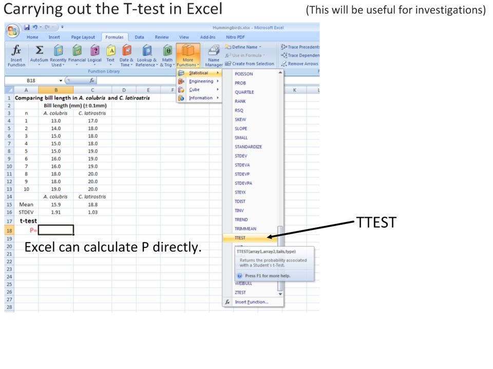
The mean is a measure of the central tendency of a set of data. Table 1: Raw measurements of bill length in A. colubris and C. latirostris. Bill length (±0.1mm) nA. colubrisC. latirostris 113.017.0 214.018.0 315.018.0 415.018.0 515.019.0 616.019.0 716.019.0 818.020.0 918.020.0 1019.020.0 Mean s Calculate the mean using: Your calculator (sum of values / n) Excel =AVERAGE(highlight raw data) n = sample size. The bigger the better. In this case n=10 for each group. All values should be centred in the cell, with decimal places consistent with the measuring tool uncertainty.
 nA. colubrisC. latirostris Mean s Calculate the mean using: Your calculator (sum of values / n) Excel =AVERAGE(highlight raw data) n = sample size. The bigger the better. In this case n=10 for each group. All values should be centred in the cell, with decimal places consistent with the measuring tool uncertainty..")
13
The mean is a measure of the central tendency of a set of data. Table 1: Raw measurements of bill length in A. colubris and C. latirostris. Bill length (±0.1mm) nA. colubrisC. latirostris 113.017.0 214.018.0 315.018.0 415.018.0 515.019.0 616.019.0 716.019.0 818.020.0 918.020.0 1019.020.0 Mean 15.918.8 s Raw data and the mean need to have consistent decimal places (in line with uncertainty of the measuring tool) Uncertainties must be included. Descriptive table title and number.
 nA. colubrisC. latirostris Mean s Raw data and the mean need to have consistent decimal places (in line with uncertainty of the measuring tool) Uncertainties must be included. Descriptive table title and number..")
15
DELETE X DELETE X

18
Descriptive title, with graph number. Labeled point Y-axis clearly labeled, with uncertainty. Make sure that the y-axis begins at zero. x-axis labeled

19
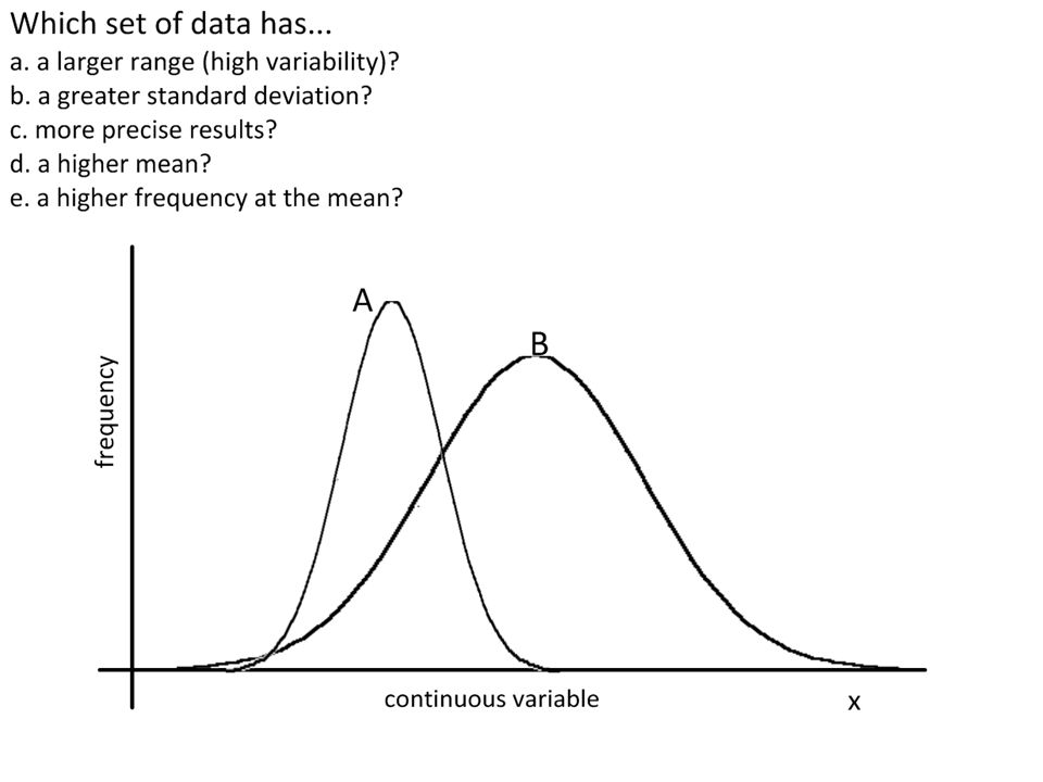
From the means alone you might conclude that C. latirostris has a longer bill than A. colubris. But the mean only tells part of the story.

31
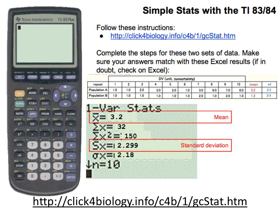
http://click4biology.info/c4b/1/gcStat.htm
32
http://mathbits.com/MathBits/TINSection/Statistics1/Spreadsheet.html

35
Standard deviation is a measure of the spread of most of the data. Table 1: Raw measurements of bill length in A. colubris and C. latirostris. Bill length (±0.1mm) nA. colubrisC. latirostris 113.017.0 214.018.0 315.018.0 415.018.0 515.019.0 616.019.0 716.019.0 818.020.0 918.020.0 1019.020.0 Mean 15.918.8 s 1.911.03 Standard deviation can have one more decimal place. =STDEV (highlight RAW data). Which of the two sets of data has: a.The longest mean bill length? a.The greatest variability in the data?
 nA. colubrisC. latirostris Mean s Standard deviation can have one more decimal place. =STDEV (highlight RAW data). Which of the two sets of data has: a.The longest mean bill length. a.The greatest variability in the data .")
36
Standard deviation is a measure of the spread of most of the data. Table 1: Raw measurements of bill length in A. colubris and C. latirostris. Bill length (±0.1mm) nA. colubrisC. latirostris 113.017.0 214.018.0 315.018.0 415.018.0 515.019.0 616.019.0 716.019.0 818.020.0 918.020.0 1019.020.0 Mean 15.918.8 s 1.911.03 Standard deviation can have one more decimal place. =STDEV (highlight RAW data). Which of the two sets of data has: a.The longest mean bill length? a.The greatest variability in the data? C. latirostris A. colubris
 nA. colubrisC. latirostris Mean s Standard deviation can have one more decimal place. =STDEV (highlight RAW data). Which of the two sets of data has: a.The longest mean bill length. a.The greatest variability in the data. C. latirostris A. colubris.")
37
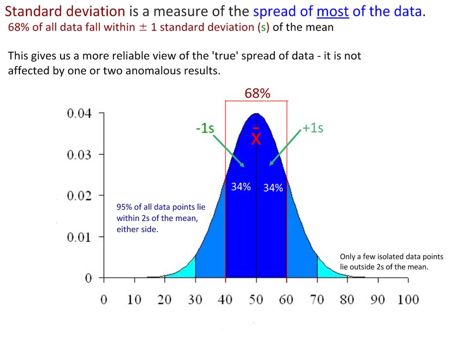
Standard deviation is a measure of the spread of most of the data. Error bars are a graphical representation of the variability of data. Which of the two sets of data has: a.The highest mean? a.The greatest variability in the data? A B Error bars could represent standard deviation, range or confidence intervals.

38
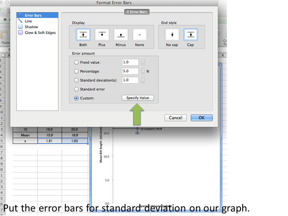
Put the error bars for standard deviation on our graph.

40
Delete the horizontal error bars

41
Title is adjusted to show the source of the error bars. This is very important. You can see the clear difference in the size of the error bars. Variability has been visualised. The error bars overlap somewhat. What does this mean?

42
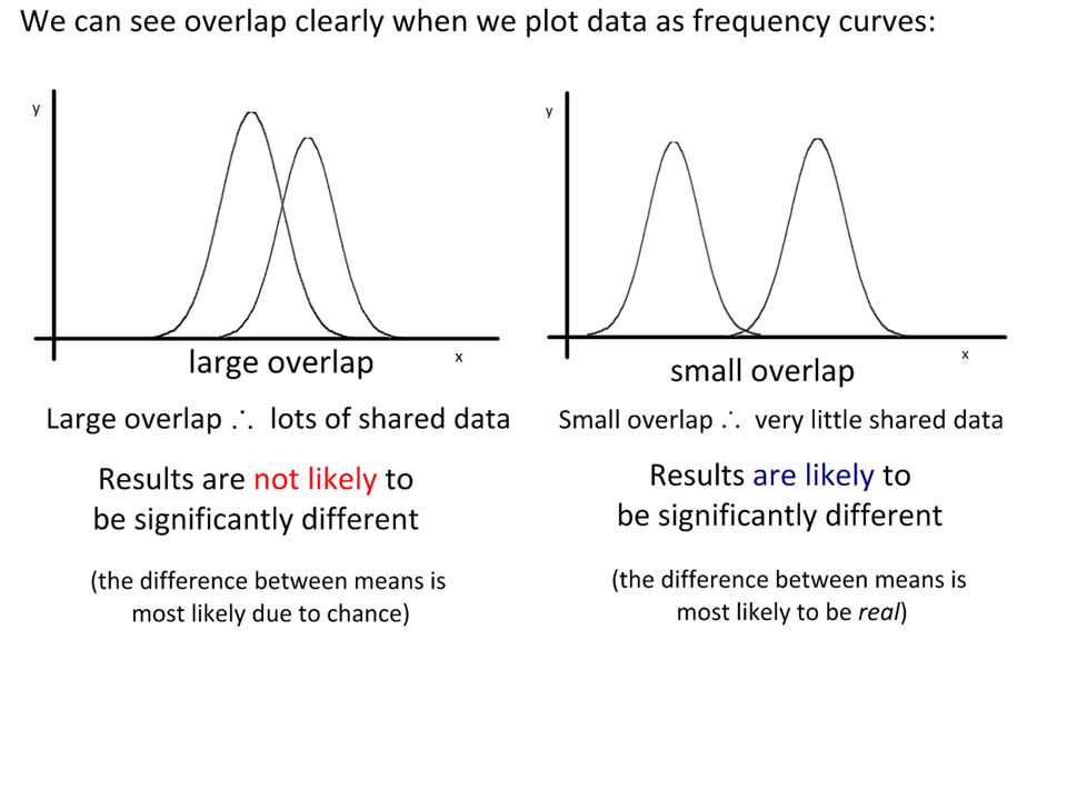
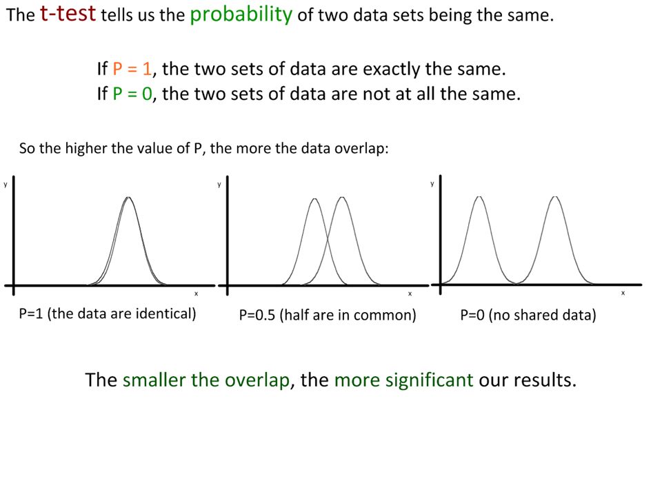
The overlap of a set of error bars gives a clue as to the significance of the difference between two sets of data. Large overlap No overlap Lots of shared data points within each data set. Results are not likely to be significantly different from each other. Any difference is most likely due to chance. No (or very few) shared data points within each data set. Results are more likely to be significantly different from each other. The difference is more likely to be ‘real’.
 shared data points within each data set. Results are more likely to be significantly different from each other. The difference is more likely to be ‘real’..")
46
Our results show a very small overlap between the two sets of data. So how do we know if the difference is significant or not? We need to use a statistical test. The t-test is a statistical test that helps us determine the significance of the difference between the means of two sets of data.

48
The Null Hypothesis (H 0 ): “There is no significant difference.” This is the ‘default’ hypothesis that we always test. In our conclusion, we either accept the null hypothesis or reject it. A t-test can be used to test whether the difference between two means is significant. If we accept H 0, then the means are not significantly different. If we reject H 0, then the means are significantly different. Remember: We are never ‘trying’ to get a difference. We design carefully-controlled experiments and then analyse the results using statistical analysis.

49
P value =0.10.050.020.01 confidence 90%95%98%99% degrees of freedom 16.3112.7131.8263.66 22.924.306.969.92 32.353.184.545.84 42.132.783.754.60 52.022.573.374.03 61.942.453.143.71 71.892.363.003.50 81.862.312.903.36 91.832.262.823.25 101.812.232.763.17 We can calculate the value of ‘t’ for a given set of data and compare it to critical values that depend on the size of our sample and the level of confidence we need. Example two-tailed t-table. “Degrees of Freedom (df)” is the total sample size minus two. What happens to the value of P as the confidence in the results increases? What happens to the critical value as the confidence level increases? “critical values”
 is the total sample size minus two. What happens to the value of P as the confidence in the results increases. What happens to the critical value as the confidence level increases. critical values .")
50
P value =0.10.050.020.01 confidence 90%95%98%99% degrees of freedom 16.3112.7131.8263.66 22.924.306.969.92 32.353.184.545.84 42.132.783.754.60 52.022.573.374.03 61.942.453.143.71 71.892.363.003.50 81.862.312.903.36 91.832.262.823.25 101.812.232.763.17 We can calculate the value of ‘t’ for a given set of data and compare it to critical values that depend on the size of our sample and the level of confidence we need. Example two-tailed t-table. “Degrees of Freedom (df)” is the total sample size minus two*. We usually use P<0.05 (95% confidence) in Biology, as our data can be highly variable *Simple explanation: we are working in two directions – within each population and across populations. “critical values”
 is the total sample size minus two*. We usually use P<0.05 (95% confidence) in Biology, as our data can be highly variable *Simple explanation: we are working in two directions – within each population and across populations. critical values .")
51
2-tailed t-table source: http://www.medcalc.org/manual/t-distribution.phphttp://www.medcalc.org/manual/t-distribution.php

52
t was calculated as 2.15 (this is done for you) t cv 2.15 If t < cv, accept H 0 (there is no significant difference) If t > cv, reject H 0 (there is a significant difference) 2-tailed t-table source: http://www.medcalc.org/manual/t-distribution.phphttp://www.medcalc.org/manual/t-distribution.php
 t cv 2.15 If t < cv, accept H 0 (there is no significant difference) If t > cv, reject H 0 (there is a significant difference) 2-tailed t-table source:")
53
0.05 t was calculated as 2.15 (this is done for you) t cv 2.15 If t < cv, accept H 0 (there is no significant difference) If t > cv, reject H 0 (there is a significant difference) 2-tailed t-table source: http://www.medcalc.org/manual/t-distribution.phphttp://www.medcalc.org/manual/t-distribution.php
 t cv 2.15 If t < cv, accept H 0 (there is no significant difference) If t > cv, reject H 0 (there is a significant difference) 2-tailed t-table source:")
54
2.069 0.05 t was calculated as 2.15 (this is done for you) t cv 2.15 > 2.069 If t < cv, accept H 0 (there is no significant difference) If t > cv, reject H 0 (there is a significant difference) 2-tailed t-table source: http://www.medcalc.org/manual/t-distribution.phphttp://www.medcalc.org/manual/t-distribution.php
 t cv 2.15 > If t < cv, accept H 0 (there is no significant difference) If t > cv, reject H 0 (there is a significant difference) 2-tailed t-table source:")
55
2.069 0.05 t was calculated as 2.15 (this is done for you) t cv 2.15 > 2.069 If t < cv, accept H 0 (there is no significant difference) If t > cv, reject H 0 (there is a significant difference) Conclusion: “There is a significant difference in the wing spans of the two populations of birds.” 2-tailed t-table source: http://www.medcalc.org/manual/t-distribution.phphttp://www.medcalc.org/manual/t-distribution.php
 t cv 2.15 > If t < cv, accept H 0 (there is no significant difference) If t > cv, reject H 0 (there is a significant difference) Conclusion: There is a significant difference in the wing spans of the two populations of birds. 2-tailed t-table source:")
56
2-tailed t-table source: http://www.medcalc.org/manual/t-distribution.phphttp://www.medcalc.org/manual/t-distribution.php

57
2-tailed t-table source: http://www.medcalc.org/manual/t-distribution.phphttp://www.medcalc.org/manual/t-distribution.php

58
2.045 2-tailed t-table source: http://www.medcalc.org/manual/t-distribution.phphttp://www.medcalc.org/manual/t-distribution.php “There is no significant difference in the size of shells between north-side and south-side snail populations.”

59
2-tailed t-table source: http://www.medcalc.org/manual/t-distribution.phphttp://www.medcalc.org/manual/t-distribution.php

60
2.086 2-tailed t-table source: http://www.medcalc.org/manual/t-distribution.phphttp://www.medcalc.org/manual/t-distribution.php “There is a significant difference in the resting heart rates between the two groups of swimmers.”

61
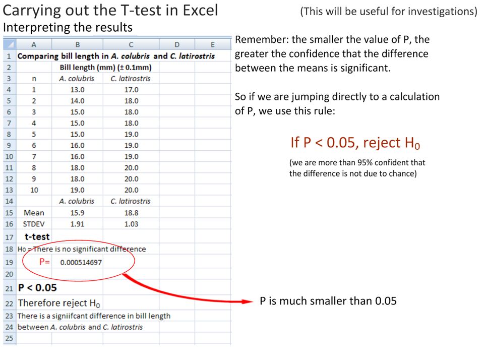
Excel can jump straight to a value of P for our results. One function (=ttest) compares both sets of data. As it calculates P directly (the probability that the difference is due to chance), we can determine significance directly. In this case, P=0.00051 This is much smaller than 0.005, so we are confident that we can: reject H 0. The difference is unlikely to be due to chance. Conclusion: There is a significant difference in bill length between A. colubris and C. latirostris.
 compares both sets of data. As it calculates P directly (the probability that the difference is due to chance), we can determine significance directly. In this case, P= This is much smaller than 0.005, so we are confident that we can: reject H 0. The difference is unlikely to be due to chance. Conclusion: There is a significant difference in bill length between A. colubris and C. latirostris..")
63
Two tails: we assume data are normally distributed, with two ‘tails’ moving away from mean. Type 2 (unpaired): we are comparing one whole population with the other whole population. (Type 1 pairs the results of each individual in set A with the same individual in set B).
: we are comparing one whole population with the other whole population. (Type 1 pairs the results of each individual in set A with the same individual in set B)..")
65
95% Confidence Intervals can also be plotted as error bars. These give a clearer indication of the significance of a result: Where there is overlap, there is not a significant difference Where there is no overlap, there is a significant difference. If the overlap (or difference) is small, a t-test should still be carried out. no overlap =CONFIDENCE.NORM(0.05,stdev,samplesize) e.g =CONFIDENCE.NORM(0.05,C15,10)
 is small, a t-test should still be carried out. no overlap =CONFIDENCE.NORM(0.05,stdev,samplesize) e.g =CONFIDENCE.NORM(0.05,C15,10).")
66
Error bars can have very different purposes. Standard deviation You really need to know this Look for relative size of bars Used to indicate spread of most of the data around the mean Can imply reliability of data 95% Confidence Intervals Adds value to labs where we are looking for differences. Look for overlap, not size Overlap no sig. diff. No overlap sig. dif.

67
Interesting Study: Do “Better” Lecturers Cause More Learning? Find out more here: http://priceonomics.com/is-this-why-ted-talks-seem-so-convincing/http://priceonomics.com/is-this-why-ted-talks-seem-so-convincing/ Students watched a one-minute video of a lecture. In one video, the lecturer was fluent and engaging. In the other video, the lecturer was less fluent. They predicted how much they would learn on the topic (genetics) and this was compared to their actual score. (Error bars = standard deviation). n=21
 and this was compared to their actual score. (Error bars = standard deviation). n=21.")
68
Interesting Study: Do “Better” Lecturers Cause More Learning? Find out more here: http://priceonomics.com/is-this-why-ted-talks-seem-so-convincing/http://priceonomics.com/is-this-why-ted-talks-seem-so-convincing/ Students watched a one-minute video of a lecture. In one video, the lecturer was fluent and engaging. In the other video, the lecturer was less fluent. They predicted how much they would learn on the topic (genetics) and this was compared to their actual score. (Error bars = standard deviation). Is there a significant difference in the actual learning? n=21
 and this was compared to their actual score. (Error bars = standard deviation). Is there a significant difference in the actual learning. n=21.")
69
Interesting Study: Do “Better” Lecturers Cause More Learning? Find out more here: http://priceonomics.com/is-this-why-ted-talks-seem-so-convincing/http://priceonomics.com/is-this-why-ted-talks-seem-so-convincing/ Evaluate the study: 1. What do the error bars (standard deviation) tell us about reliability? 2.How valid is the study in terms of sufficiency of data (population sizes (n))? n=21
 tell us about reliability. 2.How valid is the study in terms of sufficiency of data (population sizes (n)). n=21.")
70
Dog fleas jump higher that cat fleas, winner of the IgNobel prize for Biology, 2008. http://www.youtube.com/watch?v=fJEZg4QN760

71
P value =0.10.050.020.010.005 confidence 90%95%98%99%99.50% degrees of freedom 16.3112.7131.8263.66127.34 22.924.306.969.9214.09 32.353.184.545.847.45 42.132.783.754.605.60 52.022.573.374.034.77 61.942.453.143.714.32 71.892.363.003.504.03 81.862.312.903.363.83 91.832.262.823.253.69 101.812.232.763.173.58 degrees of freedom 111.802.202.723.113.50 121.782.182.683.053.43 131.772.162.653.013.37 141.762.142.622.983.33 151.752.132.602.953.29 161.752.122.582.923.25 171.742.112.572.903.22 181.732.102.552.883.20 191.732.092.542.863.17 201.722.092.532.853.15 degrees of freedom 211.722.082.522.833.14 221.722.072.512.823.12 231.712.072.502.813.10 241.712.062.492.803.09 251.712.062.492.793.08 261.712.062.482.783.07 271.702.052.472.773.06 281.702.052.472.763.05 291.702.052.462.763.04 301.702.042.462.753.03 degrees of freedom 311.702.042.452.743.02 321.692.042.452.743.02 331.692.032.442.733.01 341.692.032.442.733.00 351.692.032.442.723.00 361.692.032.432.722.99 371.692.032.432.722.99 381.692.022.432.712.98 391.682.022.432.712.98 401.682.022.422.702.97

72
Cartoon from: http://www.xkcd.com/552/http://www.xkcd.com/552/ Correlation does not imply causation, but it does waggle its eyebrows suggestively and gesture furtively while mouthing "look over there."

76
From MrT’s Excel Statbook.MrT’s Excel Statbook

77
http://diabetes-obesity.findthedata.org/b/240/Correlations-between-diabetes-obesity-and-physical-activity Interpreting Graphs: See – Think – Wonder See: What is factual about the graph? What are the axes? What is being plotted What values are present? Think: How is the graph interpreted? What relationship is present? Is cause implied? What explanations are possible and what explanations are not possible? Wonder: Questions about the graph. What do you need to know more about? See – Think - Wonder Visible Thinking Routine

78
http://diabetes-obesity.findthedata.org/b/240/Correlations-between-diabetes-obesity-and-physical-activity Diabetes and obesity are ‘ risk factors ’ of each other. There is a strong correlation between them, but does this mean one causes the other?

79
Correlation does not imply causality. Pirates vs global warming, from http://en.wikipedia.org/wiki/Flying_Spaghetti_Monster#Pirates_and_global_warminghttp://en.wikipedia.org/wiki/Flying_Spaghetti_Monster#Pirates_and_global_warming

80
Correlation does not imply causality. Pirates vs global warming, from http://en.wikipedia.org/wiki/Flying_Spaghetti_Monster#Pirates_and_global_warminghttp://en.wikipedia.org/wiki/Flying_Spaghetti_Monster#Pirates_and_global_warming Where correlations exist, we must then design solid scientific experiments to determine the cause of the relationship. Sometimes a correlation exist because of confounding variables – conditions that the correlated variables have in common but that do not directly affect each other. To be able to determine causality through experimentation we need: One clearly identified independent variable Carefully measured dependent variable(s) that can be attributed to change in the independent variable Strict control of all other variables that might have a measurable impact on the dependent variable. We need: sufficient relevant, repeatable and statistically significant data. Some known causal relationships: Atmospheric CO 2 concentrations and global warming Atmospheric CO 2 concentrations and the rate of photosynthesis Temperature and enzyme activity
 that can be attributed to change in the independent variable Strict control of all other variables that might have a measurable impact on the dependent variable. We need: sufficient relevant, repeatable and statistically significant data. Some known causal relationships: Atmospheric CO 2 concentrations and global warming Atmospheric CO 2 concentrations and the rate of photosynthesis Temperature and enzyme activity.")
82
Flamenco Dancer, by Steve Corey http://www.flickr.com/photos/22016744@N06/7952552148

83
i-Biology.net This is a Creative Commons presentation. It may be linked and embedded but not sold or re-hosted. Please consider a donation to charity via Biology4Good. Click here for more information about Biology4Good charity donations. @IBiologyStephen

Similar presentations


>")


 Collecting evidence (often in the form of numerical data)>")


: Two-tail Tests & Confidence Intervals Fall, 2008.>")