Download presentation
Presentation is loading. Please wait.

1
Reviewing my Document By Sebastian Sergent

2
Introduction In this evaluation of my own document I will talk about how it meets the user requirements of the audience, how I structured it, what I did to improve the document and any design problems I had at the start.

3
User requirements Included in this will be three worksheets within my spreadsheet called: Trip and tutor information. Main Table tutor Information. Pivot and table outputs. The three worksheets all aim towards making the user requirements of the audience as well as looking presentable at the same time.

4
Trip and tutor information (page 2 on the spreadsheet). This is the table on the second spreadsheet page containing information about the reward trips with their prices. This table contains information about the teachers and the houses their in. This table just contains information about what the activities are.

5
Main table Tutor Information.(half of the page) Pupil First Name Pupil Surname Year Group House Total Achievement points Total Behaviour points This half of the work page presents all the data from the tables on page 2 and then makes it much more easier for the audience to understand. It does this by either colour coding the information or putting it into alphabetical order.

6
Other Half of the page Net points Reward Type Activity Chosen Date Price Discount Total with discount Paid? This half of the web sheet interprets the data using formulas into other columns so that its easier to understand, looks more appealing to the audience and creates a better overall output for the data.

7
Pivot and table output data This table presents the number of people per trip using the information presented on page 2. This is raw data made clearer to understand through using a table. This table presents the total amount of achievement points of students that are in each house. The information in this table is output from the raw data tables on page 2 however uses a separate formula to gather the total figures.

8
Table that shows the total number of people doing activities chosen per year group. Table that shows the total amount of achievement points chosen per activity. This uses information from the main tables spread page corresponding points with activities.

9
To create the pivot tables you use the “PivotTable Field List” located to the right. It works by selecting the appropriate boxes containing information that then enters the information on a pivot table. The table above presents the total amount of achievement points achieved by students per form teacher using data from the main table and available on he “PivotTable Field list” to the right.

10
User feedback I asked two people a set of questions about my spreadsheet so that I could gather information about what needs to be improved. User one was before I improved my spreadsheet and user 2 was after I improved my spreadsheet On the next two slides I will show some of the improvements I made based on the feedback and you can always refer back to my feedback document.

11
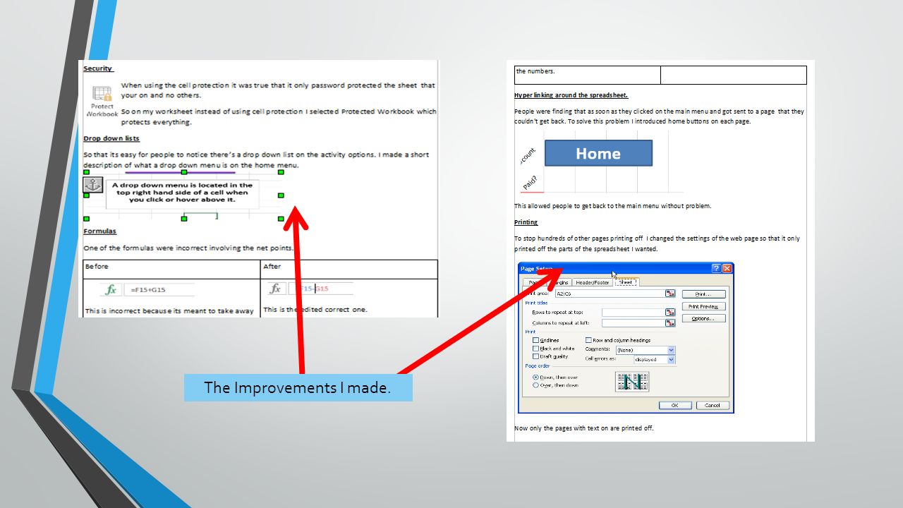
The Improvements I made.

13
Changes from initial design Changes From feedback: Changes were made after feedback from the initial design. 2 nd outputs: The outputs I made like the pivot tables and tables were changed quite dramatically in the information they contained to the original design. In my original design lots of the information included in the pivot tables was very simple and repetitive. So I included more formulas and interpreted the data further.

14
Layout and colour schemes The colour scheme was especially changed with the outputs I made using pivot tables and tables. They were changed quite dramatically in the way they looked. I found that when I made them all colour coded and organised better the output to the audience became more understandable especially to the younger less experienced people who don’t have much experience using excel. Navigation was a huge change in my spreadsheet compared to the original because I hadn’t included anyway of getting back to the main spreadsheet page after you clicked one of the spreadsheet buttons. So as a result I added home buttons on each spreadsheet page so that you can go back to the home page easily.

Similar presentations


. Itinerary for this session: Sign In View Past overtime air requests history View Current overtime air requests View.>")


>")