Download presentation
Presentation is loading. Please wait.

1
Monday, September 19 Check HW: 3 thumbnail sketches Intro to Poster Design –Handout Begin working on posters once sketches have been approved Poster deadline: –Thursday –Printed by Friday

2
Wednesday, September 21 Poster Guidelines NO copying –If you don’t think you can draw, either take a photograph or pick a new concept –You can trace but I will need to see that you created the image yourself Legal size Group critique on Wednesday Poster should be complete by Thursday Posters printed by Friday

3
Critique What is the most successful aspect of this design? Why? What is the least successful aspect of this design? Why?

4
School Violence Awareness Week October 15-19 www.crf-usa.org/network/network13_1/links.htm Design a thought provoking and inspirational poster for School Violence Awareness Week –Letter size 8 ½ X 11 Research info and facts Your design must be original – if you take an image from the internet you must make changes to make it your own

5
EFFECTIVE POSTER DESIGN

6
Step 1: Preparation Define Your Audience –Effective communication starts with knowing who your audience is. In their first 3 seconds your audience will determine whether to stay and explore your content or leave. If they stay you have 30 seconds to secure their attention by conveying an overall understanding of your subject matter. Distill Your Message –Considering the fact that your audience has only a limited time to view your poster, if there was one thing you could say on the poster, what would it be? Select a statement, photograph or diagram that is sure to attract your audience’s attention. This is your 3 second hit. Your focus item should be enlarged so that it will occupy at least 30%of the area of the finished poster. Remember that your audience will not approach if it is not clear what your topic or theme is from a “safe distance” of 10 feet (3 meters). Consider Your Presentation Requirements –Determine the size of the space provided for you. Find out if there are any regulations regarding minimum font and graphics sizes. What paper size will you be printing on?
. Consider Your Presentation Requirements –Determine the size of the space provided for you. Find out if there are any regulations regarding minimum font and graphics sizes. What paper size will you be printing on .")
7
Organize Your Information –Divide your information into main sections, for example: Title -concise name of poster, contributors, organization Introduction -statement giving quick overview of poster Problem -statement of the problem Method -brief description of the processes and procedures Results -outcomes, findings, data Conclusion -summary, discussion of significance of results, a few easily remembered key conclusions –Take each of these sections and summarize its contents into 3 categories: Heading -title the audience will see first Statement -one sentence relating to the heading, the audience will read this definition and should have and understanding of this particular section Support Material -if the definition has sparked their interest, they will move on to this section which should include documentation and illustrations

8
Step 2: Design for Impact Using Backgrounds and Color Effectively Colors and backgrounds should be subtle. Color should highlight, separate, define and associate information, if it begins to compete with your information for attention then it is too strong. Colors may look different on your screen than they will in your print. If you are concerned about color consistency you can print out a sample copy (just don’t print out too many – it wastes too much ink!) Some of your audience may be color blind so make sure contrasts are high between bars of graphs, lines on charts and backgrounds and text. The most common form of color blindness effects red and green.
 Some of your audience may be color blind so make sure contrasts are high between bars of graphs, lines on charts and backgrounds and text. The most common form of color blindness effects red and green..")
9
Effective Use of Colors –Title Bar Color: navy blue; forest green; olive green; burgundy; rust; plum (Your color should be dark enough to use white or cream as your main title text color.) –Background Color: solid cream or beige; pale version of title bar color; any of the previous fading to white; white (Background colors should always be light enough to use black for your main text.) –Highlight boxes and Graph backgrounds: pale version of title bar color; white; light cream or beige
 –Background Color: solid cream or beige; pale version of title bar color; any of the previous fading to white; white (Background colors should always be light enough to use black for your main text.) –Highlight boxes and Graph backgrounds: pale version of title bar color; white; light cream or beige")
10
Leaving Space – effective posters are spacious and easy to follow adequate clear space will direct attention to key elements remember the eye looks for edges, so align photographs, headings, text materials and axes in groups of graphs A column of text should be between not be too small or too wide for easier reading. A poster with a portrait orientation uses two columns. The same size poster with a landscape orientation requires 3 columns. Leave some space between columns. Leave a small amount of space around the inside edge of your paper as no printer prints right to the edge of the paper

11
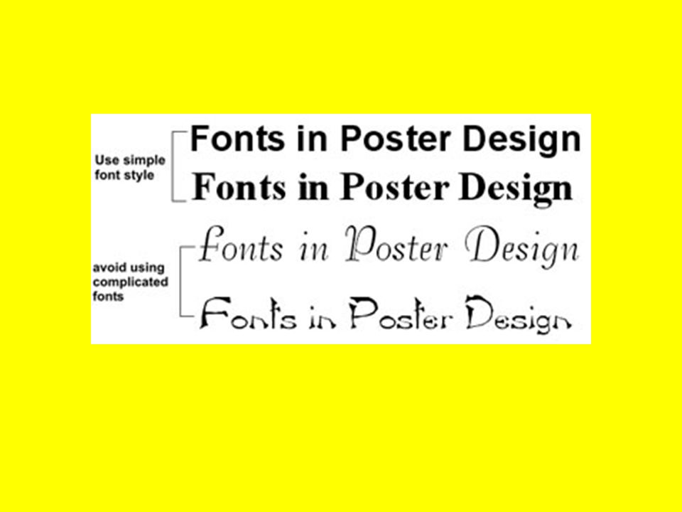
Creating Legible Text –information should flow from left to right and from top to bottom –columns allow readers who may be unfamiliar with your subject matter and method of research to easily follow the direction of your information – your main title should be large, bold and readable at a distance of 10 feet – text and titles written entirely in capitals are harder to read SAMPLE :: Sample – body text should be somewhat smaller than the main title, sans serif fonts are recommended – for ease of reading nothing beats black text on a light background Avoid: extremely long titles; font sizes too small; excessive use of different fonts; ornate fonts which may be difficult to read; single words highlighted within the text

12
Using Graphics for Impact –aim for 40% graphic content, try to find ways to show visually what was done – no photo, graphic or chart should be too small – graphics should be attractive, clear and specific – crop and enlarge photographs to eliminate unnecessary information and focus attention on significant details – viewers see what they are told to see in an image, so provide captions for your graphics –Avoid: pixilated images

13
Color your graphs, chart or diagrams to make it appealing to the audience.

14
Choose a color scheme that is harmonious.

16
Create a box for your text to emphasize it and to make it organized.

17
Create a gradient fill background instead of just plain color

18
Indicate arrows or lines in a diagram.

Similar presentations


 Name(s) of author and faculty advisor University of Wisconsin – Whitewater, Department.>")


