Download presentation
Presentation is loading. Please wait.

1
Data and Graphs

2
DAY 1: Introduction Student will learn the parts of a graph. Student will decide when to use a line graph and when to use a bar graph.

3
What is DATA DATA is a collection of facts -ex: The height of all students in 5B -The favorite food of all students in 5B -The average temperature in Concepcion from 1950 to 2011 -The percent of people without jobs every month

4
How to Represent Data 1)In a table: ClassTotal number of students 4 A22 4 B18 5 A21 5 B19
In a table: ClassTotal number of students 4 A22 4 B18 5 A21 5 B19")
5
2) In a bar graph Number of students in grades 4-5 Class Number of Students
 In a bar graph Number of students in grades 4-5 Class Number of Students")
6
3) In a line graph Number of Students Class
 In a line graph Number of Students Class")
7
Number of students in grades 4-5 Class Number of Students Graph title Data group axis Frequency axis Bars Scale

8
Graph Vocabulary Graph title: This explains what data a graph shows Axis: The two sides of a graph Groups Data Axis: shows the type of data being displayed (it is usually on the bottom) Frequency Data Axis: this axis has a scale and shows the quantity in each groups (it is usually on the side) Scale:it is on the Frequency Data Axis. The scale shows the numbers from the lowest to the highest Interval: How many numbers the scale increases by each time there is a line

9
Scale vs Interval The SCALE is 0-25 students The INTERVAL is 5 Number of Students Class

10
How to describe a graph Trend: a pattern in a graph. Increase: to go up Decrease: to go down

12
Bar graph OR line graph??? Bar graph: It is used to show differences in many types of data Line graph: It is used to show how one thing changes over time

13
In the following situations we will decide: -Should we use a line graph or bar graph? -What trends do we see in the graph?

14
I want to show students’ favourite colors (red, blue, green, black, pink) How many students like each color Should I use a line graph of a bar graph?
 How many students like each color Should I use a line graph of a bar graph")
16
I want to show how much money people make in different regions of Canada

18
I want to show change in the temperature of a place from Day 1 to Day 14

20
I want to show how many people did not have a job between 1989 to 2008

22
I want to show the population in the five largest countries in South America

24
I want to show how the population of Chile has changed in the past 10 years.

26
Tables to graphs Sam's Weight MonthWeight in kg January49 February54 March61 April69 May73

27
Frank's Math Test Grades TestGrade 175 280 3100 495 590 695

28
Day 2: Bar graphs Remember: a bar graph shows the data of DIFFERENT things.

29
What vocabulary do we know? Title Axis Group Data Axis Frequency Data Axis Scale Interval

31
Bar graph 1 in Unit 5 math folder

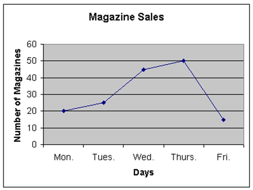
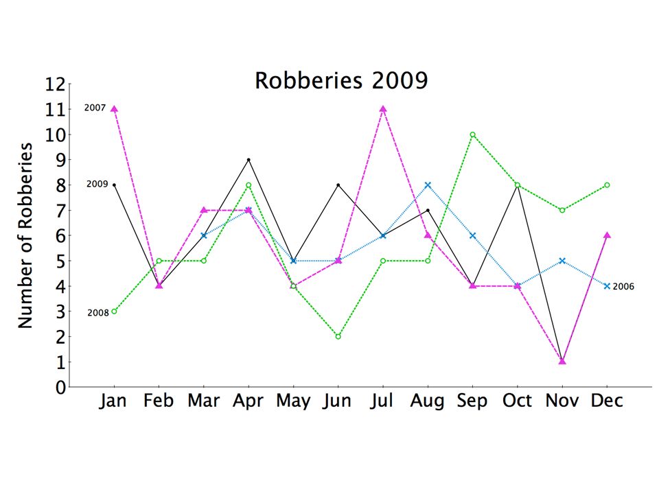
32
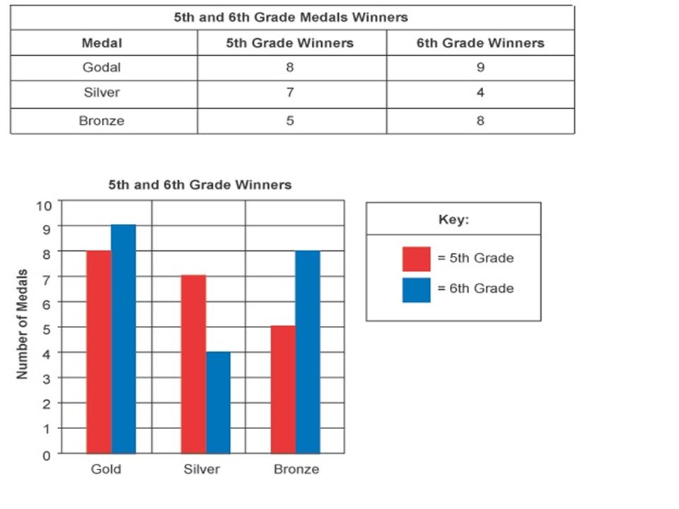
Double Bar Graph A double bar graph shows different groups of information. Each group is separated into categories.

33
-What is the title? -What data is on the frequency data axis? -What data is on the group data axis? -What is the scale? -What is the interval? -What do the different colors represent?

34
What is the title? What do the different colors represent? What is the interval and scale? Which sport is the favourite of 4 th graders? Which is the least favourite sport of 3 rd graders? How many third graders like swimming? How many 4 th graders like soccer? How many students in total like baseball? How many 3 rd graders were included in the survey? How many 4 th graders were included in the survey? How many students were included in the survey? What is the difference between 4 th graders who like soccer and 3 rd graders who like baseball? What is the difference between students who like baseball and students who like basketball?

35
How many boys participated in tennis? How many girls participated in canoeing? How many children participated in crafts? How many girls participated in tennis and swimming? How many boys participated in crafts and swimming? Did more boys or girls participate in camp activities?

36
What is the scale? What do the different colors represent? What information is represented on the group data axis? How many biographies were first edition? How many fiction books were paperbacks? How many First Edition books were sold? How many fiction books were sold? How many hardback books were sold? Were more first edition or paperbacks sold?

37
How much people give as tips

39
What is the title? What data is on the frequency data axis? What data is on the group data axis? What is the scale? What is the interval? What do the different colors represent?

43
White boards What is on the group data axis? What is on the frequency data axis? What is the scale and interval? Which teacher gave the least amount of homework on Thursday? Which teacher gave 16 minutes of homework on Wednesday? Which teacher gave the most homeowork on Thursday? How much homework did Mrs. Williams give in the 2 days? How much homework did Ms. Smith give on Wednesday? What was the difference in the minutes of homework Mrs, Jones gave in the 2 days? What was the difference in the minutes of homework Mrs. Brown gave in the 2 days? How many minutes of homework did each teacher give on Wednesday and Thursday? What was the difference between how much homework Mrs. Brown and Ms. Smith gave on Wednesday?

44
White boards What is the interval? What is the scale? What information is shown on the data group axis? What information is shown on the frequency group axis? How many 10 year olds voted for the name Eagles? How many 11 year olds voted for the name Pandas? Which was the favourite name of 10 year olds? What was the favourite name of 11 year olds? What was the difference between 10 and 11 year olds who voted for the name sharks? Which name had more votes in total: Sharks or Pandas? How many children voted for the name Eagles? How many 10 year olds voted? How many 11 year olds voted? How many children in total voted?

45
You do Double bar graph worksheet (1ª)
")
46
How to read the bars on a big interval

50
Worksheet 3

51
Day 3: Line Graphs Student will analyze double line graphs

52
Remeber: Line graphs show how ONE THING changes OVER TIME

53
Find Trends + Vocabulary Document in Unit 5 Math folder (Line graph Simple 1) Document (Line graph 2) Document (make a line graph)
 Document (Line graph 2) Document (make a line graph)")
55
Types of questions about line graphs Identify: “What was the temperature outdoors at 10:00am?” Compare: “At 12:00, was it hotter indoors or outdoors?” Analyze: “What was the difference between the indoor and outdoor temperature at 2:00pm? “At what time was the temperature outdoors and indoors the same?” “What observations can you make from the graph?”

56
How many houses 2 agents sold per year

57
What was the difference in the number of houses Smith and Jones sold in 1992? How many houses did Jones sell in 1994? If this was YOUR company, which employee would you keep and which would you fire? Why? When did the sales of Jones increase? When did they decrease?

58
Number of Children Adopted and in Foster Care

59
How many kids were adopted in 1999? How many kids were in foster care in 2006? In what year were there about 42.000 kids adopted? What was the difference between kids adopted and in foster care in 2003? What trends do you see in adoption and foster care numbers?

61
When did the girls win more games than boys? How many games did the boys win in 1991? How many games did the boys win in 1988 and 1989? How many games did the girls win between 1988 and 1993?

62
YOU DO Worksheet (2 and 4)
")
63
Day 4

70
Day 5 How to MAKE a graph. 1) Look at the data and see what it’s about 2) Is ONE thing changing, or are there GROUPS? 3) Decide on a SCALE and intervals 4) Label the axis 5) Make a TITLE
 Look at the data and see what it’s about 2) Is ONE thing changing, or are there GROUPS. 3) Decide on a SCALE and intervals 4) Label the axis 5) Make a TITLE.")
71
StudentGrade on Math Test Jacob70% Angie62% Bobby87% Joseph98% Brandy88% Destinee91% 1)What does the data represent? 2)Is ONE thing changing, or are there GROUPS? 3)What SCALE should you do? 4)Label the axis 5)Make a title
Is ONE thing changing, or are there GROUPS. 3)What SCALE should you do. 4)Label the axis 5)Make a title.")
72
Jackie’s TestScore Test 167% Test 275% Test 381% Test 491% Test 585% Test 694% 1)What does the data represent? 2)Is ONE thing changing, or are there GROUPS? 3)What SCALE should you do? 4)Label the axis 5)Make a title
Is ONE thing changing, or are there GROUPS. 3)What SCALE should you do. 4)Label the axis 5)Make a title.")
73
AthleteNumber of Gold Medals Michael Phelps (USA) Swimming 18 Larisa Latynina (Russia) Gymnastics 9 Paavo Nurmi (Finland) Athletics 9 Mark Spitz (USA) Swimming 9 Carl Lewis (USA) Athletics 9 Bjorn Daehlie (Norway) Cross Country Skiing 8
 Swimming 18 Larisa Latynina (Russia) Gymnastics 9 Paavo Nurmi (Finland) Athletics 9 Mark Spitz (USA) Swimming 9 Carl Lewis (USA) Athletics 9 Bjorn Daehlie (Norway) Cross Country Skiing 8")
74
CountryNumber of Gold Medals Number of Silver Medals China3522 USA3321 Great Britain2213 Korea126 Russia1119 France89 Germany715

75
Concepcion MonthAverage High Temperature January23 February22 March21 April18 May16 June14 July13

76
Day 6 You will make your OWN graph. You will collect data and construct a graph. This will be for a MARK. Make sure to label the axis and include a title. -survey your classmates (favorite color) -do an experiment (how many bounces do different balls have?) -look for information (get the temperature of every day this month in Concepcion)
 -do an experiment (how many bounces do different balls have ) -look for information (get the temperature of every day this month in Concepcion).")
Similar presentations


>")


>")
 Main Idea and Vocabulary Example 1:Display Data Using a Bar Graph Example 2:Display Data.>")

 to solve problems.>")


