Download presentation
Presentation is loading. Please wait.

1
Distribution of the Data. Normal Distribution. What you’ll learn Compare two sets of data. Describe the shape of the distribution. Use the shapes of distribution to select appropriate statistics.

2
Answer

4
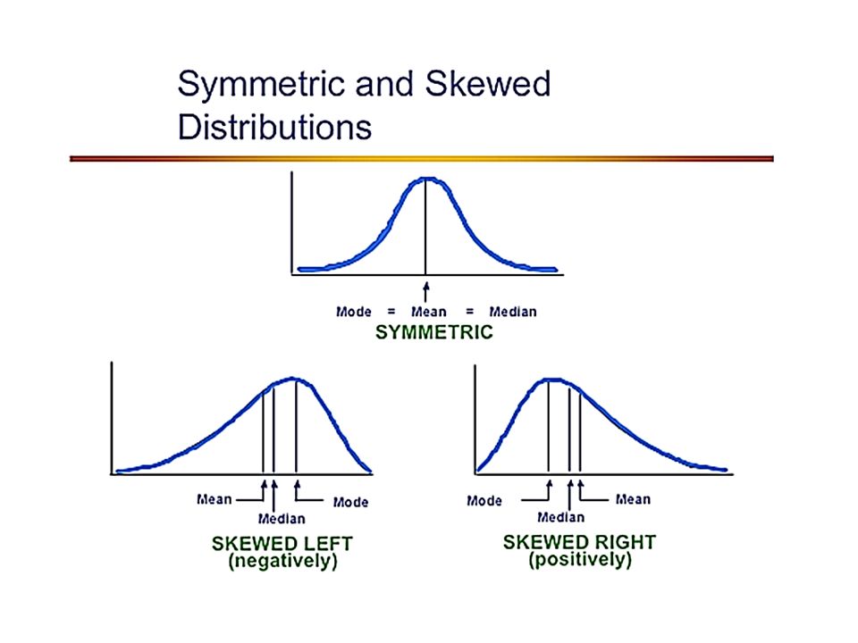
A distribution of data shows the observed frequency of each possible value. To describe distribution of data we can use a histogram. Remember: a histogram is a type of bar graph used to display data that have been organized into equal intervals. A histogram is useful when viewing the overall distribution of the data. Skewed leftSkewed right

6
What is normal distribution? Standard deviation: is a measure of how spread out the data is from the mean. Single-peak Symmetry Bell Shape

7
The Empirical Rule applies to a normal (bell-shaped) curve and states that within one standard deviation of the mean (one to the left-side and right-side) there is about 68% of the data; within two standard deviations of the mean (two to the left and two to the right) there is about 95% of the data; and within three standard deviations of the mean (three to the left and three to the right) there is about 99.7% of the data. Take a note:

8
Answer

9
The scores for all high school seniors taking the verbal section of the Scholastic Aptitude Test (SAT) in a particular year had a mean of 490 and a standard deviation of 100. The distribution of SAT scores is bell-shaped. A. What percentage of seniors scored between 390 and 590 on this SAT test? B. One student scored 795 on this test. How did this student do compared to the rest of the scores? C. A rather exclusive university only admits students who were among the highest 16% of the scores on this test. What score would a student need on this test to be qualified for admittance to this university? The data being described are the verbal SAT scores for all seniors taking the test one year. Since this is describing a population, we will denote the mean and standard deviation as m = 490 and s = 100, respectively. A bell shaped curve summarizing the percentages given by the empirical rule is below. Answer A. From the figure above, about 68% of seniors scored between 390 and 590 on this SAT test B. Since about 99.7% of the scores are between 190 and 790, a score of 795 is excellent. This is one of the highest scores on this test.

10
Since about 16% of the students scored above 590 on this SAT test, to be qualified for admittance to this university, a student would need to score 590 or above on this test. C. Since about 68% of the scores are between 390 and 590, this leaves 32% of the scores outside this interval. Since a bell-shaped curve is symmetric, one-half of the scores, or 16%, are on each end of the distribution. The figure below shows these percentages.

11
Example: IQ Scores have a bell-shaped distribution with a mean of 100 and a standard deviation of 15. What percentage of IQ scores are between 70 and 130? Since, 70 to 130 is within 2 standard deviations of the mean, we know that about 95% of the IQ scores would be between 70 and 130. Answer 130 – 100 = 30 which is 2(15). Thus, 130 is 2 standard deviations to the right of the mean. 100 – 70 = 30 which is 2(15). Thus, 70 is 2 standard deviations to the left of the mean. Let’s do the Normal curve(bell) and remember 68 95 99.7 95%
. Thus, 130 is 2 standard deviations to the right of the mean. 100 – 70 = 30 which is 2(15). Thus, 70 is 2 standard deviations to the left of the mean. Let’s do the Normal curve(bell) and remember %.")
12
Answer B

13
D

14
C

15
A

16
B

17
C

18
B

19
Joint Relative Frequency Marginal Relative Frequency It is the ratio of the sum of the joint relative frequency in a row or column and the total number of data values. Also called: Contingency Table Cross-Tabulation Table Two-Way Table Example: The table shows the results of randomly selected 20 children and adults if they like broccoli? yesno Children38 Adults72 yesnoTOTAL Children Adults TOTAL Joint Relative Frequency Marginal Frequency Answer

20
Conditional Relative Frequency yesnoTOTAL Children Adults TOTAL yesno Children38 Adults72

Similar presentations

>")


 we have a.>")


