Download presentation
Presentation is loading. Please wait.

2
Figure 9-1. Schematic representation of the hydrologic cycle. Numbers in parentheses are the volume of water (10 6 km 3 ) in each reservoir. Fluxes are given in 10 6 km 3 y -1.
 in each reservoir. Fluxes are given in 10 6 km 3 y -1..")
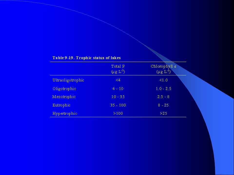
6
Figure 9-2. Solubility, at 25 o C, of quartz and amorphous silica as a function of pH. pH = 9.83 and pH = 13.17 correspond to the first and second dissociation constants, respectively, of silicic acid.

8
Figure 9-3. Total concentration of aluminum in solution, as a function of pH, for a solution in equilibrium with gibbsite.

10
Figure 9-4a. Equilibrium equations 9-16 to 9-20 plotted on a log([Na + ]/[H + ]) versus log[H 4 SiO 4 (aq) ] diagram. Numbers on the diagram indicate corresponding equations in the text. Figure 9-4b. Mineral stability fields as delineated by equilibrium equations plotted in Figure 9-4a. The labeled curve indicates the changes in chemistry of a solution in equilibrium with albite during weathering in a closed system. See text for discussion.
 versus log[H 4 SiO 4 (aq) ] diagram. Numbers on the diagram indicate corresponding equations in the text. Figure 9-4b. Mineral stability fields as delineated by equilibrium equations plotted in Figure 9-4a. The labeled curve indicates the changes in chemistry of a solution in equilibrium with albite during weathering in a closed system. See text for discussion..")
12
Figure 9-5. Stiff diagram for Columbia and Rio Grande river waters and Central Pennsylvania groundwater. See text for discussion

13
Figure 9-6. Piper diagram for Columbia and Rio Grande river waters and Central Pennsylvania groundwater. See text for discussion.

14
Figure 9-7. Hydrochemical facies. After Back (1966).
.")
15
Figure 9-8a. Plot of total dissolved solids versus relative cation abundances for surface waters. Filled circles are river, unfilled circles are lake, and pluses are ocean waters. From R. J. Gibbs (1970). Figure 9-8b. Plot of total dissolved solids versus relative anion abundances for surface waters. Filled circles are river, unfilled circles are lake, and pluses are ocean waters. From R. J. Gibbs (1970).
. Figure 9-8b. Plot of total dissolved solids versus relative anion abundances for surface waters. Filled circles are river, unfilled circles are lake, and pluses are ocean waters. From R. J. Gibbs (1970)..")
16
Figure 9-9. Graphical representation of the processes that control the chemistry of surface waters. See text for discussion. From R. J. Gibbs (1970).
..")
19
Figure 9-10. Simplified groundwater system showing the movement of water through the system. See text for discussion.

20
Figure 9-11. Mole ratio of Na + /Ca 2+ versus mole ratio of HCO 2 - /SiO 2 (aq) for waters from various types of igneous rocks. Most of the waters plot between the theoretical curves for incongruent dissolution of plagioclase to montmorillonite and the incongruent dissolution of plagioclase to kaolinite. See text for discussion. From Garrels (1967).
 for waters from various types of igneous rocks. Most of the waters plot between the theoretical curves for incongruent dissolution of plagioclase to montmorillonite and the incongruent dissolution of plagioclase to kaolinite. See text for discussion. From Garrels (1967)..")
21
Figure 9-12. Plot of Ca 2+ + pH versus SiO 2 for various groundwater samples. Stability boundaries for various phases are shown in the diagram. Solid curves with arrows indicate evolution of groundwater chemistry for systems open or closed with respect to atmospheric CO 2. See text for discussion. From Garrels (1967).
..")
23
Figure 9-13. Generalized depth-temperature profiles for a midlatitude lake during the summer and winter.

24
Figure 9-14. Two-compartment box model for a lake. See text for details.

25
Figure 9-15. Variations in the concentration of the various carbonate species as a function of pH, in freshwater at a temperature of 25 o C, given a total carbonate concentration of 1 x 10 -3 mol L -1. For these conditions the carbonate system loses its buffering capacity at pH = 4.65.

27
Figure 9-16. Adsorption of metal cations as a function of pH. From AQUATIC CHEM ISTRY, 3 rd Edition by W. Stumm and J. J. Morgan. Copyright 1996. This material is used by permission of John Wiley & Sons, Inc.

29
Figure 9-17. Partitioning of monovalent and divalent cations between solution and adsorber. Concentrations are given as an equivalent fraction of Na. K na/Ca = 0.5. The divalent cation is much more strongly adsorbed in the low ionic strength (low normality) solution.
 solution..")
30
Figure 9-18. Relative transport distances in a groundwater system for a nonadsorbed tracer species and an adsorbed species. C/C o is the measured concentration of the species relative to its original concentration at distance x. Note that the concentration of the species varies with distance because of dispersion.

32
Figure 9-19. Interaction between various earth reservoirs. Adapted from Larocque and Rasmussen (1998).
..")
33
Figure 9-20. Human impact on the “metal cycle”. Adapted from Larocque and Rasmussen (1998).
.")
34
Figure 9-21. Present-day mercury cycle. The fluxes are given in Mmol L -1. Hg P represents mercury adsorbed to particles. Anthropogenic inputs are approximately 20 Mmol y -1 ; half is returned to the surface close to the source and the other half is transferred to the atmosphere as volatile mercury. Adapted from Mason et al. (1994).
..")
36
Figure 9-22. The nuclear fuel cycle. Modified from Faure (1998).
.")
38
Figure 9-23a. Radioactivity as a function of time after removal of a fuel element from a power reactor. Curves are drawn for both SURF and HLW (after reprocessing) and the two types of radioactive components, fission products and actinides (Th, Pa, U, Np, Pu, Am, and Cm). The data are for a pressurized water reactor (PWR) with a fuel burn-up of 33 GW-day tonne -1 normalized to 1 metric ton of heavy metal in the original fuel element. TBq = 10 12 Bq. Plotted from the data of Roxburgh (1987). Figure 9-23b. Heat production as a function of time, after a five-year cooling period, for SURF and HLW. The data are for a pressurized water reactor (PWR) with a fuel burn-up of 33 GW-day tonne -1 normalized to 1 metric ton of heavy metal in the original fuel element. Plotted from the data of Roxburgh (1987).
 and the two types of radioactive components, fission products and actinides (Th, Pa, U, Np, Pu, Am, and Cm). The data are for a pressurized water reactor (PWR) with a fuel burn-up of 33 GW-day tonne -1 normalized to 1 metric ton of heavy metal in the original fuel element. TBq = Bq. Plotted from the data of Roxburgh (1987). Figure 9-23b. Heat production as a function of time, after a five-year cooling period, for SURF and HLW. The data are for a pressurized water reactor (PWR) with a fuel burn-up of 33 GW-day tonne -1 normalized to 1 metric ton of heavy metal in the original fuel element. Plotted from the data of Roxburgh (1987)..")
42
Figure 9-24. Solubility of fluorite at 25 o C as a function of F - and Ca 2+ concentrations. See text for discussion.

43
Figure 9-25. Binary mixture of groundwater (0.05 mg L -1 Br and 5 mg L -1 Cl) and brine (1 mg L -1 Br and 10,000 mg L -1 Cl). Labeled points are fraction of brine in the mixture. Groundwater samples from an aquifer (filled squares) fall along this line, suggesting they represent mixtures of uncontaminated groundwater and brine. The maximum amount of brine in the groundwater is approximately 31%.
 and brine (1 mg L -1 Br and 10,000 mg L -1 Cl). Labeled points are fraction of brine in the mixture. Groundwater samples from an aquifer (filled squares) fall along this line, suggesting they represent mixtures of uncontaminated groundwater and brine. The maximum amount of brine in the groundwater is approximately 31%..")
44
Figure 9-26. The terrestrial nitrogen cycle. DON = dissolved organic nitrogen; DIN = dissolved inorganic nitrogen; PN = particulate nitrogen: PON = particulate organic nitrogen; N = total nitrogen. From Berner and Berner (1996).
..")
46
Figure 9-27. Total nitrogen (as nitrate) and phosphorus (as phosphate) for selected rivers. Area enclosed by dashed lines represents unpolluted rivers. The diagonal lines represent constant N/P ratios (atomic). N/P = 16 is the Redfield ratio. From Berner and Berner (1996).
. N/P = 16 is the Redfield ratio. From Berner and Berner (1996)..")
47
Figure 9-C2-1. Piper diagram showing the compositions of the mine and lake discharges and the mixed stream water. From Foos (1997).
..")
48
Figure 9-C3-1. Piper diagram showing chemical evolution of groundwater in the Floridian aquifer from recharge areas to discharge areas. From Back and Hanshaw (1970).
..")
49
Figure 9-C8-1. pH, redox, and hydrological characteristics of a typical acid sulfate soil. After Åström (2001).
..")
Similar presentations


>")


 Mean Ion Activity Coefficients – determined.>")


![Karst Chemistry I. Definitions of concentration units Molality m = moles of solute per kilogram of solvent Molarity [x]= moles of solute per kilogram.](/14/4335485/big_thumb.jpg "Karst Chemistry I. Definitions of concentration units Molality m = moles of solute per kilogram of solvent Molarity [x]= moles of solute per kilogram.>")


 cause number of ions available to.>")