Download presentation
Presentation is loading. Please wait.

1
Institute for Tribal Environmental Professionals Tribal Air Monitoring Support Center Melinda Ronca-Battista Brenda Sakizzie Jarrell Southern Ute Indian Tribe

2
Assisting tribes all over country Similar questions are asked All evaluations begin the same Need for free (MS Office) tools Applicable to any data Supplements and uses existing EPA tools, helping tribes use AMTIC and have confidence of the interpretation of their data
 tools Applicable to any data Supplements and uses existing EPA tools, helping tribes use AMTIC and have confidence of the interpretation of their data")
3
AAA Data Analysis and Interpretation folders

4
1. Clean up your data. 2. Verify QC limits met 3. Aggregate data into sets 4. Find Patterns 5. Ask your question 6. Evaluate the shapes of the distributions 7. Apply the test

5
1. Initial Cleaning (checking links, hidden values, finding repeated rows, tracking data so none is lost) 2. Normalization (separating information into separate fields, using data validation to limit entries to drop- down lists) 3. Documenting Your Clean Data 4. General cleaning (macros, values- only, documentation, eliminating hidden characters) http://www4.nau.edu/itep/resources/ Data Analysis, Step 1-Data Clean Up folder
 2. Normalization (separating information into separate fields, using data validation to limit entries to drop- down lists) 3. Documenting Your Clean Data 4. General cleaning (macros, values- only, documentation, eliminating hidden characters) Data Analysis, Step 1-Data Clean Up folder.")
6
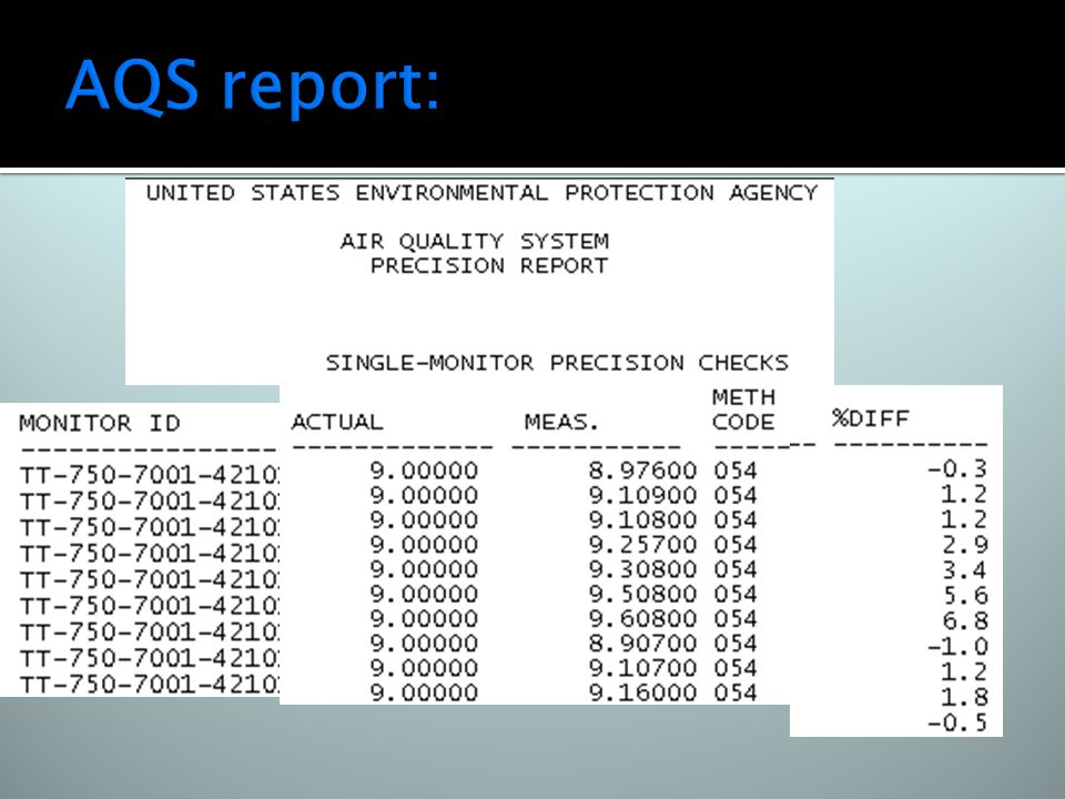
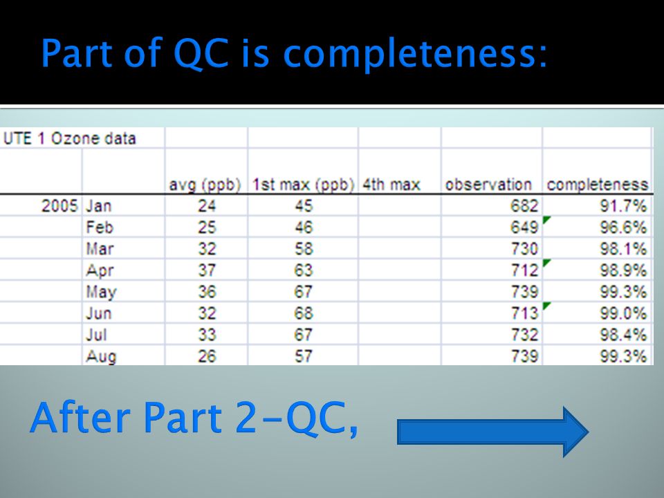
Don’t exert any effort on bad data— start with a quick review of QC Review logbooks, audits Generate AQS report of QC data, and Use EPA’s DASC tool; enter data into the spreadsheet and review PLOTS http://www4.nau.edu/itep/resources/ Data Analysis, Step 2-QC folder

8
Plots generated using EPA’s DASC tool:

10
Hourly values slow down computer Use MS Access Quick Start guide to aggregate data into chunks of daily or weekly averages MS Access easier than Excel for handling missing data, excluding codes http://www4.nau.edu/itep/resources/ Data Analysis, Step 3-Aggregate Data folder, Tribal Data Access Quick Start subfolder

11
5-day averages of daily max O3 values Reduces number of data points from >10,000s of hourly values to ~ 1000s of daily values to ~100s of 5-day averages Enables the next step of graphing against relevant parameters (temp, solar radiation, NO2, etc.)
")
12
Apply common sense to the data How does it vary with met parameters? How does it vary with other pollutants?

13
Dynamic Named Ranges as your data increase, plots and summary statistics are automatically recalculated See pg. 7 of doc “using ranges in excel and graphing.doc” Autofilter Filter out or in data 1-click recalculation of plots of different subsets

14
Use x-y plot (ALWAYS SCATTERPLOT NEVER DATE because that produces category plots) Use secondary axis for 2 nd parameter so it can have its own units Start with all data, then use Excel Autofilter to find subsets of data where both parameters have values, that show a pattern, clicking on different values that are immediately graphed
 Use secondary axis for 2 nd parameter so it can have its own units Start with all data, then use Excel Autofilter to find subsets of data where both parameters have values, that show a pattern, clicking on different values that are immediately graphed")
15
Plot 2 nd parameter on its own axis

16
ALWAYS plot on x-y scatterplots-never dates

17
Use linear regression between parameters Perfect 1-to-1 relationship with one rise on y-axis to every one run on x- axis shows: Slope ~ 1 and RSQ (r 2 ) ~ 1 Can calculate in plot or using functions
 ~ 1 Can calculate in plot or using functions")
18
=slope(Ys,Xs) and =RSQ(Ys, Xs) OR Scatterplot, show trendline, show equation and R2 on chart For the case of our correlation between O3 and temp, how well do they compare?
 and =RSQ(Ys, Xs) OR Scatterplot, show trendline, show equation and R2 on chart For the case of our correlation between O3 and temp, how well do they compare")
19
Insert regression line on x-y scatterplots, or use slope= and RSQ= functions

20
=slope(Ys,Xs) and =RSQ(Ys, Xs)
 and =RSQ(Ys, Xs)")
21
Ex: When analyzing this data, we saw a shift in how the 2 sites’ O3 tracked During one time period, one site had markedly higher O3 levels than the other site, but the rest of the time the 2 sites agreed well

22
-- ▲ --Ute 1, -- ▀ -- Ute 3

23
In this case, the (Ute 3- Ute 1)/Ute 3 ratio:
/Ute 3 ratio:")
24
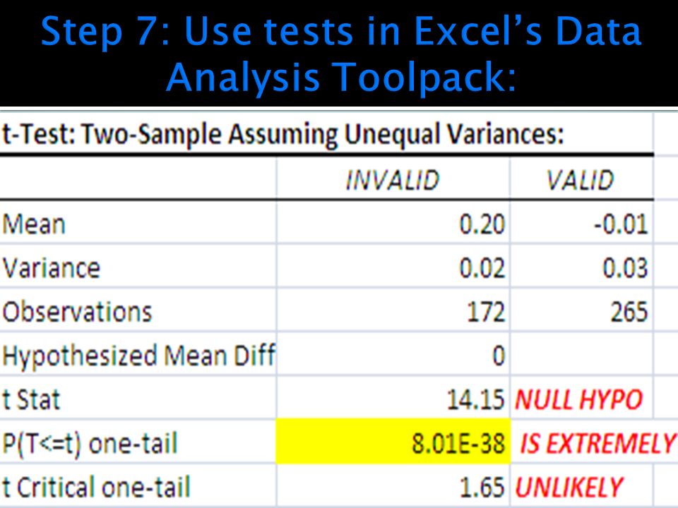
Is this helpful? Sort of... VALIDINVALID Mean-0.010.2 Variance0.030.02

25
See BoxCharter.zip for Excel Add-In to generate box and whisker plots INVALID VALID

26
Decide on your assumption that the data must be used to prove wrong--the null hypothesis If you think the data from 2 sites are different, then assume that the difference between them is zero and then the data must prove that wrong, at some level of confidence the null hypo is that there is zero difference between the means of the datasets

27
Are they normal? “approximately”? If so, the tests are easier Hmmmmm. VALID INVALID

28
Straight line is “perfectly normal” …

30
The “invalid” dataset was removed from AQS New audits were conducted, a 2 nd analyzer was collocated with Ute 1, and now data from that site are deemed “good” Southern Ute Indian Tribe is very careful with all data, and this story shows how good QC and careful data analysis yields confidence in decisions

31
AAA Data Analysis and Interpretation folders

Similar presentations


 Association Between Variables Measured at the Interval-Ratio Level: Bivariate Correlation and Regression.>")


 variable - measures the outcome of a study. Explanatory (Independent) variable - explains.>")


