Download presentation
Presentation is loading. Please wait.

1
CMPS 1371 Introduction to Computing for Engineers PLOTTING

2
Plotting

3
Two Dimensional Plots The xy plot is the most commonly used plot by engineers The independent variable is usually called x The dependent variable is usually called y

4
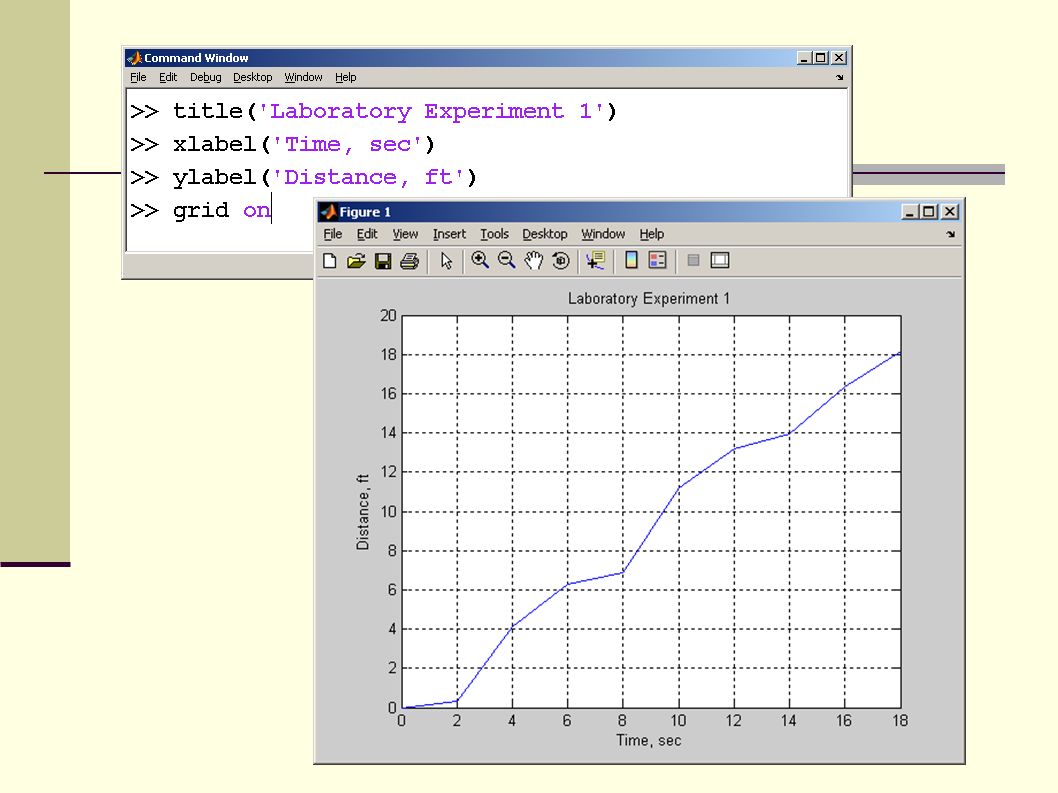
Consider xy data time, secDistance, Ft 00 20.33 44.13 66.29 86.85 1011.19 1213.19 1413.96 1616.33 1818.17 Time is the independent variable and distance is the dependent variable

5
Plot function Define x and y and call the plot function You can use any variable name that is convenient for the dependent and independent variables

7
Engineers always add … Title X axis label, complete with units Y axis label, complete with units Often it is useful to add a grid

9
Multiple plots MATLAB overwrites the figure window every time you request a new plot To open a new figure window use the figure function – for example figure(2) Create plot on same graph hold on Freezes the current plot, so that an additional plot can be overlaid When you use this approach the additional line is drawn in blue – the default drawing color
 Create plot on same graph hold on Freezes the current plot, so that an additional plot can be overlaid When you use this approach the additional line is drawn in blue – the default drawing color")
10
The first plot is drawn in blue

11
The hold on command freezes the plot The second line is also drawn in blue, on top of the original plot To unfreeze the plot use the hold off command

12
Same graph You can also create multiple lines on a single graph with one command Using this approach each line defaults to a different color

13
Each set of ordered pairs will produce a new line

14
Variations If you use the plot command with a single matrix, MATLAB plots the values versus the index number

15
Variations If you want to create multiple plots, all with the same x value you can… Use alternating sets of ordered pairs plot(x,y1,x,y2,x,y3,x,y4) Or group the y values into a matrix z=[y1,y2,y3,y4] plot(x,z)
![Variations If you want to create multiple plots, all with the same x value you can… Use alternating sets of ordered pairs plot(x,y1,x,y2,x,y3,x,y4) Or group the y values into a matrix z=[y1,y2,y3,y4] plot(x,z)](http://images.slideplayer.com/24/7033972/slides/slide_15.jpg "Variations If you want to create multiple plots, all with the same x value you can… Use alternating sets of ordered pairs plot(x,y1,x,y2,x,y3,x,y4) Or group the y values into a matrix z=[y1,y2,y3,y4] plot(x,z)")
16
Alternating sets of ordered pairs Matrix of Y values

17
Peaks The peaks(100) function creates a 100x100 array of values. Since this is a plot of a single variable, we get 100 different line plots

18
Line, Color and Mark Style You can change the appearance of your plots by selecting user defined line styles color mark styles Try using: help plot for a list of available styles

19
Available choices Line TypeIndicatorPoint TypeIndicatorColorIndicator solid-point.blueb dotted:circleogreeng dash-dot-.x-markxredr dashed--plus+cyanc star*magentam squaresyellowy diamonddblackk triangle downv triangle up^ triangle left< triangle right> pentagramp hexagramh

20
Specify your choices in a string plot(x,y,‘linestyle markstyle color') strings are identified with a tick (apostrophe) mark if you don’t specify style, a default is used line style – none mark style – none color – blue Consider:plot(x,y,’:ok’) the : means use a dotted line the o means use a circle to mark each point the letter k indicates that the graph should be drawn in black (b indicates blue)
 strings are identified with a tick (apostrophe) mark if you don’t specify style, a default is used line style – none mark style – none color – blue Consider:plot(x,y,’:ok’) the : means use a dotted line the o means use a circle to mark each point the letter k indicates that the graph should be drawn in black (b indicates blue)")
21
dotted line circles black

22
specify the drawing parameters for each line after the ordered pairs that define the line

23
Axis scaling MATLAB automatically scales each plot to completely fill the graph If you want to specify a different axis – use the axis command axis([xmin,xmax,ymin,ymax]) Lets change the axes on the graph we just looked at
![Axis scaling MATLAB automatically scales each plot to completely fill the graph If you want to specify a different axis – use the axis command axis([xmin,xmax,ymin,ymax]) Lets change the axes on the graph we just looked at](http://images.slideplayer.com/24/7033972/slides/slide_23.jpg "Axis scaling MATLAB automatically scales each plot to completely fill the graph If you want to specify a different axis – use the axis command axis([xmin,xmax,ymin,ymax]) Lets change the axes on the graph we just looked at")
24
Use the axis function to override the automatic scaling

25
Annotating Your Plots You can also add legends textbox Of course you should always add title axis labels

27
Improving your labels You can use Greek letters in your labels by putting a backslash (\) before the name of the letter. For example: title(‘\alpha \beta \gamma’) creates the plot title α β γ To create a superscript use curly brackets title(‘x^{2}’) gives x 2
 creates the plot title α β γ To create a superscript use curly brackets title(‘x^{2}’) gives x 2.")
28
Subplots The subplot command allows you to subdivide the graphing window into a grid of m rows and n columns subplot(m,n,p) rowscolumns location
 rowscolumns location")
29
subplot(2,2,1) 2 rows 2 columns 1 2 3 4
 2 rows 2 columns")
30
2 rows and 1 column

31
Other Types of 2-D Plots Polar Plots Logarithmic Plots Bar Graphs Pie Charts Histograms X-Y graphs with 2 y axes Function Plots

32
Polar Plots Some functions are easier to specify using polar coordinates than by using rectangular coordinates Use polar(x,y) For example the equation of a circle is y=sin(x) in polar coordinates
 For example the equation of a circle is y=sin(x) in polar coordinates")
34
Logarithmic Plots A logarithmic scale (base 10) is convenient when a variable ranges over many orders of magnitude, because the wide range of values can be graphed, without compressing the smaller values. data varies exponentially

35
Plots plot(x,y) – uses a linear scale on both axes semilogy(x,y) uses a log 10 scale on the y axis semilogx(x,y) uses a log 10 scale on the x axis loglog(x,y) use a log 10 scale on both axes
 – uses a linear scale on both axes semilogy(x,y) uses a log 10 scale on the y axis semilogx(x,y) uses a log 10 scale on the x axis loglog(x,y) use a log 10 scale on both axes")
37
Bar Graphs and Pie Charts MATLAB includes a whole family of bar graphs and pie charts bar(x) – vertical bar graph barh(x) – horizontal bar graph bar3(x) – 3-D vertical bar graph bar3h(x) – 3-D horizontal bar graph pie(x) – pie chart pie3(x) – 3-D pie chart
 – vertical bar graph barh(x) – horizontal bar graph bar3(x) – 3-D vertical bar graph bar3h(x) – 3-D horizontal bar graph pie(x) – pie chart pie3(x) – 3-D pie chart")
38
Bar Graphs

40
Histograms A histogram is a plot showing the distribution of a set of values Defaults to class size of 10

41
X-Y Graphs with Two Y Axes Sometimes it is useful to overlay two x-y plots onto the same figure. However, if the order of magnitude of the y values are quite different, it may be difficult to see how the data behave.

42
Scaling Depends on the largest value plotted Example Its difficult to see how the blue line behaves, because the scale isn’t appropriate

43
plotyy function for 2 y-axis The plotyy function allows you to use two scales on a single graph

44
Function Plots Function plots allow you to use a function as input to a plot command, instead of a set of ordered pairs of x-y values fplot('sin(x)',[-2*pi,2*pi]) function input as a string range of the independent variable – in this case x
![Function Plots Function plots allow you to use a function as input to a plot command, instead of a set of ordered pairs of x-y values fplot( sin(x) ,[-2*pi,2*pi]) function input as a string range of the independent variable – in this case x](http://images.slideplayer.com/24/7033972/slides/slide_44.jpg "Function Plots Function plots allow you to use a function as input to a plot command, instead of a set of ordered pairs of x-y values fplot( sin(x) ,[-2*pi,2*pi]) function input as a string range of the independent variable – in this case x")
45
Three Dimensional Plotting Line plots Surface plots Contour plots

46
Three Dimensional Line Plots These plots require a set of order triples ( x-y-z values) as input Use plot3(x,y,z) The z-axis is labeled the same way the x and y axes are labeled
 as input Use plot3(x,y,z) The z-axis is labeled the same way the x and y axes are labeled")
47
MATLAB uses a coordinate system consistent with the right hand rule

48
Just for fun try the comet3 function, which draws the graph in an animation sequence comet3(x,y,z) If your animation draws too slowly, add more data points For 2-D line graphs use the comet function
 If your animation draws too slowly, add more data points For 2-D line graphs use the comet function")
49
Surface Plots Represent x-y-z data as a surface mesh - meshplot surf – surface plot Can use both mesh and surface plots to good effect with a single two dimensional matrix

50
The x and y coordinates are the matrix index numbers

51
Surf plots surf plots are similar to mesh plots they create a 3-D colored surface instead of an open mesh syntax is the same

53
Shading There are several shading options shading interp shading flat faceted flat is the default You can also adjust the color scheme with the color map function

54
Colormaps autumnbonehot springcolorcubehsv summercoolpink wintercopperprism jet (default)flagwhite
flagwhite")
55
Contour Plots Contour plots use the same input syntax as mesh and surf plots They create graphs that look like the familiar contour maps used by hikers

56
Variations A more complicated surface can be created by calculating the values of z, instead of just defining them We’ll need to use the meshgrid function to create 2-D input arrays – which will then be used to create a 2-D result Creates an x by y matrix

59
Another 3-D graph Try this example and see what you get >> g = 0:0.2:10; >> [x,y] = meshgrid(g); >> z = 2*sin(sqrt(x.^2 + y.^2)); >> mesh(z);
![Another 3-D graph Try this example and see what you get >> g = 0:0.2:10; >> [x,y] = meshgrid(g); >> z = 2*sin(sqrt(x.^2 + y.^2)); >> mesh(z);](http://images.slideplayer.com/24/7033972/slides/slide_59.jpg "Another 3-D graph Try this example and see what you get >> g = 0:0.2:10; >> [x,y] = meshgrid(g); >> z = 2*sin(sqrt(x.^2 + y.^2)); >> mesh(z);")
61
Cowboy Hat Try this code >> [X,Y]=meshgrid(-1.5:.1:1.5,-1.5:.1:1.5); >> Z=sin(3*X.^2+2*Y.^2)./(X.^2+Y.^2); >> mesh(Z)
![Cowboy Hat Try this code >> [X,Y]=meshgrid(-1.5:.1:1.5,-1.5:.1:1.5); >> Z=sin(3*X.^2+2*Y.^2)./(X.^2+Y.^2); >> mesh(Z)](http://images.slideplayer.com/24/7033972/slides/slide_61.jpg "Cowboy Hat Try this code >> [X,Y]=meshgrid(-1.5:.1:1.5,-1.5:.1:1.5); >> Z=sin(3*X.^2+2*Y.^2)./(X.^2+Y.^2); >> mesh(Z)")
62
Cowboy Hat

63
Combine 3-D Plots Try this code >> [s,t]=meshgrid(0:.02*pi:2*pi,0:.02*pi:pi); >> [u,v]=meshgrid(0:.05*pi:2*pi,-2:.2:2); >> surf(3*cos(s).*sin(t),2*sin(s).*sin(t),cos(t)) >> axis equal; >> hold on; >> surf(cos(u),sin(u),v)
![Combine 3-D Plots Try this code >> [s,t]=meshgrid(0:.02*pi:2*pi,0:.02*pi:pi); >> [u,v]=meshgrid(0:.05*pi:2*pi,-2:.2:2); >> surf(3*cos(s).*sin(t),2*sin(s).*sin(t),cos(t)) >> axis equal; >> hold on; >> surf(cos(u),sin(u),v)](http://images.slideplayer.com/24/7033972/slides/slide_63.jpg "Combine 3-D Plots Try this code >> [s,t]=meshgrid(0:.02*pi:2*pi,0:.02*pi:pi); >> [u,v]=meshgrid(0:.05*pi:2*pi,-2:.2:2); >> surf(3*cos(s).*sin(t),2*sin(s).*sin(t),cos(t)) >> axis equal; >> hold on; >> surf(cos(u),sin(u),v)")
64
ellipsoid and cylinder

65
Editing Plots from the Menu Bar In addition to controlling the way your plots look by using MATLAB commands, you can also edit a plot once you’ve created it using the menu bar Another demonstration function built into MATLAB is >> sphere

66
Menu Bar Once you’ve created a plot you can adjust it using the menu bar In this picture the insert menu has been selected Notice you can use it to add labels, legends, a title and other annotations

67
Select Edit-> Axis Properties from the menu tool bar Change the Aspect Ratio Explore the property editor to see some of the other ways you can adjust your plot interactively Select More Properties to pull up the Inspector

68
Note If you adjust a figure interactively, you’ll lose your improvements when you rerun your program

69
Creating plots from the workspace

70
Plotting options MATLAB will suggest plotting options and create the plot for you

Similar presentations


![CSE 123 Plots in MATLAB. Easiest way to plot Syntax: ezplot(fun) ezplot(fun,[min,max]) ezplot(fun2) ezplot(fun2,[xmin,xmax,ymin,ymax]) ezplot(fun) plots.](/11/3268574/big_thumb.jpg "CSE 123 Plots in MATLAB. Easiest way to plot Syntax: ezplot(fun) ezplot(fun,[min,max]) ezplot(fun2) ezplot(fun2,[xmin,xmax,ymin,ymax]) ezplot(fun) plots.>")


