Download presentation
Presentation is loading. Please wait.

2
Less is More. and PowerPoint

3
So, what could go wrong? Any of these look familiar?

4
Lorem Ipsum Dolor “Neque porro quisquam est qui dolorem ipsum quia dolor sit amet, consectetur, adipisci velit…” clicktoaddtitle.com Leslie Harpold – Round 2

5
Lorem Ipsum Dolor Curabitur sed Nullam pretium Mauris metus Curabitur sed

6
Lorem Ipsum Dolor Lorem ipsum dolor sit amet, consectetuer adipiscing elit. Nam erat justo, sagittis vitae, commodo ut, rhoncus lacus mit nonummy, ante. Duis ligula augue, aliquam sit amet, rutrum a, gravida quis, lacus. Mauris quam. Phasellus a felis quis ipsum tincidunt vehicula. Morbi elementum dapibus est.

7
Lorem Ipsum Dolor?

8
Lorem Ispum Dolor! “Nam erat justo, sagittis vitae, commodo ut, rhoncus nonummy, ante. Duis ligula augue, aliquam sit amet, rutrum a, gravida quis, lacus. Mauris quam. Phasellus a felis”

9
LOREM IPSUM DOLOR Mauris quam. Phasellus a felis. Vestibulum ante ipsum primis in faucibus orci luctus et ultrices posuere

11
Let’s talk about design.

12
What it is... Graphic Design is: ● a strategic usage of text ● the purposeful use of pictures and animation ● focused on directing visual communication Graphic Design is not: just making it look “pretty”.

13
Improving design! your ● use “dim” option with large chunks of text – sequential disclosure ● typography and fonts Use sans-serif type, no more than three styles Consider darkest green, navy blue text ● use color blocks Frame pieces of text within blocks of light color Organizes information for audience Top Ten Suggestions

14
Improving design! your ● pictures Pictures which illustrate information Nothing ‘cause it’s cute or cool! ● background – white/light – dark text Will work for any type of lighting situation ● keep lower ¼ of slide empty or a filler – less importance Depending on screen height and seating, not everyone will be able to see slide. Top Ten Suggestions

15
Improving design! your ● keep images directing towards information ● sounds are found to be more annoyance than assistance ● keep text animations consistent Text best read “wipe” “left”, “wipe” “down” Stay away from entering left, fly ins, anything surprising to audience – not a horror movie Top Ten Suggestions

16
Improving design! your ● slides are free – don’t crowd Allow white space around your information. Top Ten Suggestions ● slides are free – don’t crowd

17
Which font should you use? Beginning February 1, 2004, all State Department correspondence must be in ‘Times New Roman 14’. The US State Department banned the use of ‘Courier New 12’ in all official correspondence. So should we follow the lead of the government and use Times New Roman in all of our PowerPoint presentations? Fonts/Blocks

18
● color blocks for listings of like pieces of information: three to five points or usually sub-content of key point. use of color blocks Example: Design Tips The US State Department banned the use of ‘Courier New 12’ in all official correspondence.

19
Which font should you use? Beginning February 1, 2004, all State Department correspondence must be in ‘Times New Roman 14’. The US State Department banned the use of ‘Courier New 12’ in all official correspondence. So should we follow the lead of the government and use Times New Roman in all of our PowerPoint presentations? Fonts/Blocks

20
Which font should you use? Beginning February 1, 2004, all State Department correspondence must be in ‘Times New Roman 14’. The US State Department banned the use of ‘Courier New 12’ in all official correspondence. So should we follow the lead of the government and use Times New Roman in all of our PowerPoint presentations?

21
NO!

22
Research results In subjective tests measuring how people judge the screen readability of different typefaces (from 0 to 5), most people prefer Verdana. (Hoffman, 2004)
.")
23
Screen v. print font Verdana, Trebuchet, Georgia, Geneva, and New York are all examples of screen display fonts, fonts specifically designed to look good on a computer screen. Times New Roman, Arial, and Helvetica are actually print display fonts, fonts specifically designed to look good on paper. People strongly and consistently judge screen display fonts to be easier to read than print display fonts. (Hoffman)
.")
24
Serif v. sans-serif On paper, people prefer reading serif fonts—fonts with a “tail” (like Times New Roman. ) On screens, however, prefer sans-serif fonts— fonts without a tail (like Verdana). So, use serif fonts (like Times New Roman) for your handouts and a sans-serif font (like Verdana or Arial) for your on-screen presentation.
 On screens, however, prefer sans-serif fonts— fonts without a tail (like Verdana). So, use serif fonts (like Times New Roman) for your handouts and a sans-serif font (like Verdana or Arial) for your on-screen presentation..")
25
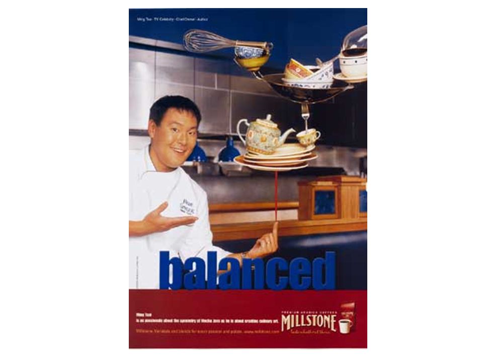
● no more than three fonts per presentation - use the variations of a single font: example: Arial - Bold, Italic, Bold Italic - variations only count as one single font - One for your Title and Headers - One for your content - One for an accent: “New”, “Know”, “Activity”, etc. Typography and fonts Design Tips

26
● keep to maximum of five to seven lines of informational text ● use minimal of 24 points for content information 28 points is better use of text on slide ● be consistent with the choice of font and font size for: Headers Information text - bullet points Design Tips

27
Slide Heading/Topic Heading - 32 Information text be 28 ● bullet points might always be 24 pt. Information text be 28 ● bullet points might always be 24 pt.

28
Backgrounds ● Stay away from any background with animation – Ribbons. ● Use light colored backgrounds with dark text. Unless you have a single important point. Then use a color box to frame information. ● Gradient backgrounds rarely work well.

29
Backgrounds ● Stay away from any background with animation – Ribbons. ● Use light colored backgrounds with dark text. Unless you have a single important point. Then use a color box to frame information. ● Gradient backgrounds rarely work well.

30
Backgrounds ● Stay away from any background with animation – Ribbons. ● Use light colored backgrounds with dark text. Unless you have a single important point. Then use a color box to frame information. ● Gradient backgrounds rarely work well.

33
Creative Text Creating interesting text for Titles and Headings.

34
Thin and thick lines Smooth and Rough Sans Serif fonts with Serif fonts W i d e spacing and Narrow spacing Cool Colors Warm Colors Color Value Changes Just one color Different Levels or font size Adding Contrast

36
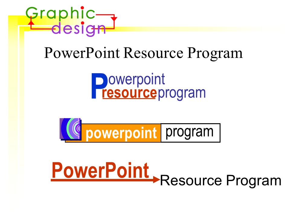
Resource Program PowerPoint Resource Program program powerpoint PowerPoint program resource owerpoint P

42
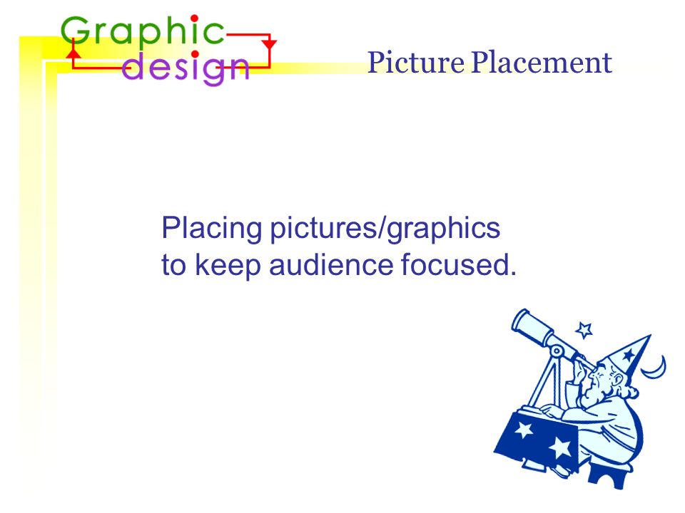
Picture Placement Placing pictures/graphics to keep audience focused.

43
images: helpful or hurtful ● images/graphics will not: - be distracting or annoying to the viewer - be used because they are “cute” or “cool” Design Tips ● images/graphics will: - be relevant to the material being presented - support the ideas being explained - have a purpose or relationship to the concepts

44
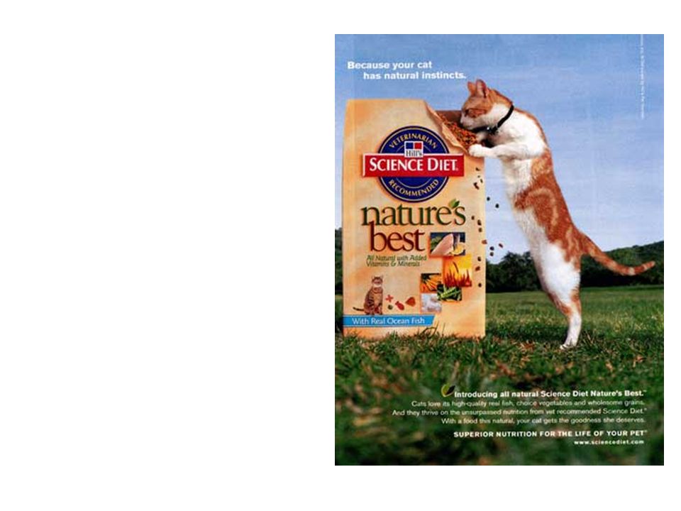
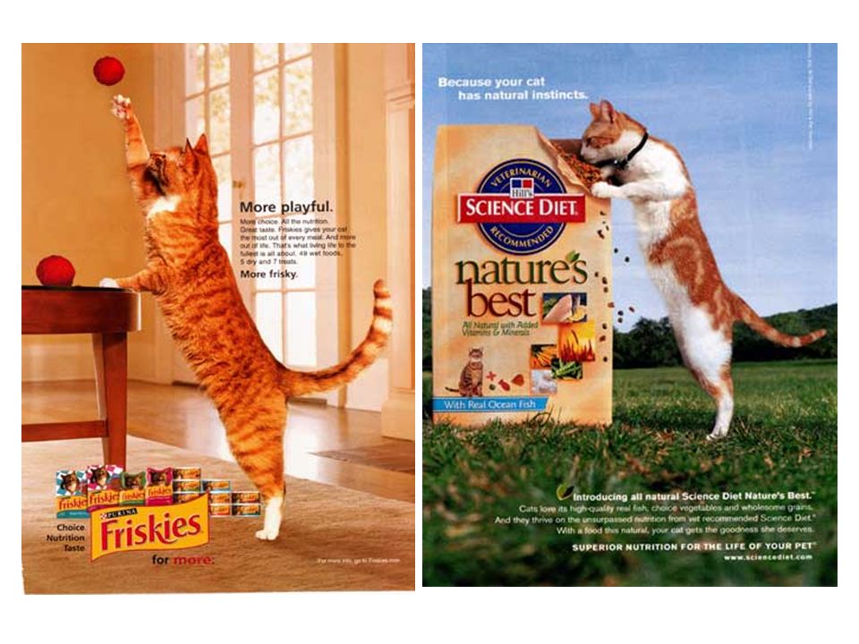
● your audience will look in the direction of your graphic image if: - the image has eyes - the image portrays movement - the image suggests directionality images: helpful or hurtful ● images always look towards your information and move towards your content and printed texts Design Tips

45
where does it go? 1. 2. 3. 4. Design Tips

46
where does it go? 1. 2. 3. 4. Design Tips

47
where does it go? 1. 2. 3. 4. Design Tips

48
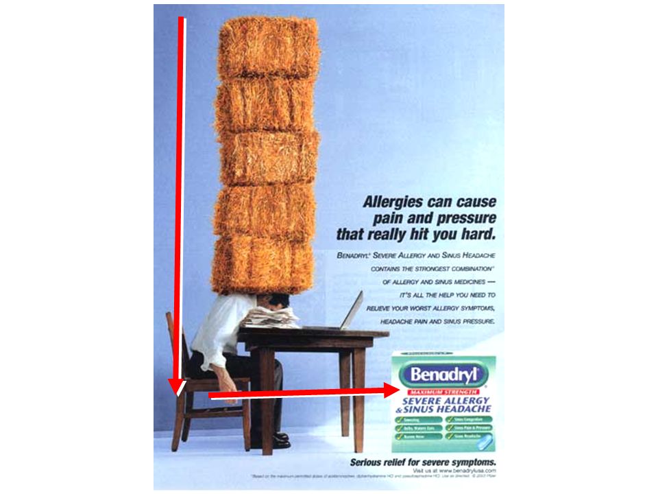
Directionality of graphics Directionality and the brain Design Tips ● Your brain will follow repeated colors ● Shapes/images which create a point ● Easiest movement to guide is from: - left to right (increase, decrease) - downward (gravity experience)
 - downward (gravity experience)")
49
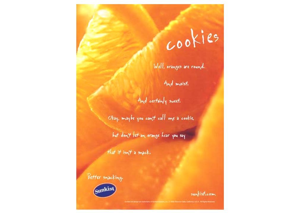
Eye gaze path Left to right Top to Bottom Dead Zone Lower Left Corner Directionality

50
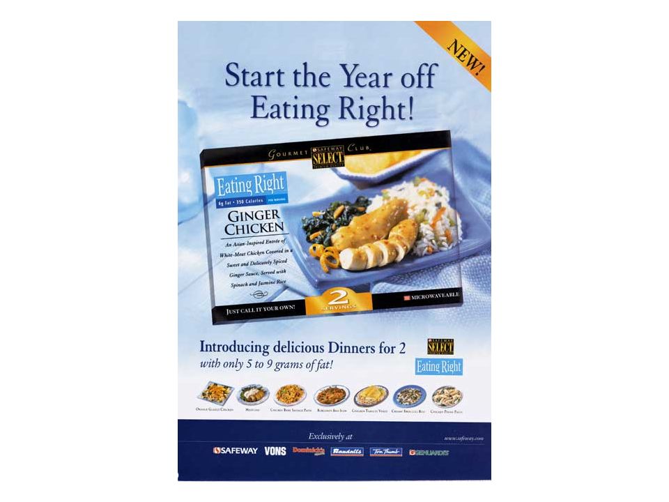
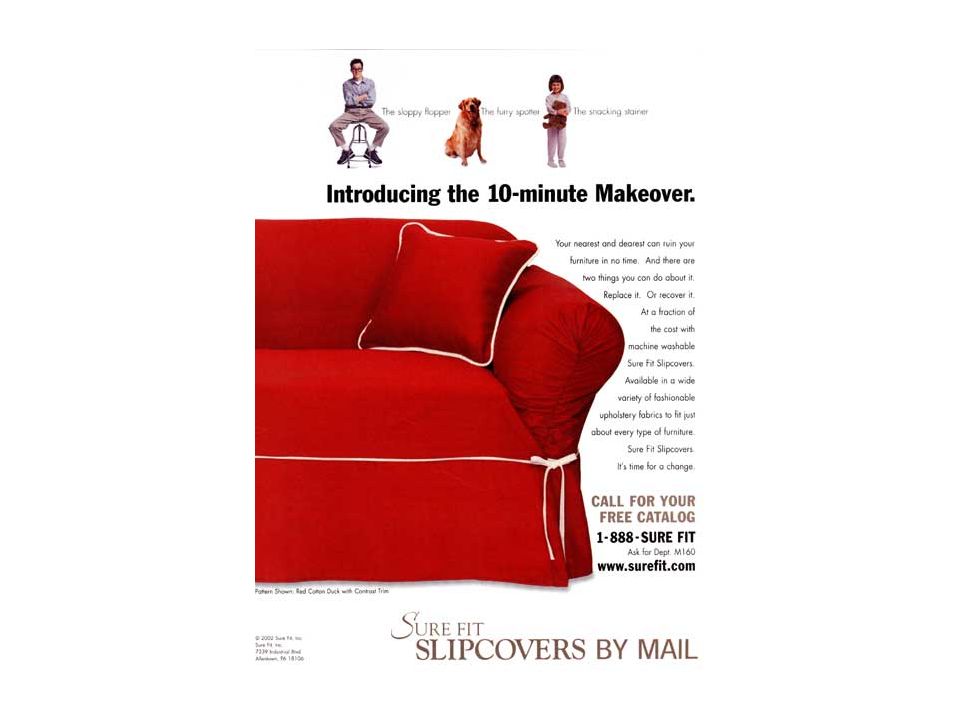
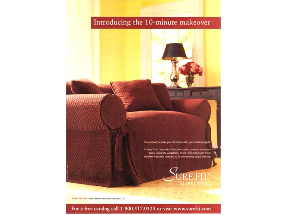
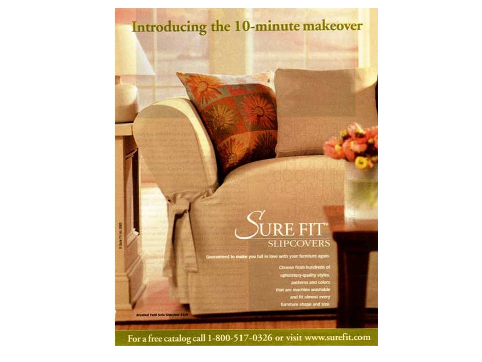
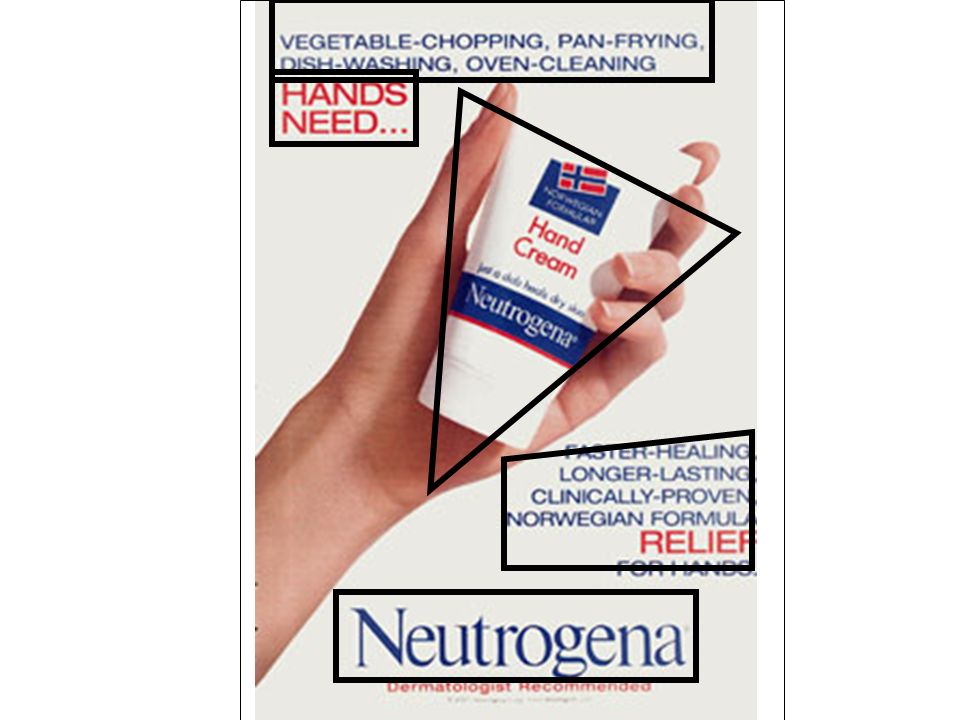
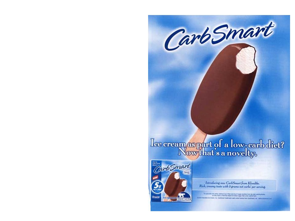
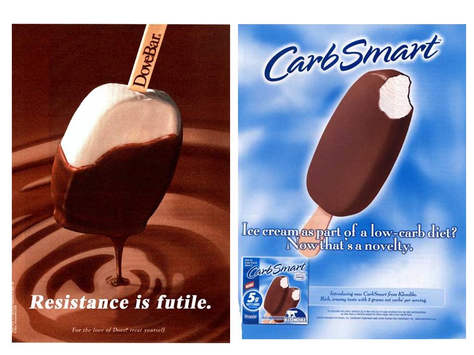
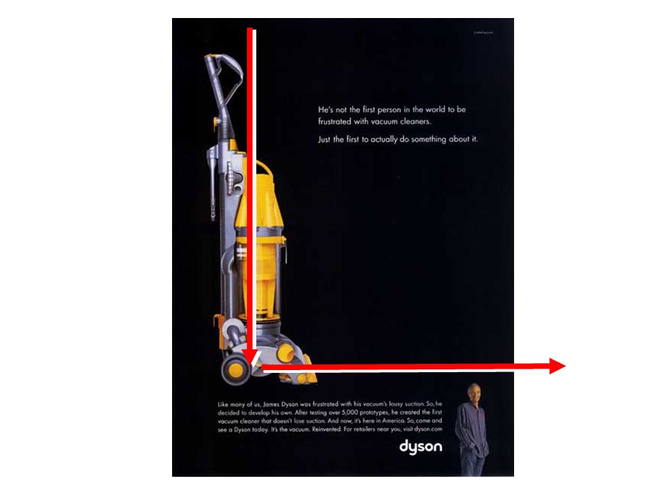
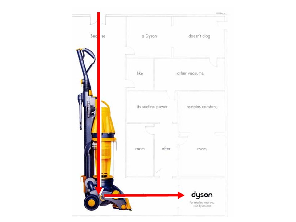
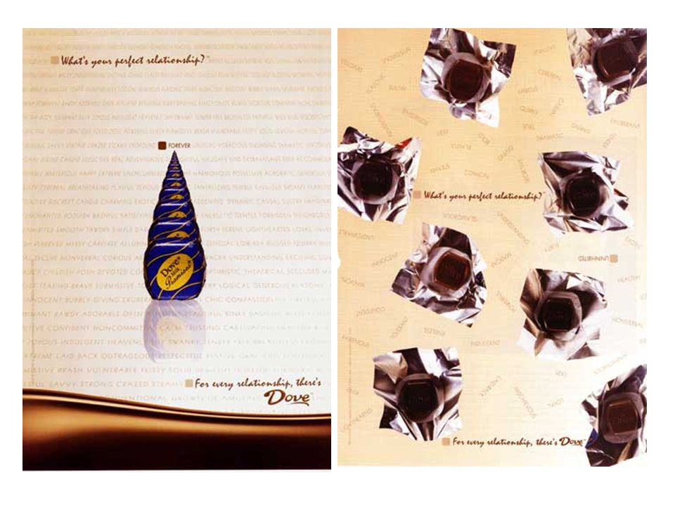
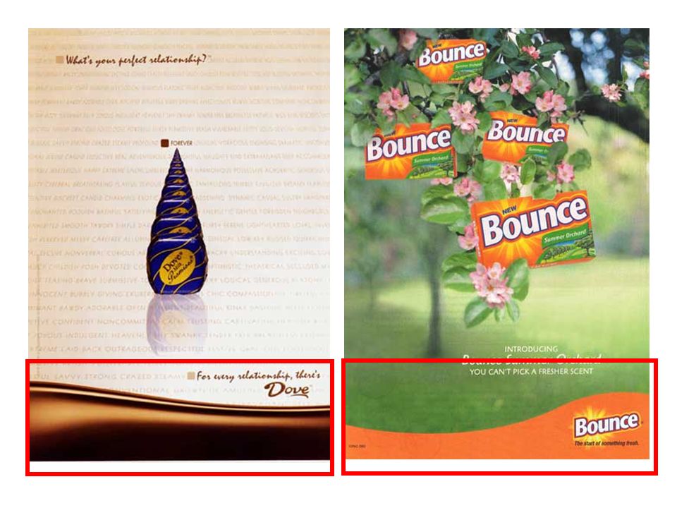
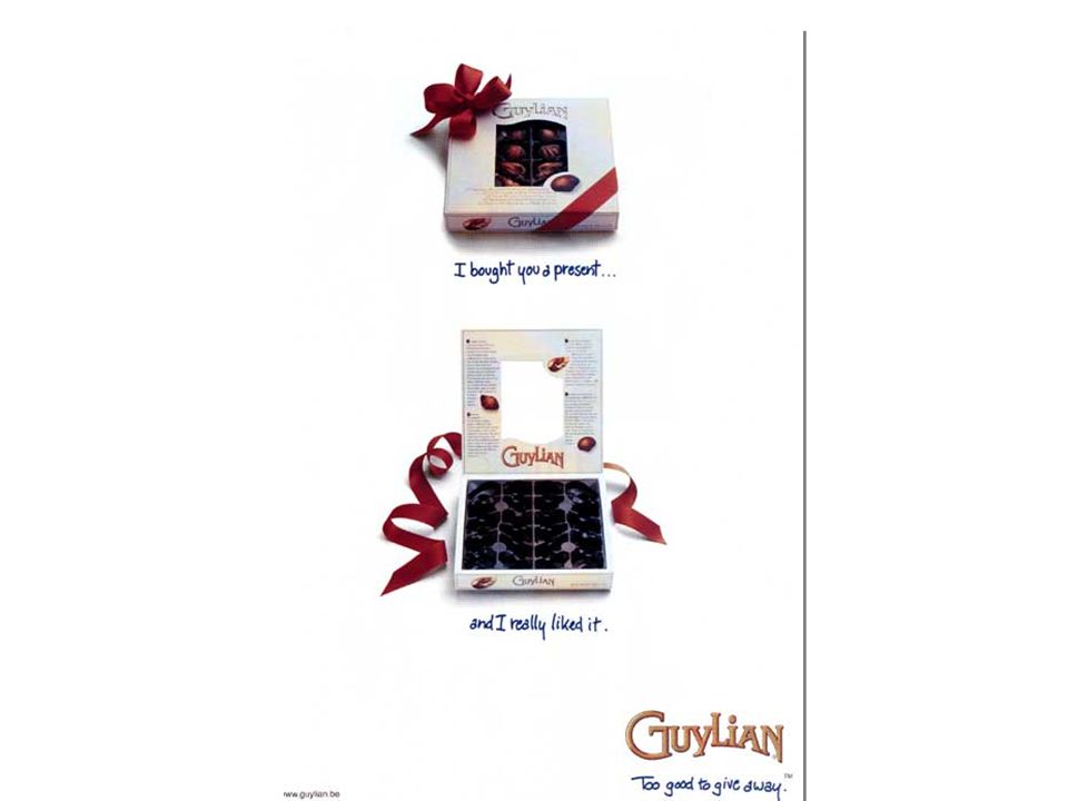
Design Tips Examples of how print ads direct your eyes … sometimes.

51
Directionality of graphics

55
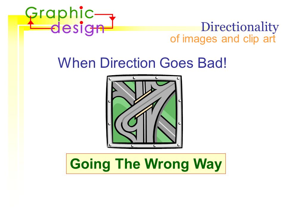
of images and clip art When Direction Goes Bad! Directionality Going The Wrong Way

68
Dead Zone The ‘Good and the Bad’ of the Dead Zone.

71
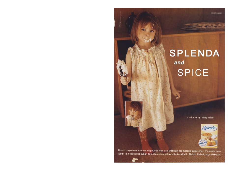
Picture Placement Strong “Downward” Designs

78
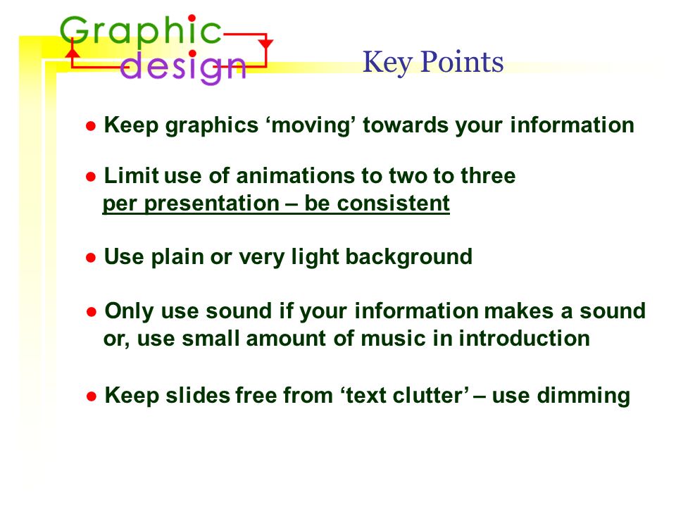
Key Points ● Keep graphics ‘moving’ towards your information ● Limit use of animations to two to three per presentation – be consistent ● Use plain or very light background ● Only use sound if your information makes a sound or, use small amount of music in introduction ● Keep slides free from ‘text clutter’ – use dimming

79
That’s all, folks!

Similar presentations


 horizontal poster. We’ve put in the headings we usually see in these.>")


 Example description (1 x indent) Introduction (0 x indent) Body text (1 x indent) lorem ipsum dolor.>")

 Presenter’s Name (example size – 72 pt) University of Wisconsin – Superior (example size – 60 pt) Text Block.>")
