Download presentation
Presentation is loading. Please wait.

1
Mark P. Baldwin Northwest Research Associates, USA Cargese UTLS Summer School, 6 Oct. 2005 Data Graphics AndTypography

2
1) Typography 2) Line plots 3) Avoiding “chartjunk” 4) Examples of bad data graphics 5) Color 6) Contour plots
 Typography 2) Line plots 3) Avoiding chartjunk 4) Examples of bad data graphics 5) Color 6) Contour plots")
3
Abcjy leading font size sans serif font (Arial) serif font (Times New Roman)
 serif font (Times New Roman)")
4
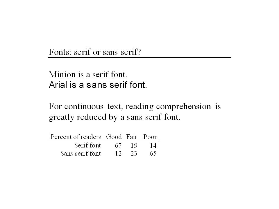
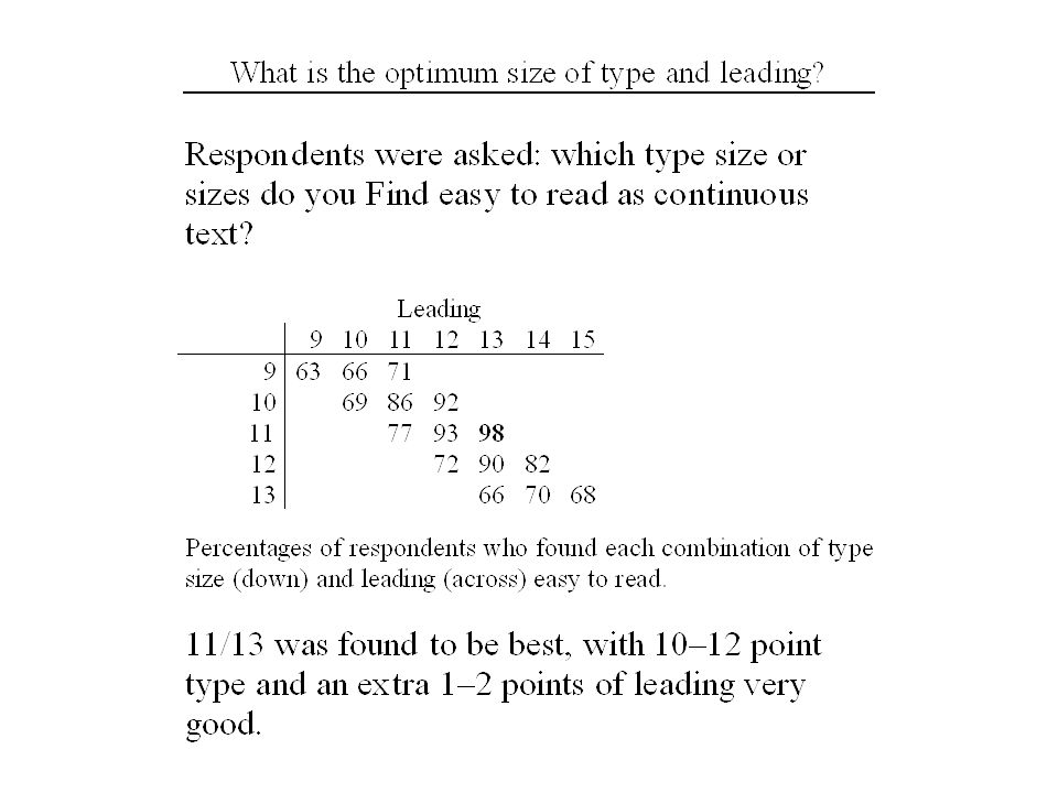
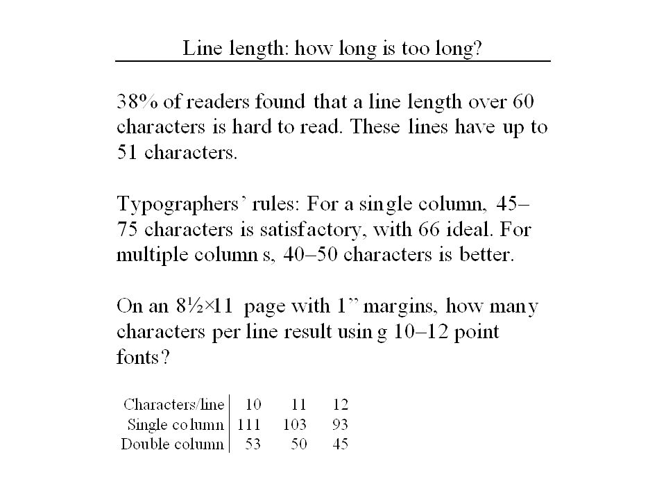
How should you judge whether your typographic choice (e.g., type, type size, leading, number of columns) is a good one? a) You judge whether it looks appealing b) You base your decision on studies of reading comprehension
 You judge whether it looks appealing b) You base your decision on studies of reading comprehension.")
6
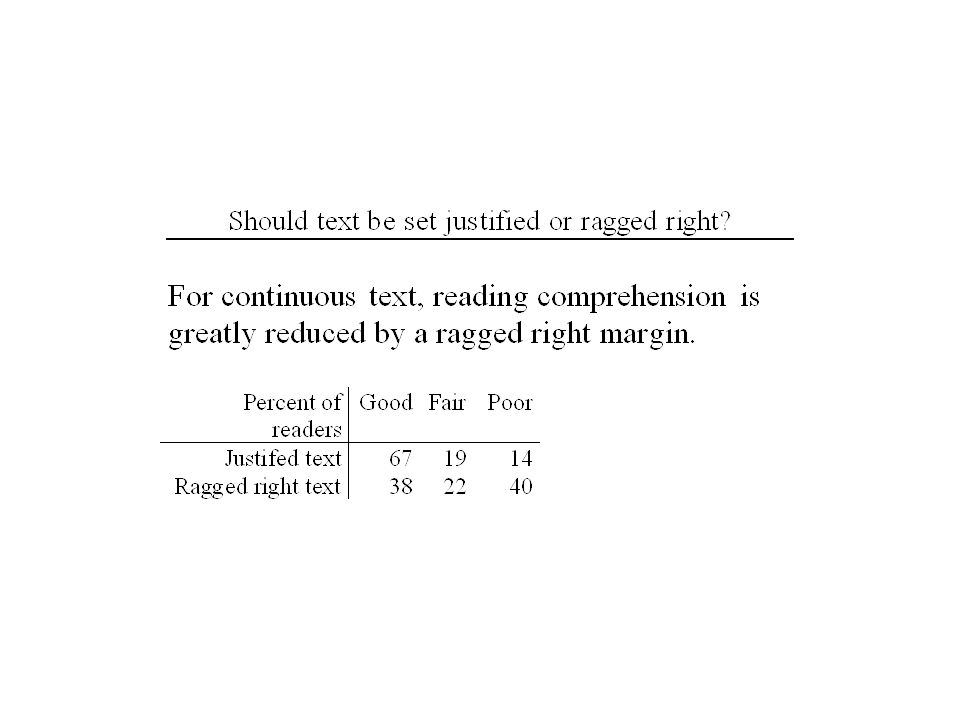
Is the stratosphere important for predicting changes in weather and climate? Although the role of the stratosphere has not been emphasized until recently, observations and models both indicate that the stratosphere acts to integrate high-frequency forcing from below, with long-lasting feedback effects. Justified Ragged right

11
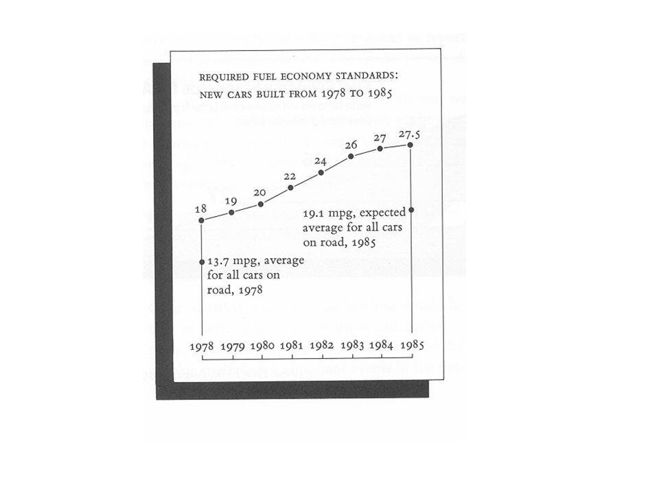
Avoid lying with data….

12
From “The Visual Display of Quantitative Information” by Edward R. Tufte.

19
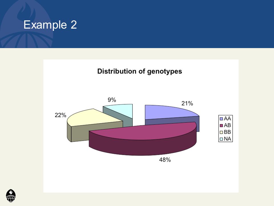
Be accurate and clear. Let the data speak. –Show as much information as possible, taking care not to obscure the message. Science not sales. –Avoid unnecessary frills — esp. gratuitous 3-D. Displaying data well

21
Bank to 45°

22
Maximize Data-ink; Minimize non-Data Ink Edward Tufte (“The visual Display of Quantitative Information”) defines the data ink ratio as: Data Ink Ratio = (data-ink)/(total ink in the plot) The goal is to make this as large as is reasonable. To do this you: Avoid heavy grids Replace enclosing box with an x/y grid Use white space to indicate grid lines in bar charts Prune graphics by: replacing bars with single lines, erasing non-data ink; eliminating lines from axes; starting x/y axes at the data values Avoid over busy grids, excess ticks, redundant representation of simple data, boxes, shadows, pointers, legends.

23
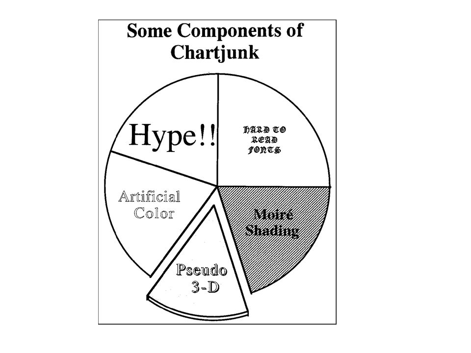
Chartjunk Chartjunk consists of decorative elements that provide no data and cause confusion (e.g., fake 3-D). Elements in close proximity cause a visible interaction. Such interactions can be very fatiguing (e.g., moiré patterns, optical vibration) and can show information that is not really there. In major science publications we see 2% to 20% moiré vibration. For example, in recent statistical and computer publications chartjunk ranges from 12% to 68%.
 and can show information that is not really there. In major science publications we see 2% to 20% moiré vibration. For example, in recent statistical and computer publications chartjunk ranges from 12% to 68%..")
31
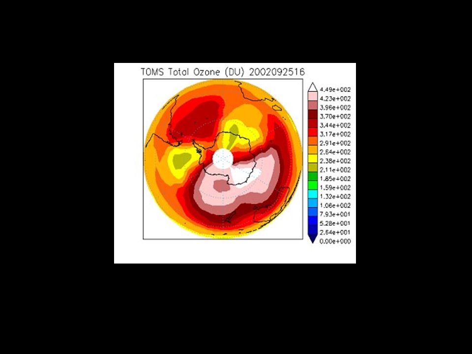
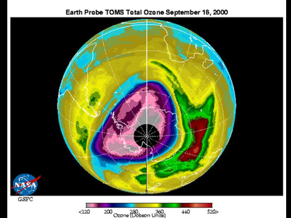
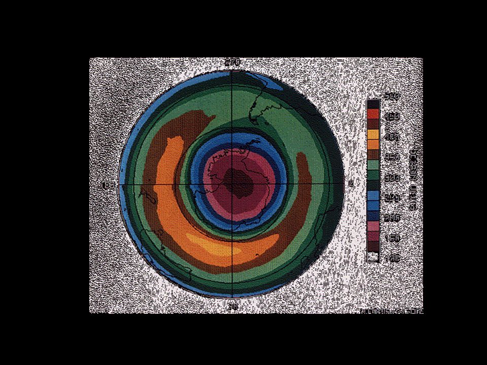
Color Tables

35
Composite surface maps for high and low AO index. (From Thompson and Wallace, Science 2001) >0.9°C
 >0.9°C")
36
From Baldwin and Dunkerton, 2001

37
From Baldwin and Gray, 2005

39
Avoid visual puzzles.

45
Example 1 Drug A Drug C Drug B

46
Example 1

48
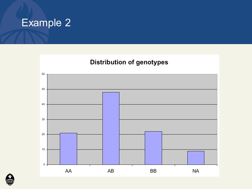
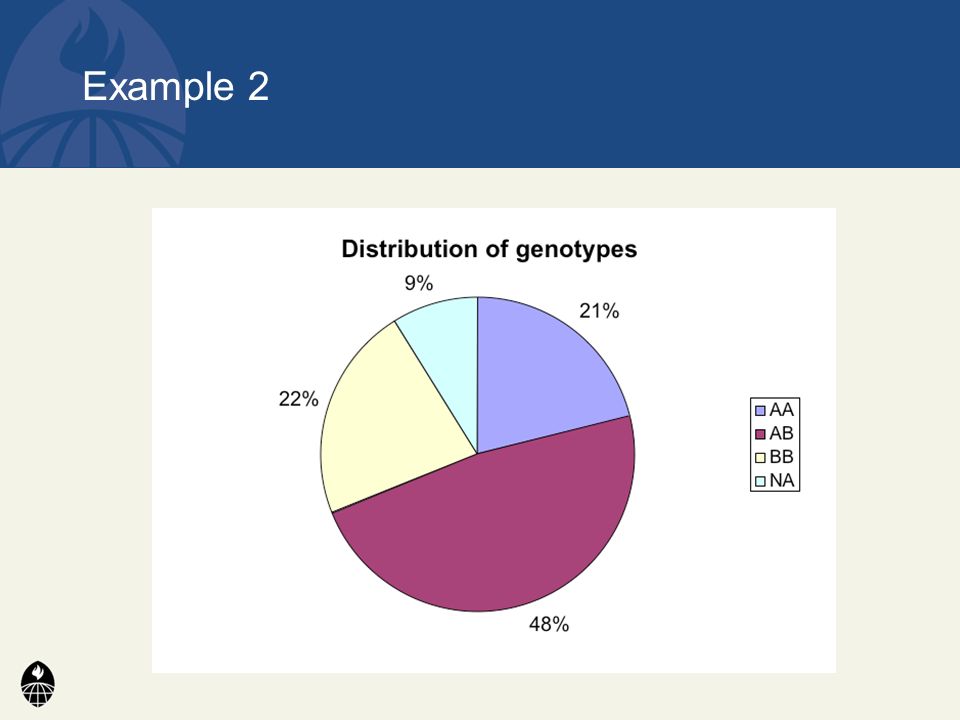
Distribution of genotypes AA21% AB48% BB22% missing 9% Example 2

54
1) Pay attention to typography 2) Work to improve graphs and plots 3) Avoid “chartjunk” 4) Maximize data ink 5) Avoid visual puzzles 6) Use easy-to-decode color tables 7) Try to make the message in your graphic immediately apparent Conclusions
 Pay attention to typography 2) Work to improve graphs and plots 3) Avoid chartjunk 4) Maximize data ink 5) Avoid visual puzzles 6) Use easy-to-decode color tables 7) Try to make the message in your graphic immediately apparent Conclusions")
Similar presentations


>")


