Download presentation
Presentation is loading. Please wait.

1
Chapter 2 Organizing the Data

2
Introduction Learn how to show variable relationship through diagrams Thematically cover graphs and maps Understand the importance of using appropriate data in representing variables Become comfortable in applying graphical representation within various types of analyses (e.g., bivariate and multivariate)
")
3
Frequency Distributions of Nominal Data Formulas and statistical techniques used by social researchers to: Organize raw data Test hypotheses Raw data is often difficult to synthesize Most common types of distributions are: Frequency Percentage Combination

4
Conventions for Building Tables Title of distribution explains contents Variable(s) in table Shows data distribution Use column headings Relevant columns are totaled Footnotes added if needed
 in table Shows data distribution Use column headings Relevant columns are totaled Footnotes added if needed")
5
Nominal Data and Distributions Responses of Young Boys to Removal of Toy Response of Childf Cry25 Express Anger15 Withdraw5 Play with another toy 5 N=50 Frequency distribution of nominal data consists of two columns: Left column has characteristics (e.g., Response of Child) Right column has frequency (f)
 Right column has frequency (f)")
6
Comparing Distributions Comparisons clarify and add information Response to Removal of Toy by Gender of Child Gender of Child Response of ChildMaleFemale Cry2514 Express Anger151 Withdraw52 Play with another toy 5 8 Total5025

7
Proportions and Percentages Proportions - Compares the number of cases in a given category with the total size of the distribution Most prefer percentages to show relative size. Percentage – The frequency per 100 cases Formula for proportion Formula for percentage

8
Illustration: Gender of Students Majoring in CJ(f) Criminal Justice Majors GenderCollege ACollege B Male879119 Female47364 Total1,352183
 Criminal Justice Majors GenderCollege ACollege B Male Female47364 Total1,352183")
9
Illustration: Gender of Students Majoring in CJ (f and %) Criminal Justice Majors College ACollege B Gender f%f% Male 8796511965 Female 473356435 Total1,352100183100
 Criminal Justice Majors College ACollege B Gender f%f% Male Female Total1,")
10
Rates Rates usually preferred by social researchers Rate – comparison between actual and potential cases Base terms in rates may vary

11
Some Common Rate Calculations Suppose 500 births occur among 4,000 women of childbearing age. This would be a rate of 125 live births for every 1,000 women of childbearing age. Suppose 562 suicides occur in a state with 4.6 million residents. The suicide rate would be 12.2 suicides per 100,000 residents.

12
Rate of Change Compare the same population at two points in time Rate of Change = time 2f – time1f time 1f (100)* YearTheft Rate 1 % Change 2005120.3 2006127.4 2007116.8 2008107.4 200998.7 201094.6 1 Source: National Crime Victimization Survey
* YearTheft Rate 1 % Change Source: National Crime Victimization Survey")
13
Rate of Change Compare the same population at two points in time Rate of Change = time 2f – time1f time 1f (100)* YearTheft Rate 1 % Change 2005120.3 2006127.45.9% 2007116.8-8.3% 2008107.4-8.0% 200998.7-8.1% 201094.6-4.2% 1 Source: National Crime Victimization Survey
* YearTheft Rate 1 % Change % % % % % 1 Source: National Crime Victimization Survey")
14
Ordinal/Interval Data and Distributions Attitudes Toward Televised Trials F Slightly Favorable 9 Somewhat Unfavorable 7 Strongly Favorable 10 Slightly Unfavorable 6 Strongly Unfavorable 12 Somewhat Favorable 21 Total 65 Attitudes Toward Televised Trials F Strongly Favorable 10 Somewhat Favorable 21 Slightly Favorable 9 Slightly Unfavorable 6 Somewhat Unfavorable 7 Strongly Unfavorable 12 Total 65

15
Frequency Distribution of Final-Examination Grades for 71 Students Gradef f f f 990852714570 981841709561 970830693550 961823685541 951811671530 940802663521 930798650511 92178164150 1 911770632N = 71 900762620 891751610 880741602 871731593 860722581

16
Grouped Frequency Distributions of Interval Data Grouped frequency distribution used to clarify presentation of data. Categories or groups referred to a class intervals Class interval size determined by the number of values

17
Grouped Frequency Distributions of Interval Data Grouped Frequency Distribution of Final- Examination Grades for 71 Students Class Intervalf% 95-993 90-942 85-894 80-847 75-7912 70-7417 65-6912 60-645 55-595 50-54 4

18
Constructing Class Intervals Categories must be mutually exclusive and exhaustive Designed to reveal or emphasize patterns Possible to have too few or too many groups – blurs the data Class intervals have a midpoint Dealing with decimal data

19
Flexible Class Intervals Income CategoryF% $100,000 and above16,88621.9 $75,000-$99,99910,47113.5 $50,000-$74,00015,75420.3 $40,000-$49,99974889.7 $30,000-$39,999799610.3 $20,000-$29,999816910.6 $15,000-$19,99937094.8 $10,000-$14,99928903.7 $5001-$999920242.6 Under $500020312.6 N = 77688

20
Cumulative Distributions Cumulative frequencies involve the total number of cases having a given score or a score that is lower Cumulative frequency shown as cf cf obtained by the sum of frequencies in that category plus all lower category frequencies Cumulative percentage – percentage of cases having any score or a lower score

21
Grouped Frequency Distributions of Interval Data Grouped Frequency Distribution of Final- Examination Grades for 71 Students Class IntervalfCf%C% 95-9934.23 90-9422.82 85-8945.63 80-8479.86 75-791216.90 70-741723.94 65-691216.90 60-6457.04 55-5957.04 50-54 4. 5.63

22
Grouped Frequency Distributions of Interval Data Grouped Frequency Distribution of Final- Examination Grades for 71 Students Class IntervalfCf%C% 95-993714.23100 90-942682.8295.76 85-894665.6392.94 80-847629.8687.31 75-79125516.9077.45 70-74174323.9460.55 65-69122616.9036.31 60-645147.0419.71 55-59597.0412.67 50-54 44 5.63 71 100

23
Chapter 2 Day 2

24
Cross-Tabulations Frequency distributions are limited Sometimes we want to know how is one variable (usually the dependent variable) distributed across another (usually the independent variable) Cross-tabulations meet this need as they allow us to consider two or more dimensions of data.
 distributed across another (usually the independent variable) Cross-tabulations meet this need as they allow us to consider two or more dimensions of data.")
25
Frequency Distribution of Seat Belt Use Use of Seat Beltsf% All the time49950.1 Most of the time17617.7 Some of the time12412.4 Seldom838.3 Never11511.5 Total997100 Cross-tab Cross-Tabulation of Seat Belt Use by Gender Gender of Respondents Use of Seat BeltsMaleFemaleTotal All the time144355499 Most of the time66110176 Some of the time5866124 Seldom394483 Never6055115 Total367630997

26
What Type to Choose? There are three sets of percentages Total Row Column All are correct, mathematically speaking Total percentages may be misleading Rule of thumb If the IV is on the row, use row percentage If the IV is on the column, use column percentage

27
Cross-tab Formulas Formula for total percents Formula for row percents Formula for column percents

28
Cross Tabulations – Victim-Offender Relationship by Gender of Victim for Homicides in US for 2005 (With Row%) Victim-Offender Relationship GenderIntimateIntimate %FamilyFamily %OtherOther %TotalTotal % Male6171,31011,23513,161 Female1,4706391,4213,531 Total2,0871,94912,65616,692
 Victim-Offender Relationship GenderIntimateIntimate %FamilyFamily %OtherOther %TotalTotal % Male6171,31011,23513,161 Female1, ,4213,531 Total2,0871,94912,65616,692")
29
Cross Tabulations – Victim-Offender Relationship by Gender of Victim for Homicides in US for 2005 (With Row%) Victim-Offender Relationship GenderIntimateIntimate %FamilyFamily %OtherOther %TotalTotal % Male6174.7%1,31010.0%11,23585.4%13,161100% Female1,47041.6%63918.1%1,42140.2%3,531100% Total2,08712.5%1,94911.7%12,65675.8%16,692100%
 Victim-Offender Relationship GenderIntimateIntimate %FamilyFamily %OtherOther %TotalTotal % Male6174.7%1, %11, %13,161100% Female1, % %1, %3,531100% Total2, %1, %12, %16,692100%")
30
Cross Tabulations – Victim-Offender Relationship by Gender of Victim for Homicides in US for 2005 (With Row%) Age JuvenileJuvenile %AdultAdult %TotalTotal % Person45228273 Property117194311 Other225204429 Total3876261013
 Age JuvenileJuvenile %AdultAdult %TotalTotal % Person Property Other Total")
31
Cross Tabulations – Victim-Offender Relationship by Gender of Victim for Homicides in US for 2005 (With Row%) Age JuvenileJuvenile %AdultAdult %TotalTotal % Person4511.63%22836.42%27326.95% Property11730.23%19430.99%31130.7% Other22558.14%20432.59%42942.35% Total387100%626100%1013100%
 Age JuvenileJuvenile %AdultAdult %TotalTotal % Person % % % Property % % % Other % % % Total387100%626100% %")
32
Graphic Presentations Graphs are useful tools to emphasize certain aspects of data. Many prefer graphs to tables. Types of graphs include: Pie charts, bar graphs, frequency polygons, line charts, and maps

33
Pie Charts Pie chart – a circular chart whose pieces add up to 100%. Especially good for nominal data. Possible to highlight or “explode” certain pieces for emphasis

34
Pie Chart

35
Exploded Pie Chart

36
Bar Graphs & Histograms Represent frequency distribution plot of: Categories/variables on one axis Responses as bars on another axis Bar length represents category frequency Bar graphs used primarily for discrete variables Histograms used to display continuous measures.

37
Bar Graph

38
Histogram of Distribution of Children in Little Rock Community Survey

39
Frequency Polygons Stresses continuity along a scale rather than differentness Frequency distribution of a single variable Used for: Continuous data Ordinal data Interval data

40
Frequency Polygon Example

41
Line Charts Generally show change (trends) temporally Show trends in: One variable Plotting two or more variables Similar to polygons, but not enclosed on the right margin
 temporally Show trends in: One variable Plotting two or more variables Similar to polygons, but not enclosed on the right margin")
42
Number of Adolescents (< 18 y/o) Using for the First Time by Month
 Using for the First Time by Month")
43
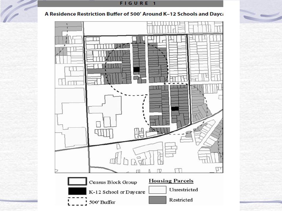
Maps Growing in popularity due to geo-coding and geo-mapping Unparalleled method for exploring geographical patterns in data For instance, a map of the U.S. Helps show which area has more or less points

45
Shape of a Distribution Kurtosis Leptokurtic Platykurtic Mesokurtic Skewness Negative Positive Normal Curve

46
Kurtosis LeptokurticPlatykurtic Mesokurtic Some Variation in Kurtosis among Symmetrical Distributions

47
Skewness Negatively skewedPositively skewedSymmetrical (Normal) Three Distributions Representing Direction of Skewness
 Three Distributions Representing Direction of Skewness")
48
Summary Organizing raw data is critical Data can be summarized using frequency distributions. Comparisons of groups possible through proportions, percentages and rates. Cross-tabs allow dimensional (and more) analysis Graphic presentations: help to emphasize findings make data more accessible to consumers of research help researchers identify trends
 analysis Graphic presentations: help to emphasize findings make data more accessible to consumers of research help researchers identify trends.")
Similar presentations


 & Bivariate Statistics>")


