Download presentation
Presentation is loading. Please wait.

1
Data Presentation

2
Descriptive Statistics
Descriptive statistics provide procedures to organize data we have collected from studies, summarize sample findings, and present these summaries in ways that can be easily communicated to others.

3
Descriptive Statistics
The goal of descriptive statistics is to summarize a collection of data in a clear and understandable way. What is the pattern of scores over the range of possible values? Where, on the scale of possible scores, is a point that best represents the set of scores? Do the scores cluster about their central point or do they spread out around it?

4
Display Graphs often make it easier to see certain characteristics and trends in a set of data. Graphs for quantitative data. Histogram Frequency Polygon Stem and Leaf Display Graphs for qualitative data. Bar Chart Pie Chart

5
Data Classifications or Scales
Nominal - groups subjects into mutually exclusive categories; numerals represent category labels only (sex, nationality, blood type, clinical diagnosis) Ordinal - gives a quantitative order to the variable; numbers indicate rank order of observations (manual muscle test, functional status, pain) Interval - equal units of measurement between each division, but no true zero thus can not represent absolute quantity (calendar years, IQ, temperature) Ratio - interval scale with an absolute zero (distance, age, time, weight strength, blood pressure) Data can be classified into several scales: The first two are non-parametric data and the last two are parametric (meet the assumptions of normality). Nominal - groups subjects into mutually exclusive categories no qualitative differentiation among the groups often used for frequency data - scale indicates the frequency or number of times an event happens Ordinal - rank order scale - gives quantitative order to the variables, but not how much better unequal distance between the positions Interval - equal units of measurement; the same distance between each division of the scale; no absolute zero ( absence of value) Ratio - based on order, has equal distance between positions and uses zero to represent the absence of value (distance, force, time -- negative score is not possible). Data are generally disorganized and doesn’t mean much, but can be organized by using statistics.
 Ordinal - gives a quantitative order to the variable; numbers indicate rank order of observations (manual muscle test, functional status, pain) Interval - equal units of measurement between each division, but no true zero thus can not represent absolute quantity (calendar years, IQ, temperature) Ratio - interval scale with an absolute zero (distance, age, time, weight strength, blood pressure) Data can be classified into several scales: The first two are non-parametric data and the last two are parametric (meet the assumptions of normality). Nominal - groups subjects into mutually exclusive categories. no qualitative differentiation among the groups. often used for frequency data - scale indicates the frequency or number of times an event happens. Ordinal - rank order scale - gives quantitative order to the variables, but not how much better unequal distance between the positions. Interval - equal units of measurement; the same distance between each division of the scale; no absolute zero ( absence of value) Ratio - based on order, has equal distance between positions and uses zero to represent the absence of value (distance, force, time -- negative score is not possible). Data are generally disorganized and doesn’t mean much, but can be organized by using statistics.")
6
Scales of Measurement Discrete variable: Continuous variable:
Consists of separate, indivisible categories; no values between neighboring categories. e.g., students in a class; psychiatric disorders Continuous variable: Divisible into an infinite number of fractional parts. e.g., height, weight, time. Scores on continuous variables are actually intervals – therefore, they may have boundaries called real limits.

7
Scales of Measurement 1. nominal: Set of categories, but no quantitative distinctions between categories. example: professions

8
Scales of Measurement 2. ordinal: Categories ranked in terms of magnitude. example: ranking participants in a race

9
Scales of Measurement 3. interval: Ordered categories with equal intervals between them; however, ratios of magnitudes are not meaningful. example: IQ scores Is a person with IQ 200, twice as intelligent as the person with IQ 100?

10
Scales of Measurement 4. ratio: An interval scale with the additional feature of an absolute zero (ratios are meaningful). example: time measurements Is two hours twice as long as one hour?

11
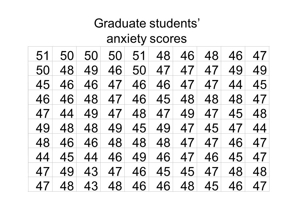
Graduate students’ anxiety scores
51 50 48 46 47 49 45 44 43
12
First you must list your scores in order.
Next, record the number of times each score occurs.

13
Anxiety Scores 51 50 49 48 47 46 45 44 43 Relative Freq. Freq (f) 51 50 49 48 47 46 45 44 43 II IIII IIII IIII IIII IIII IIII IIII IIII IIII IIII IIII IIII IIII IIII I 2 5 10 20 25 11 .02 .05 .10 .20 .25 .11 Check each time these numbers occur Total

14
Cumulative Frequency Distribution
Records all subjects who obtained a particular score or lower. X freq Cumulative Freq

15
The Percentile Rank This is a measure of relative standing, i.e., it tells us where a particular score falls in relation to the rest of the data set. In fact, it tells us what percentage of scores in a data set fall at or below a particular score. For a score at the pth percentile, p% of the scores fall at or below that score. E.g. On his first stats test, a student scored at the 70 percentile. This means 70% of the class scored the same or lower than that student.

16
Eg., The following scores are received on a
You need a cumulative frequency distribution when calculating percentile rank. Eg., The following scores are received on a stats exam marked out of 20. X freq Cumulative freq What is the percentile rank of the score 14?

17
Step 1 - Count the number of scores at and below the score you’re looking at.
In this case, 10 scores fall at or below 14. Step 2 - Divide this number by N and multiply by 100 to get the percentile rank. In this case…10/15 X 100 = 67%. The score falls at the 67th percentile.

18
Eg. Graduate Students Anxiety Scores
When the score in question is obtained more than once, a couple of steps must be added. Eg. Graduate Students Anxiety Scores X freq Cumulative Freq What is the percentile rank of the score of 46?

19
Step 1 - Count the number of scores below the score you’re looking at.
In this case, 18 scores fall below 46. Step 2 - Divide the number of scores the same as the one you’re looking at by 2. In this case, 20 people scored 46. 20/2 = 10.

20
Step 3 - Add this number to the total from step 1.
= 28. Step 4 - Divide this number by N and multiply by 100 to get the percentile rank. 28/100 x 100 = 28%. The score 46 falls at the 28th percentile.

21
The Percentile Rank (backwards)
We know how to find the percentile rank that corresponds to a score, but what if we want to do the reverse? What if we want to find the score that corresponds to a certain percentile rank.

22
E.g., The following scores are obtained on an
exam marked out of 20. X freq Cumulative freq What score is at the 75th percentile?

23
Step 1- Multiply the decimal form of the percentile rank by N.
0.75 X 15 = 12 This tells you are looking for the 12th score in the cumulative frequency distribution. Step 2- Locate this score on the cumulative frequency distribution. The score at the 75th percentile is 16.

25
Frequency Distributions
Simply a way of organizing and making sense of a data set. It’s difficult to get a sense of what the scores are really like when you just look at a data set. E.g., A hundred graduate students are given a test to measure their anxiety. They receive the following scores. Scores can range from 40 (low) to 55 (high).
 to 55 (high).")
26
What is the pattern of scores?
Create a Frequency Distribution Frequency distributions organize raw data or observations that have been collected. Ungrouped Data Listing all possible scores that occur in a distribution and then indicating how often each score occurs. Grouped Data Combining all possible scores into classes and then indicating how often each score occurs within each class. Easier to see patterns in the data, but lose information about individual scores.

27
An Example: Grouped Frequency Distribution
Las Vegas Hotel Rates An Example: Grouped Frequency Distribution Find the lowest and highest score (order scores from lowest to highest). 891 is highest score. 52 is lowest score. Find the range by subtracting the lowest score from the highest score. = 839 Divide range by 10. 839/10 = 83.9 Round off to the nearest convenient width. 100 Determine the scores at which the lowest interval should begin (an interval of the class width).
. 891 is highest score. 52 is lowest score. Find the range by subtracting the lowest score from the highest score = 839. Divide range by /10 = Round off to the nearest convenient width Determine the scores at which the lowest interval should begin (an interval of the class width).")
28
An Example: Grouped Frequency Distribution
Record the limits of all class intervals, placing the interval containing the highest score value at the top. Count up the number of scores in each interval. Las Vegas Hotel Rates

29
Frequency Table Guidelines
Intervals should not overlap, so no score can belong to more than one interval. Make all intervals the same width. Make the intervals continuous throughout the distribution (even if an interval is empty). Place the interval with the highest score at the top. For most work, use 10 class intervals. Choose a convenient interval width. When possible, make the lower score limit a multiple of the interval width.
. Place the interval with the highest score at the top. For most work, use 10 class intervals. Choose a convenient interval width. When possible, make the lower score limit a multiple of the interval width.")
30
An Example: Grouped Frequency Distribution
Proportion (Relative Frequency) Divide frequency of each class by total frequency. Used when you want to compare the frequencies of one distribution with another when the total number of data points is different.
 Divide frequency of each class by total frequency. Used when you want to compare the frequencies of one distribution with another when the total number of data points is different.")
31
An Example: Grouped Frequency Distribution
Percentage Proportion *100

32
An Example: Grouped Frequency Distribution
Cumulative Frequency Shows total number of observations in each class and all lower classes.

33
An Example: Grouped Frequency Distribution
Cumulative Proportion (Cumulative Relative Frequency): Divide Cumulative Frequency by Total Frequency Percentile Rank Cumulative Proportion * 100
: Divide Cumulative Frequency by Total Frequency. Percentile Rank. Cumulative Proportion * 100.")
34
Table 1: Examination scores for 80 students

35
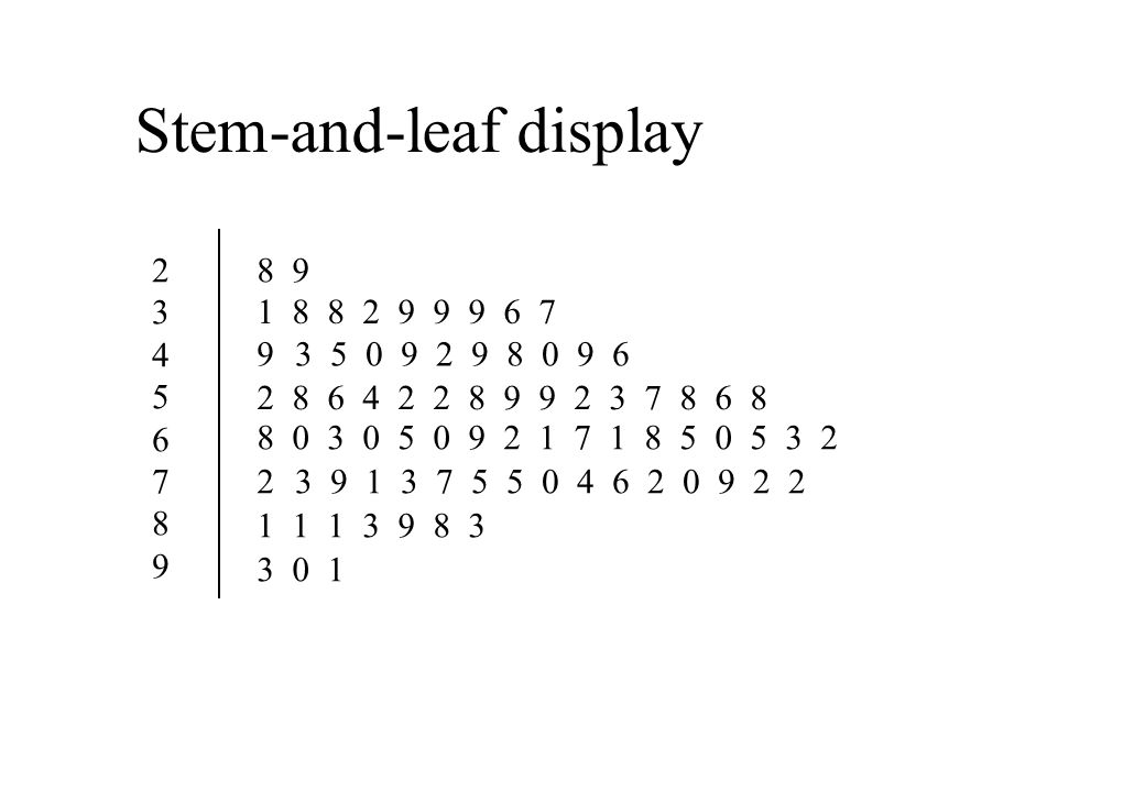
Stem-and-leaf display
2 3 4 5 6 7 8 9 8 9 9 2
36
Stem-and-leaf display
2 3 4 5 6 7 8 9 8 9

37
Stem-and-leaf display
Break each number into its tens and units digits. Tally together values which share the tens digit. The ten digits will then be aligned vertically with the units digits displayed to the side.

38
Frequency distribution of categorical data
Table 2: Responses of young boys to removal of toy Organizing data? Isn’t this table the original raw data?

39
Comparing distributions
Table 4: Response to removal of toy by gender of child More girls withdraw?

40
Comparing distributions
Percentage distribution

41
Comparing distributions
Making comparisons between distributions is a procedure often used. If the total numbers of cases are equal, the frequency distributions can be used to make comparisons In general, we use percentage distributions to make comparison.

42
Grouped distribution Grouped frequency/percentage distributions present raw (unprocessed) data in a more readily usable form. The price for this is the loss of some information. Worthwhile.

Similar presentations

: Analysing data.>")


