Download presentation
Presentation is loading. Please wait.

1
Fear Free Stats! What you need to know to be successful on the AP Test.

2
Intro to STATS Statistics (Stats) can be used as a tool to help demystify research data. Examples: Election polls Market research Exercise regimes Surveys Etc.

3
Definition of Statistics A means of organizing and analyzing data (numbers) systematically so that they have meaning.
 systematically so that they have meaning.")
4
Types Descriptive Stats- Organize data so that we can communicate about that data Inferential Stats- Answers the question, “What can we infer about the population from data gathered from the sample?” Generalizability

5
Measurement Scales Nominal Scale Ordinal Scale Interval Scale Ratio Scale

6
Looking at data in a meaningful way EXAMPLE These numbers have little meaning until they are organized. 91 92 87 99 83 84 82 93 89 91 85 94 91 98 90

7
Frequency distribution Frequency distribution- an organized list that enables us to see clusters or patterns in data. 99 – 1 98 – 1 97 – 0 96 – 0 95 – 0 94 – 1 93 – 1 92 – 1 91 – 3 and so on.

8
Grouped Frequency of same scores 95-99 2 90-94 7 85-89 3 80-84 3 N=15 The width of the intervals in grouped frequency tables must be equal. There should be no overlap.

9
Moving on to Graphs These allow us to quickly summarize the data collected. In a glance, we can attain some level of meaning from the numbers.

10
Pie Charts A circle within which all of the data points or numbers are contained in the form of percentages.

11
Bar Graphs A common method for representing nominal data where the height of the bars indicates percentage or frequency of each category

12
Frequency Polygons A line graph that has the same vertical and horizontal labels as the histogram Each score’s frequency of occurrence is marked with a point on the graph, when all points are connected with a line

13
The Frequency Polygon Useful in showing the asymmetry in distribution of ordinal, interval and ratio data. This asymmetry is referred to as SKEW.

14
Positive and Negative SKEW If there is a clustering of data on the high end, then the skew is NEGATIVE because skewness is always indicative of the “tail” or low end of the graph as indicated by low frequency of occurrence. A POSITIVE skew would be indicated by high frequency of low end data points with a few data points at the high end

15
The Tail Tells the Tale The line of the frequency polygon “tails off” to include these low frequency ends or SKEWNESS

16
Line Graphs Indicate change that occurs during an experiment. Shows the change in relationship between IV and DV IV always on the vertical axis and DV on horizontal axis

17
Graphs don’t lie But different representations will provide a different visual that can be deceptive.

18
Descriptive Statistics Measures of central tendency- these numbers attempt to describe the “typical” or “average” score in a distribution. What are the measures of central tendency?

19
Mode The most frequently occurring score in a set of scores. When two different scores occur most frequently it is referred to as bimodal distribution. Example?

20
Median The score that falls in the middle when the scores are ranked in ascending or descending order. This is the best indicator of central tendency when there is a skew because the median is unaffected by extreme scores. If N is odd, then the median will be a whole number, if N is even, the position will be midway between the two values in the set.

21
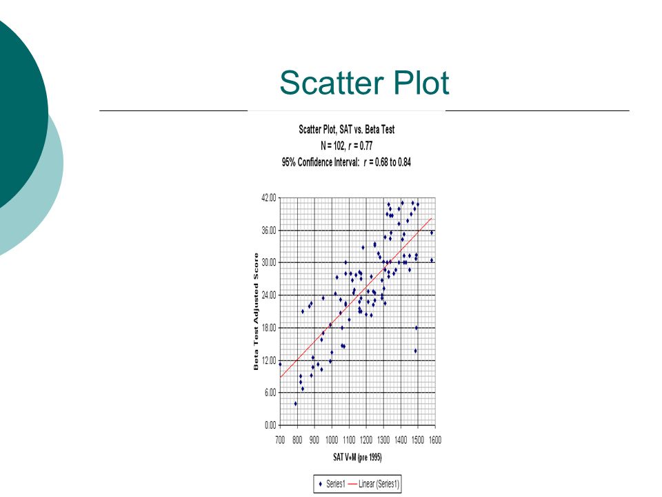
Mean The mathematical average of a set of scores The mean is always pulled in the direction of extreme scores (pulled toward the skew) of the distribution. Examples?

22
Examples SAMPLE TEMPERATURES Week One: Week Two: 71 74 76 79 98 70 74 76 77 78 CALCULATE: MEAN OF WEEK ONEMEAN OF WEEK TWO MEDIAN OF WEEK ONEMEDIAN OF WEEK TWO MODE OF WEEK ONE MODE OF WEEK TWO MEAN OF BOTH WEEKS COMBINED MEDIAN OF BOTH WEEKS COMBINED MODE OF BOTH WEEKS COMBINED

23
MEASURE OF CENTRAL TENDENCY CAN BE MISLEADING Suppose your mother wants you to attend a family reunion on Sunday. Everyone in the family protests! Your mother attempts to separately convince each family member that it will not be so bad.

24
Mom’s story Mom tells your younger sister that the average age of the gathering is 10 years old. She tells you the average age is 18. She tells dad that the average age is 36. Now each family member feels better about spending the day at the family reunion. Did Mom lie?

25
The Attendees Information AGESNAME AND RELATION 3Cousin Susie 7Cousin Sammy 10Twin Shanda 10Twin Wanda 15Cousin Marty 17Cousin Juan 18Cousin Pat 44Aunt Harriet 49Uncle Stewart 58Aunt Rose 59Uncle don 82Grandma Faye 96Great Aunt Lucille

26
Answer me this What is the median? What is the mode? What is the mean? Did Mom “lie”?

27
Answers What is the median? 18 What is the mode? 10 What is the mean? 36 Did Mom “lie”? Not really...

28
Measures of Variability Measures of variability indicate how much spread or variability there is in a distribution. If you collected the ages of all students in the 11th grade, there would be little variability. If you collected the shoe sizes of all students in the 11th grade, there would be greater variability.

29
Range The range is the difference between the lowest and highest score in the data set. The range of scores can be significantly increased with a single outlying score.

30
Example Class One: 94, 92, 85, 81, 80, 73, 62 Range=32 Class Two: 85, 83, 82, 81, 80, 79, 77 Range= 8

31
Variance This is a measure of how different the scores are from each other. The difference between the scores is measured by the distance of each score from the mean of all the scores. FORMULA: Variance= Standard Deviation squared SD 2

32
Standard Deviation This measure of variability is also based on how different scores are from each other. There are computer programs and calculators used for this data. FORMULA: The Standard Deviation is the square root of the variance

33
Normal Distribution The normal curve is a theoretical or hypothetical frequency curve. Most frequency curves are not symmetrical (remember skew) Normal distribution is displayed on a graph with a “bell” shaped curve.
 Normal distribution is displayed on a graph with a bell shaped curve..")
34
Bell Curve

35
%%%%%% Must be memorized

36
Correlations Correlation describes the relationship between two variables How is studying related to grades? How is playing video games related to grades?

37
Positive Correlation Indicates a direct relationship between variables Variables move in the same direction An increase of one variable is accompanied by an increase in another variable A decrease in one variable is accompanied by a decrease in another variable

38
Negative Correlation Indicates an inverse relationship between variables An increase in one variable is accompanied by a decrease in another variable, or vice versa.

39
Correlation coefficients Correlations are measured with numbers ranging from - 1.0 to +1.0. These numbers are called correlation coefficients.

40
Correlation Coefficient As the correlation coefficient moves closer to +1.0, the coefficient shows an increasing positive correlation. As the correlation coefficient moves closer to -1.0, the stronger the negative correlation. A zero could indicate no correlation exists between variables +1.0 and -1.0 indicate a perfect correlation

41
Continued Which is a stronger correlation? -.85 or +.62 +.45 or -.23 -.70 or +.70 The absolute value of the number indicates the strength of the correlation.

42
But… Correlation does not imply causation!

43
Correlational Studies An often used research design. May not have IV and DV, may be variable one and two. Examples?

44
Scatter Plots A visual representation of correlations The x variable is on the horizontal axis and the y variable is on the vertical axis

45
Scatter Plot

48
Inferential Statistics Help us determine if one variable has an effect on another variable. Helps us determine if the difference between variables is significant enough to infer (for credit on an AP Exam, you cannot use the term to define the term) that the difference was due to the variables, rather than chance.
 that the difference was due to the variables, rather than chance..")
49
Statistical Significance Are the results of research strong enough to indicate a relationship (correlation)? Would you publish the results? Researchers commonly use two inferential tests to measure significance T-test ANOVA

50
Are You Free of Fear????? Statistics is an important aspect of research design in psychology. In college you will take an entire course in the Statistics of Psychology. If you have a grasp of what was presented today, you will be successful on the AP Exam.

51
STATS Activity Dice and the Bell Curve (Rob McEntarffer) In this lesson, students use a simple method of gathering and plotting data. Students will discover that the data falls along a bell (normal) curve. You and a partner or two get a pair of dice. Roll the dice, add the results of each die and record the sum in some organized manner. Roll the dice 50 times.
 curve. You and a partner or two get a pair of dice. Roll the dice, add the results of each die and record the sum in some organized manner. Roll the dice 50 times..")
Similar presentations


: Analysing data.>")


