Download presentation
Presentation is loading. Please wait.

1
Reynolds Week 2015 Data Visualization Dianne M. Finch Elon University @dmfinch

2
Reynolds Week 2015 @dmfinch Elon University Reynolds Visiting Professor Today we hope to accomplish the following…. Look at concepts briefly Use Excel files to create visuals in Tableau Public Clean files – or at least talk about it Produce a tree chart, maps and bubbles Add visuals to an HTML web page for viewing IF TIME – we’ll look at Google API and JavaScript

3
What We’ll Cover Data and Encoding Overview Charts and Junk Charts Google Fusion – New Network Graph Tool Map Geocommons – Lat/Long and Map Custom Icons Google API – A timeline Google API – How to manipulate code without knowing code. Other stuff if time!

6
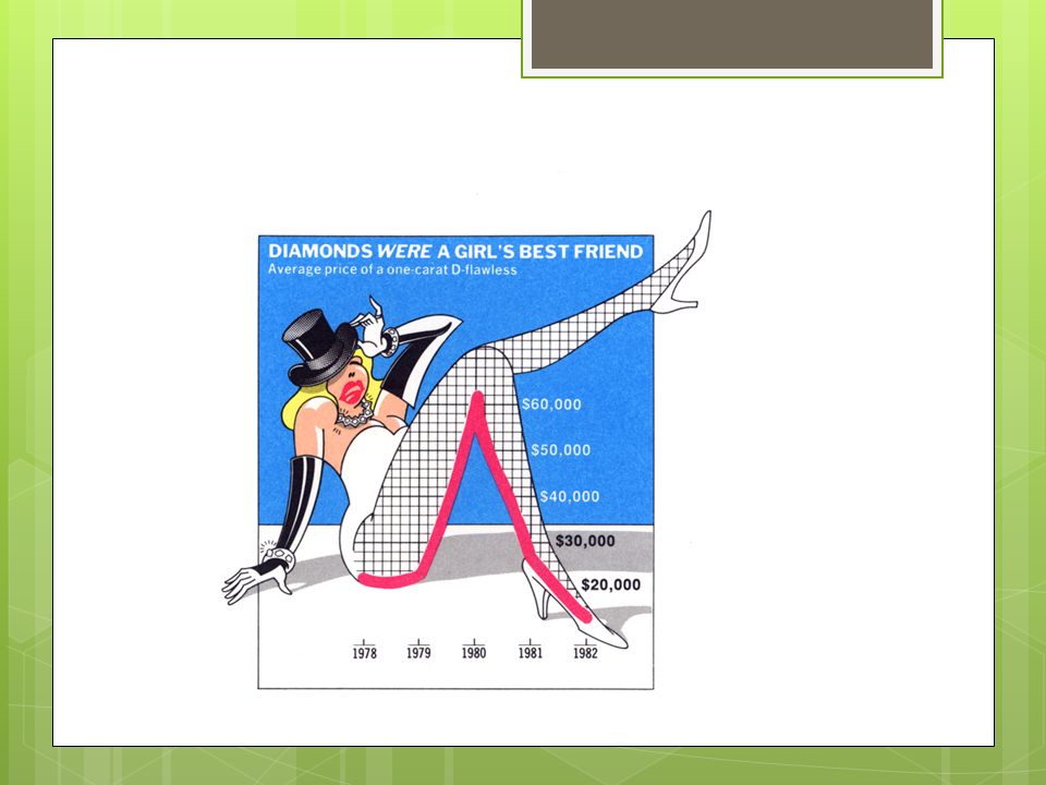
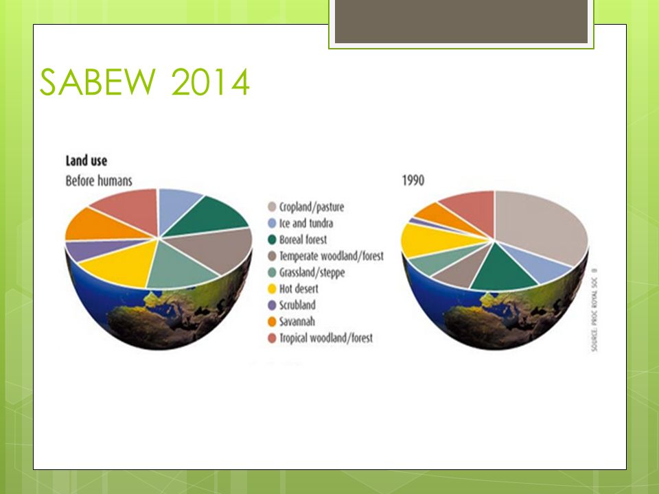
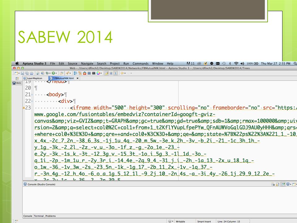
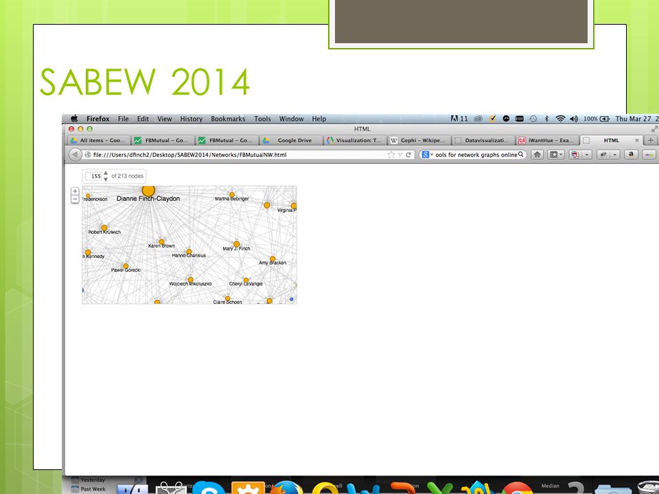
SABEW 2014

8
Data-ink Ratio More data – less ink! Save the ink for infographics and text – add those to the same web page to help tell the story! See: http://www.infovis-wiki.net/index.php/Data- Ink_Ratio

10
Data – most essential component You’ve downloaded a CSV or XLS or JSON. Does your data reflect any trends? Any outliers? Did you vet your data? Talk to the source? Check for errors? Did you look for spelling issues (John Smith and Jon Smith) Are there redundant rows? One header row? Do you need more data to clarify your story? What is the simplest and clearest chart you could use? Try using a sketchpad to draw circles, lines, texture, legends.
 Are there redundant rows. One header row. Do you need more data to clarify your story. What is the simplest and clearest chart you could use. Try using a sketchpad to draw circles, lines, texture, legends..")
11
is not Absolute, is variable, is uncertain needs context is often biased (politics and agendas) is often sampled (census) doesn’t tell a whole story requires skepticism is error-prone (humans enter it – and they are often bored and unfocused) Data ….
 is often sampled (census) doesn’t tell a whole story requires skepticism is error-prone (humans enter it – and they are often bored and unfocused) Data ….")
12
Data types Nominal Ordinal Quantitative

13
So We Evaluate, filter, clean, question and attribute our data SEE: Harvard Business Review

14
Data Cleaning with Excel – Lynda.com Using absolute and relative cell references Entering data using AutoFill and other techniques Using absolute and relative cell references Entering data using AutoFill and other techniques Restricting input using validation rules Sorting worksheet data Sorting worksheet data Creating a custom sort order Creating a custom sort order Filtering worksheet data Filtering worksheet data Introducing Excel formulas and functions Introducing Excel formulas and functions Adding a formula to a cell Adding a formula to a cell Introducing arithmetic operators Introducing arithmetic operators Using absolute and relative cell references Using absolute and relative cell references Joining text in cells with concatenation Joining text in cells with concatenation Summarizing data using an IF function Summarizing data using an IF function Creating formulas to count cells Creating formulas to count cells Importing data from comma separated value (CSV) or text files Importing data from comma separated value (CSV) or text files Introducing PivotTable reports (all 10 items in this category) Introducing PivotTable reports
 or text files Importing data from comma separated value (CSV) or text files Introducing PivotTable reports (all 10 items in this category) Introducing PivotTable reports")
15
Chart design last step – and there are many choices Position along a common scale e.g. scatter plotscatter plot Position on identical but nonaligned scales e.g. multiple scatter plotsmultiple scatter plots Length e.g. bar chartbar chart Angle & Slope (tie) e.g. pie chartpie chart Area e.g. bubblesbubbles Volume, density, and color saturation (tie) e.g. heatmapheatmap Color hue e.g. newsmapnewsmap
 e.g. pie chartpie chart Area e.g. bubblesbubbles Volume, density, and color saturation (tie) e.g. heatmapheatmap Color hue e.g. newsmapnewsmap.")
16
A look at the good ones Arab Spring Arab Spring Simple and Clear Simple and Clear Google Chart Gallery Google Chart Gallery NYT-Nursing Homes NYT-Nursing Homes Flu Flu Guns and Games Guns and Games Other Other

17
SABEW 2014

20
See HTML template Make a copy!

21
Google API “Serving” Viz Via Web Pages Not everything can be run from local computers

22
Hosted Sites You will need a web server to place your pages and images (png, svg, jpg, html) Today we are using a “small orange” hosting site. All web servers make files inside “public_html” available to everyone

23
Google API Programming: JavaScript Copy/paste without programming Tweak using intuitive options

24
Try this Latitude Longitude Tableau – take a peak Build layers on maps Add more custom icons

25
Geocommons Steps to produce “geocoded” CSV Clean your data in Excel Save as a CSV Upload the file to Geocommons Choose to “geocode” - add latitude and longitude Save your new CSV file (download from Geocommons with new “geo” fields) Save your new KML file (it will open in Google Earth)
 Save your new KML file (it will open in Google Earth)")
26
Geocommons Maps Upload CSV to geocommons Choose to geocode Go through steps. Make sure you add the date on the screen that has several questions. Save your newly uploaded file. Choose “Make a Map” As we saw in the session – the map shows up with your data. Click on the CSV filename on the right to open the “styling” section. Change the colors, shapes and tooltips. Try adding layers to the map by locating another CSV that you’ve uploaded. Or – choose one that someone else uploaded, such as census data on income. ***Make sure that you are using data that is trustworthy and vetted when you use datasets found on Geocommons. You’ll need to look into it, do some spot checking, or contact the creator. There is a lot of census data available on Geocommons.

Similar presentations