Download presentation
Presentation is loading. Please wait.

1
Object Oriented Programming 31465
Week 5 Principles of GUI Design

2
Lecture Overview What is the user interface
Principles of user interface design Issues of information display User guidance Error Messages Help systems

3
The User Interface System users often judge a system by its interface
A poorly designed interface can cause a user to make catastrophic errors Poor user interface design is the reason why so many software systems are never used The focus of this lecture is on graphical user interface (GUI) design
 design.")
4
User-System Interaction
Two problems must be addressed in interactive systems design How should information from the user be provided to the computer system? How should information from the computer system be presented to the user? User interaction and information presentation may be integrated through a coherent framework such as a user interface metaphor Controls need to be visible, with good mapping to their effects and their design should also suggest their functionality

5
Have a Question? Just type it in and click Ask!

6
Star Interface (Xerox,1981)
Make computer invisible as possible to the user Interface metaphor based on physical office Paper, folders, in and out trays were represented as icons on the virtual desktop Dragging=moving But extended metaphor e.g. allowed for rapid searching

7
Magic Cap 3D desktop

8
How many different metaphors can you find?

9
What does this do?

10
Graphical User Interfaces
User interfaces which rely on windows, iconic representation of entities, pull-down or pop-up menus and pointing devices. Previously called WIMP interfaces - now generally referred to as GUIs. The standard form of interface for workstations and high-power personal computers.

11
GUI Advantages They are easy to learn and use.
Users without experience can learn to use the system quickly. The user may switch quickly from one task to another and can interact with several different applications. Information remains visible in its own window when attention is switched. Fast, full-screen interaction is possible with immediate access to anywhere on the screen

12
User Interface Design Principles
(From Preece et al. p. 488)
")
13
User Interface Design Principles
Ian Sommerville (1995) Software Engineering
 Software Engineering.")
14
User Interface Design Principles
Linda Macaulay (1995) Human-Computer Interaction for Software Designers.
 Human-Computer Interaction for Software Designers.")
15
Principles and Rules Principles Rules
allow query in depth design for user growth allow input flexibility adapt to different user levels and styles ensure ease of understanding give appropriate quantity of response Rules provide a ‘RESET’ command always issue a ‘warning’ message to the user before deleting a file display the ‘quit’ button in the bottom left-hand quarter of the screen A ‘design rule’ can be obeyed with minimal filling out and interpretation by the designer

16
Useability Attributes

17
Designing a User Interface - 1
1. Identify what work will be shared between the user and the system 2. Specify the flow of interaction between the user and the system to do that work identify online events input/output data items create a ‘logical’ dialogue outline - at least one per event check you have got all the data you need create logical dialogue controls ( ie how will the event begin and end or branch) validate the diagrams with users 3. Design a consistent set of screens/windows to support that interaction
 validate the diagrams with users. 3. Design a consistent set of screens/windows to support that interaction.")
18
Designing a User Interface - 2
4. Decide what information should be displayed in each window/screen 5. Decide how the information should be displayed 6. Decide where each field will appear 7. Decide what highlighting is required 8. Produce a draft design 9. Test the design with users 10. Iterate

19
Information Display Factors
Is the user interested in precise information or data relationships? How quickly do information values change? Must the change be indicated immediately? Must the user take some action in response to a change? Is there a direct manipulation interface? Is the information textual or numeric? Are relative values important?

20
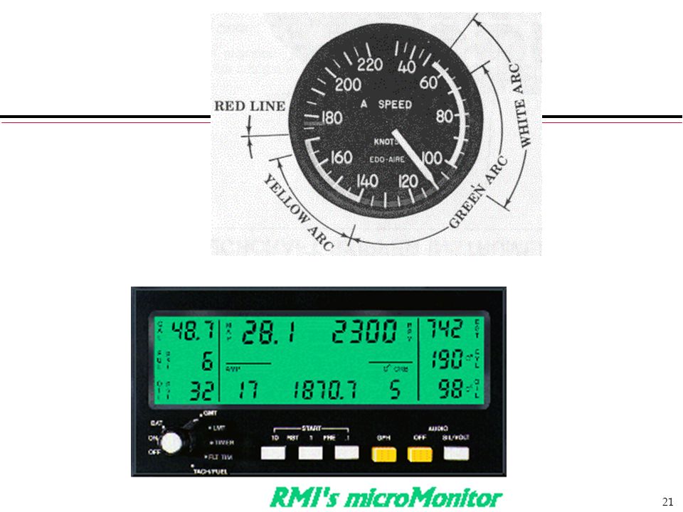
Analogue vs. Digital Presentation
Compact - takes up little screen space Precise values can be communicated User has to attend to it Analogue presentation Easier to get an 'at a glance' impression of a value Possible to show relative values Easier to see exceptional data values

22
Colour Displays Colour adds an extra dimension to an interface and can help the user understand complex information structures Colour can be used to highlight exceptional events Common mistakes in the use of colour in interface design include: Relying on colour to communicate meaning Over-use of colour in the display

23
Colour Use Guidelines Don't use too many colours
Use colour coding to support use tasks Allow users to control colour coding Design for monochrome then add colour Use colour coding consistently Avoid colour pairings which clash Use colour change to show status change Be aware that colour displays can be of lower resolution

24
Which is easiest to read and why?
What is the time? What is the time? What is the time? What is the time? What is the time?

25
Guidelines on Information Presentation
Use upper and lower case Use normal conventions Caption names should be as brief as possible Use only meaningful abbreviations Captions should be positioned in a ‘natural’ and physically consistent relationship to the corresponding data fields

26
Guidelines on Data Entry
Explicit entry: users should be asked to check data before entry Explicit movement between fields: users should be able to use Tab or some other key to move logically and explicitly between fields Explicit delete: users should be required to confirm any request for deletion Provide undo: whenever possible allow users to go back to a previous state (ie undo their last action/s)
")
27
Guidelines on Text Presentation
leave about half the total screen/window blank every screen/window should be self-contained there should be an obvious starting point usually upper left - then proceed left to right, top to bottom the same information should be displayed consistently throughout the application USE UPPER CASE TO ATTRACT ATTENTION right-justified text with variable spacing is harder to read than evenly spaced text with a ragged margin optimal spacing between lines is equal or slightly greater than the height of the characters themselves

28
User Guidance The user guidance system is integrated with the user interface to help users when they need information about the system or when they make some kind of error User guidance covers: System messages, including error messages Documentation provided for users On-line help The help and message system may be integrated

29
Error Message Design Error message design is critically important. Poor error messages can mean that a user rejects rather than accepts a system Messages should be polite, concise, consistent and constructive The background and experience of users should be the determining factor in message design

30
e.g. Medical Record / Patient Entry
Please type the patient name in the box then click on OK Bates , J . OK Cancel

31
Good and Bad Error Responses

32
Help System Design Help? means ‘help I want information”
Help! means “HELP. I'm in trouble” Both of these requirements have to be taken into account in help system design Different facilities in the help system may be required Should not simply be an on-line manual Screens or windows don't map well onto paper pages. People are not so good at reading text on a screen as they are text on paper The dynamic characteristics of the display can improve information presentation.

33
Help system use Multiple entry points should be provided so that the user can get into the help system from different places. Some indication of where the user is positioned in the help system is valuable. Facilities should be provided to allow the user to navigate and traverse the help system.

34
User Interface Evaluation
Some evaluation of a user interface design should be carried out to assess its suitability Ideally, an interface should be evaluated against a useability specification. However, it is rare for such specifications to be produced Full scale evaluation is very expensive and impractical for most systems But you can start your interface evaluation by using 1. Interface design principles 2. Useability attributes 3. User scenarios

35
Key Points Interface design should be user-centred. An interface should be logical and consistent and help users recover from errors Menu systems are good for casual or occasional system users Graphical displays should be used to present trends and approximate values. Digital displays when precision is required Colour should be used sparingly and consistently

36
More Key Points Systems should provide on-line help. This should include “help, I’m in trouble” and “help, I want information” Error messages should be positive rather than negative. A range of different types of user documents should be provided A user interface should always be evaluated, ideally against a useability specification

Similar presentations


>")
 Software Engineering, 6 th edition: Chapter 15>")

>")
![1 / 31 CS 425/625 Software Engineering User Interface Design Based on Chapter 15 of the textbook [SE-6] Ian Sommerville, Software Engineering, 6 th Ed.,](/16/5055292/big_thumb.jpg "1 / 31 CS 425/625 Software Engineering User Interface Design Based on Chapter 15 of the textbook [SE-6] Ian Sommerville, Software Engineering, 6 th Ed.,>")


. Keep number of screens to a minimum. Ensure that all.>")