Download presentation
Presentation is loading. Please wait.

2
Chapter 3 Graphical and Numerical Summaries of Qualitative Data UNIT OBJECTIVES At the conclusion of this unit you should be able to: n 1)Construct graphs that appropriately describe data n 2)Calculate and interpret numerical summaries of a data set. n 3)Combine numerical methods with graphical methods to analyze a data set.
Combine numerical methods with graphical methods to analyze a data set..")
3
Displaying Qualitative Data “Sometimes you can see a lot just by looking.” Yogi Berra Hall of Fame Catcher, NY Yankees

4
The three rules of data analysis won’t be difficult to remember n 1.Make a picture —reveals aspects not obvious in the raw data; enables you to think clearly about the patterns and relationships that may be hiding in your data. n 2.Make a picture —to show important features of and patterns in the data. You may also see things that you did not expect: the extraordinary (possibly wrong) data values or unexpected patterns n 3.Make a picture —the best way to tell others about your data is with a well-chosen picture.
 data values or unexpected patterns n 3.Make a picture —the best way to tell others about your data is with a well-chosen picture..")
5
Bar Charts: show counts or relative frequency for each category n Example: Titanic passenger/crew distribution

6
Pie Charts: shows proportions of the whole in each category n Example: Titanic passenger/crew distribution

8
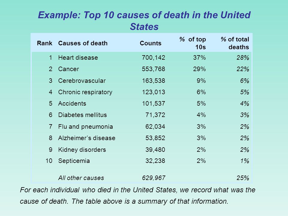
Example: Top 10 causes of death in the United States RankCauses of deathCounts % of top 10s % of total deaths 1Heart disease700,14237%28% 2Cancer553,76829%22% 3Cerebrovascular163,5389%6% 4Chronic respiratory123,0136%5% 5Accidents101,5375%4% 6Diabetes mellitus71,3724%3% 7Flu and pneumonia62,0343%2% 8Alzheimer’s disease53,8523%2% 9Kidney disorders39,4802% 10Septicemia32,2382%1% All other causes629,96725% For each individual who died in the United States, we record what was the cause of death. The table above is a summary of that information.

9
Top 10 causes of deaths in the United States Top 10 causes of death: bar graph Each category is represented by one bar. The bar’s height shows the count (or sometimes the percentage) for that particular category. The number of individuals who died of an accident in is approximately 100,000.
 for that particular category. The number of individuals who died of an accident in is approximately 100,000..")
10
Bar graph sorted by rank Easy to analyze Top 10 causes of deaths in the United States Sorted alphabetically Much less useful

11
Percent of people dying from top 10 causes of death in the United States Top 10 causes of death: pie chart Each slice represents a piece of one whole. The size of a slice depends on what percent of the whole this category represents.

12
Percent of deaths from top 10 causes Percent of deaths from all causes Make sure your labels match the data. Make sure all percents add up to 100.

14
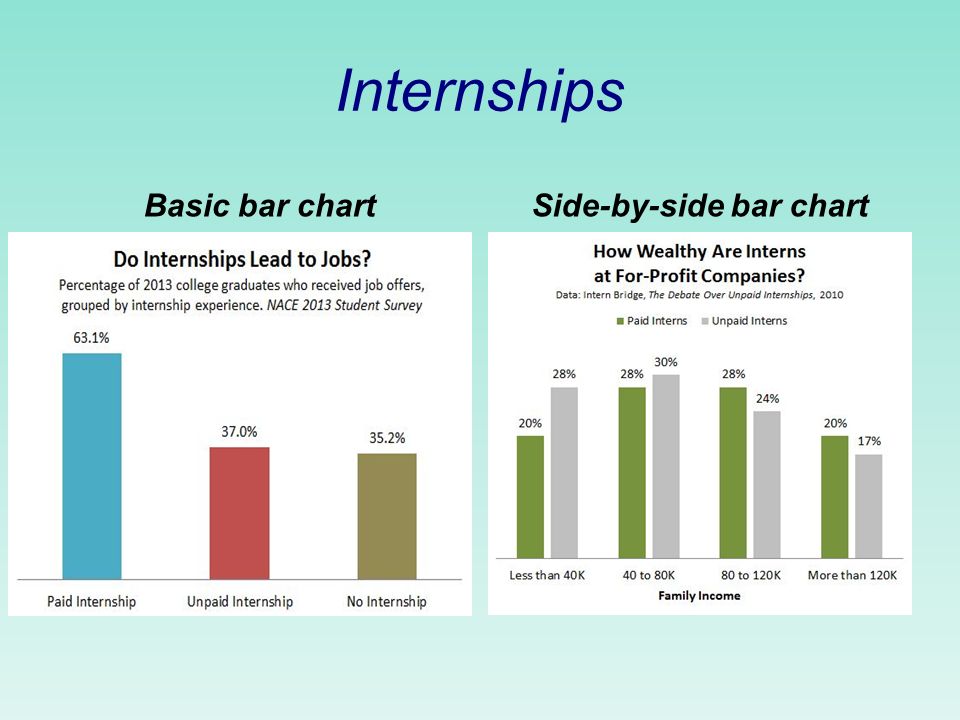
Internships Basic bar chartSide-by-side bar chart

16
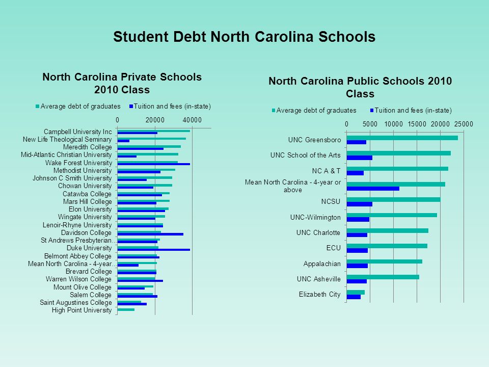
Student Debt North Carolina Schools

17
n Clouds on the ESPN Horizon Clouds on the ESPN Horizon

18
The Business of College Athletics n SEC Network Market Penetration SEC Network Market Penetration

19
The Rise of the Univ. of Louisville, an ESPN Story The Increase in Weekday College Football

21
Side-by side bar chart

22
Contingency Tables: Categories for Two Variables n Example: Survival and class on the Titanic Marginal distributions marg. dist. of survival 710/2201 32.3% 1491/2201 67.7% marg. dist. of class 885/2201 40.2% 325/2201 14.8% 285/2201 12.9% 706/2201 32.1%

23
Marginal distribution of class. Bar chart.

24
Marginal distribution of class: Pie chart

25
Contingency Tables: Categories for Two Variables (cont.) n Conditional distributions. Given the class of a passenger, what is the chance the passenger survived?

26
Conditional distributions: segmented bar chart

27
Contingency Tables: Categories for Two Variables (cont.) Questions: n What fraction of survivors were in first class? n What fraction of passengers were in first class and survivors ? n What fraction of the first class passengers survived? 202/710 202/2201 202/325

28
TV viewers during the Super Bowl. What is the marginal distribution of those who watched the commercials only? 1. 8.0% 2. 23.5% 3. 58.2% 4. 27.7%

29
TV viewers during the Super Bowl. What percentage watched the Game and were Female? 1. 41.8% 2. 38.8% 3. 51.2% 4. 19.8%

30
TV viewers during the Super Bowl. Given that a viewer did not watch the Super Bowl Game or Commercials, what percentage were male? 1. 45.2% 2. 48.8% 3. 26.8% 4. 27.7%

31
3-Way Tables n Example: Georgia death-sentence data

32
UC Berkeley Lawsuit

33
LAWSUIT (cont.)
")
34
Simpson’s Paradox n The reversal of the direction of a comparison or association when data from several groups are combined to form a single group.

35
Fly Alaska Airlines, the on- time airline!

36
American West Wins! You’re a Hero! (.889*559)+(.948*233)+(.914*232) +(.831*605)+(.858*2146)=3273.9; 3273.9/3775 = 86.7% (.856*811)+(.921*5255)+(.855*448) +(.713*449)+(.767*262)=6438.2; 6438.2/7225 = 89.1%
+(.948*233)+(.914*232) +(.831*605)+(.858*2146)=3273.9; /3775 = 86.7% (.856*811)+(.921*5255)+(.855*448) +(.713*449)+(.767*262)=6438.2; /7225 = 89.1%.")
37
End of Chapter 3

Similar presentations


 Variable: Any characteristic.>")


Construct graphs.>")
>")


Construct graphs.>")


>")