Download presentation
Presentation is loading. Please wait.

1
Mobile Web Development Strategies Best Practices Performance Tips

2
Who Am I? Martin Laritz – Web Developer since 2005 – Mobile Developer Android, iOS, Windows 8, Windows Phone, PhoneGap – Mobile Web Developer for about 5 minutes http://www.MartinLaritz.com Contact – Martin.Laritz@gmail.com Martin.Laritz@gmail.com – @MLaritz

3
HOW MANY PEOPLE ARE WEB DEVELOPERS? QUIZ TIME!

4
HOW MANY PEOPLE HAVE CREATED A MOBILE WEBSITE?

6
What is the Mobile Web? This presentation is a lie! Initially meant accessing the world wide web via a mobile device The Mobile Web doesn’t exist – It’s just the web! – Shouldn’t matter what device or what browser you’re accessing content from

13
EVOLUTION OF THE WEB THANKS BRAD FROST!

18
WHY ARE WE HERE? INTERNETS!

19
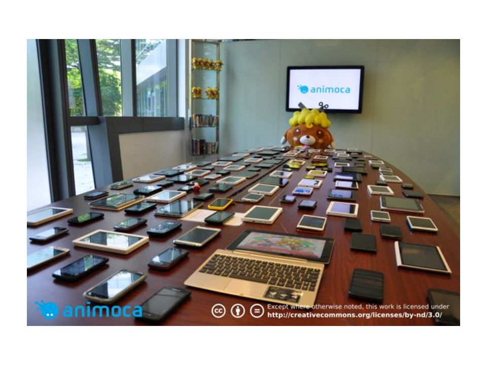
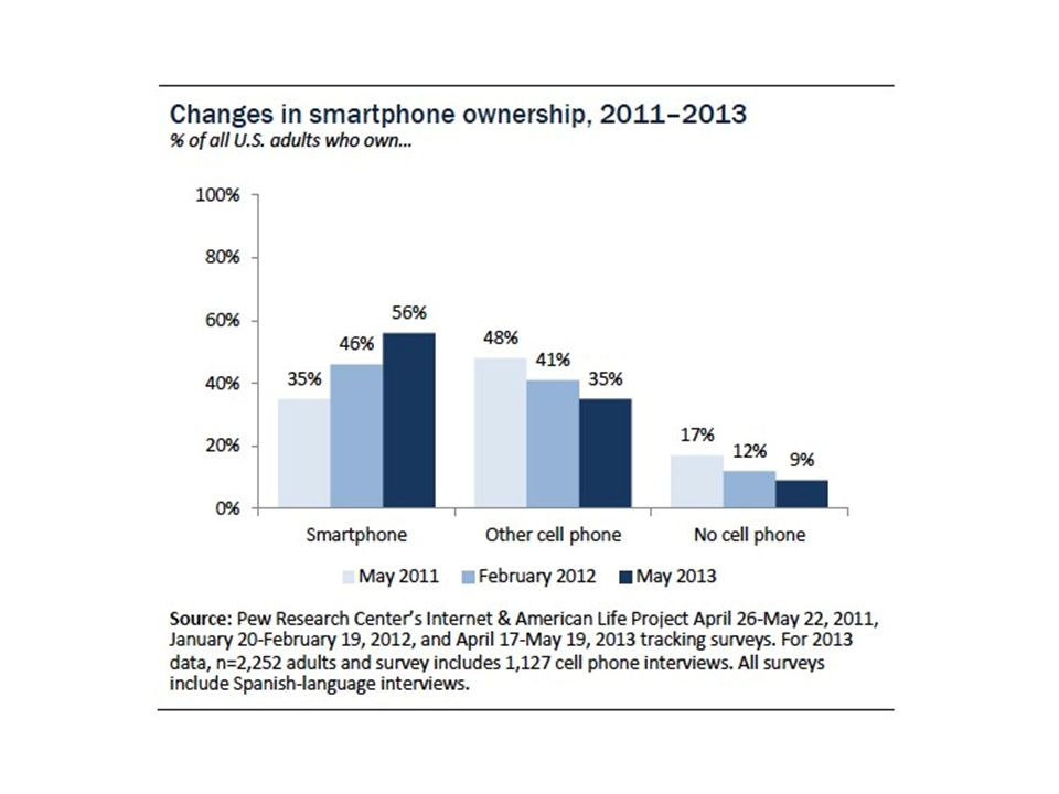
Why Should You Care? Mobile is blowing up!

21
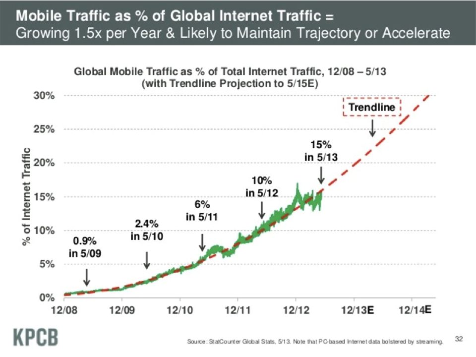
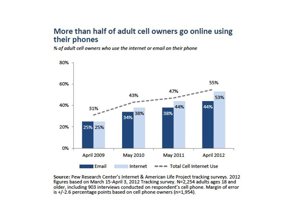
HERE COMES THE STATISTICS YEAH! Random graphs!

26
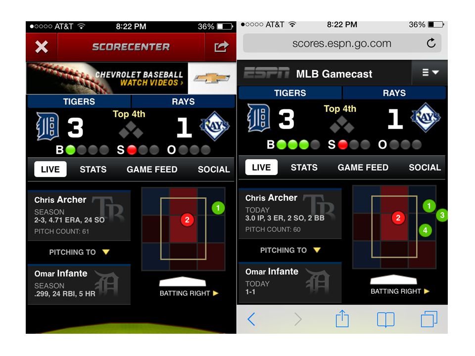
This Talk is NOT … Responsive Images Web apps vs. Native apps – They can coexist ESPN – Development Frameworks PhoneGap Titanium

28
LET’S GET DONE TO BUSINESS

29
Agenda Strategies – Mobile Design and Development Best Practices – Both for Mobile and General Web Development Performance Improvements

30
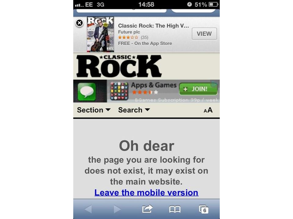
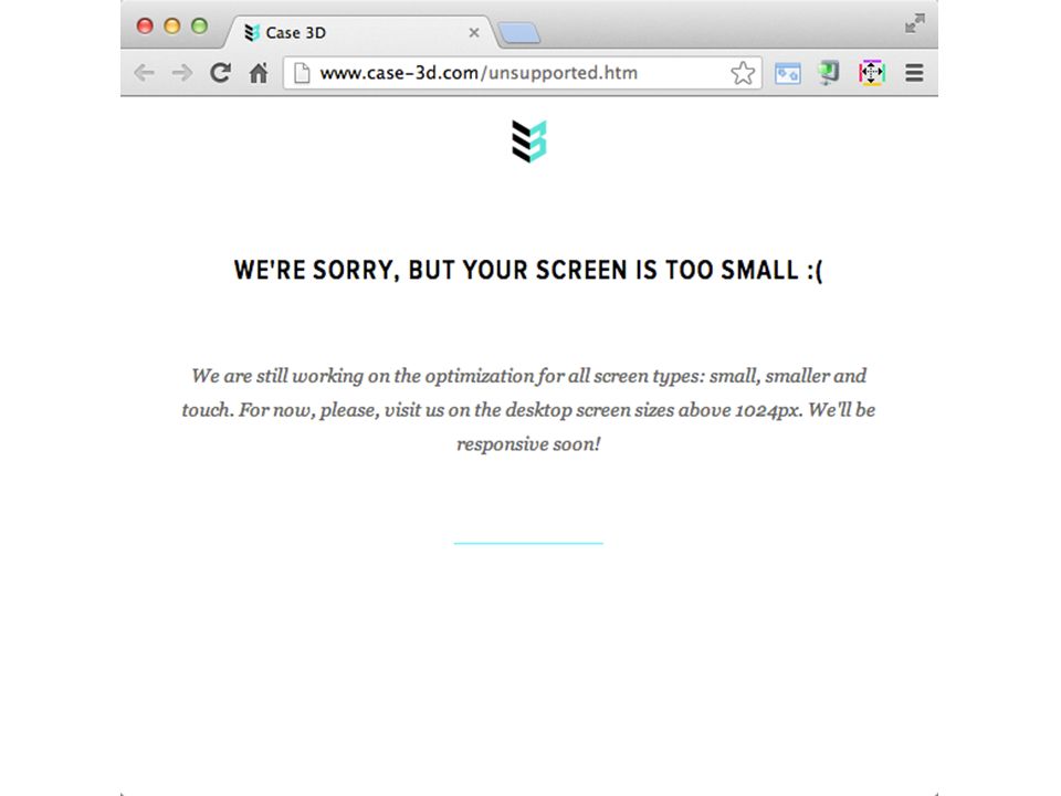
Mobile Web Strategies Desktop website – Usually fixed width Responsive Separate Mobile site(s) RESS – Responsive Design + Service Side Components
 RESS – Responsive Design + Service Side Components")
31
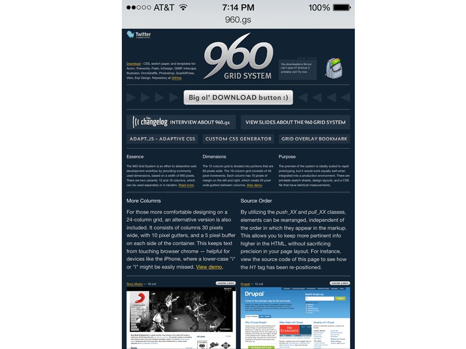
Desktop Website Usually fixed width – The 960 Grids Pros – Easy to implement – Most mobile browsers do a decent job of rendering desktop-only designs Cons – Not mobile optimized – Tends to be slower – Pinch and Zoom

34
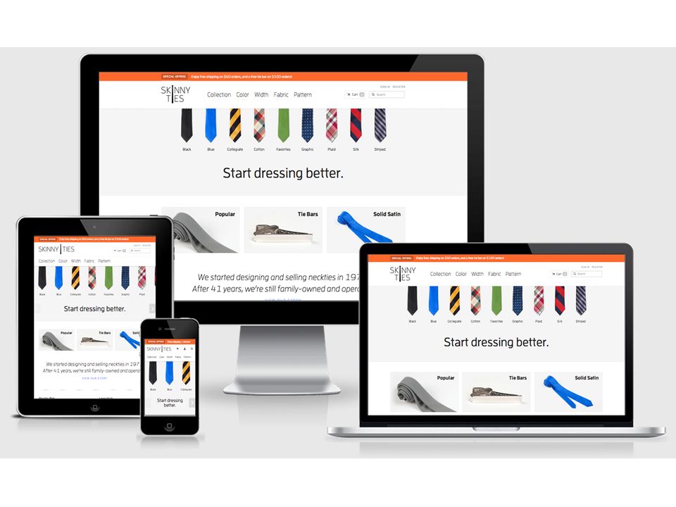
Responsive Web Design Content is adapted based on the capabilities of the browser – Content is adapted by using fluid, proportion based grids, flexible images, and media queries Percents for the grids instead of PXs Flexible Images – Max-Width: 100% Media Queries

38
Responsive Pros and Cons Pros One code base – Site updates are easy Future Friendly Better for SEO – Same content between devices – One URL Aesthetically pleasing for different device heights and widths Cons More upfront planning required Tends to lead to bloated pages and slower load times Some things are not fluid – Banner images – Videos – Images Not all devices support media queries (IE8)
")
39
Responsive Design Tips More than just Fluid Grids, Flexible media, and media queries – Performance, Device Support, Device Optimization, Future Friendly Designs Set your breakpoints based on content – Not based on devices Use EMs for breakpoints – 100% = 1em ~= 16px ~= 14pt – This fixes issues when zoom is increased Images – Max-Width: 100% Don’t round percentages

40
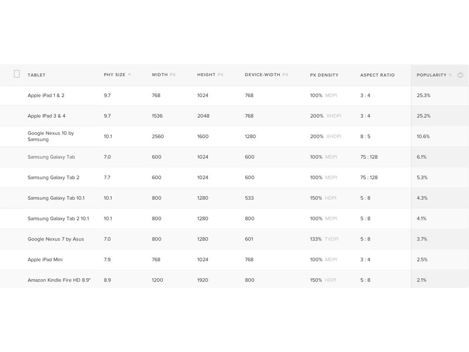
Separate Mobile Site(s) Different websites for each class of devices – Group common capabilities Different websites on separate subdomains Use a device database to lookup capabilities based on User-Agent strings – WURFL and DeviceAtlas – Must be comfortable with device detection Allow the user to switch between desktop/mobile sites
 Different websites for each class of devices – Group common capabilities Different websites on separate subdomains Use a device database to lookup capabilities based on User-Agent strings – WURFL and DeviceAtlas – Must be comfortable with device detection Allow the user to switch between desktop/mobile sites")
41
Separate Mobile Site Pros Easier to make changes to specific sites – But more difficult to change common elements Faster load times Tailored experience per device (class) Cons Where do you draw the line? – One site for phone, one for tablet, one for desktop? New devices coming out every day – With new heights, widths, resolutions, and capabilities SEO – Penalized by Google if you redirect incorrectly – Multiple URLs which can lead to duplicate content Requires redirection Multiple codebases

44
Responsive Design + Server Side Components Also known as RESS Best of both worlds – Client side media queries – Server side optimizations Increased performance or fine tune user experience Can pass client side data in cookie to server One code base with defaults – Then deliver component based features based on device detection

45
RESS Pros and Cons Pros Faster load times – Unneeded HTML, CSS, JS, and images will not be downloaded Tailored experiences per device or device class Cons Requires device detection – Harder to test Dynamically build your content on the server will increase load on server More complicated

46
Best Practices Mobile First Design For Touch Readability Fixed Width is Dead Optimize User Input Progressive Enhancement Viewport Meta Tag Border Box Testing

47
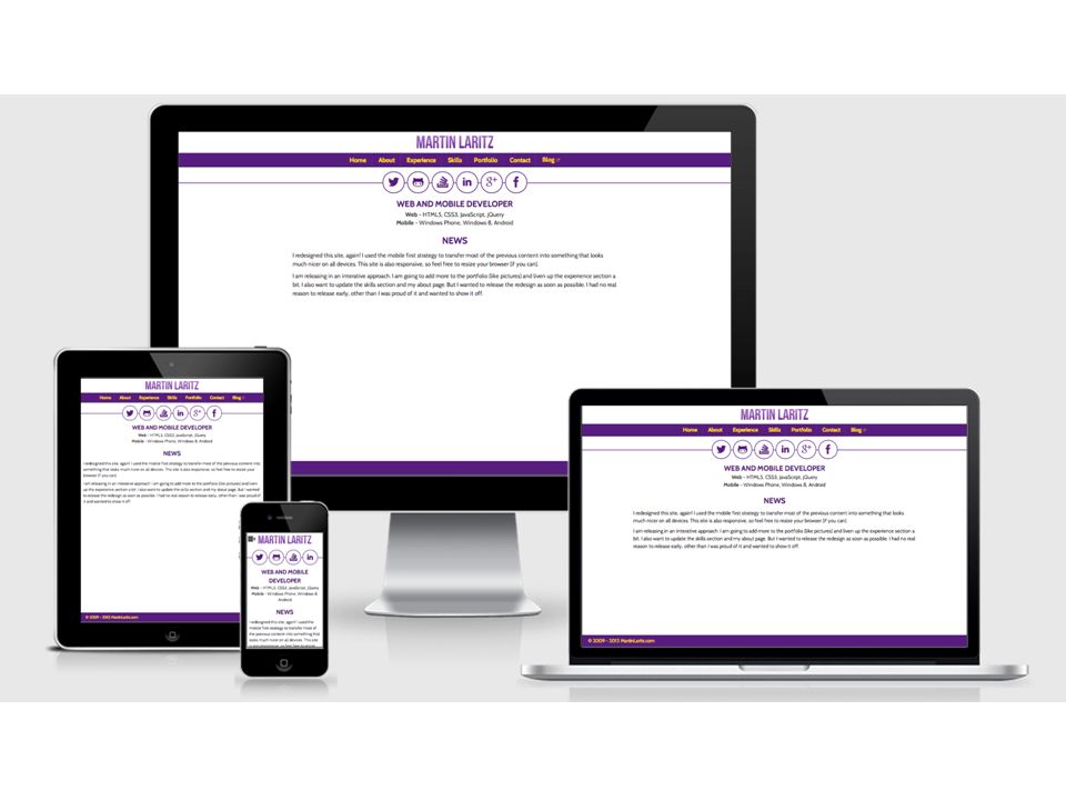
Mobile First Mobile forces you to focus – On the most important data and actions – CONTENT! Mobile extends your capabilities – Mobile browsers tend to have more capabilites than desktop browsers – But this gap is closing fast Let’s redesign my old website

50
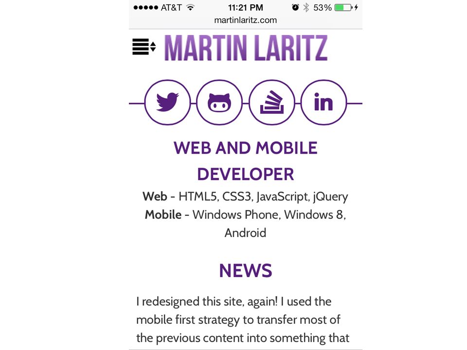
Mobile First It didn’t work for me – I struggled changing the existing markup to fit on mobile Step back and think about your content Start with the small/tightest constraints and work out

53
Design For Touch Clickable elements should be 44px – Use padding instead of margin Don’t rely too heavily on hover – Touch doesn’t support hover Incorporate gestures where appropriate

54
Design for Thumbs Content on the top Controls on the bottom Don’t place clickable items too close together

56
Readability Design for Readability – Not only increased font size – Also increase line height Everything should be at least 14px – I try to keep all content that is meant to be read (like blog entries) at 1em+
 at 1em+")
59
Fixed Width is Dead Even if you don’t use responsive design, there’s no need to confine your users to a minimum browser width – Users shouldn’t have to view your website with their browser maximized Use % for width and heights instead of PX – (target / context) * 100 = percent – Remember: don’t round
 * 100 = percent – Remember: don’t round")
62
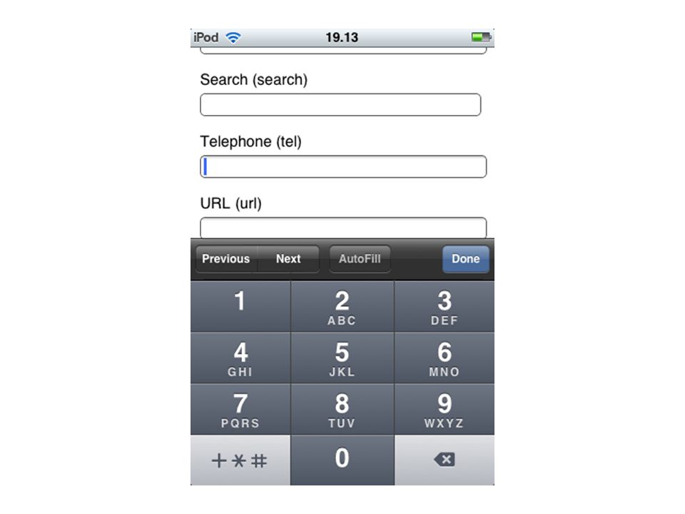
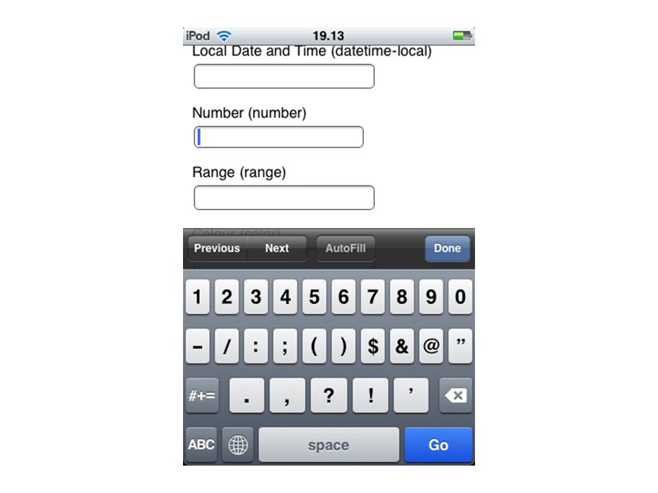
Optimize User Input Only include required fields – Minimize the length of the form and more users will fill it out Use Checkboxes, Radio Buttons, Dropdowns instead of Textboxes where you can Use the correct HTML5 input types – Email, Number, URL, Search, Date, Telephone

67
Progressive Enhancement Uses web technologies in a layered fashion that allows all users to access the basic functionality of a web page Provides an enhanced version to those with advanced browsers Start with basic html – no css, no javascript – Enhanced layout provided by CSS – Enhanced functionality provided by JS

68
Viewport Meta Tag You need one if you using responsive design or dedicated mobile sites Width – Tells the width of your site Initial-Scale – Sets the zoom level Maximum-Scale – Sets the maximum zoom

70
Border Box * { box-sizing: border- box; } – IE8 and up Padding and Border cut into the width, not add to it

71
How to Test Your Mobile Sites Firefox Mobile on Desktop – http://www.mozilla.org/en-US/mobile/#desktop Opera Mini Simulator – http://www.opera.com/developer/tools/mini Opera Mobile Simulator – http://www.opera.com/developer/tools/mobile iOS SDK Android SDK Windows Phone SDK

72
What Do You Think? What’s the best thing you can do to improve the mobile experience for your users?

73
Improve Mobile Experience Performance Other Answers – Aesthetics Mobile browsers do a decent job of rendering desktop sites – Optimize for Touch Pinch and Zoom – Readability Pinch and Zoom – Add a QR Code

74
Performance! Remove HTTP Headers Reduce HTTP Requests Framework Optimization Optimize Images Icon Fonts Miscellaneous

76
Why Optimize for Performance? An average webpage is 1246KB – AT&T account – 2GB at $30/month: 2¢ / page 74% of users expect a mobile website to load in the same amount of time as a desktop site

77
Load Times

78
Remove HTTP Headers Helps Security Remove all unneeded headers – Server – Asp.Net MVC Version – Asp.Net Version – Powered By RemoveUnnecessaryHeaders NuGet Package

81
Reduce HTTP Requests Latency – amount of time between when browser requests a resource and when it starts to receive the response – Cable modem: 20ms – 3G Connection: 200ms Average webpage has 40 requests – Latency – 0.2 seconds for Cable Modem – Latency - 2.5 seconds for 3G Most browsers only open 2 connections to a domain at a time

82
Reduce HTTP Requests Remove files – Concatenate CSS and JS Files – CSS Sprites Reduce unneeded files – Print CSS Request Quest – Quiz on what triggers an HTTP Request – http://jakearchibald.github.io/request-quest/ http://jakearchibald.github.io/request-quest/

83
Reduce File Size Minify HTML, CSS, and JS files Gzip – Compresses resources to reduce – If you do one thing to improve performance, do this Every byte counts Use a CSS Preprocessor – Less or Sass – Will help remove duplicate selectors – Minifies automatically

84
Frameworks Do you really need a Framework? – jQuery Framework for just one Select Do you need the whole CSS Framework? – Download all of Bootstrap just for the icons – jQuery UI – Do you need every component? Why use a bloated Framework – http://microjs.com/ http://microjs.com/ Do you even need a Framework – Use Vanilla JS

85
Optimize Images Images make up between 50%-60% of the average website payload Save the image in the correct format – If you have to, save in each format Don’t load a big image and make the browser scale it down – Use an Image Optimizer – ImageOptim on Mac, Image Resizer NuGet

86
Icon Fonts It’s a font, so one download – Instead of multiple images Benefits – Scale them with CSS – Color them with CSS – Add shadow, change opacity, and/or rotate with CSS – They automatically scale for retina displays IcoMoon – Search different icon fonts and create your own font

89
Miscellaneous Set up caching – Especially for static resources – Add an expires tag Put Stylesheets at the top – Page appears to load faster as it eliminates reflow Put Scripts on the bottom – While script is downloading, browser will not download any other resources Use GET for AJAX Requests – POST sends the headers first, then the content

90
Miscellaneous 2 Do you really need a CMS? – The default WordPress page queries the database 27 times Reduce 3 rd party libraries – “to load the Facebook, Twitter and Google social media buttons for a total of 19 requests takes 246.7 KB in bandwidth.” – Zurb Limit Cookies – Cookies get sent with each request

91
Summary So what did we learn? There is only one web Mobile Web Strategy: – Desktop site, responsive, device class sites, RESS Best Practices Performance Your website should be accessible no matter what device your users are using

92
Questions?

94
Images Courtesy of … Brad Frost – http://bradfrostweb.comhttp://bradfrostweb.com CSS Tricks – http://css-tricks.comhttp://css-tricks.com Bukk It – http://bukk.ithttp://bukk.it Web Performance Today - http://www.webperformancetoday.com/ http://www.webperformancetoday.com/

Similar presentations


. Implementing responsive design. Berkeley, California: New Riders Publishing. MarcotteMarcotte, E. (2010).>")


