Download presentation
Presentation is loading. Please wait.

1
Chapter 2: Organizing data
Statistics Chapter 2: Organizing data

2
Section 2.1 Frequency distributions, histograms, and related topics

3
Focus Points Organize raw data using a frequency table.
Construct histograms, relative-frequency histograms, and ogives. Recognize basic distribution shapes: uniform, symmetric, skewed, and bimodal. Interpret graphs in the context of the data setting.

4
Focus Problem “Say it With Pictures” on page 35

5
Frequency Table A frequency table partitions data into classes or intervals and shows how many data values are in each class. The classes or intervals are constructed so that each data value falls into exactly one class. (5 – 15 are usually used.) If you use fewer than 5, you risk losing too much information. More than 15 – the data may not be sufficiently summarized.
 If you use fewer than 5, you risk losing too much information. More than 15 – the data may not be sufficiently summarized. v=ooeuNlXBweU.")
6
How to Make a Frequency Table
Determine the number of classes and corresponding class width. Create the distinct classes. Lower class limit of the first class is the smallest data value. Add the class width to this number to get the lower class limit of the next number. Fill in the upper class limits to create distinct classes that accommodate all possible data values from the data set. Tally the data into classes. Each data value of should fall into exactly one class. Total the tallies to obtain each class frequency. Compare the midpoint (class mark) for each class. Determine the class boundaries.
 for each class. Determine the class boundaries.")
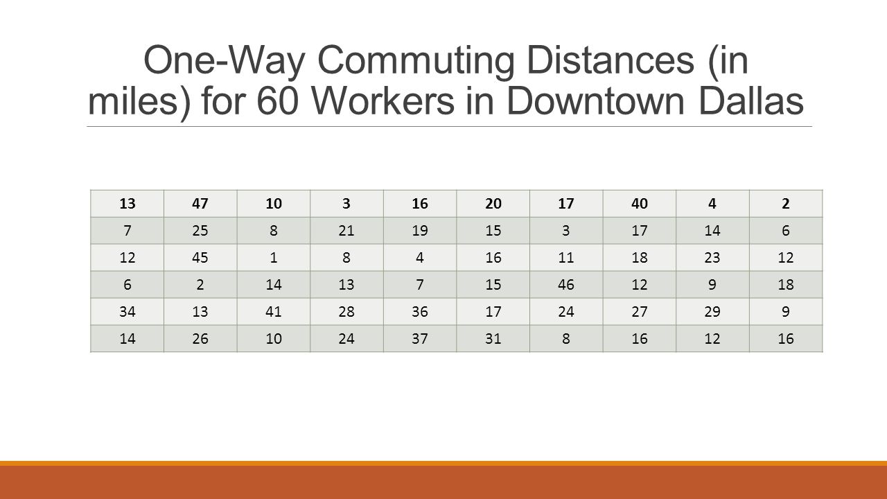
7
One-Way Commuting Distances (in miles) for 60 Workers in Downtown Dallas
13 47 10 3 16 20 17 40 4 2 7 25 8 21 19 15 14 6 12 45 1 11 18 23 46 9 34 41 28 36 24 27 29 26 37 31
8
Number of Classes Usually use 5 to 15 classes
Less than five classes – risk losing too much information More than 15 classes – data may not be sufficiently summarized Let the spread of data and purpose of the frequency table be your guide. For the commuting data, let’s use six classes.

9
How to Find Class Width Compute:
𝐿𝑎𝑟𝑔𝑒𝑠𝑡 𝑑𝑎𝑡𝑎 𝑣𝑎𝑙𝑢𝑒 −𝑠𝑚𝑎𝑙𝑙𝑒𝑠 𝑑𝑎𝑡𝑎 𝑣𝑎𝑙𝑢𝑒 𝐷𝑒𝑠𝑖𝑟𝑒𝑑 𝑎𝑚𝑜𝑢𝑛𝑡 𝑜𝑓 𝑐𝑙𝑎𝑠𝑠𝑒𝑠 Increase the computed value to the next highest whole number. even if the first step produced a whole number! Commuting data: observe the largest distance commuted = 47 miles and smallest is 1 mile. Class width = (47 – 1) / 6 approximately 7.7 so round to 8. Commuting Data:
 / 6 approximately 7.7 so round to 8. Commuting Data:")
10
Class Limits Lower Class Limit:
The lowest data value that can fit in a class. Upper Class Limit: The highest data value that can fit in a class. Class Width: The difference between the lower class limit of one class and the lower class limit of the next class. Commuting Class Limits: Smallest distance = 1 mile so 1 is the lower class limit of the 1st class. Class width = 8 so = 9 which is the lower class limit for the 2nd class. Continue w/ pattern to find all lower class limits. 1, 9, 17, 25, 33, 41 1 – 8 9 – 16 17 – 24 25 – 32 33 – 40 Class Width/Limits

11
How to Tally Data Tallying Data: method of counting data values that fall into a particular class or category. Examine each data value and determine which class it falls into. Use a tally mark to count it. The fifth tally mark is placed diagonally across the prior four marks. Class Frequency: The number of tally marks corresponding to that class.

12
Class Midpoint (Class Mark)
Midpoint (Class Mark): The center of each class. - Often used as a representative value of the entire class. 𝑴𝒊𝒅𝒑𝒐𝒊𝒏𝒕= 𝑳𝒐𝒘𝒆𝒓 𝑪𝒍𝒂𝒔𝒔 𝑳𝒊𝒎𝒊𝒕+𝑼𝒑𝒑𝒆𝒓 𝑪𝒍𝒂𝒔𝒔 𝑳𝒊𝒎𝒊𝒕 𝟐
: The center of each class. - Often used as a representative value of the entire class. 𝑴𝒊𝒅𝒑𝒐𝒊𝒏𝒕= 𝑳𝒐𝒘𝒆𝒓 𝑪𝒍𝒂𝒔𝒔 𝑳𝒊𝒎𝒊𝒕+𝑼𝒑𝒑𝒆𝒓 𝑪𝒍𝒂𝒔𝒔 𝑳𝒊𝒎𝒊𝒕 𝟐.")
13
Class Boundaries There is a space between the upper limit of one class and the lower limit of the next class. The halfway points of these intervals are called class boundaries. UPPER CLASS BOUNDARIES: add 0.5 unit to the upper class limits. LOWER CLASS BOUNDARIES: subtract 0.5 unit from the lower class limits.

14
Frequency Table of One-Way Commuting for 60 Downtown Dallas Workers
Class Limits Lower – Upper Class Boundaries Tally Frequency Class Midpoint 1 – 8 0.5 – 8.5 14 4.5 9 – 16 8.5 – 16.5 21 12.5 17 – 24 16.5 – 24.5 11 20.5 25 – 32 24.5 – 32.5 6 28.5 33 – 40 32.5 – 40.5 4 36.5 41 – 48 40.5 – 48.5 44.5

15
Relative Frequency The Relative Frequency of a class is its proportion of all data values that fall into that class. 𝑅𝑒𝑙𝑎𝑡𝑖𝑣𝑒 𝐹𝑟𝑒𝑞𝑢𝑒𝑛𝑐𝑦= 𝑓 𝑛 = 𝐶𝑙𝑎𝑠𝑠 𝐹𝑟𝑒𝑞𝑢𝑒𝑛𝑐𝑦 𝑇𝑜𝑡𝑎𝑙 𝑜𝑓 𝑎𝑙𝑙 𝑓𝑟𝑒𝑞𝑢𝑒𝑛𝑐𝑖𝑒𝑠 See page 39 in your text for the Relative Frequencies of One-Way Commuting Distances Table.

16
How to Make a Histogram or a Relative-Frequency Histogram
Make a frequency table (including relative frequencies) with the designated number of classes. Place class boundaries on the horizontal axis and frequencies or relative frequencies on the vertical axis. For each class of the frequency table, draw a bar whose width extends between corresponding class boundaries. For histograms, the height of each bar is the corresponding class frequency. For relative-frequency histograms, the height of each bar is the corresponding class relative frequency.
 with the designated number of classes. Place class boundaries on the horizontal axis and frequencies or relative frequencies on the vertical axis. For each class of the frequency table, draw a bar whose width extends between corresponding class boundaries. For histograms, the height of each bar is the corresponding class frequency. For relative-frequency histograms, the height of each bar is the corresponding class relative frequency.")
17
Practice Look at Guided Exercise on Page 41

18
Homework – Due Thurs 9/26 A#2.1 Page 46 # 1 – 4 all # 6 (a)
# 7 (a) through (d)
 through (d)")
19
Distribution Shapes Mound-shaped symmetrical: both sides of the histogram are the same when the graph is folded vertically down the middle. Uniform or rectangular: Every class has the same frequency. Skewed left/right: One tail is stretched out longer than the other. The direction of the skewness is on the side of the longer tail. Bimodal: Two class with the largest frequencies are separated by at least one class. Top two frequencies of these classes may have slightly different values. Can possibly indicate we are sampling from two different populations.

20
Distribution Shapes - continued
If raw data came from a random sample of the population, then the histogram of that sample should have a shape representative or similar to that of the population. Bimodal a.k.a. “Mound-Shaped”

21
Outliers Outliers in a data set are data values that are very different from other measurements in the data set. May indicate data recording errors. Valid outliers may need to be examined separately.

22
Cumulative Frequency Tables; Ogives
The cumulative frequency for a class is the sum of the frequencies for that class and all previous classes. An ogive is a graph that displays cumulative frequencies. Ogives are especially useful for examining data from the point of view of numbers of scores above (or below) a given level. Cumulative-frequency tables are easy to construct once we have made the basic frequency table!
 a given level. Cumulative-frequency tables are easy to construct once we have made the basic frequency table!")
23
How to Make an Ogive Make a frequency table showing class boundaries and cumulative frequencies. For each class, make a dot over the upper class boundary at the height of the cumulative class frequency. The coordinates of the dots are (upper class boundary, cumulative class frequency). Connect these dots with line segments. By convention, an ogive begins on the horizontal axis at the lower class boundary of the first class. See example 3 on pages 44 and 45
. Connect these dots with line segments. By convention, an ogive begins on the horizontal axis at the lower class boundary of the first class. See example 3 on pages 44 and 45.")
24
Classwork – Friday 9/27 – Due Monday
Pages 46-47 #5, # 6 (b and c) #8 - 9 (a thru f)
 #8 - 9 (a thru f)")
25
How to Make a Dotplot Display the data along a horizontal axis.
Then plot each data value with a dot or point above the corresponding value on the horizontal axis. For repeated data values, stack the dots. Review and discuss problem #15 on pages

26
Homework – Due Tuesday 10/1/13
Pages 48-49 #11, 14, 16, 17

27
Section 2.2 BAR GRAPHS, CIRCLE GRAPHS, AND TIME-SERIES GRAPHS

28
Objectives After this section, you will be able to:
Determine types of graphs appropriate for specific data; Construct bar graphs, Pareto charts, circle graphs, and time-series graphs; Interpret information displayed in graphs

29
Historgrams... Provide a useful visual display of __________________________________. Data MUST be ________________________________. What about… Provide a useful display of the distribution of data Data must be quantitative. What about qualitative or categorical data?? What do we do or use for this type of data?

30
Can be used to display quantitative or qualitative data.
Bar Graphs Features: Bars can be ____________________ or __________________. Bars are of uniform width and uniformly spaced. The lengths of the bars represent ______________________________________________being displayed, the ________________ of occurrence, or the _____________________ of occurrence. The same measurement scale is used for each bar. The graph is well annotated with ____________, ______________ for each bar, and _________________ or actual value for the length of each bar. Bars can be vertical or horizontal. Bars…. The lengths of the bars represent values of the variable being displayed, the frequency of occurrence, or the percentage of occurrence. The graph is well annotative with title, labels for each bar, and vertical scale or actual value for the length of each bar.

31
Changing Scale Whenever you use a change in scale in a graphic, warn the viewer by using a squiggle on the changed axis. Sometimes, if a single bar is unusually long, the bar length is compressed with a squiggle in the bar itself. See Example 4, pages 50-51

32
Pareto Chart A Pareto Chart is a bar graph in which the bar height represents the frequency of an event. The bars are arranged from left to right according to decreasing height. Pareto Charts are very useful in quality-control programs.

33
Cause for Lateness (Sept – Oct)
Example – Pareto chart Cause for Lateness (Sept – Oct) Cause Frequency Snoozing after alarm goes off 15 Car trouble 5 Too long over breakfast 13 Last-minute prep work 20 Finding something to wear 8 Talking too long with babysitter 9 Other 3 Suppose I want to arrive at Stats class 15 minutes before class starts so that I can feel relaxed when I walk into class. An early arrival time also allows room for unexpected delays. However, I always find yourself arriving “just in time” or slightly late. What causes me to be late? I made a list of possible causes and kept a checklist for 2 months. Some days, more than one item was checked because several events occurred that caused him to be late.
 Cause. Frequency. Snoozing after alarm goes off. 15. Car trouble. 5. Too long over breakfast. 13. Last-minute prep work. 20. Finding something to wear. 8. Talking too long with babysitter. 9. Other. 3. Suppose I want to arrive at Stats class 15 minutes before class starts so that I can feel relaxed when I walk into class. An early arrival time also allows room for unexpected delays. However, I always find yourself arriving just in time or slightly late. What causes me to be late I made a list of possible causes and kept a checklist for 2 months. Some days, more than one item was checked because several events occurred that caused him to be late.")
34
Make a Pareto Chart What recommendations do you have for Mrs. Schneider? Label title: Conditions that might cause lateness Label each bar 20, 15, 13, 9, 8, 5, 3 Label each bar prep, snooze, breakfast, talk, dress, car, other Recommendations: Rearranging prep time, or getting up earlier to allow for prep would cure most frequent cause for lateness. Repairing the car might be as important, but for getting to school early, it would not be as effective as prep time.

35
Circle Graph or Pie Chart
Popular Relatively safe from misinterpretation Especially useful for showing the division of a total quantity into its composed parts. In a circle graph or pie chart, wedges of a circle visually display proportional parts of the total population that share a common _________________________.

36
Example – Circle Graph The following table represents a recent survey of 500 people (as reported in the USA Today) as to how long we spend talking on the telephone after house (at home after 5 P.M.): Time Number Fractional Part Percentage Number of Degrees Less than ½ hour 296 296/500 59.2 59.2% x 360 = 213 ½ hour to 1 hour 83 More than 1 hour 121 Total 83/ x 360 = 60 121/ x 360 = 87 Totals: 500 responses. 100% degrees
 as to how long we spend talking on the telephone after house (at home after 5 P.M.): Time. Number. Fractional Part. Percentage. Number of Degrees. Less than ½ hour / % x 360 = 213. ½ hour to 1 hour. 83. More than 1 hour Total. 83/ x 360 = / x 360 = 87. Totals: 500 responses. 100%. 360 degrees.")
37
Circle Graph continued

38
See pages 53-54 for an example of how to create a Time-series graph. Time-series Graph In a time-series graph, data are plotted in order of _____________________at regular intervals over a _______________________. In a time-series graph, data are plotted in order of occurrence at regular intervals over a period of time.

39
Time-series data Time-series data consist of measurements of the same _____________________ for the same ___________________ taken at regular _____________________ over a period of time. Time-series data consist of measurements of the same variable for the same subject taken at regular intervals over a period of time.

40
How to Decide Which Type of Graph to Use?
_____________________: useful for quantitative or qualitative data; Qualitative: the frequency or percentage of occurrence can be displayed Quantitative: the measurement itself can be displayed. watch that the measurement scale is consistent of that a jump scale squiggle is used. _________________________: Identify the frequency of events or categories in decreasing order of frequency of occurrence. __________________________: Display how a total is dispersed into several categories. Very appropriate for qualitative data or any data for which percentage of occurrence makes sense. Most effective when the number of categories is 10 or fewer. Display how data change over time; It is best if the units of time are consistent in a given graph. Bar graphs Pareto charts Circle graphs Time-series graphs

41
For any graph… Provide a title; Label the axes;
Identify the units of measure. Don’t let artwork or skewed perspective cloud the clarity of the information displayed. Edward Tufte, The Visual Display of Quantitative Information

42
Homework – Due Wednesday 10/2/13
Pages 55-57 #1-4 all, 6, 8, 9, 11, 12

Similar presentations


