Download presentation
Presentation is loading. Please wait.

1
Lesson 1 slide show

2
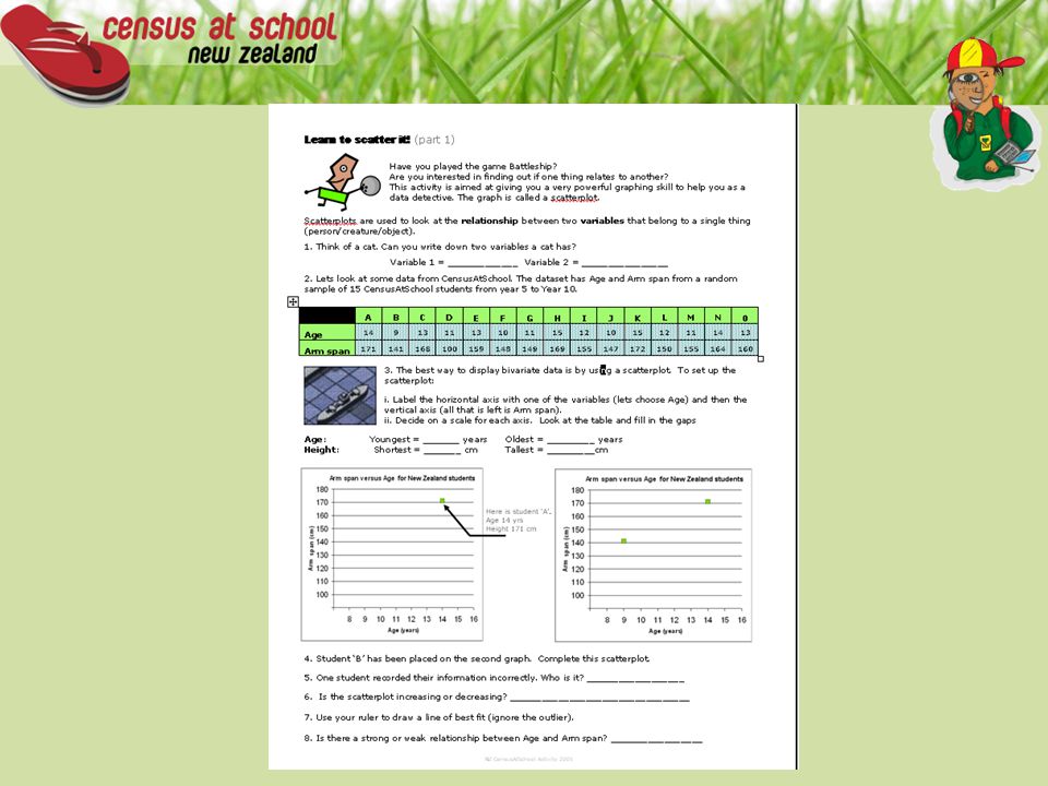
Learn to Scatter it!

3
variables Write down in your book 2 variables for a lion

4
Real data!

6
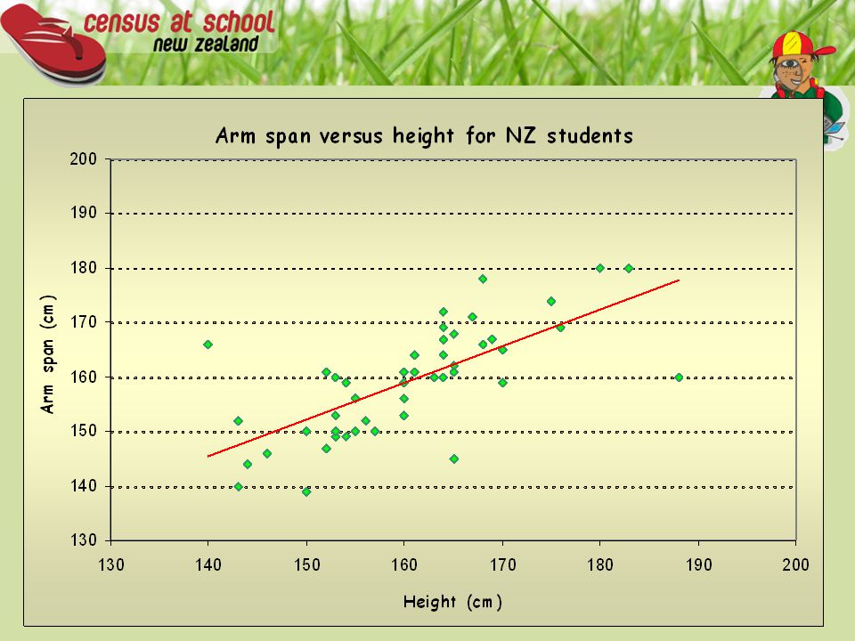
Graph of the data Your graph should look like this

7
Lesson 2 Slide Show Learn to scatter it even more !!

8
4. Collect your own dataset of 50 students from your year level the CensusAtSchool data sampler. Select students from your region. Use the ‘Are you a masterpiece?’ option in the questions dropdown.

9
Step 1: Check that your excel sheet looks similar to Fig 1. This is an example from the 2005 data, other years will have similar headings.

10
Step 2: delete the columns gender; age; ethnic; Nōtēheaiwi; rightfoot. Right-click column A select delete This is an example from the 2005 data, other years will have different columns to delete.

11
Step 3: Highlight all data and (click and hold) and select chart wizard
 and select chart wizard")
12
Step 4: Chart Wizard- Select scatter and then select next

13
Hit next

14
Step 6: Label title and axis; Note- Your first column is always your horizontal axis. –Hit next

15
Step 7: Select either ‘As new sheet’ or ‘As object in’.

16
Step 8: Your graph is finished! Answer question 5 on the worksheet. Before you change anything, write down what you notice about the scatterplot?

17
Step 9 &10: Tidying up. 9. Right click on the legend and select clear. 10. Right click on horizontal axis.

18
Step 11: Select scale. Choose a minimum (what is the minimum height). Choose a maximum (what is the maximum height). Major unit: Change to 10 Minor unit: Change to 5
. Major unit: Change to 10 Minor unit: Change to 5.")
19
Step 12: Repeat the process with the vertical axis. Select maximum and minimum based on sample. Major unit: Change to 10 Minor unit: Change to 5

20
Step 13: The Graph is now finished. Complete Question 7 on worksheet. You can also change add a trend line and remove outliers when you are experienced.

22
End of Lesson 2 slide show

23
Lesson 3 Slide Show

24
Question 8 8. Do you think there is a relationship between the circumference of students’ thumbs and the circumference of students’ wrists? Use the CensusAtSchool data-sampler and a spreadsheet to investigate this relationship and answer the question.

25
http://www.censusatschool.org.nz/2005/sampler/ Select sample size Gender Region Questions about you/Ng ā K ō rero M ō u

26
Select Excel option

27
…and begin

28
CensusAtSchool New Zealand is supported by For more information please visit www.censusatschool.org.nz

Similar presentations

. Is a spreadsheet application designed to take advantage of the windows graphical interface MICROSOFT EXCEL.>")


